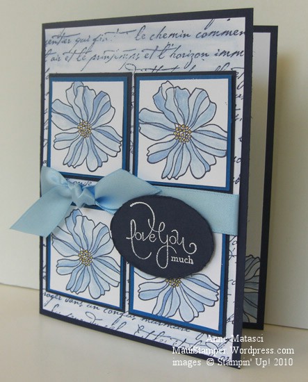
In case you haven’t noticed, I’ve been cruising through a lot of different challenge blogs and forums recently. It’s a great way to shake up my projects a little and keep things fresh. It’s easy to use familiar color combinations and card layouts, but after a while it gets boring.
I haven’t settled on any particular favorites but if I do I promise I’ll share. The layout for this card is from Sketch Girl, and it appeals to my sense of orderliness. Today’s colors are courtesy of the Paper Pal Arts Monochromatic Blues Challenge (PPA40) and I knew the moment I saw the challenge that it would make me happy. I don’t think there’s a shade of blue I dislike, and the clean look of blue and white is one of my favorites. I had a lot of fun with this card:
- Fifth Avenue Floral, Well Scripted and French Script stamp sets
- Whisper White, Night of Navy and Pacific Point card stock
- Not Quite Navy Classic ink pad; Craft White ink pad
- Crushed Curry Stampin’ Write Marker; Bashful Blue Ink refill and the Aquapainter
- Bashful Blue Satin ribbon, Large oval punch, white embossing powder and the heat tool
And yes, I blurred the French Script lettering with the AQP on purpose! Lately I can’t seem to make a card without using the Aquapainter for something. For the past couple of days, I’ve only been able to find the small-brush AQP – the large-brush one is AWOL. It’s driving me crazy (admittedly, a very short drive) because I’m somewhat OCD (or as my daughter likes to point out, CDO – alphabetical order). I Do Not Like To Lose Things. And I use that AQP a lot! (deep breath…another one…it’s going to be okay…really.)
Ahem. I had a marvelous time with this card. The concept was clear in my head before I started, and although I made a few adjustments as I went along the process was very enjoyable. This is not always the case, as evidenced by the card in the trash can in my craft room. When I finished this lovely Ode to the Blues I thought my mojo was firmly in place and started in on another sketch challenge I’d seen. I spent way more time than I’d planned trying to make it work, changing focal points and orientation and struggling mightily. I finally finished it and set it aside to look at this morning, which is often the perfect solution. Sometimes looking over a not-quite-there project after a good night’s sleep will produce that Ah-ha! moment that fixes everything. But this card was immune to Good-Sleep-Therapy. I ripped off the salvageable bits and threw the rest away. It’s only paper, after all.


Another card I love, the blues in this card are soooooo soothing…Brava to you!
LikeLike
I love your creation and blue is beautiful. Thank you for joining in with Sketch Girl Challenge.
Harriet
LikeLike
Love all of your shades of blue – beautiful job with the challenges! Thanks for joining us at PPA!
LikeLike
Love the card those blues sure are beautiful. Good luck with the challenge.
LikeLike
So pretty! Love your blue flowers and the script background. Great layout too!
LikeLike
Very very pretty! I love the blue and white together. Thanks for playing along with us at Sketch Girl
LikeLike
What a fabulous interpretation of the sketch! Beautiful card! You really made me giggle with the CDO!! Thanks for playing along with the sketch girls!
LikeLike
Great card, love the monochromatic look! Thanks for joining us at Sketch Girl!
LikeLike
I agree, the blues are a great color family! Your card has captured a very soothing blue and I really like the repetition of the flowers. Fab take on the sketch, especially the addition of the ribbon!!!
Thanks for playing along with Sketch Girl, glad you found us!
LikeLike
fabulous colouring and I love the blue and white combo. Beautiful job with that sketch.
LikeLike