
I’ve taken a summer blogging break, but I’ve been creating with a lot of energy. I needed a breather!
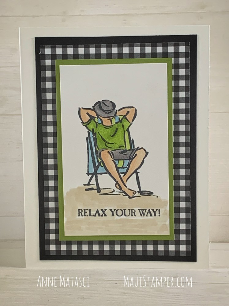
Last month, one of my groups asked to make Manly Cards. They’re really not difficult, but it does take a different mindset. I enjoyed the challenge and discovered that once I switched off the flowers-and-birdies reflex, it was a lot of fun! An easy place to begin is with A Good Man, one of the new stamps sets in the Stampin’ Up! 2019-2020 Annual catalog.
- Stamps: A Good Man
- Color palette: Whisper White, Basic Black, Old Olive, Balmy Blue, Ivory, Crumb Cake, Smoky Slate
- Accessories: Botanical Butterfly DSP (Retired, SAB 2019), Stampin’ Blends, Memento Ink, Stampin’ Dimensionals
This card is notably plain. I find most embellishments are too, well, embellishmenty for a Manly Card. A little linen thread wouldn’t hurt here, but I honestly felt it was just right, just as it was. I think the gingham pattern on the DSP added enough interest.
One of the things I love about gingham is the even character of the pattern. Yes, I took the time to cut it so that the same row appeared on each edge, and yes, I measured my center panel so it would fit just so. I’m not an engineer (heaven forbid, we have plenty of those in my family, enough is enough), but I do love symmetry.

This image is really simple to color. I try to work with the lines that Stampin’ Up! gives me to guide me in my dark-to-light balance. It helps to imagine the sun shining from one side or the other, but I’m not seeking perfection here, just a pleasing appearance.
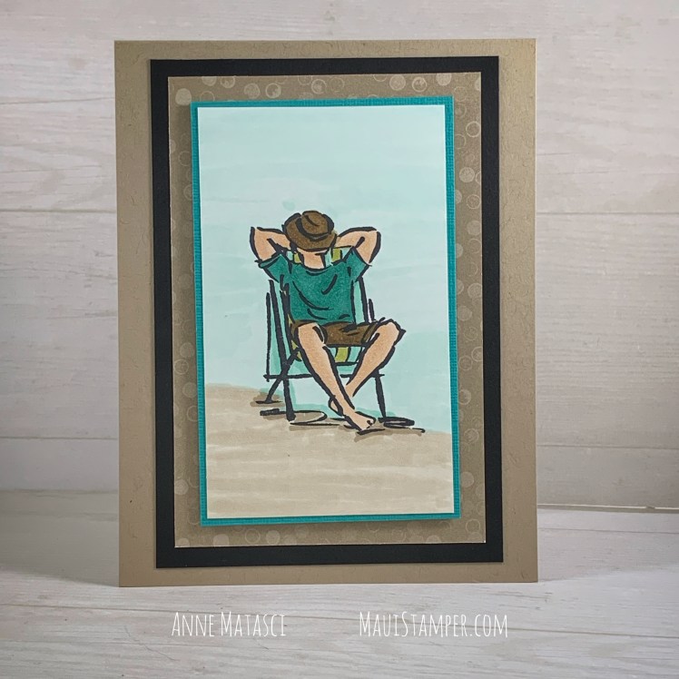
I colored quite a few of these and used different combinations and background papers. This is another retired paper from the Nature’s Poem series, and I think this is a perfect way to use up that stash. (Confess it: you have one too.)

Don’t forget – there are just two more days to earn Bonus Days vouchers!
Shop HERE.

What a nice card. I like the way you colored both of these cards.
LikeLike
Thanks, Annette. I look at them pretty critically and see lots of room for improvement, so it’s nice to have your unbiased opinion.
LikeLike
Love this stamp set. What colors did you use for the flesh tones?
Sent from my iPad
>
LikeLike
Mary, we have 2 blends that are designed for skin tone. They’re Ivory and Bronze, and I used the Ivory for this haole guy 🙂 The skin tone blends don’t come as dual (light/dark) sets because the shading is more subtle, and you can layer over the first coloring to get a little deeper tone. To get a little shading on his legs, I just added another layer of color. You’re gonna love Blends!
LikeLike