When words aren’t enough

Sometimes you need to send a hug through the mail.  You want to convey love and support and hope, but you know that right now, words aren’t enough.

When words aren't enough

  • Thoughts and Prayers and Teeny Tiny Wishes stamp sets
  • Very Vanilla card stock
  • Soft Suede and Baja Breeze Classic ink pads
  • Stampin’ Sponges and 1 3/8″ square punch

I used the square punch to cut a rectangular mask out of a scrap of card stock.  I sponged the Baja Breeze ink evenly through the mask, then removed the mask to stamp the tree from Thoughts and Prayers.  I like the hopeful feeling that I get when I look at this card.  I hope my friend will feel hopeful when she opens it.

CASE-ing the new catalog

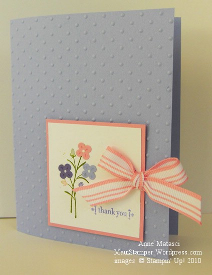
There are lots of great samples in the new Idea Book and Catalog coming out July 1, and the other day one caught my eye.  The designer added some Itty Bitty punch flowers to this image from Pocket Silhouettes, and they were a perfect fit.  Here’s my version:

Dotted Silhouettes

  • Pocket Silhouettes and All Holidays stamp sets
  • Almost Amethyst, Pretty in Pink, Whisper White and Lovely Lilac card stock
  • Old Olive and Almost Amethyst Classic ink pads
  • Pretty in Pink, Lovely Lilac and Old Amethyst Stampin’ Write Markers
  • Tombo adhesive, Blender Pen and White Gel pen
  • Itty Bitty punches; Horizontal Slot punch
  • Pretty in Pink striped ribbon; Stampin’ Dimensionals
  • Big Shot and Perfect Polka Dots Impressions Folder

This card falls in the simple and sweet category – an easy card for beginners.  After inking the image with Old Olive, I used a blender pen to remove the Olive color from the buds and replaced it with the Stampin’ Write markers.  I punched the bitty flowers out, attached them with Tombo, and added white centers and coordinating petal lines.  Add a sentiment and a ribbon and you’re done!  The image panel is adhered with Stampin’ Dimensionals to provide a little, well, dimension, and also to leave a little room for those Big Shot Polka Dots and the ribbon.

Have you looked at the Last Chance Lists?  Stamps, accessories and Decor Elements are clearing out – some of them very quickly – and some of them at a discount!  Be sure you check my Online Store for all the information.  One of the punches that is retiring is the Horizontal Slot, and I am sorry to see it go – it’s just the thing for ribbon!

Travel Time Collage

It’s a busy day for Stampin’ Up! demonstrators.  Last night (or early this morning, depending on where you live) the new catalog Sneak Peak products were released.  There was a frenzy of posting on various forums as we waited for the new information to load on the demonstrator site.  Since Hawaii is four hours behind Riverton, Utah (where Stampin’ Up! is located) I was doing my waiting at a very respectable 8pm.  Demonstrators east of Riverton were not so fortunate!

I’ve ordered some new goodies, and though we’re not allowed to show you any pictures of actual products until they are released, we ARE allowed to show you things we MAKE with those products.  Watch for some exciting new images hitting this blog soon!

Today I have a card that is entirely different from anything I’ve ever done:
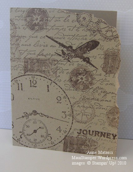
Timeless Journey CAS

  • Sentimental Journey, Sense of Time and French Script Stamp sets
  • Kraft (soon to be Crumb Cake) card stock
  • Chocolate Chip Classic ink pad

Are you shocked?  I’m still trying to decide if I like it.  I’ve admired other stampers collage work, and these sets seemed to fit together well for the purpose.  Some of the images were stamped with fresh ink and others were stamped off before I put them to the card.  Three stamp sets, one paper, one ink.  That’s it.  The whole enchilada.

I masked the large clock before I stamped the large background French Script stamp.  I like the way it makes the clock face take center stage, although sometimes I wish the clock wasn’t such a priority in life.  Many years ago, my husband and I drove across the country and we packed away our watches and covered up the dashboard clock.  It was a wonderful trip.

I couldn’t stamp this way all of the time – it would bore me to tears.  Once in a while, though, it’s nice to do something different.

The envelopes are the best part

Today’s project is brought to you by the Letter E…for Envelope!

I’ve seen a number of projects recently where the crafter ran the envelope flap through the Big Shot with an embossing folder.  I finally gave it a try, and I have to tell you it’s really easy and a real wow:

Elegant Bouquet Envelope

I’ll try to get some photos of my technique.  I only embossed the back flap, and it was simple to line it up in the Impressions folder and run it through the Big Shot.  The trick is to put the folder through sideways, sending the body of the envelope through the Big Shot first (and outside of the folder).  I know, sorry, I’m visual too – I’ll set up my Very Sophisticated Photographic Equipment (point-and-shoot) and take some photos for you.

Here’s the rest of the project:

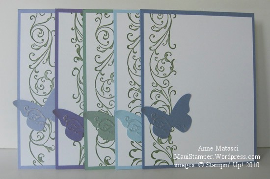
Beautiful Wings note cards

  • Baroque Border Stampin’ Around Wheel
  • Always Artichoke Classic ink cartridge
  • Whisper White and Lovely Lilac, Almost Amethyst, Sage Shadow, Bashful Blue and Brocade Blue card stock
  • Big Shot and Beautiful Wings Embosslit
  • Tombo Multi-purpose Adhesive; Champagne Mist Shimmer Paint
  • Envelope:  Elegant Bouquet Impressions Folder

These go together really quickly and only use a quarter sheet of cardstock  each of color and Whisper White for the note card.  I have a stash of “extra” butterflies made with the Beautiful Wings Embosslit – it cuts five at a time, and if you only need the little itty bitty one, you have four left over.  The smaller ones make fun confetti, but this is the largest one and it’s almost perfect.  It will be really perfect when the new 2010-2011 Idea Book and Catalog merchandise is available and a Certain Product can be added…but I’ll have to save that news for later.

Monkey-shines

Some people are born with fun running through their veins.  I have a friend who is all about fun, and her daughter has inherited that delightful character.  It wouldn’t do to have a stuffy, grown-up graduation card for her.  Sock Monkey was the Man for the Job:

Sock Monkey Graduates

  • Sock Monkey, Sock Monkey Accessories and Hugs and Wishes (retired) stamp sets
  • Very Vanilla, Crushed Curry, Brocade Blue and Night of Navy card stock
  • Close to Cocoa and Night of Navy Classic ink pads
  • Close to Cocoa, Night of Navy, Brocade Blue and Crushed Curry Classic ink refill
  • Aquapainter, Scallop oval punch and Crushed Curry polka dot ribbon
  • Crop-a-dile and White gel pen
  • Big Shot and Polka Dot Impressions folder

School colors are blue and gold – can you tell?   Sock Monkey got tired of sitting in all of those boring graduation practices, stuck in the back row because he was the tallest.  Who ever heard of lining up the graduates by height??  He sat down and started picking flowers to make a bouquet for his mommy who is just a little stressed out with all the relatives in town.  What a sweet monkey.

Graduation Season

It’s that time of the year…caps and gowns and diplomas, oh my!

No graduates in my house – or my immediate family – this year, but we have lots of friends graduating from high school and college.  I’ve enjoyed making cards for them with little nods to their schools and even their personalities.  That’s the whole point of a hand-made card, isn’t it?

Fifth Avenue Floral Congratulations

  • Fifth Avenue Floral, Elements of Style and Well Scripted (retired) stamp sets
  • Whisper White, Brocade Blue and Night of Navy card stock
  • Brocade Blue and Night of Navy Classic ink pads; Whisper White Craft ink pad
  • Versamark ink pad; Crushed Curry Stampin’ Write marker, Vanilla Smooch Spritz
  • Embossing Buddy, Powder Pal, Clear Embossing Powder and Heat Tool
  • Scallop Border punch, Elegant Bouquet Impressions Folder and Big Shot

My little point-and-shoot doesn’t pick up the details too well, but there’s Smooch Spritz (I can’t decide if I should laugh or cry when I say that) on the floral panel and the sentiment is embossed with clear embossing powder.  The Craft White ink is on the Night of Navy panel behind the sentiment.  It was originally larger and destined for another use but I scrapped the entire concept on the basis of irreconcilable differences – that card was NEVER going to work.  The pieces survived to find purpose in an alternate relationship!

I’m ought to apologize for using a retired sentiment, but I don’t feel too badly about it.  There are tons of great “Congratulations” stamps out there and I’m sure you’ll find a substitute if you don’t have this one.  There are always so many great sets in the mini catalog (this was the Occasions Mini) and it always seems as though there’s one set you should have purchased when you had the opportunity.

It’s a glorious Maui day and my son is finished with finals today, so his sister and I are going to take him out to lunch in Lahaina.  Too nice a day to stay inside, even for stamping!

Twitterpated

It’s been quite a day!  I’ve spent a lot of time with the new catalog and have had a few demonstrator friends in to see it.  I don’t know the exact number, but only a few demonstrators qualified for the early release of the 2010-2011 catalog and I feel very privileged to be one of them.  There’s a lot to like here!

Today’s card is actually the card I was preparing to photograph when I opened my front door and the envelope fell inside.  The afternoon light is best in the front of my house, and I was opening the door to get more light when I discovered my package.  You’ll have to forgive the quality of this photograph as I was all twitterpated when I took it 🙂

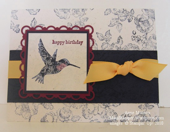
One more Elements of Style card

  • Elements of Style and Teeny Tiny Wishes stamp sets; Very Vintage Wheel
  • Night of Navy, Rich Razzleberry and Naturals White card stock
  • Night of Navy and Rich Razzleberry Classic ink pads; White Craft ink pad
  • Brocade Blue and Rich Razzleberry Stampin’ Write markers; Blender pen
  • Scallop Trim Border and Corner punches
  • So Saffron 5/8″ grosgrain ribbon (retired)

I’m having a good time playing with color combinations on this hummingbird.  I ink the stamp with a base color and use the Blender Pen to selectively remove ink from the stamp.  I add in new color with Stampin’ Write markers in the spaces cleaned by the Blender Pen and huff on the rubber before I apply the stamp to the paper.

It’s not apparent in this photograph, but I used Craft White ink to stamp the “roses” background image behind the hummingbird.  The result is a very soft look, almost like stamping on brocade.

Time to get something done.  My day has disappeared, but in a good way.  Tomorrow I’ll be back on schedule.  Mostly.

Wish I could share more…

Got a WONDERFUL surprise this afternoon.  I was one of the demonstrators who qualified to receive an early copy of the 2010 – 2011 Idea Book and Catalog under a special program offered by Stampin’ Up! this spring.  I expected my catalog tomorrow afternoon based on the email I received, so you can imagine my response when I opened my front door this afternoon to head out the door and a large envelope fell into the house.  I nearly fell over myself!!

We’ve been given VERY clear and specific instructions about what we can and cannot share, and the basic message is that the catalog must be shared in person.  I can tell you that it’s beautiful, that there are many gorgeous new stamp sets and papers, and that the new Color Renovation has been carried out beautifully.  There are products and accessories for every color as well as “kits” of new products to fill in the gaps – for example, you can purchase markers in just the new colors to complete your set of Many Marvelous Markers.

As I have more time to go through this catalog I’ll try to include more insights.  It’s a wonderful catalog and we’ll all get a great deal of pleasure from this offering!

Steppin’ up

I’m working on projects for workshops coming up and I’m struggling.  My personal card-making style tends to be in the “More is More” category, and not so much in the KISS (Keep It Simple, Sweetie) department.  All of my workshops are totally hands on – I don’t demonstrate anything, I just pass out the paper, stamps and ink and let everyone play.  If there are too many steps or the steps are too advanced, new stampers get overwhelmed.

My solution is to make two versions of a card.  There’s one for everyone to make, and another to let them see where they can take the card.  Here’s the starter version:

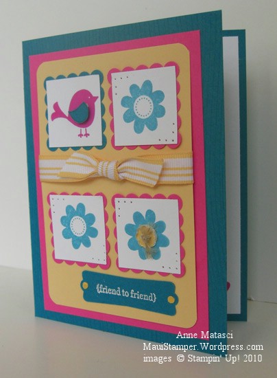
Cheep Talk Four Square

  • Cheep Talk and Teeny Tiny Wishes stamp sets
  • Whisper White, Taken with Teal, Barely Banana and Pink Passion card stock
  • Taken with Teal and Pink Passion Classic ink pads
  • 1 1/4 inch and Scallop Square punches
  • Bitty Buttons, Itty Bitty punch pack and Tombo All-Purpose Adhesive

Do you see the peek at the inside of the card?  Taken with Teal is too dark for correspondence so I include a Whisper White panel inside, and the little heart from Cheep Talk is stamped in the corner just for fun.

Here’s Version 2 (and it’s the same card stock – operator error with the camera is responsible for the color discrepancy):

Cheep Talk Four Square Version 2

Same supplies as above PLUS:

  • Wood Grain stamp
  • Whisper White Craft ink, Heat tool and White Embossing powder
  • Paper Piercing tool, template and mat
  • So Saffron striped grosgrain ribbon and Linen Thread
  • 1/8 inch hole punch (non-SU) and Crystal Effects
  • Corner rounder and Modern Label punch
  • Stampin’ Dimensionals

Perhaps you prefer the first card – a lot of people like a simpler look.  Every now and then I get into a Clean and Simple kind of mood, but I don’t think this first sample even qualifies there — too many layers.  Either way, the cards are bright and whimsical and get the message across:  I’m thinking of you!

Good-Bye (Kiwi) Kiss

One thing that crafters in all mediums have in common is a stash.  We hoard special goodies we bought at that out-of-the-way shop we found while traveling, expensive goodies we splurged on in some high-end store, or perhaps most precious, RETIRED goodies.  These are things we can’t get anymore.

I have goodies in all three catagories, but I’m finally relenting and using up some of my retired and retiring paper.  Stampin’ Up! has announced a Color Renovation effective July 1 (You haven’t heard?  Have you been off the planet?) and there just isn’t room for ALL of the old and ALL of the new.  One of my stashes is Kiwi Kiss – paper, ink, and ribbon – and I’m going to use it up. (gasp!)

Colour Q Challenge 33 Vintage Vogue

  • Vintage Vogue and Teeny Tiny Wishes stamp sets; Very Vintage Wheel
  • Kiwi Kiss, Bermuda Bay, Whisper White and Summer Sun card stock
  • Kiwi Kiss, Soft Suede and Summer Sun Classic ink pads; Whisper White Craft ink pad
  • 1 1/4 inch, 1 3/8 inch square punches; Round tab punch; 1/8 inch circle punch (non-SU)
  • Soft Suede polka dot grosgrain ribbon; White gel pen
  • Big Shot and Lattice Impressions Folder

This is a Colour Q Challenge and when I saw it included Kiwi Kiss my first thought was to substitute Old Olive and continue hoarding my precious stash.  When I put the colors (oops!  Colours!) together I realized the brighter tone of the Kiwi Kiss made a big difference and I decided to be brave.  What’s the point of hoarding something if you never intend to use it?

I’m feeling very brave…maybe it’s time to go take a look into my closet.   Maybe…