The Wonder of Wisteria

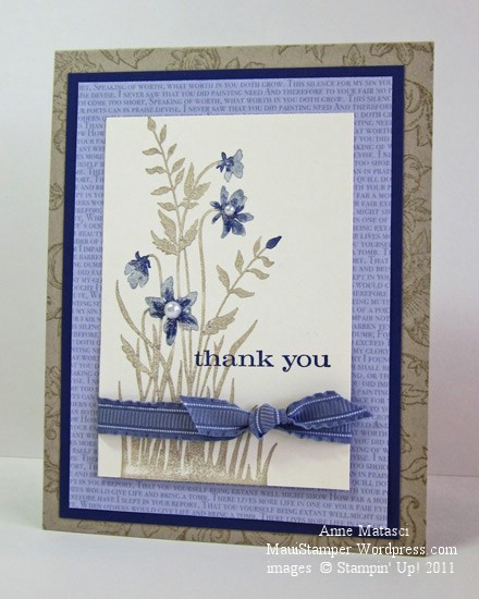
Wisteria Wonder was the first 2011-2012 In Color selection featured in my Getting to Know the In Colors class series.  I had one of those happy moments when I held it up and everyone ooohed and aahhhed:

  • Just Believe and Bella Toile stamp sets
  • Crumb Cake Classic ink pad
  • Wisteria Wonder and Concord Crush Stampin’ Write markers
  • Very Vanilla, Crumb Cake and Concord Crush card stock
  • Wisteria Wonder Patterns Prints Designer Series Paper (In Color collection)
  • Wisteria Wonder 3/8 inch ruffled ribbon
  • Blender pen
  • Pearl Jewels

It’s a very simple card, but I love the combination of colors, and I love that Just Believe stamp set.   Someone in class asked if that was an “old” stamp set – it was brand new LAST year!  It doesn’t seem old to me, because I always find new ways to use the images in the set.

The main image in this card is inked with Crumb Cake ink, and the ink is removed from the flower portions of the image with a Blender Pen.  We used the Wisteria Wonder Stampin’ Write marker to add color back to the flowers, and then used the flat edge of the Concord Crush marker to accent the centers of the flowers before we stamped the image.

I’ve seen many cards using Wisteria Wonder and neutrals.  That seems to be a really popular pairing, especially Wisteria Wonder and Crumb Cake.   (hijack:  I know Stampin’ Up! likes colors to have two-word, alliterative names, but really, what was wrong with Kraft??)  I like that look myself, but enough is enough.  We did some projects with other color combinations too. (stay tuned)

Here’s the inside of the card:

Just Believe In Wisteria Wonder inside

Oh dear, my title is going to create havoc with Google searches by gardeners in love with a vine.  My bad 🙂


Lovin’ our In Colors

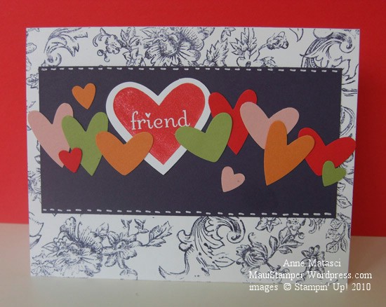
True confession time…I beg, borrow and steal a lot of my ideas.  Today’s card was inspired by THIS card posted on the Stampin’ Addicts website.  I played with it and to continue in the true confessions theme, I’m not convinced that I like this version.  However, I definitely like our new In Color selection.  Poppy Parade is that perfect Red Hot Red color , Concord Crush is a deep indigo purple, Peach Parfait is a soft but saturated orange, Pear Pizzazz is a gorgeous spring green, and Blushing Bride….well, what can I say about a color called Blushing Bride?  It’s soft and not too pinky and very, very feminine.  Laurie’s card used all 5 colors and I borrowed her concept to accomplish the same result:

Hearts In Color

  • I {Heart} Hearts and Bella Toile stamp sets
  • Whisper White, Concord Crush, Poppy Parade, Blushing Bride, Peach Parfait and Pear Pizzazz card stock
  • Poppy Parade and Concord Crush Stampin’ Write Markers
  • Uniball Signo White Gel Pen; Tombo adhesive
  • Full Heart and Heart to Heart punches

The I {Heart} Hearts stamp set from the Occasions Mini catalog has made it into the new 2010-2011 Stampin’ Up! Idea Book and catalog.  This set was selected for the Haitian Refugee Relief program through Stampin’ Up! and raised well over $20,000 for the American Red Cross.    Although the fundraising effort is complete, you can still purchase the stamp set as well as the coordinating Full Heart and Heart to Heart punches to make your own “heart-felt” greetings (Get it??  I crack myself up!)

Personally, I think Bella Toile is a bit of an overkill on this card and I’m going to make another using Woodgrain to see if I like it.  Stay tuned.

Kitchen Sink Card Making

Do you ever have one of those crafting moments when you can’t stop yourself?  You think “ah, that’s just it!” and then you spot a little something over there in the corner of your craft desk and before you know it, you’ve added it in.  You could call it “Kitchen Sink Card Making”,  I suppose.  Well, that happened to me:

Vintage Style and more...

  • Vintage Vogue, Bella Toile, and Teeny Tiny Wishes stamp sets
  • Very Vanilla, Sahara Sand, Bashful Blue, Melon Mambo and Soft Suede card stock
  • Soft Suede, Bashful Blue and Melon Mambo Classic ink pads
  • Melon Mambo and Bashful Blue Classic Ink refills
  • Modern Label punch, Fresh Favorites buttons, and Linen Thread
  • Aquapainter,  and Stampin Sponges
  • Big Shot and Beautiful Wings embosslit

Those butterflies from yesterday’s post were lurking around on the craft table and I couldn’t resist them.  However, it appears I couldn’t resist anything else!  This was fun to play with, even it if does look a little…hmmm…shall we say “busy”?  That would be kind.

One note:  Be sure to insert a liner on the inside of a card that’s this deep in color.  A simple Very Vanilla panel would do here, although I often add a mat and stamp a little in the corner.  What the heck – if the front is gonna be all out, the inside needs a little zip too!

Re-interpreting the Mini…Summer Mini, that is!

If you’re a Stampin’ Up! demonstrator AND you’ve received your advance copy of the Summer Mini Catalog (May 1 to August 31) this card may seem vaguely familiar:

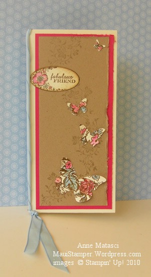
Vintage Butterflies with a Summer Mini inspiration

  • Vintage Vogue,  Bella Toile and Only Ovals stamp sets
  • Very Vanilla, Kraft and Melon Mambo card stock
  • Sahara Sand and Soft Suede Classic ink pad
  • Bashful Blue and Melon Mambo Classic ink refills
  • Big Shot and Beautiful Wings embosslit
  • Oval punch, Stampin’ Sponges Aquapainter and Bashful Blue taffeta ribbon

I looked at the images on the front of that mini catalog and fell in love with the colors and the vintage style.  The more I looked, the more I thought I could find a way to create that same feeling with stamps I already had.  I pulled out the color palette the cover artists used, rummaged around until I found a few vintage-looking stamp sets, and started to play.

I wanted to add the ribbon, but with the tall skinny card format it just seemed too wide even at 3/8″.  Eventually, the little light bulb went on in the air over my head and I figured out that I could twist the ribbon to make it fit my purpose.  The butterflies were created from the Beautiful Wings embosslit using paper that was stamped with the Bella Toile background stamp (an under-utilized stamp, I might add!).  I used the Aquapainter and Classic ink refills to selectively color bits of the image and I love the result.

By the way, that Beautiful Wings embosslit is so popular that Stampin’ Up! is STILL experiencing shipping delays.  If you want it,  my suggestion is to put in your order and get in line now!

Just because I could recreate this concept does NOT mean I won’t be buying this set.  You see, one of the many beautiful images it features is a hummingbird, my favorite bird to watch.  They are fast, tiny, jewel-colored, and crazily territorial little things and I love the zzzhhhmm noise they make when they go by.  Somehow, the little hummer has never made it to Hawaii, and I miss seeing it.

Have I got you thinking ahead about that Summer Mini??  Good.