A promise made, a promise kept

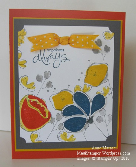
A couple of days ago I put together a couple of colors that surprised me.  The combination of Basic Gray and Crushed Curry jumped off my craft table and shouted “Look at me!”  I promised I would use them together:

Awash With Flowers Basic Grey and Crushed Curry

  • Awash With Flowers and Whimsical Words (SAB) stamp sets
  • Whisper White, Basic Grey, Crushed Curry and Dusty Durango card stock
  • Basic Grey, Crushed Curry, Not Quite Navy and Dusty Durango Classic ink pads
  • Basic Grey Stampin’ Write marker and the Aquapainter
  • Ticket Corner Punch, Double Rectangle Punch, and Crushed Curry Polka Dot ribbon
  • Stampin’ Dimensionals and Stamp-a-ma-jig

These colors would have worked really well for a masculine card, but I am currently infatuated with Awash with Flowers.   The Not Quite Navy petals are stamped on Whisper White, cut out and attached with Dimensionals for a little pop, and I used the Aquapainter to add a little Crushed Curry around the Dusty Durango Two-Step flower.  I only used the SAMJ for that same Dusty Two-Step because I wanted it Just So – the rest of them are happy accidents.

I like these strong colors together, and before long I’ll have to find a nice Man Stamp Set and try again.  I just got a couple of new things from the Summer Mini and one of them will be perfect.   (Hijack:  Don’t you hate it when you have decided you don’t need something and then you see not one, not two, but an abundance of projects using that same rejected stamp set?  And where on earth did the word “hijack” originate?  Off to the old Funk and Wagnalls…)

Enjoy your Friday.

An In Color Trifecta

Whew!  Time for some antidote to pink!  Not that there’s anything wrong with pink…but I’m swimmin’ in the stuff this week.  Some friends are expecting a baby girl the beginning of next month and we’re getting having a small get together this weekend to celebrate.  I’ve got a couple of Pink Projects in various stages of completion and it’s time to put the pedal to the metal and get them done!

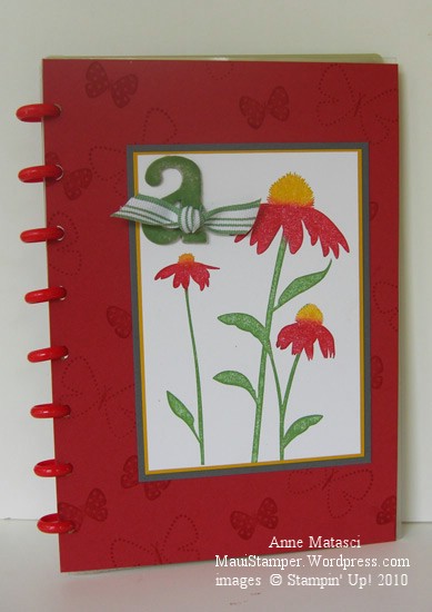
In the meantime, I made another cover for one of my many Circa notebooks. I have a LOT of these notebooks that I use for a variety of purposes.  If  I don’t personalize the covers, then I tend to get a little cranky when I’m looking for a particular one and have to flip through 2 or 3 others in the process.  (By the way, if you read the post where I lamented my AWOL Aquapainter, it was hidden in plain sight.)  I like to make fresh covers for the pleasure of it and to keep myself on my toes.

This notebook has red Rollabind discs, so I knew red would be in my color scheme.  I chose Riding Hood Red (IC’09) to celebrate the new Color Renovation, and Wild Wasabi (IC’08) and Crushed Curry (IC’10) just fell into place behind it.  A three-generational-In-Color trifecta!

Inspired by Nature Levenger Circa Cover

  • Inspired by Nature and Flight of the Butterfly stamp sets
  • Whisper White, Riding Hood Red, Wild Wasabi, Crushed Curry and Basic Gray card stock
  • Wild Wasabi, Crushed Curry and Riding Hood Red Classic ink pads
  • Wild Wasabi striped ribbon (retired), chipboard letters (retired) and Sponge Daubers

Inspired by Nature was one of the sets demonstrators received at the 2008 Stampin’ Up! convention.  I learned a great technique at convention when we did our Make ‘n Takes:  we used Sponge Daubers to selectively apply ink to the stamp.  The sponges avoid streaks that sometimes appear when you use a marker on bold images, and they give the image a slight softness.  You can also spritz the entire stamp very lightly for a watercolor effect.   I added the Basic Gray into the mat layers because the Riding Hood combined with the Wild Wasabi and Crushed Curry created  a confused Christmas/Rasta kind of look…not quite the effect I was going for.  Serendipitously, I realized  I really like Basic Gray paired with Crushed Curry – I’ll be putting those two together very soon.

In Color: Blast from the Past

I was digging through the DSP (Designer Series Paper, but you knew that) scrap bin the other night.  It’s not very organized, though it’s better than it used to be.  I kept running across retired paper and thinking about how much I loved this design or that color.  Before I knew it I had a handful of things I wanted to use, so this is a warning:  The next couple of days will be “SU Retro”.

SU Retro Kindness

  • Define Your Life and Contempo Alphabet stamp sets
  • Baja Breeze (ret), River Rock(ret), Night of Navy and Naturals White card stock
  • Retired Designer Series Paper
  • Baja Breeze (ret), Old Olive and Night of Navy Classic ink pads
  • Spiral punch, Stampin’ Sponges, Basic Gray taffeta ribbon and Filigree Designer brads
  • Stampin’ Dimensionals, Clear embossing powder, Embossing buddy, and Heat tool

This layout came from the Stampin’ Addicts Sketch Challenge from this week (SASC44) but I twisted it around.  I’m getting kind of rebellious about that kind of thing lately!  It’s not intentional, it’s just that my mind sees the possibilities of doing something different.

I sponged around the edge of the Naturals White panel with Baja Breeze ink to soften it a little.  And while we’re on the subject of Baja Breeze, if I haven’t mentioned it before (though I know I have) Baja Breeze is one of my all-time absolute please-bring-it-back FAVORITE Stampin’ Up! colors.  Ever.

Cheery little birds

We’re staying positive here…working with cheery colors and cheery subjects!  I spent the afternoon with my oldest daughter on Saturday culling through heaps of papers, books, photos, and other accumulated mementos.  I also ended up with the challenge of reuniting a huge box of cd cases with the discs that belong inside.  It’s amazing how many cd’s have nothing more than a photo on the front – no band, no songs, no disc title.  I did very well, all things considered.

OK – now on to a card!  These chubby little birds really sing in bright colors.  I don’t think either one of them has met a shocking hue they didn’t love.

Bright Little Birdies

  • Cheep Talk stamp set
  • Bermuda Bay, Crushed Curry and Whisper White card stock
  • Garden Green Prints Pack 6×6 Designer Series Paper
  • Bermuda Bay, Crushed Curry and Garden Green Classic ink pads
  • Bermuda Bay and Crushed Curry markers and a Blender Pen
  • Crushed Curry Polka Dot ribbon

I was feeling oh-so-confident and I stamped this WITHOUT the Stamp-a-ma-jig.  I know.  Can you believe it???  That Crushed Curry bird is floating a little, but if it was any closer to the branch those leaves would be tickling its tail feathers. And we wouldn’t want that now, would we??

Celebrating the new Mini

Yee haaa!   New stamps and accessories still give me that adrenaline rush!  Today the Occasions Mini Catalog and the Sale-a-bration mini are available for customer orders.  If you haven’t gotten your catalog, take a quick peek online to see what’s in store!

Here’s a little something to celebrate with:

Vintage Vogue Clear Mount Stamps

  • Vintage Vogue Clear Mount Stamps
  • Melon Mambo, Soft Suede, Sahara Sand and Very Vanilla Cardstock
  • Melon Mambo, Sahara Sand and Soft Suede Classic ink pads
  • Melon Mambo and Soft Suede Stampin’ Write markers
  • Melon Mambo Polka Dot ribbon, Stampin Dimensionals, and a Blender Pen

I’m not usually a big fan of bright colors, but I make an exception for brights paired with neutrals.  I’m really happy with this Melon Mambo and Soft Suede combination.  With the new Stampin’ Up! Clear Mount stamps I didn’t even use my Stamp-a-ma-jig to line up the images on top and bottom.  I did make use of the Blender pen to selectively remove ink so that I could marker the areas where I wanted to add contrast to my images.  I also used the stamping off technique to create variety in my background.

Find something to celebrate today.

Best Mail Call Ever!

Kim Bolzenthal did the kindest thing you can imagine – she sent me her stash of Riding Hood Red striped grosgrain ribbon.  I am so touched by her generosity that I’m still floating around the house a couple of hours after bringing in the mail.  I’m overwhelmed and delighted!

And look at her beautiful card…

That Winter Post stamp set is so charming, and I struggled long and hard over whether or not to purchase it.  It didn’t quite make sense here in the tropics, but I know it suits Kim’s corner of the world.

Make someone’s day…send them a note they’re not expecting.

Hugs and Kisses through the mail

My Sara called yesterday.  She had a rough day.  College is like that – the learning experiences are multi–faceted and sometimes you feel kinda beat up.  As a matter of fact, life is like that, and it would be dreadfully dull if it weren’t.  She’s fine, and she’s making good decisions, but it would sure nice to be able to give her a hug.  This is as close as I’ll get to that until she’s home for Christmas:

Simply_Said_CC243

  • Simply Said and Define Your Life stamp sets; Texture Wheel
  • Basic Black, Bermuda Bay and Whisper White card stock
  • Basic Black and Bermuda Bay Classic Stamp pad
  • Stamp-a-ma-jig and Rhinestone brads

I sat down last night when the household quieted down to put together a love note for Sara.  It’s a relatively simple card, but I wanted the message to stand out.  I love the saturated Bermuda Bay In Color with the crisp black and white, and I think I should use brights this way more often.  Big bold colors aren’t usually my first choice, but this is a look I really like.  I hope Sara will like it too…at least more than Chemistry.

When you need a little color…

This year’s In Color collection is a lot of things, but honey, it’s not subtle.  These are colors that pop.  They stand up and shout!  My color preferences tend to be more muted or rich tones but this bunch just vibrates with intensity.  It’s taken a little getting used to for me.

I made this card at a shoebox swap at a demonstrator meeting.  If there’s anything I like more than stamping, it’s stamping with friends.  We’re usually kinda noisy, and sometimes we get distracted and have to hurry up to finish, but we always have a great time.

Hello_Again_crop

  • Hello Again stamp set
  • Bermuda Bay, Crushed Curry and Melon Mambo Classic ink pads; Bermuda Bay and Melon Mambo Stampin’ Write markers
  • Whisper White, Bermuda Bay, Crushed Curry and Melon Mambo cardstock
  • Crushed Curry polka dot ribbon
  • Gold brads and 1/16″ handheld circle punch

You can’t help but feel cheery when you’ve got colors like this in your face.  They insist that you smile.

My First Mojo

Card challenges can be addicting.   They stretch you to try new techniques, layouts, and colors.  Sometimes they go together so easily that you are exhilarated.  Sometimes you push and pull and struggle and end up throwing the whole thing away (well, I do anyway.  It’s just paper.)

I’ve been following the Mojo Monday blog and challenges for a while but haven’t taken the leap.  This week I jumped – just couldn’t resist those scallops along the bottom.  The Mojo bloggers have such awesome samples that it’s a little tough to get started, but it was fun to play with this sketch.

Mojo Monday 105

Mojo Monday 105

  • Blush Blossom and Whisper White cardstock, retired Stampin’ Up! DSP
  • Cameo Coral, Kiwi Kiss Classic Ink
  • Champagne Mist shimmer paint and sponge daubers
  • Crazy for Cupcakes and Teeny Tiny Wishes Stamp Sets
  • Wide Oval, Scallop edge and 1/16″ circle punches
  • Riding Hood Red taffeta ribbon and Gold cord
  • Stamp-a-ma-jig, crewel needle, Stampin’ Dimensionals

I keep pulling out that darn Kiwi Kiss paper and ink.  I really loved last year’s In Color collection from Stampin’ Up! and I’m having a hard time letting go of it.  Eventually I’ll run out of scraps…but then there will be this year’s In Color collection to deal with.  If it’s not one challenge, it’s another!