A Manly Tree

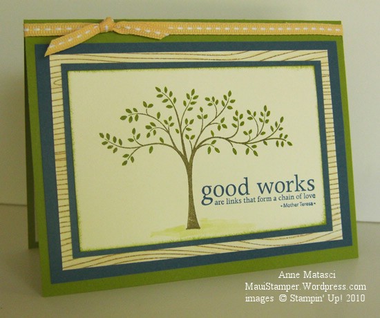
The tree from Thoughts and Prayers is just right for a masculine card.  It lends itself to earth tones and has such a balanced, solid feeling that makes it so suitable for special occasions:

Stampin' Up! Thoughts and Prayers Masculine Tree

  • Thoughts and Prayers, Woodgrain, Vintage Vogue and Inspired by Nature Stamp sets
  • Very Vanilla, Old Olive and Not Quite Navy card stock
  • Old Olive, Soft Suede and Not Quite Navy Classic ink pads
  • Soft Suede and Not Quite Navy Stampin’ Write markers and Blender pen
  • Aquapainter, Stampin’ Sponge, SAMJ and Ribbon Originals Elementary ribbbon

And now the very astute of you are thinking “Ha!  The abundant sea air has finally driven this woman bonkers!  There’s no Vintage Vogue here – she is so obsessed with that stamp set that she’s hallucinating!”  Ah, my friends, behold the inside of the card:

Vintage Vogue Stampin' Up! interior

And here you have your Vintage Vogue, ever so slightly crooked despite multiple attempts AND the Stamp-a-ma-jig.  I decided it was meant to be this way.

To create the multiple colored effect with the tree and the border for the inside, I inked the stamp in Old Olive and used a blender pen to selectively remove the Old Olive ink.  It’s very simple to go back and add in the color that you want with a Stampin’ Write marker (Soft Suede for the tree trunk, Not Quite Navy as flowers on the border).  This has the advantage of being faster than inking the entire stamp with markers, and it also helps avoid the dreaded “skipped rubber” when you are using only markers and miss a spot entirely.

This card was made for my son, who was Confirmed over the weekend.  We are quite proud of him, and I thought you might enjoy one final photo:

Dad, Matt and Mom

True confession:  I made him stand on the step below us.  He’s as tall as his dad  (or perhaps even taller, I haven’t measured today).

Sweet home for a cardinal

Cardinals are nest builders, not house dwellers, but if your imagination can tolerate a little stretching  I think you’ll enjoy this:

Stampin' Up! milk carton die Two Step Bird punch Bird House

  • Vintage Vogue and I {Heart Hearts} stamp sets
  • Naturals White, Soft Suede, Real Red, Mellow Moss, Basic Black, Pumpkin Pie and Always Artichoke card stock
  • Real Red, Soft Suede and Always Artichoke Classic ink pads
  • Black Stampin’ Write Journaler and White Gel pen
  • Big Shot and Bigz L Milk Carton die
  • Two Step Bird, Heart to Heart and Scallop Edge punches
  • Stampin Sponges, Sponge Daubers, Tombo adhesive and Stampin’ Dimensionals

I need to send you to see two special ladies to thank them for their part in this project.  The first is the Amazing Kim Bolzenthal, who generously sent me a RAK of pre-cut milk cartons.  If you know Kim at all, you’ll know she is a thoughtful, giving person who has a passion for stamping and stampers.  Please leave her a comment and tell her how fabulous she is!

The second person I’d like you to visit is Marie whose charming Goldfinch Birdhouses were my direct inspiration for this project.  I loved her concept and tweaked it just a little to suit my purposes, but she’s the genius behind the design and she deserves the credit.  Please leave her a comment and let her know how brilliant she is!

The cardinal and the little heart are both attached with Stampin’ Dimensionals, but the heart is so small I snipped off a little piece from the strip around the edge of the dimensionals.

Here’s the 411 on the cardinal’s face:  It’s a pain in the, um, tailfeathers but I think it makes a big difference.  After you punch the bird’s body in Real Red, go back and insert a right angle corner of black cardstock into the face portion of the punch at the beak.  The farther in you insert that black corner, the bigger your mask will be.  Punch it and set it someplace you can find it, because it’s not very big.  Do the same thing with a piece of Pumpkin Pie cardstock, but only insert that corner in to the point where it makes a tiny diamond shape with the beak.  Punch this very carefully, because as soon as you punch it is so small it will disappear into the litter on your workspace.  Take a pair of tweezers (yep, I really did that) and use a teeny tiny dot of Tombo to put the Pumpkin Pie beak on the Black mask.  Use a tiny dot of Tombo to attach the mask to the cardinal’s face and use a white gel pen to add an eye.

Go ahead – give it a try – you can do it!

Courage

I bought the Hope Happens stamp set because I liked this sentiment so much:

It Takes Courage

  • Hope Happens and Vintage Vogue stamp sets
  • Whisper White, So Saffron, Certainly Celery and Tempting Turquoise card stock
  • Certainly Celery and Tempting Turquoise Classic ink pads
  • Ribbon Originals Elementary, Piercing tool and mat, and scoring blade
  • Big Shot and Beautiful Wings Embosslit

It’s hard to see, but the white card base is scored  at right angles to create a texture.  I fiddled around for so long with other stuff that I ran out of steam when it came to doing what I’d planned with this scored grid, so I just used it as is.

I don’t consider myself especially courageous, and for that matter, I don’t consider myself especially grown up.  I’ve learned to ACT like a grown up at least some of the time, but being one is something altogether different.  I can dress the part, and I can certainly talk it too, but I find it hard to believe I’m really a grown up.  I suppose that to my kids and their peers I seem like a grown up, always reminding them to do responsible things like pick up after themselves and develop a budget they can stick to and tackle big problems one step at a time (hey, kids, look how I managed to nag each of you!!)  But the truth is, I have trouble with all of those things myself – that’s why I can see them so clearly in others (my kids, for example).    Real courage lies in looking honestly at ourselves, accepting what we find and stretching to become just a little bit better.  And if that’s being a grown up, well maybe I’m in the club after all.

Kitchen Sink Card Making

Do you ever have one of those crafting moments when you can’t stop yourself?  You think “ah, that’s just it!” and then you spot a little something over there in the corner of your craft desk and before you know it, you’ve added it in.  You could call it “Kitchen Sink Card Making”,  I suppose.  Well, that happened to me:

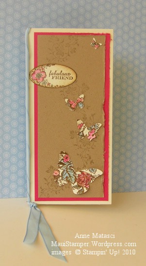
Vintage Style and more...

  • Vintage Vogue, Bella Toile, and Teeny Tiny Wishes stamp sets
  • Very Vanilla, Sahara Sand, Bashful Blue, Melon Mambo and Soft Suede card stock
  • Soft Suede, Bashful Blue and Melon Mambo Classic ink pads
  • Melon Mambo and Bashful Blue Classic Ink refills
  • Modern Label punch, Fresh Favorites buttons, and Linen Thread
  • Aquapainter,  and Stampin Sponges
  • Big Shot and Beautiful Wings embosslit

Those butterflies from yesterday’s post were lurking around on the craft table and I couldn’t resist them.  However, it appears I couldn’t resist anything else!  This was fun to play with, even it if does look a little…hmmm…shall we say “busy”?  That would be kind.

One note:  Be sure to insert a liner on the inside of a card that’s this deep in color.  A simple Very Vanilla panel would do here, although I often add a mat and stamp a little in the corner.  What the heck – if the front is gonna be all out, the inside needs a little zip too!

Re-interpreting the Mini…Summer Mini, that is!

If you’re a Stampin’ Up! demonstrator AND you’ve received your advance copy of the Summer Mini Catalog (May 1 to August 31) this card may seem vaguely familiar:

Vintage Butterflies with a Summer Mini inspiration

  • Vintage Vogue,  Bella Toile and Only Ovals stamp sets
  • Very Vanilla, Kraft and Melon Mambo card stock
  • Sahara Sand and Soft Suede Classic ink pad
  • Bashful Blue and Melon Mambo Classic ink refills
  • Big Shot and Beautiful Wings embosslit
  • Oval punch, Stampin’ Sponges Aquapainter and Bashful Blue taffeta ribbon

I looked at the images on the front of that mini catalog and fell in love with the colors and the vintage style.  The more I looked, the more I thought I could find a way to create that same feeling with stamps I already had.  I pulled out the color palette the cover artists used, rummaged around until I found a few vintage-looking stamp sets, and started to play.

I wanted to add the ribbon, but with the tall skinny card format it just seemed too wide even at 3/8″.  Eventually, the little light bulb went on in the air over my head and I figured out that I could twist the ribbon to make it fit my purpose.  The butterflies were created from the Beautiful Wings embosslit using paper that was stamped with the Bella Toile background stamp (an under-utilized stamp, I might add!).  I used the Aquapainter and Classic ink refills to selectively color bits of the image and I love the result.

By the way, that Beautiful Wings embosslit is so popular that Stampin’ Up! is STILL experiencing shipping delays.  If you want it,  my suggestion is to put in your order and get in line now!

Just because I could recreate this concept does NOT mean I won’t be buying this set.  You see, one of the many beautiful images it features is a hummingbird, my favorite bird to watch.  They are fast, tiny, jewel-colored, and crazily territorial little things and I love the zzzhhhmm noise they make when they go by.  Somehow, the little hummer has never made it to Hawaii, and I miss seeing it.

Have I got you thinking ahead about that Summer Mini??  Good.

Playing with color

We all have our favorites in the color world, and we have our favorite ways of combining those colors too.  The Stampin’ Up! color families make it easy to put colors together by organizing them into pleasing groups.  It’s soothing to work with those comfortable combinations – color evokes an emotional response in most of us, and seeing something in our favorite colors evokes happy thoughts.

It’s a challenge to stretch myself beyond my favorites but I keep working at it.  Sometimes I like the results, and sometimes they make me wince, but I’m learning to see color in new ways.  There’s  a basket full of scraps on my craft table (what a surprise!) and lately I’ve been pulling handfuls of scraps out to play with.  I arrange and re-arrange the scraps, bringing one color forward and another back to adjust the proportions of colors until I have something I want to work with.

Vintage Vogue Scripted Birthday

  • Vintage Vogue and Well Scripted Clear Mount stamp sets
  • Very Vanilla, Certainly Celery and So Saffron card stock
  • Certainly Celery and Rich Razzleberry Classic Ink pads
  • Rich Razzleberry polka dot grosgrain ribbon
  • Big Shot and Beautiful Wings embosslit

I came very close to making a big ol’ bow with that Rich Razzleberry ribbon, but this card was for a workshop and I wasn’t sure if a bow would through the new crafters too much of a curve ball.  I’ve seen a lot of really big bows lately and in all honesty, that’s not my style.  I would have probably ripped off the bow and changed it to a nice, flat square knot.  Playing with color is enough for one card – messing with bows will have to wait for another day.  Or maybe not at all.

Elegant and Easy Notes

A few weeks ago I came across a black and white card with a single color accent.  It was so appealing to me that it has stayed on my mind.  Sometimes an idea just won’t go away, and this one was very persistent.  Last night I had time to play with it, and it took me no time to come up with this:

  • Vintage Vogue Clear Mount Stamp set
  • Basic Black Classic ink pad and Stampin’ Write Journaler
  • Whisper White,  Melon Mambo, Bashful Blue and So Saffron card stock
  • Big Shot and Beautiful Wings Embosslit
  • Mini Glue dots

The colors I used with black and white were drawn – literally – from a jar of Beautiful Wings Butterflies I have in my craft room.  I never seem to use all the butterflies that embosslit makes, and I can’t bear to throw them away so they collect in a jar.

This card would be very easy to reproduce in quantity, especially if you changed the stamp to a wheel.  As it was, I made a dozen of these in about 20 minutes.  Each note card is made from a quarter sheet of card stock and is just the right size for a quick thank you or invitation.

Keeping your feet firmly planted

Whew.

The past week has been so full.  Early Saturday morning we took Carol to the airport, said our goodbyes (a few extra times for good luck) and put her on the plane for Perth.  Getting to that point was physically and emotionally exhausting, but once we were there, it felt much better than I’d anticipated.  Of course we shed tears, and continue to do so (like right now, typing this post).  Her dad and I know this is the right move for her, and after all the sorting, packing and problem solving of last week we are ready to let go.  She’s ready too – sorry to leave Maui, but happy to finally live in the same time zone as her boyfriend.

I haven’t accomplished much since Saturday.  I did engage in something of a cleaning frenzy yesterday.  My son grumbled that it was his sister’s fault that I suddenly needed all his stuff  Put Away Now, but he knows I’ll get over it.  My next task is to clear out the debris that remains in Carol’s room, clean it up, and return it to the purpose it fulfilled so well for 4 years of university:  My Stamp Room.  Ah yes.  Every cloud does have its silver lining.

In the meantime, I sat down at the disaster area that currently functions as a stamp space and made a card.  Boy, did that feel good.  So good, I think I’ll make another later on!

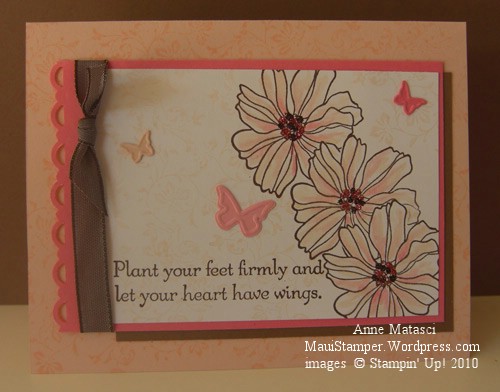
Plant your feet firmly and let your heart have wings

  • Fifth Avenue Floral, Vintage Vogue, and Hope Happens Stamp sets
  • Whisper White, Regal Rose, Blush Blossom and Close to Cocoa card stock
  • Chocolate Chip, Blush Blossom and Regal Rose Classic ink pads
  • Big Shot and Beautiful Wings Embosslit die
  • Chocolate Chip taffeta ribbon, Aquapainter and the Scallop Trim border punch
  • Stamp-a-ma-jig, Embossing Buddy, Fine Supernova Stampin’ Glitter and Tombo Adhesive

The color inspiration for this card came from colourQchallenge – this is ColourQ 19.  I used the same embellished leaf stamp from Vintage Vogue on the Blush Blossom card base and the Whisper White focal image, but I stamped it off on the Whisper White panel to make it more subtle.  To get the mixed colors with the glitter, I dotted Tombo adhesive in the center of the flower a few times and dusted with the Chocolate glitter, then repeated and dusted again with the Pink glitter.  Don’t forget to use your Embossing Buddy on your cardstock before glittering – it really makes a difference!

You’ve got a friend

Today’s post is an auto post, set earlier in the week to post today.  Today is the day my oldest daughter leaves for Australia.  Her dad and I are really happy for her, but it’s very  hard to say goodbye.  It’s going to be a tough day.

This week, my friends have been so supportive, calling and asking how I’m doing.  They don’t let me get too emotional, and they assure me they’ll be there for me next week.  I have wonderful, generous, loving friends.  I am so grateful for them.

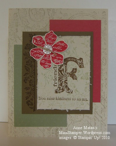
Kind and wonderful friends

  • Vintage Vogue stamp set and Very Vintage Jumbo Wheel
  • Naturals Ivory, Soft Suede, Ruby Red and Mellow Moss card stock
  • Soft Suede, Ruby Red, Mellow Moss and Sahara Sand Classic ink pads
  • Button Latte, Linen Thread and Paper Snips
  • Big Shot and the Backgrounds I Texturz plates

I prefer to sew my buttons on whenever possible.  They stick pretty well with glue dots, but I like the authenticity of sewing them on, and they don’t come off unless you really yank on them.

Thanks, friends.

The things we do for love

My dear friend and partner-in-crime has made an offer on a wonderful home almost 50 minutes away.  Here on Maui, that’s the kind of trip that requires an overnight bag.  She lives less than 5 minutes away right now, so this move is something of a shock to us both.  I went out to see the “estate” with her last week – it’s 2 acres – and we were both inspired with all sorts of fabulous decorating ideas.  There could never be enough money to satisfy our imaginations, but we did agree on a color concept.

  • Vintage Vogue Clear Mount Stamp set
  • Soft Suede, Bermuda Bay and Naturals Ivory Card stock
  • Soft Suede and  Bermuda Bay Classic ink pads; Pretty in Pink Stampin’ Write marker
  • Big Shot and Perfect Polka Dots textured impressions folder
  • Pretty in Pink 1/2″ Epoxy Sending Love brads
  • Crop-a-dile

I’m trying REALLY hard to be supportive, so I designed this card based on her colors.  She’ll have to select a carpet before she makes a final decision between a Soft Suede kind of accent or a Close to Cocoa kind of accent.  (You know you’re a serious Stampin’ Up! stamper when you use those alliterative color names to describe colors you see out in the Real World.)

There’s lots of wall space in this new house and Decor Elements will help fill it up without the cost of artwork, framing, and holes pounded in freshly painted walls.   I’ll have to pack my bags and leave a freezer full of meals so I can take my trusty Decor Elements Applicator out to Haiku.  Change is good.  Right??