Owl Love You Forever

Is it me, or has this whole stamping business gone to the birds?

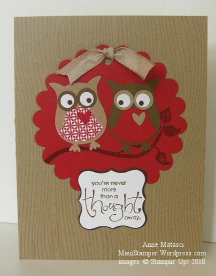
Owl Love You Forever

  • Woodgrain, Cheep Talk and Whimsical Words (retired 2010 SAB) stamp sets
  • Whisper White, Crumb Cake (Kraft), Riding Hood Red, Chocolate Chip and  Shimmer White card stock
  • A scrap of retired Riding Hood Red Designer Series Prints Pattern paper
  • Crumb Cake and Chocolate Chip Classic ink pads
  • Two-Step Owl XL punch; Curly Label punch
  • Big Shot;  Scallop Circles #2 die;  Movers & Shapers Curly Label XL Bigz die
  • Crop-a-dile and Kraft taffeta ribbon (retired)

This Two-Step Owl punch is hilarious and addictive.  I sat in my craft room the other night with a basket full of scraps and started punching out bits and pieces.  This is something you could play with for a very long time, mixing and matching colors and crossing and uncrossing the eyes.  Oh, yeah – you better believe I played with those eyes!  (Note to self:  tweezers are required for those itty bitty eye-bubs that go in the middle.)  And it wasn’t until I got everything all put together that I realized you could use the bottom of the heart for a little beak.

The mat on the Curly Label punch is the piece that is cut out when you use the Movers & Shapers XL die with the Curly Label insert.  It works the same way with all the other magnetic inserts – isn’t that tricky?  I made the hole for the taffeta ribbon with the Crop-a-dile since my favorite double rectangle punch is now retired.  I am TRYING to be a good demo and use only current supplies, but I’m tellin’ you, it’s not easy!  Take that kraft ribbon as an example.   Stampin’ Up! is an awesome company and I’m thrilled with the Color Renovation and all the cool new goodies we’ve seen added to the catalog, but what was wrong with leaving us a little bit of Kraft Taffeta ribbon?   They could even re-name it Crumb Cake Taffeta Ribbon – that would be OK.  There’s a little stash in the ribbon drawer, so you may see it from time to time.

You’ll be seeing more of these owls, too.

Lots of Bitty Birds

This was the set that made my eyes roll back in my head the first time I looked through the new 2010-2011 Stampin’ Up! Idea Book and Catalog.  I immediately thought of my friend Cheryl and her mud room.  She used to live 5 minutes from my house, but this past spring she moved 50 minutes away.  One of her projects in her new house was an entry room with a gorgeous saltillo tile floor and not much else.  She wanted to make it into the Bird Room, and she hostessed a pretty awesome workshop last spring so that she could earn the Level III Bird Cage Decor Elements Hostess gift.

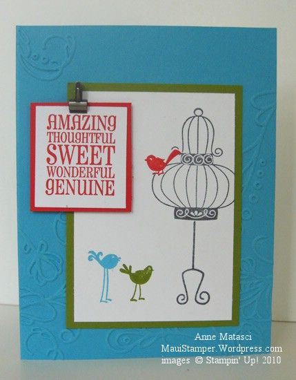
  • Aviary and On a Pedestal stamp sets
  • Tempting Turquoise, Old Olive, Poppy Parade, and Whisper White card stock
  • Tempting Turquoise, Old Olive, Poppy Parade and Basic Grey Classic ink pads
  • Big Shot and Elegant Lines Textured Impressions Embossing Folder
  • Stamp-a-ma-jig, Stampin’ Dimensionals and Mini Library clips

I made a mask using a Post-It note of the bird with the shortest legs and the top part of the bird cage.  I stamped the bird first, then masked it and stamped the cage part.  I left the bird mask in place and added the mask for the cage before I stamped the stand.  The “legs” on that stand are really long!  I didn’t need such a tall bird cage.

That new Elegant Lines Embossing folder is really gorgeous.  I hated to cover it up with the image, but I’m not quite ready to post a card with nothing but a little embossing on it.  That’s Clean and Simple style to the extreme!  I’ll be honest, though, I think it would make a gorgeous card.  Well, you might have to give it a little sparkle with some Shimmer Paint.

Our new Color Families are helping me to see color in completely new ways.  Tempting Turquoise hasn’t been much of a favorite for me, but when I see it grouped with the other colors in the Brights Collection it inspires me.  It’s refreshing to see something familiar with new eyes, and I like the energy I’m experiencing when I look through our new Color Collection.

A promise made, a promise kept

A couple of days ago I put together a couple of colors that surprised me.  The combination of Basic Gray and Crushed Curry jumped off my craft table and shouted “Look at me!”  I promised I would use them together:

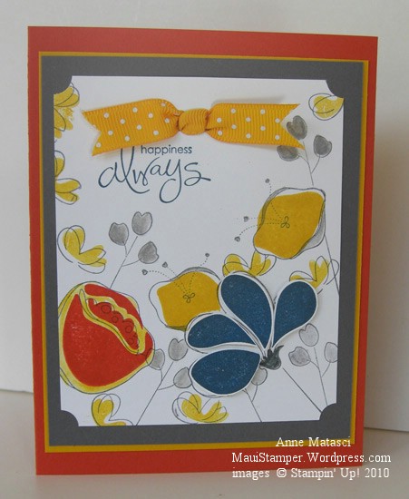
Awash With Flowers Basic Grey and Crushed Curry

  • Awash With Flowers and Whimsical Words (SAB) stamp sets
  • Whisper White, Basic Grey, Crushed Curry and Dusty Durango card stock
  • Basic Grey, Crushed Curry, Not Quite Navy and Dusty Durango Classic ink pads
  • Basic Grey Stampin’ Write marker and the Aquapainter
  • Ticket Corner Punch, Double Rectangle Punch, and Crushed Curry Polka Dot ribbon
  • Stampin’ Dimensionals and Stamp-a-ma-jig

These colors would have worked really well for a masculine card, but I am currently infatuated with Awash with Flowers.   The Not Quite Navy petals are stamped on Whisper White, cut out and attached with Dimensionals for a little pop, and I used the Aquapainter to add a little Crushed Curry around the Dusty Durango Two-Step flower.  I only used the SAMJ for that same Dusty Two-Step because I wanted it Just So – the rest of them are happy accidents.

I like these strong colors together, and before long I’ll have to find a nice Man Stamp Set and try again.  I just got a couple of new things from the Summer Mini and one of them will be perfect.   (Hijack:  Don’t you hate it when you have decided you don’t need something and then you see not one, not two, but an abundance of projects using that same rejected stamp set?  And where on earth did the word “hijack” originate?  Off to the old Funk and Wagnalls…)

Enjoy your Friday.

Following your heart

There’s a big transition looming on my horizon.  My oldest daughter is moving.  To Australia.  In about one week.

We’ve known about this for a long time.  She spent a semester abroad in Perth her junior year at Notre Dame, and met someone.   These two have maintained a long distance relationship for two years, seeing each other a couple of times a year and making do with Skype, instant messaging, email and the occasional card.  Our daughter graduated in May and came home to work for a few months.  Her goal was to earn enough money to convince the Australian government to grant her a visa, and a couple of months ago, she got the good word that she could enter the country.  Her Someone has just finished law school and needs to get work experience in his field before he can apply to work in the U.S.  They assure me that living in the U.S., specifically in Hawaii, is their long term goal.

As her departure grows closer, the distance seems to grow greater.  It’s not all that much farther than she was when she was at Notre Dame, but it’s another country.  Not so easy (or so cheap!) to pick up the cell phone and push her speed-dial.  And it’s West of us instead of East, which makes the time zone coordination a little more complicated.

Her dad and I support her decision, but it’s still hard.  When I saw this sentiment in the Sale-a-bration catalog, I knew it was meant for her.

Follow Your Heart Beautiful Wings

  • Whimsical Words SAB Clear Mount stamps and Baroque Motifs stamp set
  • Whisper White, Bordering Blue, So Saffron, and Pale Plum card stock
  • Certainly Celery and Bordering Blue Classic ink pads
  • Big Shot and Beautiful Wings Embosslit
  • Ticket corner punch, Gold brads, and Champagne Mist Shimmer Paint

The butterflies seem appropriate too, though butterflies aren’t really her favorites.  They represent change and taking flight and letting go.  I’m working on accepting all three.