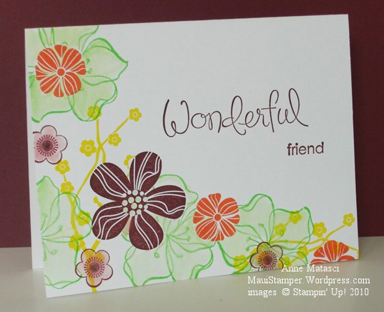
A Fond Farewell to Green Galore

Didn’t think I’d give Green Galore it’s own day, did you?  Not after yesterday’s bashing…that wasn’t very nice of me.  Poor Green Galore.  {snort}

Colour Q Challenge Green Galore Eastern Elegance

  • Wonderful Favorites, Eastern Blooms and Embrace Life Stamp sets
  • Whisper White card stock
  • Bravo Burgundy, Green Galore, YoYo Yellow and Tangerine Tango Classic ink pads
  • Aquapainter

I had to try that Colour Q challenge again…can’t really explain why.  That’s the mystery of playing challenges, I guess.  This time I chose to make the card a single layer to avoid the dilemma of balancing colors.  I did a fair amount of masking and used both solid and line art images to keep the sense of lightness that a white card provides.  As you can see, I couldn’t resist using the Aquapainter to blend some of the color.

There’s so much color and so many images that I’m not convinced this card is truly Clean and Simple, but with no layers OR embellishments I think it comes close.  The style is growing on me…one of these days I’m going to take it to another level.  Just not today.

A Fond Farewell to YoYo Yellow

Fond may be stretching it!  I think I am still working from my original package of YoYo Yellow, and my stamp pad looks brand new.  In my opinion, it’s time to go – but Arielle decided to push my buttons with this week’s Colour Q challenge.   I’ll admit that the dinnerware she used for her inspiration looks pretty cool, but honestly – Whisper White with Bravo Burgundy, Tangerine Tango, Yoyo Yellow and Green Galore???  Aaack!!

Colour Q Challenge 29 Splitcoaststampers Sketch Challenge 277

  • Sense of Time and Define Your Life Stamp sets; Texture Jumbo Wheel
  • Whisper White, Bravo Burgundy, Tangerine Tango and Yoyo Yellow card stock
  • Bravo Burgundy, Tangerine Tango, Yoyo Yellow and Green Galore Classic ink pads
  • Aquapainter;  Piercing tool, template and mat;  and Vintage Brads

To add a little more challenge, I used the Splitcoaststampers Sketch Challenge 277 for the layout of this card.  The white balance on this card seems off, but with this color combination I couldn’t bear to add any more solids!  I compromised by using the Aquapainter to blur the Bravo Burgundy ink in the background of the card base.  I’m not too crazy about Yoyo Yellow (can you tell??) but Green Galore positively gives me fits.

Ah, but enough complaining.  These colors are Bold Brights and bright they are.  There are lots of crafters that love them and will lament their retirement, and I understand that feeling.   The world would be a dreary place if we all loved the same colors.  Farewell, Triple Y and Double G.