
Oh, I do love black and white with a pop of color! My dear friend Robbie showed me this fun fold, and I thought it was perfect for our Host Pattern Party DSP and the Floral Squares. I confess I was also inspired by the black and white gingham ribbon in the current mini as well!
- Stamps: Many Messages
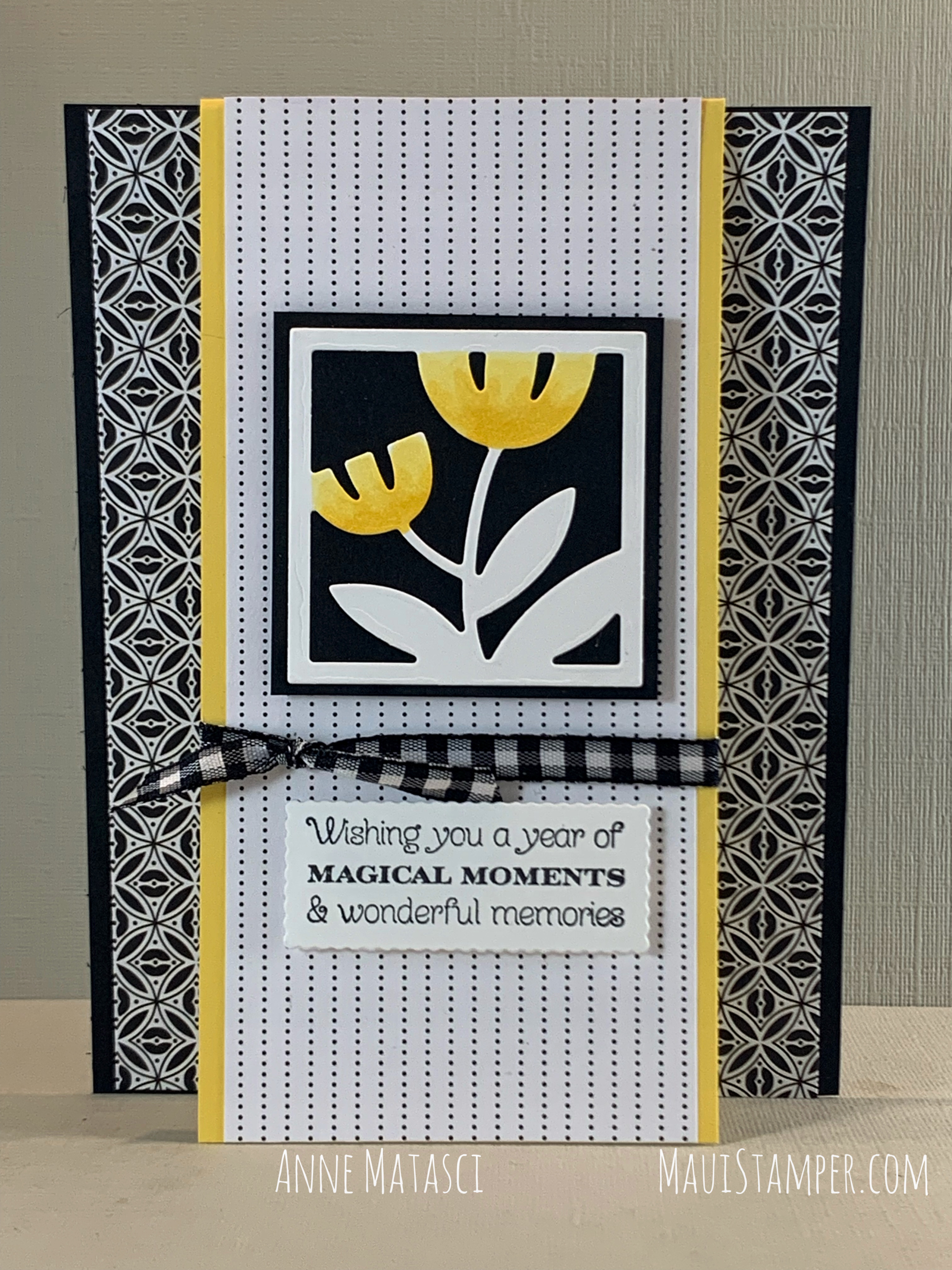
- Color Palette: Basic White, Basic Black, Daffodil Delight
- Accessories: Big Boss, Floral Squares dies, Messages dies, Stampin’ Blends, Pattern Party DSP (Host), Black & White Gingham ribbon, Stampin’ Dimensionals
The papers in Pattern Party have gorgeous color on one side (both tone-on-tone and rainbow brights). The reverse side for every sheet is a black and white pattern. I LOVE THEM ALL (oops, sorry, got carried away with myself.) This huge pack has 48 sheets, so there are 4 of each design – plenty for a big project, and enough so that you don’t fear cutting into one sheet.

The Fun Fold part of this card is that front panel. Mine is 2 3/4″ wide and 5 1/2″ tall, with a DSP layer that’s 2 1/2″ wide on the front and a Basic White panel of the same width inside. Pro tip: Make your inside panel a smidge (highly scientific mathematical term) shorter – maybe 5 7/’16” tall – so that it doesn’t crowd the top fold and make your card wonky (highly scientific paper management term.)
Please note this is a highly scientific blog.
The dies for the Floral Squares include small flower dies that coordinate with the floral images in each square, but I preferred coloring with my Stampin’ Blends. I find it so therapeutic to sit with a stack of die cuts and just color. I did a few with Watercolor pencils as well, but I love the vivid color and shading of the Stampin’ Blends.
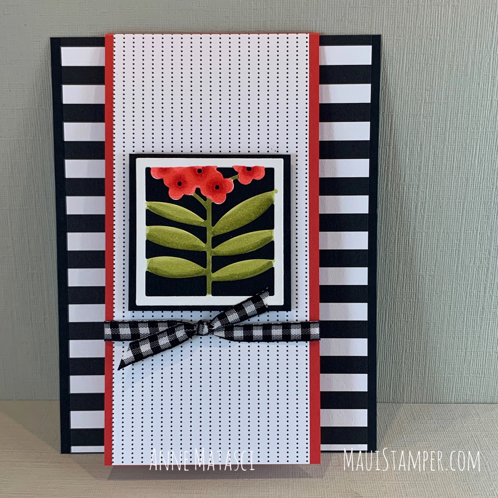
This is a different die, combined with Poppy Parade and Old Olive. I love the bold stripes on the back panel – they begged to pair up with Poppy Parade.
My Floral Square panels are adhered to a 2″ square of Basic Black card stock, letting the image and the color stand out. You can leave them without color and adhere them to a patterned paper background, but that wasn’t the look I wanted for this project.
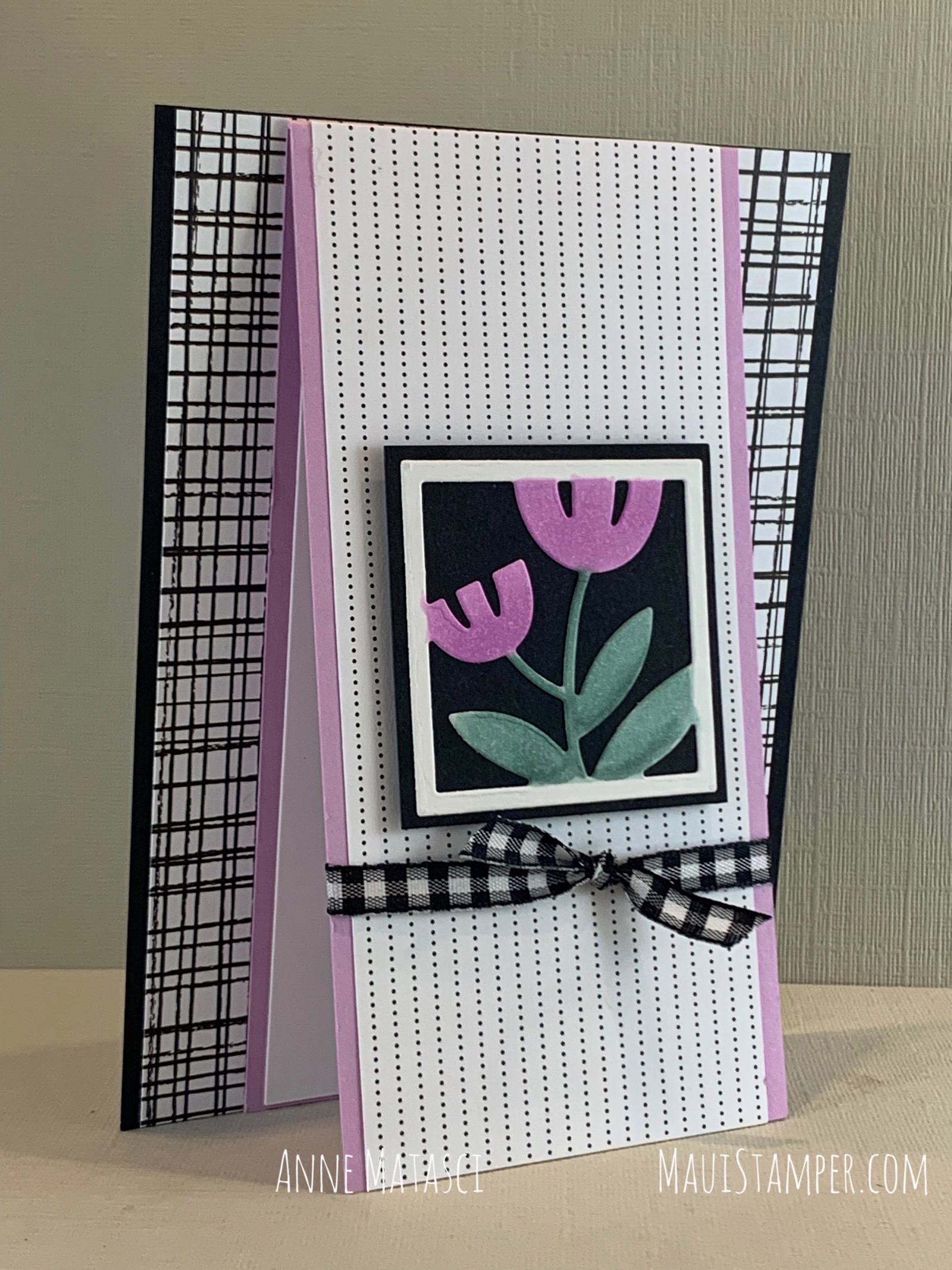
Fresh Freesia made a softer looking card, and that criss-cross railroad track pattern was a great match for the lighter look. I used the dotted lines on all the card fronts to let the bold backgrounds be, well, BOLD.

I oriented this last square on what seemed to be the side for me. A slightly different direction gave it a casual look, and the combination of Daffodil Delight and Calypso Coral added to that laid back style.
Which is your favorite? Leave me a comment and if you’re feeling frisky, tell me why!
There are stamps (All Squared Away) that coordinate with the Floral Squares dies, but I didn’t use them this time. I left off the sentiments as well so that I could add them when it was time to send each card. I like having options <wink>

Don’t miss everyone’s favorite promotion, SALE-a-bration! Earn free stamps, dies, or gorgeous paper at two sales levels! Available while supplies last through September 30th.
Ready to shop? Please visit the Online Store.
