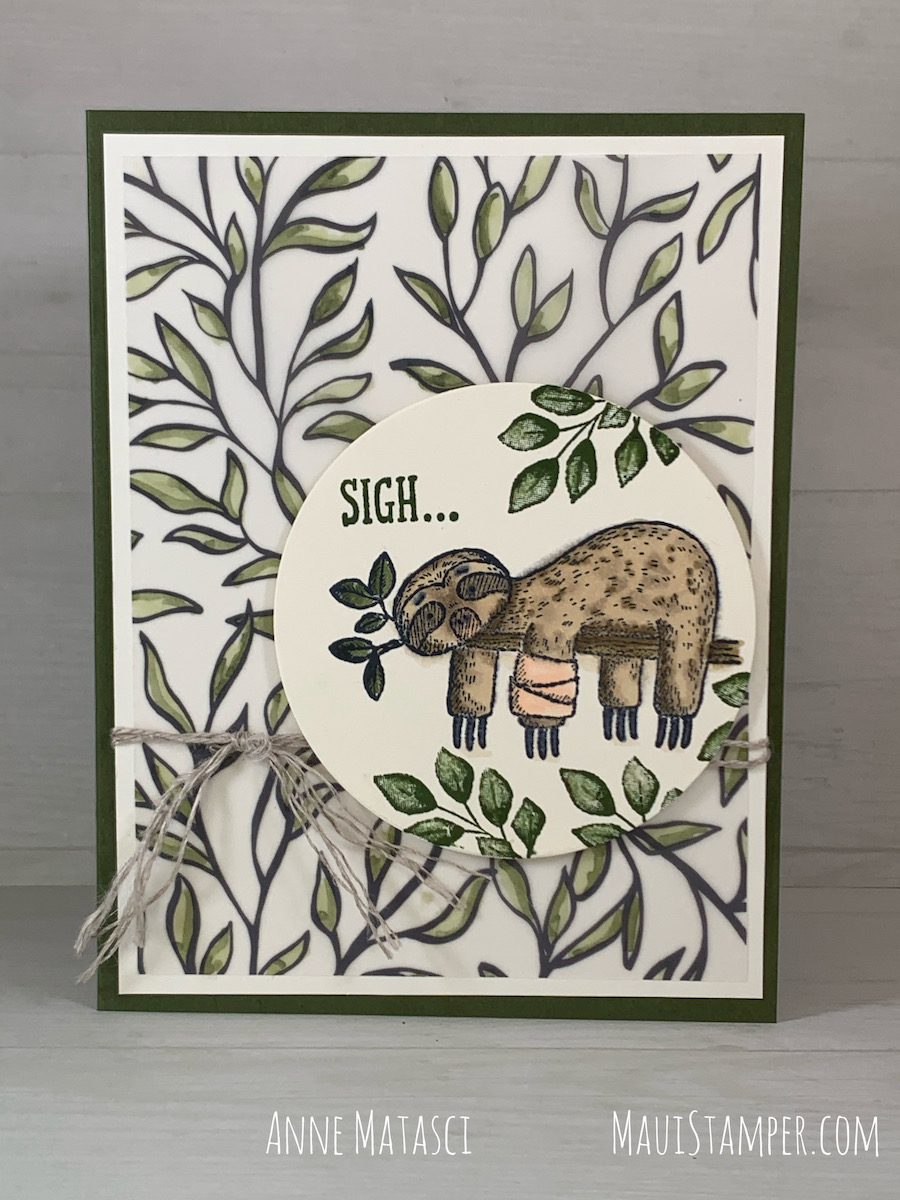
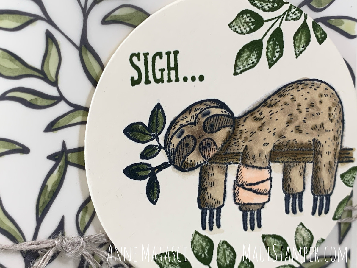
You know how it is. An unexpected injury, a surgery you’d hoped wouldn’t be necessary…and there you are, out of your routine and needing more help than you want to request. The Back on Your Feet stamps know how it feels, too, and are the perfect solution to send a little heartfelt commiseration to a friend in need.
Stamps: Back on Your Feet, Forever Fern
Color Palette: Very Vanilla, Mossy Meadow, Petal Pink, Crumb Cake, Soft Suede, Basic Grey
Accessories: Stampin’ Cut and Emboss (The Boss), Layering Circle dies, Linen Thread, Stampin’ Dimensionals, Stampin’ Blends, very very old and retired printed vellum
The little sprig at the end of the branch looked a lot like the leaves from Forever Fern, and from there it was a very short leap to the printed vellum that has been lurking in my stash since Moses inked a stamp. It may have been an SAB choice, or it may not have, I have no idea – but it was perfect for this project. I colored it with Stampin’ Blends and used it as background.
Would you look at that face? If that isn’t the face of compassion and sympathy, I can’t tell you what would be.
And make note of this: Sale-a-bration ends next Sunday, February 28th. Don’t miss the chance for free – FREE! – stamps and paper available with your qualifying purchase. Shop HERE.
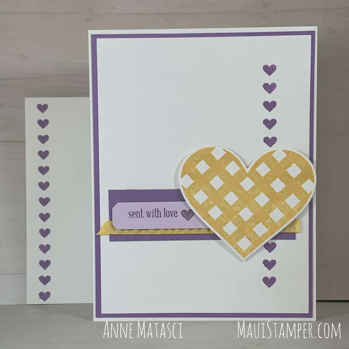
While it’s perfect for creating Valentines, the Lots of Heart stamps from the January-June mini catalog are truly year-round images. The companion Many Hearts dies provide great options as well, and I spent a delightful afternoon creating a variety of cards:
Stamps: Lots of Heart, Lovely You
Color Palette: Basic White, Coastal Cabana, Poppy Parade, Gold
Do you keep a little stash of die cut bits? I can’t seem to bear to throw them away, but eventually it drives me crazy to have all those pieces. My goal this month is to use ’em or lose ’em!
One I got started, was on a roll. This version most closely resembles Melissa Davies card, which I used for my inspiration. I wanted to play with some non-traditional Valentine colors, and Highland Heather and Daffodil Delight were a great way to switch it up.
The greeting is from Itty Bitty Greetings – one of my most indispensable stamp sets. You can see just a hint of the Subtle Embossing Folder on the Highland Heather panel, and the end of the Purple Posy strip was shaped with the Lovely Labels Pick a Punch. There’s a little Wink of Stella too [wink, wink}.
My intent was to create a rainbow with that row of horizontal hearts, but I stopped after 4 rows. I liked the way it looked, and I was eyeballing it and they were lurching downhill! That’s Rich Razzleberry, Magenta Madness, Calypso Coral and Mango Melody, and the Bumblebee Gingham ribbon across the front.
I confess that I squealed a little teeny squeal when I realized the gingham echoed the design in the heart! A few Champagne rhinestones finished this one off.
I went monochromatic in my favorite blues and greens for this version. That’s Misty Moonlight, Just Jade, Bermuda Bay and Coastal Cabana in the lineup, and I used the Scripty Embossing folder on the Misty Moonlight panel. I left off the glitz and glamor to give this one a more masculine feeling.
I really love that horizontal row of tiny hearts!
I think I spent more time cleaning the stamps than I did putting these cards together! It was a lovely way to spend an hour or so, and these will be in the mail in time for Valentines Day.
If your heart is just bursting for any of these supplies, you can shop right HERE. You don’t even need to put on your shoes to do it! And don’t forget to make your Sale-a-bration choice – there are just a couple of weeks left.
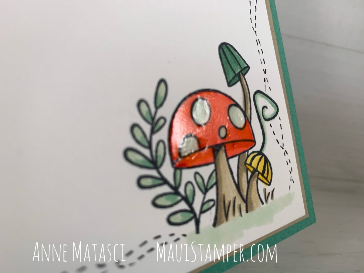
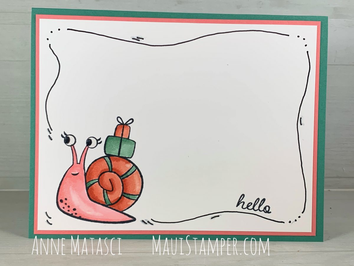
These are the toadstools of childhood, the ones occupied by talking caterpillars or lining forest paths. They’re charming but carry the scent of foreboding, as if to say look but don’t touch. The whimsical nature of this design signals the friendly nature of these fungi:
Stamps: Snailed it
Color Palette: Basic White, Basic Black, Poppy Parade, Just Jade, Mint Macaron, Crumb Cake, Daffodil Delight
Accessories: Stampin’ Blends, Fine Tip Glue Pen
This one is doodled again, but I chose to doodle two sides instead of all four. I think this would make a charming post card!
The Fine Tip Glue pen has again made an appearance, giving my toadstool a shiny surface and a reflective gleam.
Snails and Donkeys! Who would have thought I would be so crazy about such, hmmm, non-traditional creatures? I mean, neither one is especially snuggly. But here we are, with The Rose:
Color Palette: Basic White, Crumb Cake, Real Red, Soft Suede, Petal Pink
Accessories: Big Boss, Curvy dies, Linen Thread, Stampin’ Blends, Stampin’ Dimensionals, Paper Snips, Red gemstone, retired corrugated heart and DSP
How did I ever create a card without Stampin’ Blends? I’m sure I did it, but I find Blends indispensable now, not to mention therapeutic. It’s so relaxing to color, especially when I can blend and re-blend the tones and hues until I get exactly what I want. Seriously – what else can you do and get just what you want???
The messages and hand-lettering in the Ridiculously Awesome are, in fact, ridiculously awesome. I could never write p.s. i love you and have it look like that. And why should I? There’s a stamp for that.
There’s still time to make a Valentine. Quick. Shop HERE.
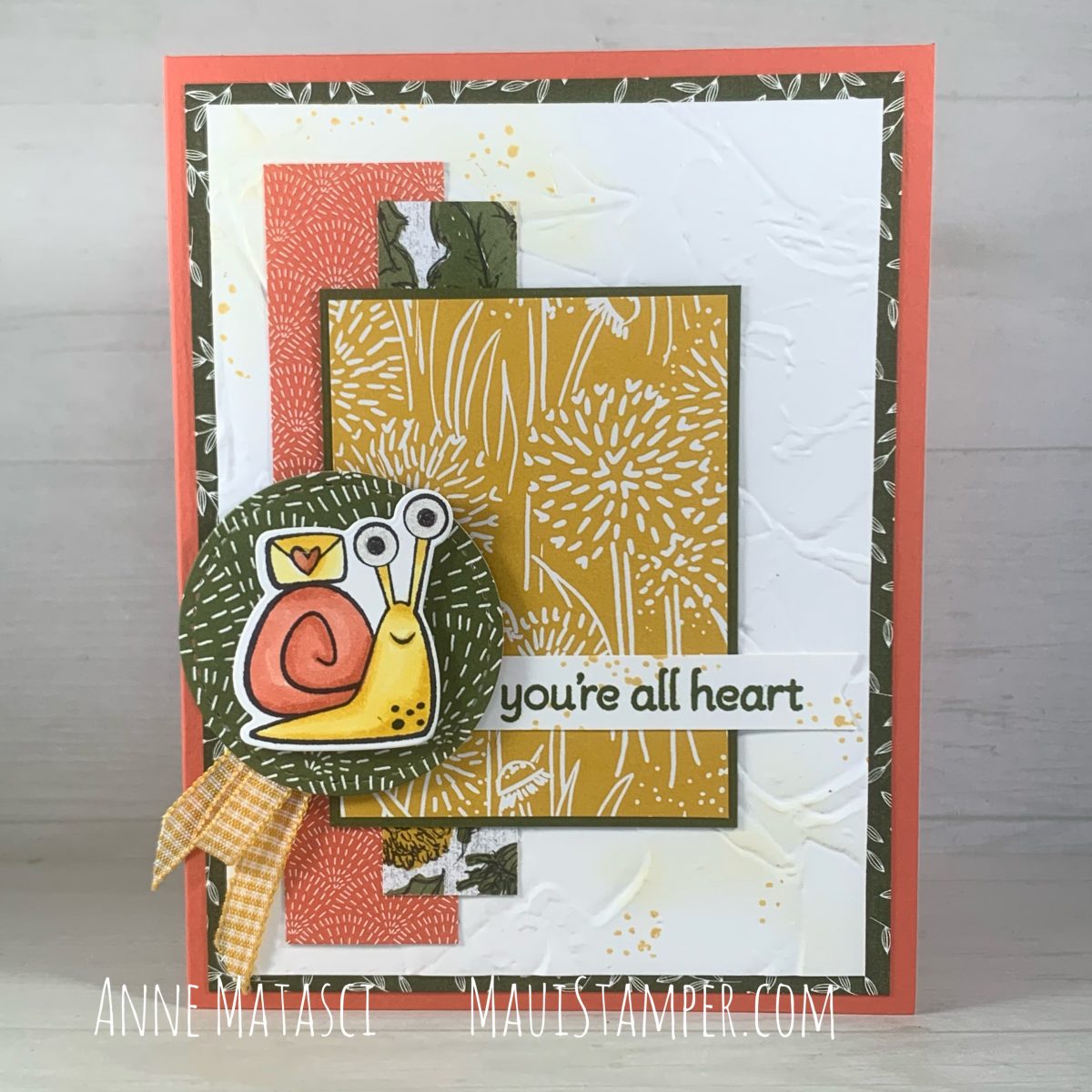
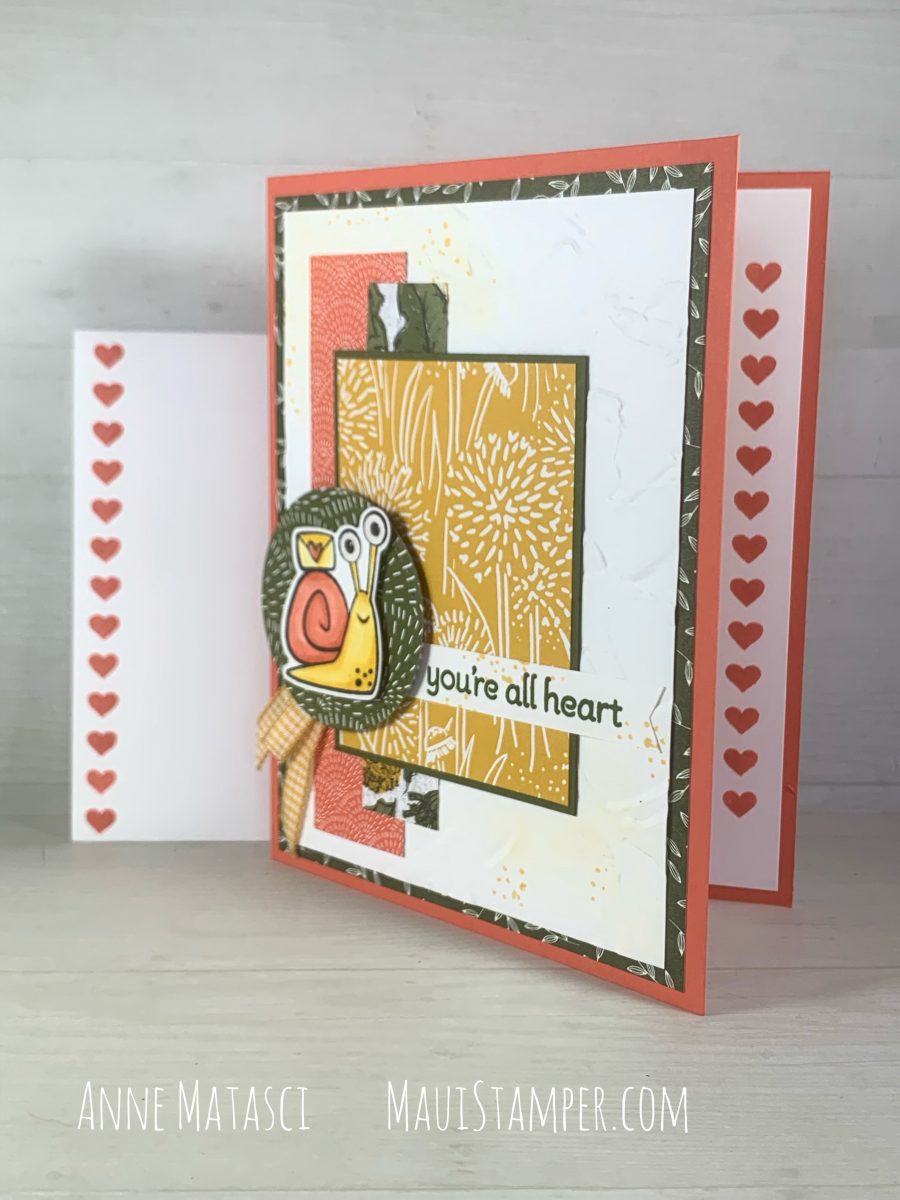
When I first saw the Mojo Monday 552 sketch, I envisioned it in Designer Series Paper. Once I started working, I switched to textured paper, but the idea of using DSP was still in my head. I finally got it out of my head and onto a card:
Stamps: Snailed It, Lots of Heart, The Right Angle
Accessories: Big Boss, Snail dies, Stitched Shapes dies, Painted Texture 3D Embossing Folder, Blending Brushes, Bumblebee Gingham Ribbon, Wink of Stella, Fine Tip Glue Pen, Stampin’ Dimensionals
The card sketch is the same – I followed the dimensions in the challenge – but this is the original layout. My first card made for this challenge was a mirror image of the design, since that snail was traveling East. This snail is Westward Ho!
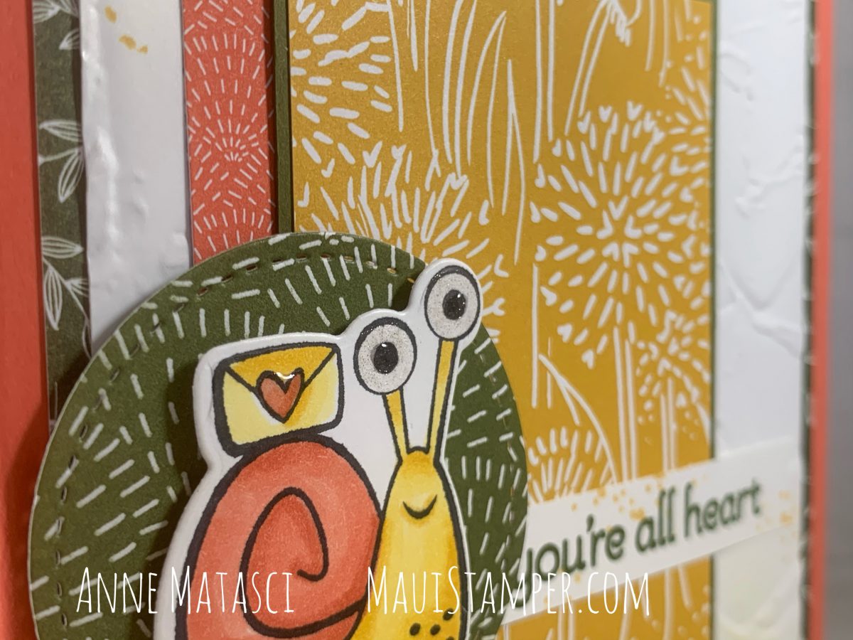
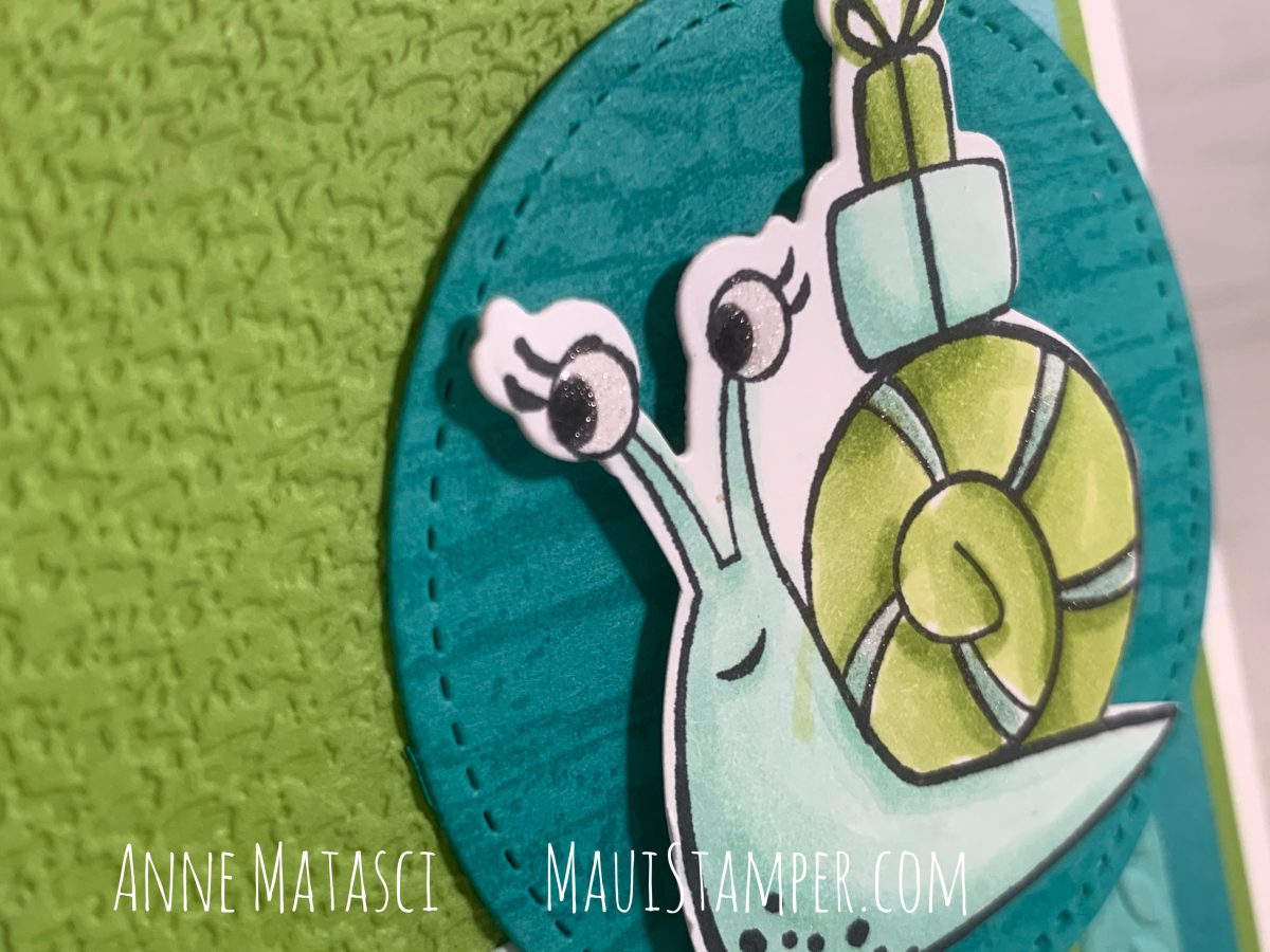
I’m totally sold on using Wink of Stella and the Fine Tip Glue pen to make eyes – any eyes – really sparkle. I don’t use the fine tip, I unscrew the entire top of the bottle and dip right in with a bamboo skewer. You need to let the excess drip back into the bottle, but I find it gives me better control when I want to “paint” with the glue.
The horizontal row of hearts in Lots of Heart is perfectly sized for adding to the envelope or the inside of the card – or both! Why be either/or when you can be both/and?? Ask yourself this more often.
Take that idea of Both/And with you to the Online Store and you too can be overrun with cute little paper snails! They’re highly preferable to the slimy kind, at least if you ask me. You may discuss amongst yourselves.
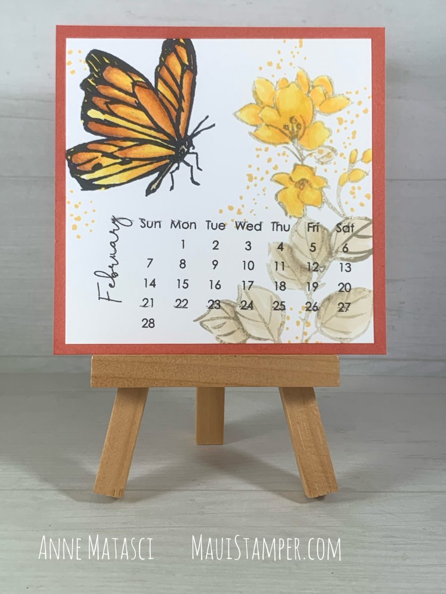
This month’s DIY calendar doesn’t feature hearts or Presidents or any other traditional February images. I was clearing the Snails off my desk (I’m afraid I got a little carried away) and underneath the heaps was the Touch of Ink stamp set with its beautiful line art. My first thought was that the images were too big, but when I looked again, I realized they were perfect:
Stamps: A Touch of Ink (Sale-a-bration 2021.1), Forever Fern
Color Palette: Memento Black, Sahara Sand, Crumb Cake, So Saffron, Daffodil Delight, Mango Melody, Pumpkin Pie, Cajun Craze
Accessories: Stampin Blends, Wink of Stella
This was so enjoyable! I dialed up an image of a Monarch Butterfly on Professor Google and started layering color. I’m not sure you would ever see this particular Monarch out in nature, but the way the colors worked together was very satisfying. I started light and worked my way through to the Light Cajun Craze – I didn’t use the dark version.
If you’d like to try your hand at this simple DIY calendar, I have the 2021 pdf available for $5. Just contact me with your email and your state of residence and I’ll get an invoice to you pronto.
Ready to shop? Visit the Online Store for Stampin’ Blends and Sale-a-bration rewards! These little calendars are so gratifying – easily an evening’s work, and a short evening at that! Thanks for stopping by today, and be sure to see what Cheryl and Crystal have done for February.
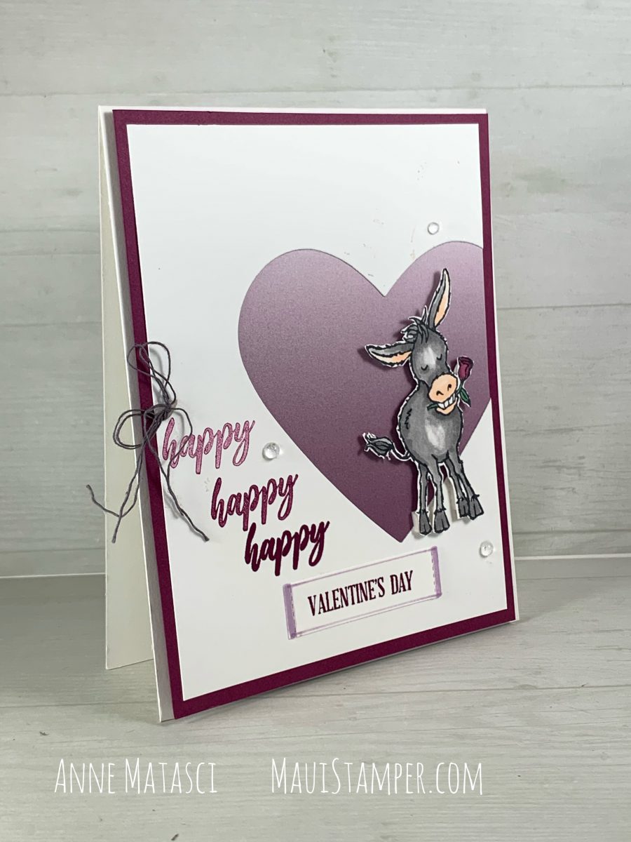
I hope there’s room for more Darling Donkeys in your heart. I’ve been working on Valentines, and what says I love you any better than a donkey with a rose in his teeth?
Accessories: Ombré Designer Series paper (Sale-a-bration 2021.1), Big Boss, Messages die, Heart dies (retired, but there are current ones), Stampin’ Blends, Paper Snips, Mini Stampin’ Dimensionals, Clear Epoxy Droplets, Well Suited Twine Combo pack
The technique is really simple. I used a heart shaped die placed overlapping the edge of the top panel on the card. The DSP just needs to be big enough to cover the opening, and once they’re secured I added a mat and adhered it to the card front. My donkey is fussy cut with snips and set up on mini-dimensionals, and I unraveled the grey twine to make it softer and less bulky.
I stamped off “happy” for a tonal effect to coordinate with that fabulous Ombré paper. Let’s not talk about how many orders I’ve placed to be sure I have enough of that paper now, can we agree on that?
If you really need that Ombré paper like I need that Ombré paper, pop over to the Online Store and make an order of at least $50 and then choose that paper as your free gift! Ombré?? and Free?? in the same sentence? Must be my lucky day.
I haven’t joined in for a challenge in ages. Mojo Monday popped up in my social media and I liked the layout and thought “why not?” Why not indeed? This was a great chance to celebrate the Snailed It snails!
Stamps: Snailed It, Itty Bitty Greetings, The Right Triangle, Stacked Stone
Color Palette: Basic White, Bermuda Bay, Granny Apple Green, Coastal Cabana, Pool Party
Accessories: Big Boss, Snailed dies, Stitched Shapes dies, Textured Textiles Embossing Folder, Greenery Embossing Folder, Ombré DSP (Sale-a-bration 2021.1), Blending Brushes, Stampin Blends, Wink of Stella, Fine Tip Glue Pen, Stampin’ Dimensionals, tiny clear dots from a long-past Paper Pumpkin
This card was all about texture. With all those layers, it required something too distinguish them! I used embossing folders, background stamps, sparkle and shine, dimensionals, and Designer Series Papers to create dimension on this project. The sentiment tab and the narrowest patterned paper were gently brushed with Blending Brushes and Pool Party ink to give them very soft color.
If you’ve missed The Right Triangle, check out all of the textures you can find in that stamp set!
I repeated my sparkly eyes trick, using Wink of Stella and the Fine Tip Glue pen to bring her eyes to life. I also did a little spattering with Stella on the Oh So Ombre DSP, and added some “dits” with a textural stamp from Right Triangle.
The sketch challenge really inspired me. I’d felt like I was in a rut, that everything I created had an element of sameness to me. Maybe it did, and maybe it didn’t, but working with a sketch helped me see paper and layers with fresh eyes, and I feel like my creative energy stores have been replenished.
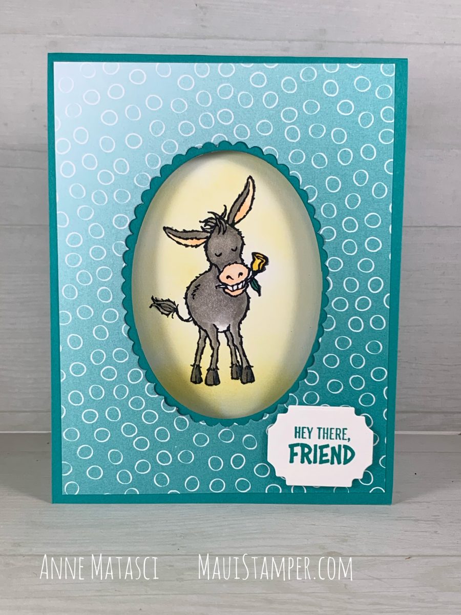
Stampin’ Up! has set me up! What is with snails and donkeys? I didn’t anticipate falling for such off-my-radar critters, but here I am. After I finished the January DIY calendar, I was on a Donkey Bender – but I didn’t really want to cut him out. I mean, I’ll fussy cut with the best of them, but enough is enough.
Stamps: Darling Donkeys
Color Palette: Whisper White, Bermuda Bay, Gray Granite, Daffodil Delight, Petal Pink
Accessories: Stampin Cut and Emboss (BIG BOSS), Layering Ovals dies, Ornate Frames dies, Stampin Blends, Blending Brushes, Stampin Dimensionals, Oh So Ombré Designer Series Paper (SAB 2021.1)
I’ve based this card on a design by Mary Knabe of Stampin’ Peace. I loved her concept and color palette, and reinterpreted them for this card. One of the delights of this design is that by using an opening on the front of the card, the image can be expanded when you open it:
The Blending Brushes are VERY easy to use, and in this case I didn’t even bother to mask off the donkey before I created that Daffodil Delight aura. (You know donkeys have auras, right??) I also added an additional message in the corner that isn’t visible from the front of the card. (I am quite proud of myself, as I normally struggle to use images AND sentiments from the same set, and on this one I have used 3 of the 4 sentiments!)
But wait, there’s more!
You could call this technique a card within a card. The card base is 11″ x 8 1/2″, scored at 5 1/2″. The white card inside is 10″ x 3 3/4″, scored at 5″, so it fits well within the first card. The bottom panel is completed adhered to the card base, much as a layer would be. That leaves a front for artwork to peep through the window, and an interior page for your message – or more artwork!
As you can see, I accidentally inked up this kick-up-your-heels donkey in Bermuda Bay instead of Memento Black, and had to be extra careful to avoid pulling in the Bermuda Bay ink when I colored with my Blends.
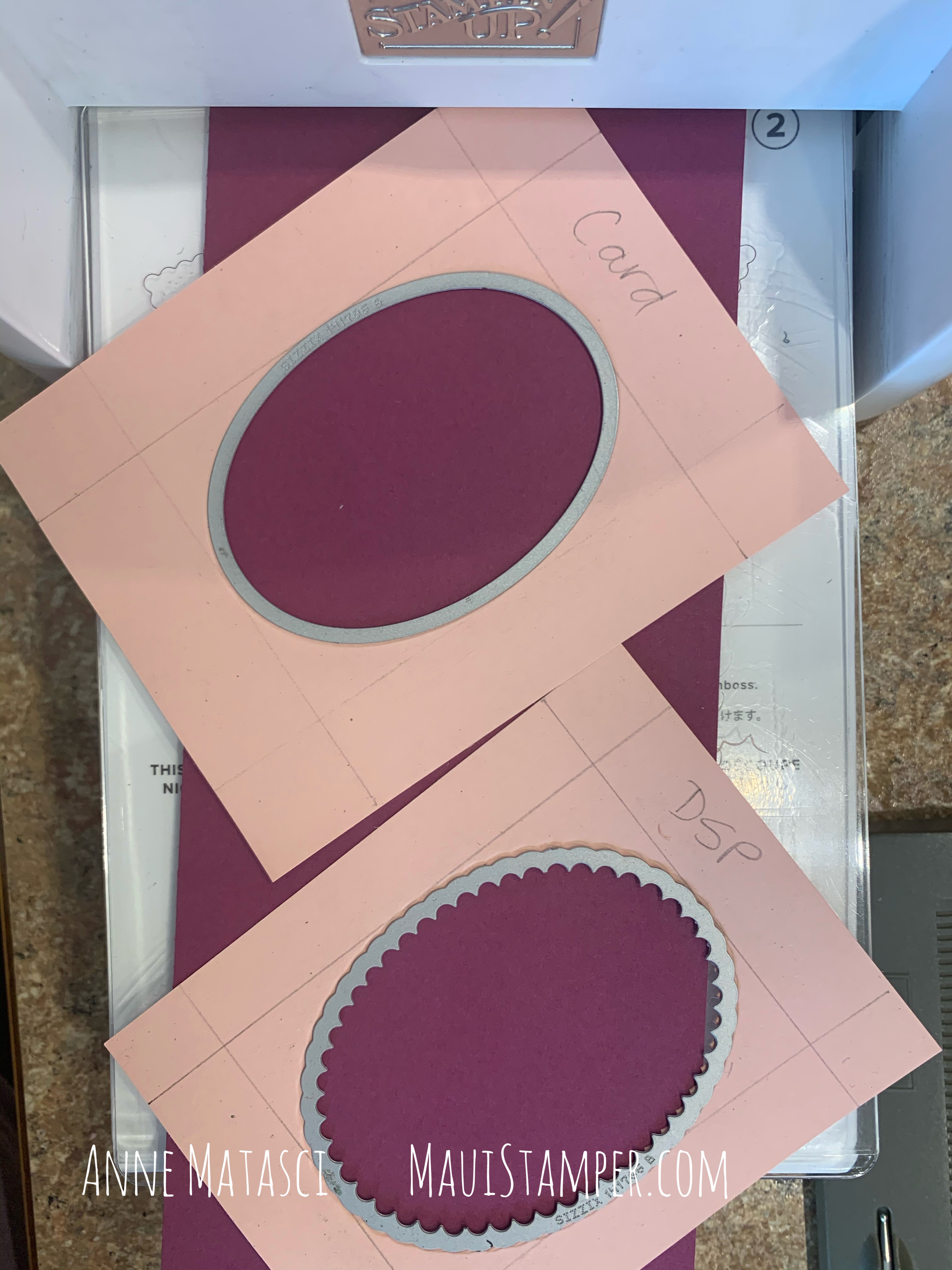
I prepared quite a few of these for a virtual stamping event, and I wanted to be sure I had the ovals in the center every time. To simplify that task, I made templates to use with the BIG BOSS:
There’s a little math involved, so bear with me. I began by measuring the height and width of each die, then subtracting that number from the height and width of the card panel. For example, the plain oval is 2 1/4″ wide, and the card front is 4 1/4″ wide, so the difference is 2 inches. I divided that number by 2 and measured in that amount from each edge, drawing a line at 1 inch. That gives me the left-to-right guideline for placing my die.
I went through the same process with the height of each die, creating two panels that had a rectangle in the center of each one. I centered the appropriate die in each panel (note that I wrote which panel was which on the template, I am famous for mixing up things like this!) When I ran the centered die through my BIG BOSS I created a template that I could use repeatedly without having to mark each piece of paper.
Just place the template squarely on top of your card or panel, drop the die into the pre-cut opening, and crank ‘er through! When you have a bunch of cutting to do, this is a real time saver.
Have some fun with your own Darling Donkeys, or any other spotlight image for that matter! Darling Donkeys and the Oh So Ombré are only available in January and February 2021 as Sale-a-bration selections. Don’t miss out! Shop HERE.
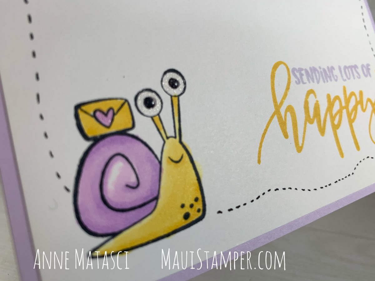
The only thing better than making cards is sending cards. I don’t know anyone who doesn’t like getting a card in the mail, and I like to make cards! What a perfect match. The stars of my latest batch are the charming, bug-eyed snails from Snail Mail.
Stamps: Snailed It, Pretty Perennials
Color Palette: Whisper White, Basic Black, Purple Posy, Daffodil Delight
Accessories: Stampin’ Blends, Wink of Stella, Fine Tip Glue Pen
This is a pretty simple card without a lot of embellishment. The snail has a little Stella in her eyes, and I used the Fine Tip Glue Pen to make those black eyeballs good and shiny. Other than that, there’s some coloring and some doodling. This is a relaxing and enjoyable project!
Can you see the sparkle and shine? The combination really works for these hilarious eyeballs. I considered adding some Stella to the doodles running around the edge of the card, but it seemed a little too, well, snaily.
I mean, the truth is that I’m a gardener and snails are my arch-enemy out there! The Stampin’ Up! concept artists did an amazing job making these little critters so appealing, because in person, I like them NOT SO MUCH. (Also, in Hawaii we have ginormous snails, and that’s even more gross.)
Once I got started I was on a roll. Coloring the snails is addicting. I’ve always loved to color, and Stampin’ Blends are such a satisfying coloring tool.
I chose Flirty Flamingo, Calypso Coral, and Just Jade for this version. I used the same treatment on those big eyes – don’t you love the lashes?? Seriously. It must be such fun to dream these things up. I would need someone else in the room to call over and affirm my creative genius! I think that’s one of the things I miss most as a result of the pandemic. It’s such fun to craft alongside someone else, and try as she might, the cat doesn’t cut it.
So what do you think? Are these colors too far from reality? (Of course they are, I would freak out if I saw snails in my garden that looked like this.) I’m trying to decide if I dare try one in shades of blue…
Snail Mail is available as a bundle with snaily dies, or as a suite that includes the bundle, Designer Series Paper, and two different embellishments. If you’re ready for some paper snails that won’t snack on your herb garden, shop HERE.