Flocks of little green birds

Isn’t it odd how stamps you didn’t think you needed or wanted become your favorites?  I don’t understand but I’m willing to embrace the paradox.

Betsy's Blooms in Gumball Green

  • Betsy’s Blooms and Itty Bitty Banners stamp sets
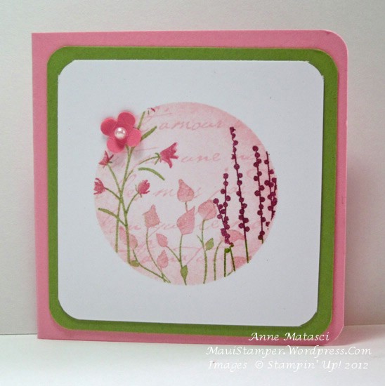
  • Gumball Green, Primrose Petals and Whisper White card stock
  • Floral District Designer Series paper
  • Gumball Green, Primrose Petals and Daffodil Delight FFIP (Firm Foam Ink Pads)
  • Basic Black Stampin’ Write markers
  • Big Shot; Labels Collection and Bitty Banners Framelits
  • Daffodil Delight Seam Binding
  • Rhinestone Jewels

This is a square card.  I can count on the fingers of one hand the number of square cards I’ve made, but I love the design possibilities.  I also love the way these birds fly across the front of the card – they remind me of all the little birds I watch in the morning zooming around outside my kitchen window.

I liked this concept of a flock of birds so well I wanted to stamp it again in A2 format (that’s 4 1/4 x 5 1/2).  At the time, I didn’t have the FFIP in all of our luscious Stampin’ Up! colors so I used my old ink pads:

Betsy's Blooms in Baja Breeze


That’s Baja Breeze and Lucky Limeade; can you see why I’m in love with the FFIP?  In all fairness, some of my old-style ink pads are more than 5 years old – but Lucky Limeade is only a year old!! I’m thrilled with the results I’m getting with these new ink pads.

I have something kind of exciting to share, but it’s also a little bit scary.  I’m within a reach – well, a real stretch – of earning the Stampin’ Up! Hilton Head incentive trip.   If you had told me a year ago that I would be in this place I would have laughed and offered to pour you another glass of your favorite refreshing beverage, but it’s true!  I have some hard work to do but I’m excited by the challenge.

If you’re thinking about ordering Stampin’ Up! product and don’t have your own demonstrator, I would LOVE to take your order.  If you’ve bought Stampin’ Up! product from me in the past and are thinking you might like to purchase more, I would LOVE it if you placed your order before June 30th!!  Every person who orders between now and June 30 at my Online Store will receive a special hand-stamped thank you and two yards of new ribbon from the 2012-2013 catalog.  Thank you in advance for helping me to achieve this dream!


Choosing stamps

Betsy's Blooms spotlightI’m trying to be deliberate in my choice of new stamps.  Every time Stampin’ Up! releases a new catalog I have the overwhelming urge to press the “I WANT IT ALL” button on the demonstrator website.  (OK, full disclosure:  there is no such button.  However, demonstrators have been lobbying for this button for years.)

I know that there are people – Stampin’ Up! customers as well as demonstrators – who not only want it all, but buy it all.  Perhaps some of them have a large enough business or crafting environment to actually need it all.  In all honesty, I have to acknowledge that I neither have time nor space to have it all.  That brings me back to the dilemma of making choices.

It’s easy to choose the things that I love.  It’s tricky to be sure I have a well-rounded selection.  It’s even harder still to choose things that will appeal to a broad cross-section of crafters.  Over the years, I’ve gotten better at that last set of choices, but it takes careful evaluation.  And just like each of you, I will make a decision and then see something that another stamper has done with a set that I had dismissed as absolutely un-workable and all of my “careful evaluation” goes out the window.  Ah well, there’s room for an impulse buy or two in my budget!

Happily, this card was made with a stamp set that was a gift to me from Stampin’ Up!:

  • Betsy’s Blooms and Itty Bitty Banners stamp sets
  • Very Vanilla, Cherry Cobbler and Soft Suede card stock
  • Comfort Cafe Designer Series Paper
  • Soft Suede and Cherry Cobbler Classic ink pads
  • Summer Starfruit Firm Foam Ink Pads (FFIP)
  • Big Shot and Herringbone Textured Impressions Embossing Folder
  • 3 and 3 1/2 inch circle Originals Dies
  • Bitty Banners Framelits
  • 1/2 inch Cherry Cobbler Scallop Dots ribbon
  • Stampin’ Sponge
  • Stampin’ Dimensionals
  • Jewels Rhinestones

I can’t wait to get the rest of my FFIP!!  They’re arriving slowly but surely and my, oh, my are they fabulous!  Betsy’s little bird will surely SING when she gets inked up with FFIP in Cherry Cobbler.

I have to let you in on a little secret.  This is one of those things I wouldn’t have noticed, but I think it’s pretty interesting.  I looked at that Comfort Cafe DSP and my mind said “Cherry Cobbler” – and that’s what I pulled out to use.  However, yesterday afternoon I was dreaming through the Annual Catalog and I came across the color palette for Comfort Cafe:  Cajun Craze!!!  Honestly, I couldn’t tell the difference until I put the papers together.  I’ll have to make this card again and make that adjustment.  I’m waiting for that Cajun FFIP though…


Can you dig it?

This stamp set isn’t brand new to the Brand New 2012-2013 Annual Catalog, but it’s one that recalls sweet memories of my son.  From the time he could see beyond his own hands he has been fascinated with vehicles, and as a toddler he could identify  construction equipment better than most adults I knew.

I Dig You Midnight Muse

  • I Dig You stamp set
  • Summer Smooches Designer Series Paper
  • Whisper White, Gumball Green and Midnight Muse card stock
  • Gumball Green and Midnight Muse Firm Foam Ink Pads (woo hoo!!)
  • Daffodil Delight 1/4 inch stitched grosgrain ribbon
  • Color Spritzer tool
  • Midnight Muse Stampin’ Write marker
  • Big Shot, 3 inch and 3 1/2 inch Bigz circle dies
  • 1/8 inch hand held circle punch (not Stampin’ Up!)

I like all of the circles in this layout, and I especially like those crazy Firm Foam Ink Pads (to be known as the FFIP).   Love the coverage on that excavator!

I need to focus on “guy” cards – I never have enough – and this stamp set is a perfect choice.


Happily Mauied

Mr Maui Stamper and I celebrated our 31st wedding anniversary last week.  It’s hard for me to believe that many years have gone by!  Math has never been a strong point for me, and clearly there’s some sort of mistake here.  I’m barely 30 years old myself – right???

Making a card with Designer Series Paper called Mocha Morning was clearly the perfect choice for a couple of coffee lovers:

Mocha Morning Anniversary

The geometric layout and neutral color scheme give this card it’s strong masculine theme despite a curly-cue or two.  And since this was a hand-delivered card, I got out a big Neutrals Designer Button for the front.  I know you can attach buttons with glue dots, but I much prefer stitching them on.  It doesn’t take all that long to make a couple of holes with the Pokey Doodle (Thank you, Heather Summers!) and thread a little Linen Thread through the holes and make a knot.  I like knowing that button isn’t going to fall off.

There was a little part of his present that I didn’t have on hand to put in his package (yes, there might be one or two disadvantages to living 2500 miles out in the Pacific Ocean!!)  I made a coordinating 3×3 notecard to tell him about it:

Morning Mocha 3x3

Who takes these photos anyway?  Operator error.  I would never take such a crooked photo.

By the way, if you’re one of those Plan Ahead sorts of people, scoot yourself on over to the Clearance Rack.  Lots of beautiful accessories and gorgeous holiday products at GREAT prices!  Clearance Rack merchandise is only available through the Online Store because supplies are so limited, so if you love it, buy it!  You won’t regret it 🙂

An Egg-ceptional Gift Card


A few times a year, I am asked to prepare a gift certificate for a dear friend by her dear mother-in-law. This time, I thought it was time to do something a little different:

Easter Gift Certificate

There’s an Easter Egg card inside a tiny Scallop Envelope basket inside that small cello bag.  It’s not particularly elaborate, but it was fun to do and something a little out of the ordinary.  Here’s what’s inside:

Easter GC first page

I used the oval from the Big Shot Scalloped oval to make four egg shapes, and put them together with a brad left over from one of the SAB bundles.  This one has a butterfly with vellum wings for the front cover.

Easter GC page two

The second egg has a small tag with the details on the gift.  I told you she was a dear mother-in-law!!


Easter GC page three

I cut an oval out of DSP and hand-trimmed the middle out – I used that on page two above.  The top and bottom pieces went on the third page with a space in the middle for the names of the generous givers.

Easter GC last page

The last page is simply decorated for Easter.

It was fun to do something unexpected – that’s the beauty of hand-made crafts, right?


Choosing colors

The way I look at it, sympathy cards pose a unique challenge.  I want them to convey hope, warmth and comfort, while still acknowledging the fact that a family is grieving.  The challenge for me is in choosing the colors; I want them to lift the spirit but still be soothing.

Just Believe With Sympathy

  • Just Believe and Teeny Tiny Wishes stamp sets
  • Concord Crush Classic ink pad
  • Whisper White, Pear Pizazz, So Saffron and Concord Crush card stock
  • Stampin’ Sponge
  • Pearl Jewels
  • Modern Label Punch
  • Crop-a-dile
  • Pear Pizazz Seam Binding

I made 10 of these for a ministry group at my church.  When they need cards, I’ll come up with 2 or 3 designs and make 10 of each – it’s much more enjoyable for me than 20 or 30 of the same design.  10 is my magic number when it comes to production – more than that and I start wondering why on earth I said I would do this!

I’m very fond of the Just Believe stamp set, but I have a feeling it may be on the retired list this year.  It was a convention set in 2010.   Stampin’ Up! gives us heaps of free stamps at Convention, and they’re always brand new.  I’ve heard that the Powers That Be are planning on cleaning house a little bit and giving us a fresh start with a lot of new product, so I’m trying to put myself in the right frame of mind to say good-bye to some old favorites.  Cross your fingers that Teeny Tiny Wishes makes the cut and remains to stamp another year – that set is my absolute sentiment anchor!!!

The most difficult thing to let go of will be Pear Pizazz.  It’s a 2010-2012 In Color, and since it’s 2012 now that means Pear Pizazz (plus Blush Blossom, Poppy Parade, Peach Parfait and Concord Crush) will be retiring to make room for a new group of colors.  Embrace change!!

So what do you think?  Are these colors hopeful or hopelessly bright?

Musings on square cards

Aside

Recently I had a little time and I browsed through a papercrafting forum I used to visit often, but haven’t visited in a long time.  Ah, so much inspiration!  There are so many talented artists, and it’s at once inspiring and discouraging to see their work.  It’s inspiring, because it gives me ideas; it’s discouraging, because there isn’t enough time in the day to play with all of those ideas.

Today’s card is simple and has a hint of Japanese Spring in the colors:

Image

  • Pocket Silhouette and French Script stamp sets
  • Whisper White, Lucky Limeade and Regal Rose card stock
  • Lucky Limeade, Regal Rose, Rose Red, and Rich Razzleberry Stampin’ Write markers
  • Pink Pirouette Classic ink pad
  • Bitty Punch Pack
  • 1 3/4 inch circle punch
  • Corner rounder punch
  • Pearl Jewels
  • Stampin’ Sponge

I punched a circle from a sticky note and used it as a stamping template.  I also used a Stampin’ Sponge and whirled some Pink Pirouette ink around the circle to give it definition and softness (there’s a contradiction for you – but you know what I mean!)

I need to play around with this a little more to find a way to create this card as a larger card – it’s a 3 x 3 notecard here.   The USPS doesn’t seem to like square cards, but they’re a completely different type of canvas – and they make a hand-crafted envelope almost mandatory!   That’s a job for the new Diagonal Scoring Plate 🙂

I hope there are trees in Heaven

I love using the image of the tree from Thoughts and Prayers for a sympathy card.  It’s a full, graceful tree that hints of a life well-lived, of abundance and generosity and beauty.

It also seems like a little piece of heaven.  Haven’t been there myself, but it seems to me that heaven must have a feeling like  being in the woods…and like walking on a white sandy beach…and like climbing tall, majestic mountains…all of those beautiful, powerful places that bring the presence of God alive in a very tangible way.  I hope this card conveys that feeling of  God’s presence to my friend.

Thoughts and Prayers Limeade

  • Thoughts and Prayers and Teeny Tiny Wishes stamp sets
  • Very Vanilla, Soft Suede, Lucky Limeade and River Rock card stock
  • Lucky Limeade Prints Pack Designer Series Paper
  • Lucky Limeade and Soft Suede Stampin’ Write markers
  • Lucky Limeade Classic ink pad
  • Piercing tool and Mat
  • 1/8 inch Lucky Limeade Organdy Ribbon (SAB)

I made holes on either side of the tree trunk with the piercing tool and used a big upholstery needle to thread the Organdy Ribbon through.  It’s soft and easy to work with, and I much prefer tying my ribbons onto cards instead of attaching them with Glue Dots.  Don’t get me wrong – I love those Glue Dots – but I don’t want to take the chance that the ribbon will fall off.  I’m picky that way.


Looking ahead to Easter

I took this layout straight off Pinterest:

Mixed Bunch Blushing Bride for Easter

  • Mixed Bunch and Delightful Dozen stamp sets
  • Whisper White and Blushing Bride card stock
  • Whisper White and Blushing Bride Classic ink pads
  • Pear Pizazz seam binding
  • Blossom punch
  • 3/4 circle punch
  • Big Shot
  • Vintage Wallpaper Textured Impressions Embossing Folder
  • Stampin’ Dimensionals

I’ve been doing a lot of these raised panels lately – I’m SEEING a lot of them too!  I like the look, and I like the possibilities…you can selectively emboss, easily wrap ribbon around the panel, raise the panel with Stampin’ Dimensionals…I’ll bet you can think of other techniques!  Leave me a comment if you have an idea – I’m always looking for new tricks 🙂

Blushing Bride is such a grown-up pink, and I’m going to miss it when it bows out of our Stampin’ Up! color palette with the end of the catalog on May 31.  I do my best to embrace change, but to be very honest, I have a hard time letting go of things.  Take a peek in any closet in my house (well, except Mr. Maui Stamper’s closet) and I’m sure you’ll agree – I’m not a minimalist!  I’m trying to be more clutter-free, but it’s a lifestyle that is going to take some time to embrace.  My Gramsie on my mom’s side kept EVERYTHING – old vegetable drawers from the refrigerator that stopped working (after all, they were useful for storing things), back issues of the Wall Street Journal (we found issues from the 60’s when we moved her from her big 3 bedroom home in the early 90’s) – so I’m just carrying on a family tradition.

Well, except I don’t subscribe to the Wall Street Journal.

Hello there, Everyday Enchantment!

Such soothing colors for this card!

Elementary Elegance Pool Party

The images from the Everyday Enchantment Designer Series paper coordinate so perfectly with all of the Sale-a-bration stamp sets – this one is Elementary Elegance.  I punched out the sentiment on with the Curly Label and brushed the edges with a dauber dunked in Lucky Limeade ink and one-two-three I was done!

This card is kinda begging for more bling, and I am going to revisit it after Spring Break.  I don’t think EVERY card has to be ready to pop in the mail.  I have a little hint for you too – when you make a panel with two different pieces of DSP, cut a narrow strip of cardstock – I used Very Vanilla but anything would work – just 1/4 inch shorter than the width you are joining, and maybe 3/4 inch wide.  Cover it with SNAIL and you have a platform to join and stabilize your DSP  – you can butt the edges together and there is no waste!

Just 3 more weeks of Sale-a-bration!