It’s gettin’ kinda Birdy around here…

Don’t know what it is about me and birds recently…I must be picking up Bird-Vibes from the cat.  He sits at the sliding glass door in the kitchen and watches the birds.  When they get too close to the door he barks.  Seriously.  He has this goofy sound he makes that sounds like a bark.  We refer to it as his “Birdy Bark”, and that should tell you all you need to know about how wacky this household is.  I think we’d better move onto the card before I  reveal any more deep, dark family secrets:

Elements of Style Ruby Throated Hummingbird

  • Elements of Style and Vintage Labels (SAB) stamp sets
  • Very Vanilla, Bermuda Bay, Rich Razzleberry and Garden Green card stock
  • Thoroughly Modern Designer Series Paper
  • Sahara Sand and Garden Green Classic ink pads
  • Bermuda Bay, Tempting Turquoise, Garden Green and Rich Razzleberry Stampin’ Write markers
  • Rich Razzleberry and Garden Green Classic ink refills; Aquapainter
  • Big Shot and Lattice Impressions folder
  • Scallop Trim border punch; Piercing tool, template and mat
  • Very Vanilla Taffeta ribbon

I really threw the tool box at this card!  I used the Sahara Sand ink pad to lay down the beautiful roses on the Vanilla card stock and then watercolored them with the Aquapainter and the ink refills.  I used markers directly on the stamp to color the hummingbird  and although the colors aren’t perfectly true to life I’m happy with the result.  Just in case you’re wondering, that’s not a new taffeta ribbon – I folded it in half – OK, the truth is I brought it downstairs and IRONED it in half.  It wouldn’t stay when I folded it.  The things I do to get a card just right!

Uh-oh.  Somebody’s barking again.  One of these days those sassy Mynah birds are gonna let him have it.

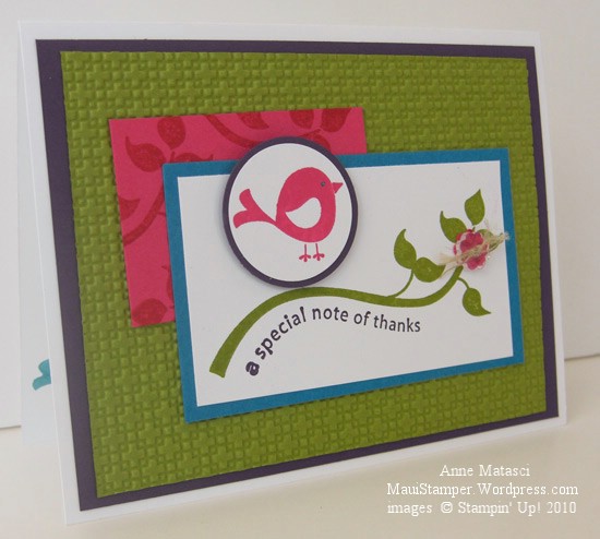
Cheery and Cheep

It’s been a while since I’ve done a color challenge – I’ve made notes about at least half a dozen of them but that’s as far as they’ve gotten – until today.  So many challenges, so little time!  Fortunately, the Color Dare 67 challenge was a winner and the card practically made itself:

Cheep Talk Color Dare 67

  • Cheep Talk stamp set
  • Whisper White, Melon Mambo, Bermuda Bay, Old Olive and Elegant Eggplant card stock
  • Melon Mambo, Old Olive and Elegant Eggplant Classic ink pads
  • Bermuda Bay Stampin’ Write marker
  • Stampin’ Dimensionals
  • 1 1/4″ and 1 3/8″ Circle Punches
  • Itty Bitty Shapes punch pack, Bitty Buttons and linen thread
  • Big Shot and Lattice Impressions folder

I’m very proud of myself; ANOTHER one-stamp-set-card!  Stampin’ Up! really does a great job of assembling complementary images in a stamp set – I’ve done so many very different cards using just Cheep Talk.  It’s a great value, in my humble opinion.  And as long as I’m running a commercial, have I mentioned how much I love this Lattice Impressions folder?  The two sides, front and back, have a very different look, and the texture is so deep and condensed that it really creates something entirely different from the original sheet of paper.

I’m hooked on Bitty Buttons, too – another “nah, I don’t need it” product when I saw it in the Mini Catalog, but then Robbie brought some over and I couldn’t resist them.  I love that they’re clear, that there are little bitty punches that match them, and that they’re small enough that they don’t overwhelm a project.  I REALLY hope they make it into the 2010-2011 catalog…but I feel that way about a lot of mini catalog products.  Carpe diem and all that.  Use the buttons today!!

Regal Roses

The beautiful flowers in the new Elements of Style stamp set have to be old fashioned roses.  My grandmother had a beautiful pink rose that looked much like this growing on the fence in her back yard.  It was pink and it was named Carol – my mother’s name – and Gramsie took great pride in it.  All of the roses in her garden had such intoxicating scents – one time she gave me a bouquet to take back to school after I visited her, and a complete stranger actually stopped me and asked to smell them up close.  I imagine these roses to have that kind of wonderful fragrance:

Elements of Style Regal Roses

  • Elements of Style stamp set
  • Certainly Celery and Regal Rose card stock;  Watercolor paper
  • Sahara Sand Classic ink pad;  Chocolate Chip Stampin’ Write marker
  • Old Olive, Crushed Curry and Regal Rose Classic ink refills
  • Scallop Trim Border punch; Aquapainter
  • Chocolate Chip 5/8″ Satin Ribbon

I’m debating on whether or not I should add a sentiment.  The watercolor paper has quite a bit of texture so I’m not sure I would get the look I want.  I think I’ll add the appropriate message to the inside of the card when I’m ready to send it.  I like to have a few “ready to personalize” cards set aside for special occasions.

Are you wondering where that Sahara Sand Classic ink is?  When I want to watercolor something with this much detail but I don’t want to see the lines on the finished card, I use Sahara Sand to put the image on the paper and then use the Aquapainter to add my color.  If you look really closely you’ll see some lines in some of the roses, but for the most part the Sahara Sand ink disappears.  Pretty sneaky, wouldn’t you say?

Now we’re hummin’…

I grew up in Santa Barbara.  It’s one of the most beautiful cities in the country, tucked between the mountains and the ocean and blessed with beautiful weather all year round.  I’ve always joked that being raised in that temperate climate has given me a 7 degree comfort zone – I like it between 75° and 82° – and it’s really not much of a joke.  Moving to Maui over 20 years ago was a glorious adjustment!

One of the things that Maui lacks and Santa Barbara has in abundance is the hummingbird.  I love the brilliant colors, the zoom-zoom as they zip by, and their arrogant little territorial attitudes about feeders.  I can even pick out the sound of a hummer singing, though it took me a long time to learn that song.   Tough as hummingbirds are, the commute from the Mainland to the Hawaiian Islands is tougher, and we have to settle for paper hummers:

Hummingbird Elements of Style

  • Elements of Style stamp set
  • Whisper White, Rich Razzleberry, Certainly Celery and Tempting Turquoise card stock
  • Rich Razzleberry, Certainly Celery and Tempting Turquoise Classic ink pads
  • 1 and 1 1/4″ circle punches, Black Stampin’ Write Marker, Stampin’ Dimensionals
  • Certainly Celery 5/8″ satin ribbon, Golden Glow Smooch Spritz, Paper snips
  • Big Shot and the Lattice Textured Impressions Folder

I’ll thank you to notice that I managed to make a card using only ONE stamp set today!!

That new Lattice Impressions folder gives amazing results.  First of all, there are two patterns – a basketweave for the positive side and an open lattice for the negative side – take your pick.  Secondly, the impressions are so deep and so close together that it completely changes the character of the paper.  The paper softens, but has a beefier heft (I know, not a very kind description) and I think it will be really interesting to try in 3-D projects.  Stay tuned for more on this subject!

Going places with double pockets

Travel is the ultimate educational experience.  Getting outside of my comfortable routine and familiar environment exposes me to other ways of thinking and living and I find that really stimulating – at least for a while.  We’ve been fortunate to be able to travel as a family to some pretty interesting places.  Those times together have given us a lot of fond memories as well as no small amount of ammunition in the battle of the minds.

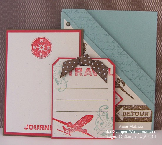
The new Sentimental Journey stamp set in the Summer Mini catalog calls to mind those family vacations.  The excitement of arrival in a new place, the chaos of unanticipated situations, and the adventure of exploration are evoked in the images in this set.  A pocket card seemed like a great way to package the possibilities:

Double Pocket card Sentimental Journey

  • Sentimental Journey, En Francais, Wings of Friendship and Whimsical Words stamps
  • Naturals Ivory, Sage Shadow, Soft Suede and Ruby Red card stock
  • Sage Shadow, Soft Suede and Ruby Red classic ink pads
  • Soft Suede Stampin’ Write marker, Vintage Brads,  and Crop-a-dile
  • Soft Suede polka dot ribbon, Horizontal Slot and Tag Corner punches
  • 1 1/4″ and 1 3/8″ square punches

Wouldn’t this be a fabulous way to present your graduate with that trip of a lifetime?  Ah well…in my house, the trip of a lifetime is called University Tuition.  But here are the tags I put inside:

Travel Pocket Tags

Makes you want to pack your bags, doesn’t it?  Even when I live in a wonderful place like Maui, travel beckons.  And when the travel is done, well, there’s no place like home.

Happy Mother’s Day

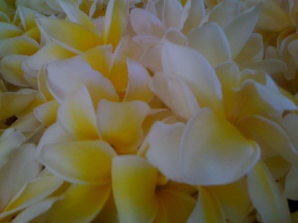
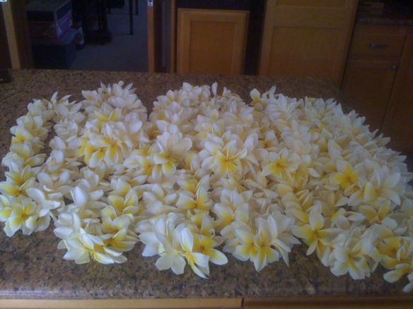
This morning my son and I picked flowers and strung lei for the youth group to sell this weekend at church. Take a deep breath…

I hope you can smell them – the fragrance was incredible. Happy Mother’s Day to all of you nurturing women!

A promise made, a promise kept

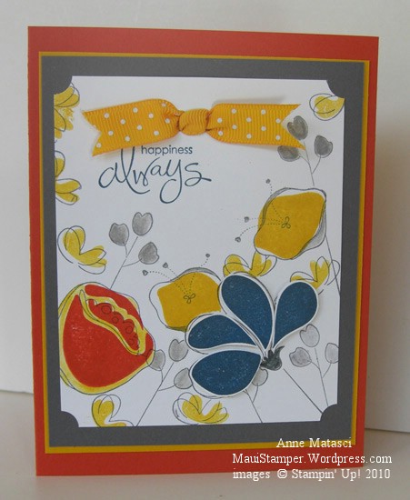
A couple of days ago I put together a couple of colors that surprised me.  The combination of Basic Gray and Crushed Curry jumped off my craft table and shouted “Look at me!”  I promised I would use them together:

Awash With Flowers Basic Grey and Crushed Curry

  • Awash With Flowers and Whimsical Words (SAB) stamp sets
  • Whisper White, Basic Grey, Crushed Curry and Dusty Durango card stock
  • Basic Grey, Crushed Curry, Not Quite Navy and Dusty Durango Classic ink pads
  • Basic Grey Stampin’ Write marker and the Aquapainter
  • Ticket Corner Punch, Double Rectangle Punch, and Crushed Curry Polka Dot ribbon
  • Stampin’ Dimensionals and Stamp-a-ma-jig

These colors would have worked really well for a masculine card, but I am currently infatuated with Awash with Flowers.   The Not Quite Navy petals are stamped on Whisper White, cut out and attached with Dimensionals for a little pop, and I used the Aquapainter to add a little Crushed Curry around the Dusty Durango Two-Step flower.  I only used the SAMJ for that same Dusty Two-Step because I wanted it Just So – the rest of them are happy accidents.

I like these strong colors together, and before long I’ll have to find a nice Man Stamp Set and try again.  I just got a couple of new things from the Summer Mini and one of them will be perfect.   (Hijack:  Don’t you hate it when you have decided you don’t need something and then you see not one, not two, but an abundance of projects using that same rejected stamp set?  And where on earth did the word “hijack” originate?  Off to the old Funk and Wagnalls…)

Enjoy your Friday.

An In Color Trifecta

Whew!  Time for some antidote to pink!  Not that there’s anything wrong with pink…but I’m swimmin’ in the stuff this week.  Some friends are expecting a baby girl the beginning of next month and we’re getting having a small get together this weekend to celebrate.  I’ve got a couple of Pink Projects in various stages of completion and it’s time to put the pedal to the metal and get them done!

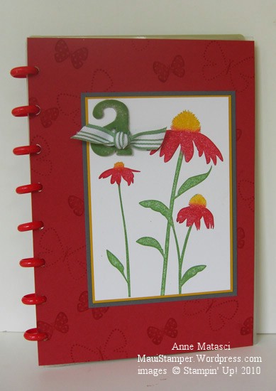
In the meantime, I made another cover for one of my many Circa notebooks. I have a LOT of these notebooks that I use for a variety of purposes.  If  I don’t personalize the covers, then I tend to get a little cranky when I’m looking for a particular one and have to flip through 2 or 3 others in the process.  (By the way, if you read the post where I lamented my AWOL Aquapainter, it was hidden in plain sight.)  I like to make fresh covers for the pleasure of it and to keep myself on my toes.

This notebook has red Rollabind discs, so I knew red would be in my color scheme.  I chose Riding Hood Red (IC’09) to celebrate the new Color Renovation, and Wild Wasabi (IC’08) and Crushed Curry (IC’10) just fell into place behind it.  A three-generational-In-Color trifecta!

Inspired by Nature Levenger Circa Cover

  • Inspired by Nature and Flight of the Butterfly stamp sets
  • Whisper White, Riding Hood Red, Wild Wasabi, Crushed Curry and Basic Gray card stock
  • Wild Wasabi, Crushed Curry and Riding Hood Red Classic ink pads
  • Wild Wasabi striped ribbon (retired), chipboard letters (retired) and Sponge Daubers

Inspired by Nature was one of the sets demonstrators received at the 2008 Stampin’ Up! convention.  I learned a great technique at convention when we did our Make ‘n Takes:  we used Sponge Daubers to selectively apply ink to the stamp.  The sponges avoid streaks that sometimes appear when you use a marker on bold images, and they give the image a slight softness.  You can also spritz the entire stamp very lightly for a watercolor effect.   I added the Basic Gray into the mat layers because the Riding Hood combined with the Wild Wasabi and Crushed Curry created  a confused Christmas/Rasta kind of look…not quite the effect I was going for.  Serendipitously, I realized  I really like Basic Gray paired with Crushed Curry – I’ll be putting those two together very soon.

All spritzed up and nowhere to go

Someone may have to pry the Smooch Spritz out of my hands…I think I’ve become dangerous.  A definite case of  “More is More”, and I’m not convinced it’s a good thing:

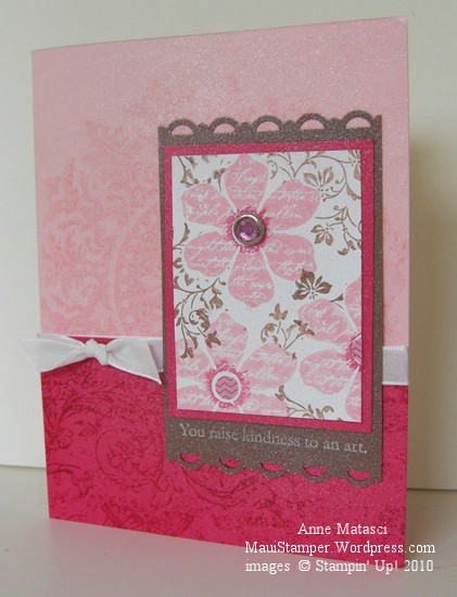
All Smooched up and nowhere to go

  • Vintage Vogue and Medallion Stamp sets; Very Vintage Wheel
  • Whisper White, Pretty in Pink, Melon Mambo and Close to Cocoa card stock
  • Pretty in Pink, Melon Mambo and Close to Cocoa Classic ink pads; Whisper White Craft ink pad
  • Melon Mambo Stampin’ Write marker, Vanilla Smooch Spritz
  • Scallop Trim Border punch, Rhinestone brad, Whisper White taffeta ribbon
  • 1/4″ circle punch and a teeny scrap of DSP – I think from SAB but don’t quote me

A couple of days ago I went on a rant about challenges that wouldn’t cooperate.  This card uses the survivors from that challenge – a lot of pieces went into the round file (trash) in my craft room.  I have to admit, my concept was good but it just wouldn’t tolerate being forced into a sketch that I disliked.  You can see I’m still playing with the same colors I used yesterday for the Inkspiration Challenge – it’s getting pretty girly around here.  Maybe tomorrow I’ll go Rasta for a change!

Mama, do you Mambo?

I love to play with color.  I love the moods and energy it evokes, and the simple pleasure that comes from looking at a pleasing combination of colors.  When I chanced on the photo for the Inkspirations Challenge, it felt deeply feminine…like a Southern Belle sitting on a porch, all dressed up and sipping iced tea – without leaving a trace of lipstick on her glass, of course!

Inkspirations 21

Big, full pink blossoms, crystal and tapers…in pink and cream…doesn’t that say feminine to you?  Here is my response:

Thoughts and Prayers for Mother's Day

  • Thoughts and Prayers, All Holidays and Bella Toile stamp sets
  • Naturals White, Pretty in Pink, Melon Mambo and Close to Cocoa card stock
  • Close to Cocoa, Pretty in Pink and Melon Mambo Classic ink pads
  • Pretty in Pink and Melon Mambo Stampin’ Write Markers and a Blender pen
  • Scallop Trim Border and Double Rectangle punches; Rhinestone and Filigree brads
  • Melon Mambo Polka Dot Grosgrain Ribbon and Vanilla Smooch Spritz

Yeah, you can see I got a little carried away with the Smooch, huh?  But doesn’t it give a nice candle-lit sort of look?  That’s what I was going for 🙂

Be sure you take a good look at that pretty little Filigree brad.  You could have a package of those (or stars, flowers or circles) for free with the purchase of select stamp sets this month from Stampin’ Up!  Check my Online Store in the Promotions page for details.

If you’d like to see what others have done for this challenge, check this post from Kirsty.  She’s helping out this week.