This morning my son and I picked flowers and strung lei for the youth group to sell this weekend at church. Take a deep breath…

I hope you can smell them – the fragrance was incredible. Happy Mother’s Day to all of you nurturing women!

This morning my son and I picked flowers and strung lei for the youth group to sell this weekend at church. Take a deep breath…
I hope you can smell them – the fragrance was incredible. Happy Mother’s Day to all of you nurturing women!
A couple of days ago I put together a couple of colors that surprised me. The combination of Basic Gray and Crushed Curry jumped off my craft table and shouted “Look at me!” I promised I would use them together:
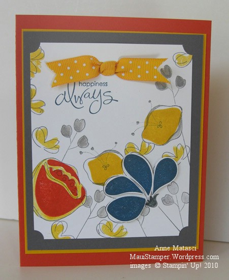
These colors would have worked really well for a masculine card, but I am currently infatuated with Awash with Flowers. The Not Quite Navy petals are stamped on Whisper White, cut out and attached with Dimensionals for a little pop, and I used the Aquapainter to add a little Crushed Curry around the Dusty Durango Two-Step flower. I only used the SAMJ for that same Dusty Two-Step because I wanted it Just So – the rest of them are happy accidents.
I like these strong colors together, and before long I’ll have to find a nice Man Stamp Set and try again. I just got a couple of new things from the Summer Mini and one of them will be perfect. (Hijack: Don’t you hate it when you have decided you don’t need something and then you see not one, not two, but an abundance of projects using that same rejected stamp set? And where on earth did the word “hijack” originate? Off to the old Funk and Wagnalls…)
Enjoy your Friday.
Whew! Time for some antidote to pink! Not that there’s anything wrong with pink…but I’m swimmin’ in the stuff this week. Some friends are expecting a baby girl the beginning of next month and we’re getting having a small get together this weekend to celebrate. I’ve got a couple of Pink Projects in various stages of completion and it’s time to put the pedal to the metal and get them done!
In the meantime, I made another cover for one of my many Circa notebooks. I have a LOT of these notebooks that I use for a variety of purposes. If I don’t personalize the covers, then I tend to get a little cranky when I’m looking for a particular one and have to flip through 2 or 3 others in the process. (By the way, if you read the post where I lamented my AWOL Aquapainter, it was hidden in plain sight.) I like to make fresh covers for the pleasure of it and to keep myself on my toes.
This notebook has red Rollabind discs, so I knew red would be in my color scheme. I chose Riding Hood Red (IC’09) to celebrate the new Color Renovation, and Wild Wasabi (IC’08) and Crushed Curry (IC’10) just fell into place behind it. A three-generational-In-Color trifecta!
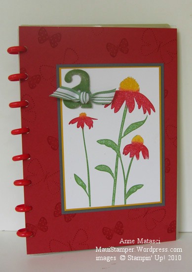
Inspired by Nature was one of the sets demonstrators received at the 2008 Stampin’ Up! convention. I learned a great technique at convention when we did our Make ‘n Takes: we used Sponge Daubers to selectively apply ink to the stamp. The sponges avoid streaks that sometimes appear when you use a marker on bold images, and they give the image a slight softness. You can also spritz the entire stamp very lightly for a watercolor effect. I added the Basic Gray into the mat layers because the Riding Hood combined with the Wild Wasabi and Crushed Curry created a confused Christmas/Rasta kind of look…not quite the effect I was going for. Serendipitously, I realized I really like Basic Gray paired with Crushed Curry – I’ll be putting those two together very soon.
Someone may have to pry the Smooch Spritz out of my hands…I think I’ve become dangerous. A definite case of “More is More”, and I’m not convinced it’s a good thing:
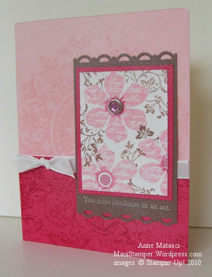
A couple of days ago I went on a rant about challenges that wouldn’t cooperate. This card uses the survivors from that challenge – a lot of pieces went into the round file (trash) in my craft room. I have to admit, my concept was good but it just wouldn’t tolerate being forced into a sketch that I disliked. You can see I’m still playing with the same colors I used yesterday for the Inkspiration Challenge – it’s getting pretty girly around here. Maybe tomorrow I’ll go Rasta for a change!
I love to play with color. I love the moods and energy it evokes, and the simple pleasure that comes from looking at a pleasing combination of colors. When I chanced on the photo for the Inkspirations Challenge, it felt deeply feminine…like a Southern Belle sitting on a porch, all dressed up and sipping iced tea – without leaving a trace of lipstick on her glass, of course!
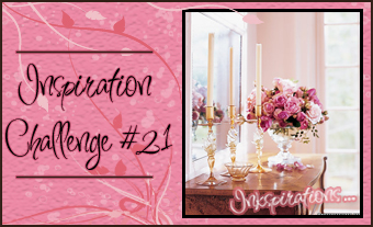
Big, full pink blossoms, crystal and tapers…in pink and cream…doesn’t that say feminine to you? Here is my response:

Yeah, you can see I got a little carried away with the Smooch, huh? But doesn’t it give a nice candle-lit sort of look? That’s what I was going for 🙂
Be sure you take a good look at that pretty little Filigree brad. You could have a package of those (or stars, flowers or circles) for free with the purchase of select stamp sets this month from Stampin’ Up! Check my Online Store in the Promotions page for details.
If you’d like to see what others have done for this challenge, check this post from Kirsty. She’s helping out this week.
In case you haven’t noticed, I’ve been cruising through a lot of different challenge blogs and forums recently. It’s a great way to shake up my projects a little and keep things fresh. It’s easy to use familiar color combinations and card layouts, but after a while it gets boring.
I haven’t settled on any particular favorites but if I do I promise I’ll share. The layout for this card is from Sketch Girl, and it appeals to my sense of orderliness. Today’s colors are courtesy of the Paper Pal Arts Monochromatic Blues Challenge (PPA40) and I knew the moment I saw the challenge that it would make me happy. I don’t think there’s a shade of blue I dislike, and the clean look of blue and white is one of my favorites. I had a lot of fun with this card:

And yes, I blurred the French Script lettering with the AQP on purpose! Lately I can’t seem to make a card without using the Aquapainter for something. For the past couple of days, I’ve only been able to find the small-brush AQP – the large-brush one is AWOL. It’s driving me crazy (admittedly, a very short drive) because I’m somewhat OCD (or as my daughter likes to point out, CDO – alphabetical order). I Do Not Like To Lose Things. And I use that AQP a lot! (deep breath…another one…it’s going to be okay…really.)
Ahem. I had a marvelous time with this card. The concept was clear in my head before I started, and although I made a few adjustments as I went along the process was very enjoyable. This is not always the case, as evidenced by the card in the trash can in my craft room. When I finished this lovely Ode to the Blues I thought my mojo was firmly in place and started in on another sketch challenge I’d seen. I spent way more time than I’d planned trying to make it work, changing focal points and orientation and struggling mightily. I finally finished it and set it aside to look at this morning, which is often the perfect solution. Sometimes looking over a not-quite-there project after a good night’s sleep will produce that Ah-ha! moment that fixes everything. But this card was immune to Good-Sleep-Therapy. I ripped off the salvageable bits and threw the rest away. It’s only paper, after all.
OK, first things first:
This is normally a family friendly site, but today’s card incorporates language that may not fit that classification. Surely it’s not the worst thing you’ve ever heard, but it’s not language I like to use. Of course there’s a story.
Last month, the Hostess for my stamp club brought fabulous treats – a gorgeous cheese and fruit platter, delicious crackers, and a special champagne. No, this wasn’t Auntie’s fabulous home-made Cherry and Lilikoi wine – Auntie might have blushed. This was a special bubbly and we laughed and laughed over the label. Not to disparage the product, but let’s just say I’ve tasted better champagne. The label was, well, quite unusual. This week I finally got the card made:

As you can see, the label was, well, it was a B****! Didn’t want to come off that bottle now, did it? The retired wheel I Versamarked onto the Blush Blossom card stock seemed a perfect accompaniment to the Bubbles.
Couldn’t leave well enough along, though, and had to finish off the inside:
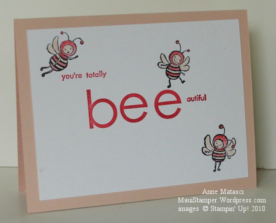
I just love those craxy bees! Especially the one who dances on the head of a pin. They’re kinda Outer-Spacey lookin’, which suits me just fine.
A lovely color, Sage Shadow, but somewhat out of style. It’s not usually quite this difficult to work with, but there were three of us stamping together and we all thought Arielle’s Colour Q Challenge 30 looked interesting. Interesting? More like INSANE!!
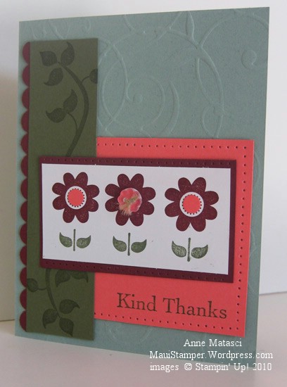
This color challenge was tough – the three of us sat at my kitchen table shuffling cardstock around trying to figure out what to do for a long time. The colors work together, but I’ll confess I would never think of putting them together on my own. It took a lot of shuffling to come up with this card.
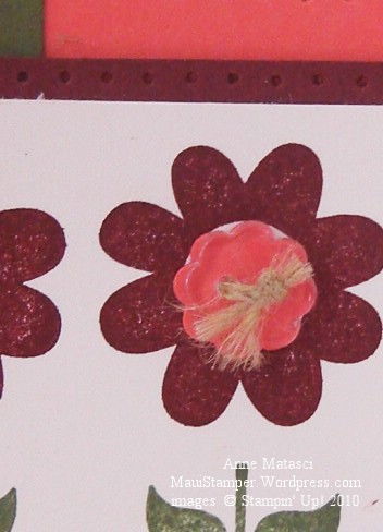
I hope you noticed that Bitty Button…you’ll be able to purchase buttons and matching little punches starting on May 1 when the Summer Mini catalog debuts. Stampin’ Up! has done it again – lots of very cool new products to keep our designs fresh and interesting. These clear buttons come in an assortment of four shapes, and there are coordinating punches for all four shapes. Let your inspiration run wild!
New products available in a new Summer Mini should be our cue to review the Occasions Mini catalog. Some items from the Occasions mini – punches and Big Shot dies – will continue to be offered, but stamps, paper and accessories will not be available after April 30 – that’s Friday! Check the Online Store and place your order if there’s something you know you’ll need. There are a number of products that are already sold out – including the Sweet Pea Designer Series Paper Stack and Stitched Felt. Don’t miss out!
Color is such a subjective thing. What makes one person’s heart soar leaves another person squarely in the dust. I don’t know about you, but Baja Breeze makes my heart soar and I am thrilled beyond words that it is returning to the Stampin’ Up! color palette in July. I have carefully guarded my stash of Baja Breeze cardstock and grudgingly doled out bits and pieces of my Baja Breeze Designer Series Papers over the past year, but no more! I can’t wait to see what the Design Geniuses at Stampin’ Up! have in store for us in the new 2010-2011 Idea Book and Catalog. In the meantime, I offer you this:

Don’t you love this color combination? Wild Wasabi has been retired two years and Baja Breeze for only one year. I’ll be using these colors together again and again! And I love the options for two-step stamping and/or watercoloring with the new Awash With Flowers stamp set – don’t forget that it’s a 2010-2011 Sneak Peak and will be available only through April 30 (that’s Friday!!) Go to my Online Store and place your order now, or you’ll be waiting until July 1 and wishing you’d placed your order now.
Someday I will take a watercolor class, but in the meantime I play around and make messes. I love to work with color saturation and layering different colors, and even when it doesn’t turn out as I planned I find the process enjoyable. I’ll warn you, though, when you watercolor with Real Red ink refills, it can look positively magenta! That was a bit startling, to say the least.
Have you heard of Circa notebooks? I am addicted to this system. Infinitely customizable in a variety of sizes, I love the specially punched papers, covers and rings. They are available through the Levenger Catalog (stores in Boston, Chicago, and I think Florida) and the concept is absolutely brilliant. Circa provides a very pedestrian cover for the notebooks, but because of the way the system works you can easily remove their dull-as-dirt cover and create one of your own – and that’s what I’ve done here. This is a Junior sized notebook, and the cover is 5 1/2″ x 8″. It’s my To-Do list notebook, and it keeps me on track on the days when I want to follow an agenda. Some days – like this weekend – I jettisoned the To-Do list in favor of the spirit of What-Do-I-Want-To-Do-Now? Needless to say, it was a lovely weekend.
Didn’t think I’d give Green Galore it’s own day, did you? Not after yesterday’s bashing…that wasn’t very nice of me. Poor Green Galore. {snort}

I had to try that Colour Q challenge again…can’t really explain why. That’s the mystery of playing challenges, I guess. This time I chose to make the card a single layer to avoid the dilemma of balancing colors. I did a fair amount of masking and used both solid and line art images to keep the sense of lightness that a white card provides. As you can see, I couldn’t resist using the Aquapainter to blend some of the color.
There’s so much color and so many images that I’m not convinced this card is truly Clean and Simple, but with no layers OR embellishments I think it comes close. The style is growing on me…one of these days I’m going to take it to another level. Just not today.

