…and 2012 is just around the corner

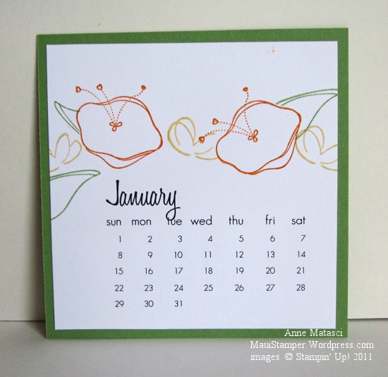
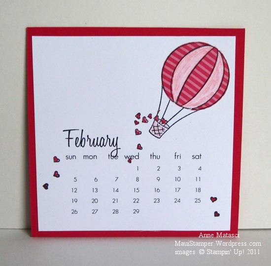
I made these little calendars last year using a template from Tracy Harp at Inky Doodles and they were so popular that I brought them back for an encore this year:

January 2012 Easel Calendar

January uses the Awash with Flowers stamp set

February 2012 Easel Calendar

February uses the Ain’t Love Grand Hostess set

March 2012 Easel Calendar

March uses Fabulous Florets, one of my personal favorites

These little calendars are just the right size to sit on a cute little easel in my kitchen.

And now back to our regularly scheduled program…

All that cat business is lots of fun, but there are cards to be made and seen!  Yesterday’s post about my goofball cat got picked up by Freshly Pressed, the front page of WordPress.com.  Captain Stupidhead is now a mini-celebrity and while I’m not making any promises, you may see a little more him from time to time.  As my daughter Sara said, “The internet has spoken. And it says that it loooooooves Pookie.”

Pookie did NOT help with this card, and that’s a good thing.  My stamping desk isn’t very big and it’s usually covered with ink pads.  No place for a cat.  However, it’s a great place for some colors that I loved and hoarded when they retired.  Wild Wasabi was an In Color selection in 2007 and Riding Hood Red was from 2008.  I kept a little folder with a few odd sheets of Wasabi, but I must confess that I have a substantial stash of Riding Hood Red.  It’s a deep, rich red that worked with so many colors and I am thrilled to have it back in the Stampin’ Up! Color Family:

Wild Wasabi and Riding Hood Red are back again

  • Awash with Flowers, Woodgrain and Because I Care (Hostess Level I) stamp sets
  • Wild Wasabi, Riding Hood Red, Soft Suede and Whisper White card stock
  • Wild Wasabi, Riding Hood Red and Soft Suede classic ink pads
  • Soft Suede Stampin’ Write marker and the Blender pen
  • Big Shot and Perfect Polka Dots Textured Impressions Embossing folder
  • Corner Rounder, Oval and Scallop Oval punches
  • Linen thread and Stampin’ Dimensionals

I used my Lazy Stampin’ Girl technique on the Two-Step Stampin’ part of the flower.  I inked the solid (flower petal) image with Riding Hood Red, then used a blender pen to remove the RHR ink from the little pod thingy at the base of the flower.  (OK, tell me, what would you YOU call it??  Sheesh.)  The Soft Suede Stampin’ Write marker adds that little change of color that makes a big difference – at least to me.

I’m lovin’ this new catalog and the return of some of my favorite colors, and I hope you are too.

A promise made, a promise kept

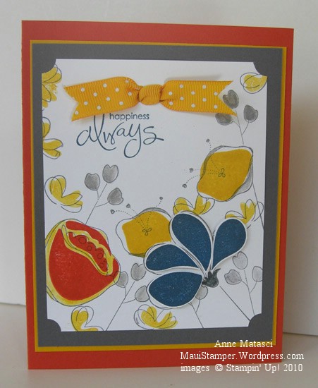
A couple of days ago I put together a couple of colors that surprised me.  The combination of Basic Gray and Crushed Curry jumped off my craft table and shouted “Look at me!”  I promised I would use them together:

Awash With Flowers Basic Grey and Crushed Curry

  • Awash With Flowers and Whimsical Words (SAB) stamp sets
  • Whisper White, Basic Grey, Crushed Curry and Dusty Durango card stock
  • Basic Grey, Crushed Curry, Not Quite Navy and Dusty Durango Classic ink pads
  • Basic Grey Stampin’ Write marker and the Aquapainter
  • Ticket Corner Punch, Double Rectangle Punch, and Crushed Curry Polka Dot ribbon
  • Stampin’ Dimensionals and Stamp-a-ma-jig

These colors would have worked really well for a masculine card, but I am currently infatuated with Awash with Flowers.   The Not Quite Navy petals are stamped on Whisper White, cut out and attached with Dimensionals for a little pop, and I used the Aquapainter to add a little Crushed Curry around the Dusty Durango Two-Step flower.  I only used the SAMJ for that same Dusty Two-Step because I wanted it Just So – the rest of them are happy accidents.

I like these strong colors together, and before long I’ll have to find a nice Man Stamp Set and try again.  I just got a couple of new things from the Summer Mini and one of them will be perfect.   (Hijack:  Don’t you hate it when you have decided you don’t need something and then you see not one, not two, but an abundance of projects using that same rejected stamp set?  And where on earth did the word “hijack” originate?  Off to the old Funk and Wagnalls…)

Enjoy your Friday.

Welcome back, Baja Breeze!

Color is such a subjective thing.  What makes one person’s heart soar leaves another person squarely in the dust.  I don’t know about you, but Baja Breeze makes my heart soar and I am thrilled beyond words that it is returning to the Stampin’ Up! color palette in July.  I have carefully guarded my stash of Baja Breeze cardstock and grudgingly doled out bits and pieces of my Baja Breeze Designer Series Papers over the past year, but no more!  I can’t wait to see what the Design Geniuses at Stampin’ Up! have in store for us in the new 2010-2011 Idea Book and Catalog.  In the meantime, I offer you this:
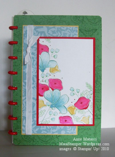
Awash with Flowers Circa Notebook insert

  • Awash with Flowers Stamp Set, Very Vintage Stampin’ Around Wheel
  • Whisper White, Real Red, Wild Wasabi and So Saffron card stock
  • Baja Breeze Designer Series Paper (retired – don’t remember the name)
  • Wild Wasabi and So Saffron Classic ink pads
  • Baja Breeze, Wild Wasabi, and Real Red Classic ink refills
  • Aquapainter, Wheel Guide and White Taffeta ribbon
  • Circa Notebook from Levenger Catalog

Don’t you love this color combination?  Wild Wasabi has been retired two years and Baja Breeze for only one year.  I’ll be using these colors together again and again!  And I love the options for two-step stamping and/or watercoloring with the new Awash With Flowers stamp set – don’t forget that it’s a 2010-2011 Sneak Peak and will be available only through April 30 (that’s Friday!!)  Go to my Online Store and place your order now, or you’ll be waiting until July 1 and wishing you’d placed your order now.

Someday I will take a watercolor class, but in the meantime I play around and make messes.  I love to work with color saturation and layering different colors, and even when it doesn’t turn out as I planned I find the process enjoyable.  I’ll warn you, though,  when you watercolor with Real Red ink refills, it can look positively magenta!  That was a bit startling, to say the least.

Have you heard of Circa notebooks?  I am addicted to this system.  Infinitely customizable in a variety of sizes, I love the specially punched papers, covers and rings.  They are available through the Levenger Catalog (stores in Boston, Chicago, and I think Florida) and the concept is absolutely brilliant.  Circa provides a very pedestrian cover for the notebooks, but because of the way the system works you can easily remove their dull-as-dirt cover and create one of your own – and that’s what I’ve done here.  This is a Junior sized notebook, and the cover is 5 1/2″ x 8″.   It’s my To-Do list notebook, and it keeps me on track  on the days when I want to follow an agenda.  Some days – like this weekend – I jettisoned the To-Do list in favor of the spirit of  What-Do-I-Want-To-Do-Now?  Needless to say, it was a lovely weekend.

Fond Farewell to Summer Sun

You know, I’m actually going to miss Summer Sun.  I didn’t use it a lot, but its deep, rich color was sometimes just the shade I needed.   When I saw Riley’s choices for this week’s Color Dare Challenge I started thinking about that yellow.  For me, the key to using bold color is getting the Goldilocks dose – not too little, not too much, but just right:

Mojo135 Awash with Flowers Color Dare Challenge Stampin Up!

  • Awash with Flowers, Teeny Tiny Wishes, Flight of the Butterfly, Wings of Friendship and Linen (retired) stamp sets
  • Very Vanilla, Summer Sun, Certainly Celery and Old Olive card stock
  • Summer Sun and Olive Olive Classic ink pads
  • Summer Sun and Certainly Celery Classic ink refills and the Aquapainter
  • Big Shot, Perfect Polka Dots Embossing Folder and the Beautiful Wings Embosslit
  • Scallop Border and Corner Rounder punches, White Gel pen, and Very Vanilla Taffeta ribbon

This sketch is number 135 from Mojo Monday (yes, I am aware it is Thursday – sometimes life gets in the way.)  I wasn’t sure if I would like it but once I decided to skip the fancy shape for the focal point it was an easy sketch to use.  I stamped the larger flowers first and then made a mask to cover them before stamping the smaller stemmed flowers.  Masking is an under-rated technique!

As if two challenges weren’t enough for one post, I’ve also been given a Sunshine Award from my blogging friend Lisa.  The rules of the award state that I need to pass it on, and that’s a tough choice for me.  Lisa awarded one of the people I regularly follow – Melissa Huie – so in no particular order, here are a few other stamping bloggers whose work I admire:

I hope you’ll enjoy the work of these talented artists as much as I do.  They each have a different perspective, but the one thing they have in common is uncommon creativity.

And thanks, Lisa!  You made my day.

Fond Farewell to Blush Blossom

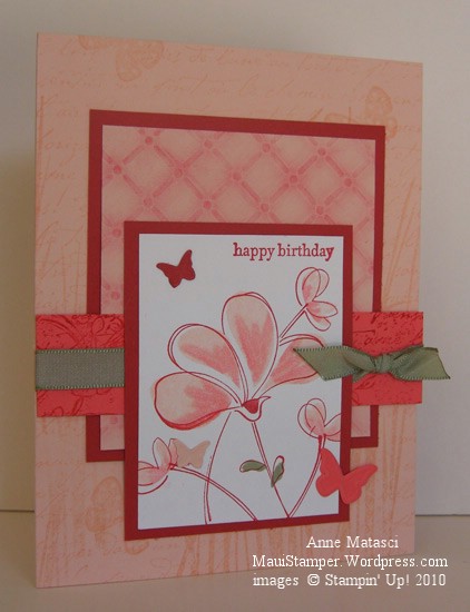
When I look at the list of colors retiring in June, I feel ambiguous about Blush Blossom.  It’s not a very trendy color.  It doesn’t inspired me on its own.   But Blush Blossom plays well with others.

Stampin' Up! Awash with Flowers Splitcoaststampers challenge

  • Awash with Flowers and Teeny Tiny Wishes stamp sets
  • French Script, Inspired by Nature, and Flight of the Butterfly stamp sets
  • Blush Blossom, Ruby Red, Cameo Coral and Whisper White card stock
  • Ruby Red, Blush Blossom and Mellow Moss Classic ink pads
  • Cameo Coral and Ruby Red Stampin’ Write markers
  • Big Shot, Beautiful Wings Embosslit, and SU Backgrounds 1 Texturz plate
  • Very Vintage Jumbo Wheel, Stampin’ Pastels, and Mellow Moss taffeta ribbon

The new Awash with Flowers stamp set is a winner, my stampin’ friends.  I inked the solid stamps in Blush Blossom and used the Cameo Coral and Ruby Red markers to add a little extra color to the rubber before I stamped the images.  If you want to see a mind-boggling beauty of a card with this set, peek at Lisa’s Add Ink and Stamp.  She is one amazing artist.

This card was a project for my stamp club last night.  I’m not sure if it was the profusion of stamps or all of the steps or just the fact that we were crazy enough to schedule stamp club on Tax Day, but it was a wild and crazy kind of club!  Lots of hootin’ and hollerin’  and crazy farmin’ talk, especially when we were finished stamping.  Teresa brought some of her Auntie’s home made wine – a bottle of cherry and a bottle of lilikoi.  Yes, I was wrong – there ARE cherry trees on Maui!  The cherry wine was sweet and refreshing and and the lilikoi was tropical and somewhat mystical and both were absolutely delicious.  I think it’s fair to say a good time was had by all!

One last thought:  If you haven’t tried a challenge card yet, I enthusiastically recommend that you do.  This card uses Color and Sketch Challenges from Splitcoaststampers and there are loads of other challenges out there to try.  Find one that inspires you and give it a shot!