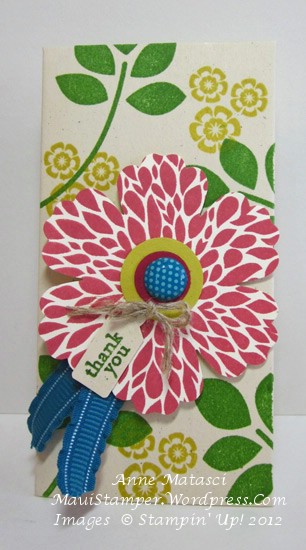
Betsy’s little pocket

The Petite Pocket Bigz die cut has called my name for quite a while, but I’ve resisted…until now.  Cheryl and I designed vintage monochromatic Pockets HERE, and that was it:  I gave in and bought the die.

Maui Stamper Betsy's Blooms Petite Pocket

  • Betsy’s Blooms and Teeny Tiny Wishes stamp sets
  • Gumball Green, Summer Starfruit and Primrose Petals FFIP (Firm Foam Ink Pads)
  • Very Vanilla, Summer Starfruit and Raspberry Ripple card stock
  • Blossom, 1/2 and 3/4 inch Circles and Jewelry tag punches
  • Linen thread and Island Indigo 3/8 inch ruffled ribbon
  • 2011-2013 Printed Designer brads
  • Stampin’ Dimensionals
  • Big Shot and Petite Pocket Bigz die

I try not to jump on the new Big Shot Die Bandwagon every time a new die comes out.  Sometimes I’ll borrow it from another demonstrator to find out if I really like it.  Sometimes I find it’s something I don’t really need to have.  Most of the time, I’m hooked.

I filled this little pocket with a couple of yards of ribbon to say thanks to some kind friends.  It’s just the right size for a little gift and it uses a half sheet of cardstock cut the long way.  It goes together easily with a little Tombo (the wonder adhesive).  Betsy’s Blooms is a great “go-to” stamp set.  It’s versatile and the big round floral image fits perfectly in the Blossom Punch.

I’m getting ready for convention – it’s just around the corner – and things are getting a little wacky around here.  Seems as if the whole summer has been a progression from one big event to another!  Can’t wait to find out what Stampin’ Up! has in store for us.  I’ll share as much as I can!


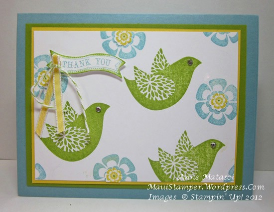
Flocks of little green birds

Isn’t it odd how stamps you didn’t think you needed or wanted become your favorites?  I don’t understand but I’m willing to embrace the paradox.

Betsy's Blooms in Gumball Green

  • Betsy’s Blooms and Itty Bitty Banners stamp sets
  • Gumball Green, Primrose Petals and Whisper White card stock
  • Floral District Designer Series paper
  • Gumball Green, Primrose Petals and Daffodil Delight FFIP (Firm Foam Ink Pads)
  • Basic Black Stampin’ Write markers
  • Big Shot; Labels Collection and Bitty Banners Framelits
  • Daffodil Delight Seam Binding
  • Rhinestone Jewels

This is a square card.  I can count on the fingers of one hand the number of square cards I’ve made, but I love the design possibilities.  I also love the way these birds fly across the front of the card – they remind me of all the little birds I watch in the morning zooming around outside my kitchen window.

I liked this concept of a flock of birds so well I wanted to stamp it again in A2 format (that’s 4 1/4 x 5 1/2).  At the time, I didn’t have the FFIP in all of our luscious Stampin’ Up! colors so I used my old ink pads:

Betsy's Blooms in Baja Breeze


That’s Baja Breeze and Lucky Limeade; can you see why I’m in love with the FFIP?  In all fairness, some of my old-style ink pads are more than 5 years old – but Lucky Limeade is only a year old!! I’m thrilled with the results I’m getting with these new ink pads.

I have something kind of exciting to share, but it’s also a little bit scary.  I’m within a reach – well, a real stretch – of earning the Stampin’ Up! Hilton Head incentive trip.   If you had told me a year ago that I would be in this place I would have laughed and offered to pour you another glass of your favorite refreshing beverage, but it’s true!  I have some hard work to do but I’m excited by the challenge.

If you’re thinking about ordering Stampin’ Up! product and don’t have your own demonstrator, I would LOVE to take your order.  If you’ve bought Stampin’ Up! product from me in the past and are thinking you might like to purchase more, I would LOVE it if you placed your order before June 30th!!  Every person who orders between now and June 30 at my Online Store will receive a special hand-stamped thank you and two yards of new ribbon from the 2012-2013 catalog.  Thank you in advance for helping me to achieve this dream!


Choosing stamps

Betsy's Blooms spotlightI’m trying to be deliberate in my choice of new stamps.  Every time Stampin’ Up! releases a new catalog I have the overwhelming urge to press the “I WANT IT ALL” button on the demonstrator website.  (OK, full disclosure:  there is no such button.  However, demonstrators have been lobbying for this button for years.)

I know that there are people – Stampin’ Up! customers as well as demonstrators – who not only want it all, but buy it all.  Perhaps some of them have a large enough business or crafting environment to actually need it all.  In all honesty, I have to acknowledge that I neither have time nor space to have it all.  That brings me back to the dilemma of making choices.

It’s easy to choose the things that I love.  It’s tricky to be sure I have a well-rounded selection.  It’s even harder still to choose things that will appeal to a broad cross-section of crafters.  Over the years, I’ve gotten better at that last set of choices, but it takes careful evaluation.  And just like each of you, I will make a decision and then see something that another stamper has done with a set that I had dismissed as absolutely un-workable and all of my “careful evaluation” goes out the window.  Ah well, there’s room for an impulse buy or two in my budget!

Happily, this card was made with a stamp set that was a gift to me from Stampin’ Up!:

  • Betsy’s Blooms and Itty Bitty Banners stamp sets
  • Very Vanilla, Cherry Cobbler and Soft Suede card stock
  • Comfort Cafe Designer Series Paper
  • Soft Suede and Cherry Cobbler Classic ink pads
  • Summer Starfruit Firm Foam Ink Pads (FFIP)
  • Big Shot and Herringbone Textured Impressions Embossing Folder
  • 3 and 3 1/2 inch circle Originals Dies
  • Bitty Banners Framelits
  • 1/2 inch Cherry Cobbler Scallop Dots ribbon
  • Stampin’ Sponge
  • Stampin’ Dimensionals
  • Jewels Rhinestones

I can’t wait to get the rest of my FFIP!!  They’re arriving slowly but surely and my, oh, my are they fabulous!  Betsy’s little bird will surely SING when she gets inked up with FFIP in Cherry Cobbler.

I have to let you in on a little secret.  This is one of those things I wouldn’t have noticed, but I think it’s pretty interesting.  I looked at that Comfort Cafe DSP and my mind said “Cherry Cobbler” – and that’s what I pulled out to use.  However, yesterday afternoon I was dreaming through the Annual Catalog and I came across the color palette for Comfort Cafe:  Cajun Craze!!!  Honestly, I couldn’t tell the difference until I put the papers together.  I’ll have to make this card again and make that adjustment.  I’m waiting for that Cajun FFIP though…