An In Color Trifecta

Whew!  Time for some antidote to pink!  Not that there’s anything wrong with pink…but I’m swimmin’ in the stuff this week.  Some friends are expecting a baby girl the beginning of next month and we’re getting having a small get together this weekend to celebrate.  I’ve got a couple of Pink Projects in various stages of completion and it’s time to put the pedal to the metal and get them done!

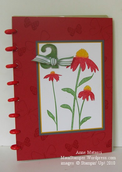
In the meantime, I made another cover for one of my many Circa notebooks. I have a LOT of these notebooks that I use for a variety of purposes.  If  I don’t personalize the covers, then I tend to get a little cranky when I’m looking for a particular one and have to flip through 2 or 3 others in the process.  (By the way, if you read the post where I lamented my AWOL Aquapainter, it was hidden in plain sight.)  I like to make fresh covers for the pleasure of it and to keep myself on my toes.

This notebook has red Rollabind discs, so I knew red would be in my color scheme.  I chose Riding Hood Red (IC’09) to celebrate the new Color Renovation, and Wild Wasabi (IC’08) and Crushed Curry (IC’10) just fell into place behind it.  A three-generational-In-Color trifecta!

Inspired by Nature Levenger Circa Cover

  • Inspired by Nature and Flight of the Butterfly stamp sets
  • Whisper White, Riding Hood Red, Wild Wasabi, Crushed Curry and Basic Gray card stock
  • Wild Wasabi, Crushed Curry and Riding Hood Red Classic ink pads
  • Wild Wasabi striped ribbon (retired), chipboard letters (retired) and Sponge Daubers

Inspired by Nature was one of the sets demonstrators received at the 2008 Stampin’ Up! convention.  I learned a great technique at convention when we did our Make ‘n Takes:  we used Sponge Daubers to selectively apply ink to the stamp.  The sponges avoid streaks that sometimes appear when you use a marker on bold images, and they give the image a slight softness.  You can also spritz the entire stamp very lightly for a watercolor effect.   I added the Basic Gray into the mat layers because the Riding Hood combined with the Wild Wasabi and Crushed Curry created  a confused Christmas/Rasta kind of look…not quite the effect I was going for.  Serendipitously, I realized  I really like Basic Gray paired with Crushed Curry – I’ll be putting those two together very soon.

A Fond Farewell to Ballet Blue

Ballet Blue.  All by itself it’s a lovely shade of blue.  I wear that color and I’ve decorated with that color.  But I seldom make cards with Ballet Blue.  Not exactly sure why but there you have it.

Stampin' Up! Medallion Joseph's Coat

  • Medallion, En Francais and Teeny Tiny Wishes stamp sets
  • Ballet Blue, Pale Plum, and Whisper White card stock
  • Ballet Blue, Pale Plum, Perfect Plum and Mellow Moss Classic ink pads
  • Oval Punch and Small oval punch, brayer
  • Clear Rhinestone brads, piercing tool and mat
  • Stampin Sponges, Embossing Buddy, Clear Embossing powder and Heat Tool

I’m playing with techniques – can you tell?  This is Joseph’s Coat and if I didn’t know better, I would think it was developed with this Medallion stamp in mind.  The tutorial shows the color applied to the base card stock in stripes using the (now retired) spectrum pad, but I applied color with Stampin’ Sponges.  I like the look better, especially with such a bold stamp.

This technique takes me back to grade school, back in the day when we did art projects in class.  We would color as hard as we could with crayons in the same sort of random pattern, then cover it all with a thick coat of black crayon.  The final step was to etch a design in the black, revealing the pattern of color underneath it.  It must have kept us occupied for a LONG time!  Our crayons never looked the same after one of those projects…especially the black crayon.

Farewell, Ballet Blue.

A Fond Farewell to Lavender Lace

OK, well maybe only kinda fond.  Lavender Lace is one of those colors that I bought as a new demonstrator because I “needed” to have all the colors.  It’s never been a color that cried out “Me! Me!” in the stamp room.  More often than not, I would use it because I felt guilty that I had neglected it.

As of June 30, I will be 100% Lavender Lace Guilt Free.

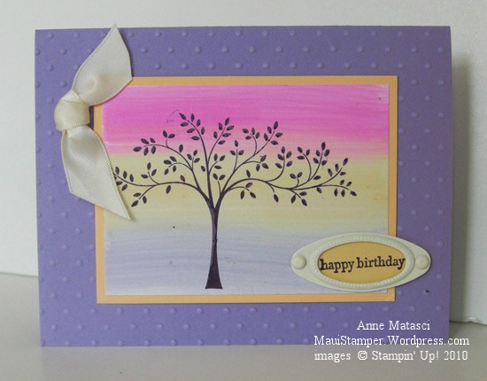
That said, I like the way it looks in this card:

Stampin' Up! Lavender Lace Thoughts and Prayers

  • Thoughts and Prayers and Teeny Tiny Wishes stamp sets
  • Lavender Lace, Apricot Appeal and Glossy White card stock
  • Elegant Eggplant Classic ink pad
  • Lavender Lace, Apricot Appeal, and Pixie Pink Classic ink refills
  • Styled Vanilla Hodgepodge Hardware; Big Shot and Perfect Polka Dots Impressions folder
  • Double Rectangle punch and 5/8 inch Vanilla Satin ribbon

The background behind the fabulous tree from Thoughts and Prayers is the oh-so-easy Striped Wipe technique.  I am such a fan of that tree.   It’s graceful and has just enough asymmetry to give you room to embellish away without disturbing the balance of the card.

Lavender Lace looks great with Pixie Pink, which ought to give you a clue to my feelings about Pixie Pink!  I’ll miss Apricot Appeal though – my upline uses it a lot and I’ve learned to love it.

Speaking of Crystal, I saw her twice last week and got to feed baby Isaac.  He’s a man-child, always hungry.  What is it about baby boys?  It’s hard to get their little tanks all filled up.

Off to fill up my Stampin’ Tank.