The first cut is the tricky part

What’s it gonna be today?

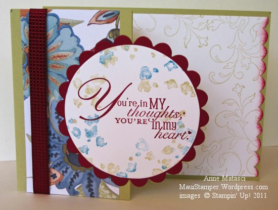
You're in my heart

  • Word Play, Creative Elements and Simply Soft stamp sets
  • River Rock, Cherry Cobbler and Whisper White card stock
  • Paisley Petals Designer Series paper
  • River Rock, Cherry Cobbler and Marina Mist Classic ink pads
  • Cherry Cobbler Quilted Satin ribbon
  • Big Shot, Scallop Circles 2 and 3 inch Circle Bigz dies
  • Scallop Border punch
  • Stampin’ Sponge

I love this specialty cut, but I have a confession to make.  Every time I run this through the Big Shot, I make a mistake (or two) and ruin two or three pieces of paper.  The placement of the cutting pads on the Big Shot is a little tricky and I always goof it up.  I got that Sheryl Crow song stuck in my head – you know – “The first cut is the deepest, Baby I know!”

THIS video tutorial does a great job of demonstrating how to make this cut, and I’ve bookmarked it so I can review it every time!  I used a card with the fold on the narrow side instead of the wide side, but it’s the same principle.

Those little smudgy bits around the edge of the circle are one of the two-step “filler” stamps from the Simply Soft stamp set.  Just the right amount of texture!  You could do a lot of different things with those smudgy bits.

A special card for a special couple

We have some dear friends who were married this month, and they needed a special card:

Brooke and Jeff

  • Sweetly Said and Creative Elements stamp sets
  • Wisteria Wonder, Concord Crush, Pear Pizazz, Shimmer White and Whisper White card stock
  • Wisteria Wonder and Concord Crush Classic ink pads
  • Blossom Builder and XL 2 Step Bird punches
  • Big Shot and Fun Flowers L die
  • Stampin’ Sponges
  • Vanilla Smooch Spritz
  • Champagne Mist Shimmer paint mixed with rubbing alcohol in a spray mist bottle
  • A retired brad (oops, my bad)
  • Mini Glue dots and Tombo the wonder adhesive

I love making these flowers (I know – surprise, surprise).  But they really add something special to a project!  They’re a leeeetle bit tricky to get into an envelope, but I’ve even mailed them using a larger padded envelope (#116911, #2.95 for 3).  This was a hand-delivered card, so I put it in a Medium envelope and gently closed the flap.

I really love that Creative Elements stamp set too.  It always seems to supply the right image when I’m looking for something…you know, that kind of looking when you don’t know WHAT you’re looking for but you know you’ll recognize it when you find it?  That kind of looking.

The paper in this flower has been mashed into a completely new substance.  It almost feels like raw silk when I’m done mashing it.  Once I get it like that, I mist it with the Champagne Spray until it’s pretty damp, then shape it and set it aside to dry.  When it’s dry, it stiffens up a bit and holds its shape.  I don’t know how that works, I just know it happens.


Wow Cards: Uno

I liked the little card so well, I turned it into a full sized card for my WOW class:

Marina flower full card

It’s almost exactly the same – except there isn’t a pocket on the front.  This card still opens from the top, and the inside has a lovely panel but I forgot to take a photo of that.  Honestly, I must be sniffin’ the Tombo these days because I seem to forget more than I remember!!

I tried something a little different last week – a WOW card class.  In the past when I’ve done card classes I’ve tried to have something for everyone, but I’ve learned it’s pretty difficult to please all of the people, all of the time.  The people who like simple cards don’t want to fuss with detailed cards, and vice versa. This time we focused on details – lots and lots of details!  Cheryl said she had to stand up to get it right.

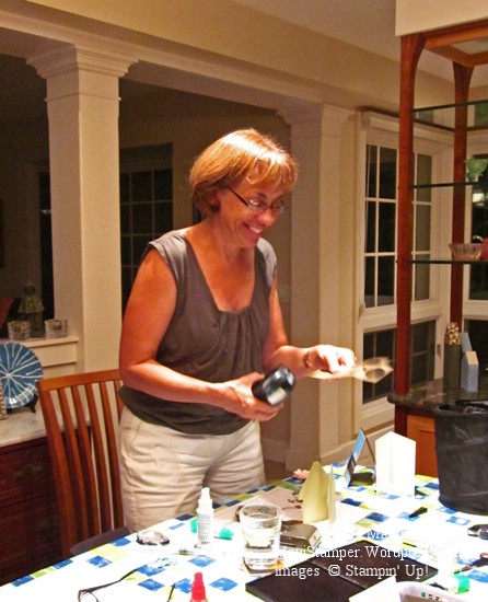
Cheryl the Stand Up Stamper

Her hands were flyin’!  I took 3 different photos and her hands are a blur in every one!  I have to confess that when I really get into a project I stand up too.  I just can’t seem to concentrate if I’m sitting down, or maybe it’s just that I have to get my whole body into the process.

Hmmm.  I wonder if Weight Watchers will assign a Points Plus activity value for aerobic card making and paper crafting?

A special order

Last week I was asked to design pocket cards to coordinate with an internal promotion a local business was doing for its sales staff.  The manager at the store wanted something that would set this promotion apart, and she gave me a sample of the card that her employees would receive.

I had a fabulous time playing with this project!  The sample that I received was trendy but very classy – much like the merchandise in this store.  The employees are all female, so I was free to encourage my feminine muse.  Here’s the result:

Marina Mist flower card holder

Because this project is sized to hold the equivalent of a business card, I was able to make it stand up.   It’s like a greeting card that opens from the top instead of the side, but there’s a pocket on the front to hold the card.  It looked GREAT with the enclosure inside – but I can’t share that with you.  This was such a fun More Is More project!

I used the Creative Elements stamp set with Shimmer White, Early Espresso, Crumb Cake and Marina Mist as the color palette, and I’m sure you can figure out the rest.

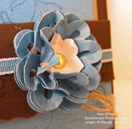
Here’s the flower embellishment up close:

Marina Mist Flower Embellishment

I heard they were a big hit with the staff – that feedback was music to my ears.  It’s one thing to love what you do, but when you create something for someone else and they love it too, that’s incredibly satisfying.

Come back tomorrow for another adaptation of this project!

And now for something completely different…

How about a little Vintage Style?

Creative Elements Cherry Cobbler

  • Creative Elements and My Friend stamp sets
  • Very Vanilla, Cherry Cobbler and Crumb Cake card stock
  • First Edition Specialty Designer Series Paper
  • Crumb Cake and Cherry Cobbler Classic ink pads
  • Cherry Cobbler Seam Binding
  • Stampin’ Dimensionals

Love this First Edition paper!  Fun and easy to work with – it’s very smooth and light-weight and takes to tearing and crumpling quite well.  It’s become something of a “go-to” paper in my stash because it blends in with everything…sort of the Little Black Dress of papercrafting.  I just have to remember to pair it with Very Vanilla instead of Whisper White.  You would think that would be obvious.

I tweaked this card a little bit and am taking a few to Salt Lake City for convention to swap.  Convention will be a fresh experience for me this year as I’m sharing it with some of the Maui Stampers team.  The first time I attended, I roomed with a wonderful Canadian demonstrator (Hi Wendy!) that I met through another Canadian demonstrator who came to one of my classes when she was on Maui (Hi Jane!)  I felt like an honorary Canadian that week, and they showed a rookie the ropes of Convention.  Last year Robbie and I took our 60’s gig on the road and had a blast, and we came back and did our best to motivate (is jealousy a motivator??) our teammates to join us.  I’m looking forward to sharing this experience, and to meeting new friends and re-connecting with others.


Finding the right words

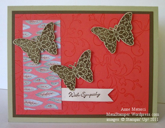
Sympathy cards are a challenge for me.  It’s hard to get just the right balance, much less put into words those feelings that are really wordless.  There have been a couple of difficult losses in our community recently, and each called for something unique.  I made this card for a family who lost a brilliant, compassionate, loving husband and father after a long battle with leukemia:

Creative Elements Sympathy

  • Teeny Tiny Wishes and Creative Elements stamp sets
  • River Rock, Soft Suede, Naturals Ivory and Calypso Coral card stock
  • Paisley Prints Designer Series Paper
  • Soft Suede and Calypso Coral Classic ink pads
  • Stampin’ Dimensionals
  • 1 1/4 inch square punch

I chose these bold colors to convey life and vibrancy.  I’ve experienced my share of loss, and in for me it’s the emotion, not the words that convey sympathy.  When you can share in person, you can say so much with touch – a hug, a squeeze of the hand – and the wordless communication in your eyes.  I won’t be able to see my friends in person, and I hope this small token of my love brings some comfort to them.

Blues and greens – my favorite combination

If I had to choose only one color combination to work with it forever would be blue with green:

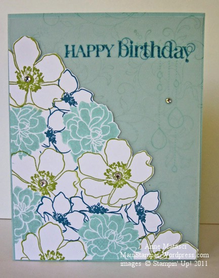
Pool Party Vellum Florets

  • Fabulous Florets, Creative Elements, My Friend and Curly Cute stamp sets
  • Whisper White and Pool Party card stock
  • Vellum card stock
  • Pool Party, Island Indigo and Lucky Limeade Classic ink pads
  • Rhinestone Jewels

Love these stamps, love this technique, love this look!  More masking – yep, you’ll see this again – and some vellum too.  My cards were starting to have a “same-same” feeling to them and I’ve been looking for ways to switch them up.  New colors certainly help, and of course new stamps always make a big difference, but I wanted a different feeling.

Finding a new layout always makes a difference.  There are loads of sources for new sketches and many of them have challenges – Mojo Monday is one of my favorites.  Sometimes a sketch seems to fall into place, and other times it becomes a battle, but new sketches are a great way to bring some freshness to your projects.

I like the trimmed edge on this card, making the floral collage into one giant focal point.  Don’t be intimidated because it’s just not that hard!  It’s a quick way to give your card new perspective.