Happily Mauied

Mr Maui Stamper and I celebrated our 31st wedding anniversary last week.  It’s hard for me to believe that many years have gone by!  Math has never been a strong point for me, and clearly there’s some sort of mistake here.  I’m barely 30 years old myself – right???

Making a card with Designer Series Paper called Mocha Morning was clearly the perfect choice for a couple of coffee lovers:

Mocha Morning Anniversary

The geometric layout and neutral color scheme give this card it’s strong masculine theme despite a curly-cue or two.  And since this was a hand-delivered card, I got out a big Neutrals Designer Button for the front.  I know you can attach buttons with glue dots, but I much prefer stitching them on.  It doesn’t take all that long to make a couple of holes with the Pokey Doodle (Thank you, Heather Summers!) and thread a little Linen Thread through the holes and make a knot.  I like knowing that button isn’t going to fall off.

There was a little part of his present that I didn’t have on hand to put in his package (yes, there might be one or two disadvantages to living 2500 miles out in the Pacific Ocean!!)  I made a coordinating 3×3 notecard to tell him about it:

Morning Mocha 3x3

Who takes these photos anyway?  Operator error.  I would never take such a crooked photo.

By the way, if you’re one of those Plan Ahead sorts of people, scoot yourself on over to the Clearance Rack.  Lots of beautiful accessories and gorgeous holiday products at GREAT prices!  Clearance Rack merchandise is only available through the Online Store because supplies are so limited, so if you love it, buy it!  You won’t regret it 🙂

Re-use, reduce, recycle

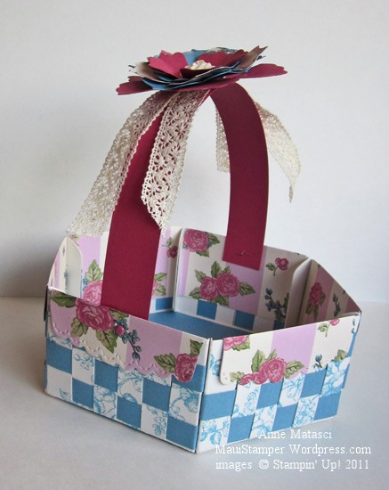
I was in search of a bigger basket, one that would be sturdy enough to hold more than a couple of pieces of chocolate.  I found a beautiful example on Mary Jo Albright’s blog, complete with a tutorial:

Mary Jo Albright's scallop envelope basket 1

  • Elements of Style stamp set
  • Marina Mist and Rose Red card stock
  • Springtime Vintage Designer Series Paper
  • the stiff white 12 x 12 sheets that come in the back of the Stampin’ Up! DSP package
  • Marina Mist Classic ink pad
  • Victoria Crochet Trim;  Tombo the Wonder Adhesive
  • Vintage Flowers Adornments; brads
  • Big Shot and Scallop Envelope and Fun Flowers Bigz dies

You read that right – this basket is made from the Scallop Envelope cut out of the stiff white sheets from the back of the package of the DSP.  I stamped on them to disguise them , and I was pleased with how strong they made the project.  And it’s so green!

I really need to go back and give this basket a little step-up treatment.  It was a club project, and I knew we would be challenged to finish in the amount of time we have, so I left the handle pretty plain.  We did make a layered flower to put on the top, but it looks a little lonesome sitting there by itself.

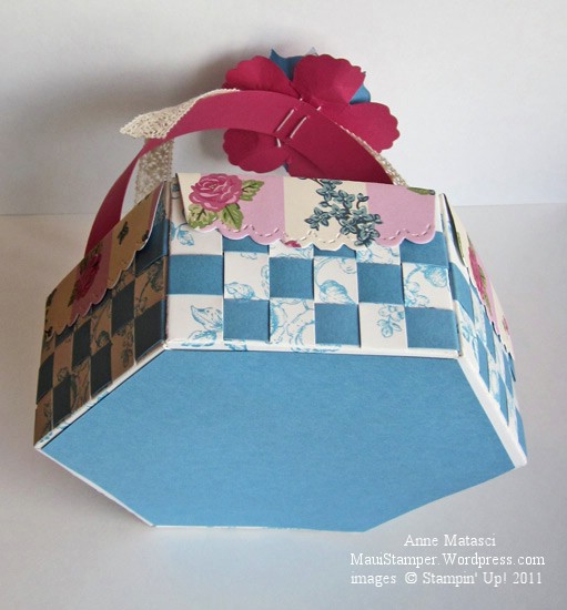
Scallop Envelope basket 2

I wanted the bottom to be finished, and I also wanted to stabilize the base to make the basket sturdy.  I cut a hexagon from Marina Mist to put inside, and a second one to finish the bottom.  Wow.  It looks so simple, written like that.  Have you tried to cut a hexagon lately?  A nice, symmetrical one?  Let’s just say it’s been a long time since geometry!  I tried a number of techniques, but in the end I do what I generally end up doing:  I winged it.  And for being winged, I thought it came out pretty well:

Scallop envelope basket 3

Ha – oops, you can see my stitches.  I get teased all the time because I like to sew things on.  I hate it when things fall off!!  Just don’t look too closely at my hexagon, ok?


Soothing Sahara Sand

Sometimes you need a card that is soothing.  Your message is simple and subdued, and your colors and images need to fit the same criteria:

Soothing Elements of Style

  • Elements of Style and Teeny Tiny Wishes stamp sets
  • Very Vanilla, Soft Suede and Sahara Sand card stock
  • Soft Suede Classic ink pad
  • Oval and Small Oval punches
  • 3/8 inch Vanilla Taffeta ribbon
  • Basic Pearl Jewels
  • Stampin’ Dimensionals

Although this card didn’t start out to be this understated I’m happy with it all the same.  As a matter of fact, if I’d set out to create a card that looked like this I’m not sure I would have been able to accomplish that task.

The ribbon embellishment is a pair of 1 1/2 inch pieces that are loosely hand stitched along one edge and gathered slightly.  The ends are drawn together and I’ve tied a knot to hold each short piece in a rough semicircle.  They’re attached to the back of the oval with a bit of SNAIL and a second Soft Suede oval is adhered over the first, sandwiching the ribbons in place so they’ll be secure.  The completed embellishment is attached to the card with Stampin’ Dimensionals.

Sahara Sand is an under-appreciated color in our palette.  I need to remember to choose it more often.

Back to the Circle Circus

When is a circle more than a circle?  When it collaborates with others to form a topiary:

Circle Circus matter of Moments

  • Circle Circus and Elements of Style stamp sets; Vintage Vogue wheel
  • Whisper White, Daffodil Delight, Cajun Craze, Crumb Cake and Certainly Celery card stock
  • Cajun Craze, Crumb Cake and Certainly Celery Classic ink pads
  • Modern Label punch, XL Decorative Label punch (Holiday Mini), various circle punches
  • Big Shot, Top Note die and Lattice Impressions folder
  • Hemp twine, Antique Brads, Stampin’ Sponges and Stampin’ Dimensionals

I had the brilliant idea to twist two strands of Hemp Twine together to make the trunk of the topiary, but my execution was flawed – there’s not enough space between the “topes” and you can hardly see it.  This card is finished, but I’ll be back to the drawing board to try that one again.

The new XL Decorative Label punch makes a pretty terra cotta planter, doesn’t it?  I cut it in half and sponged it with Cajun Craze and Old Olive.  I was trying to get a moss-stained look but I think it would be more effective on a lighter color of cardstock – next time I’ll try Peach Parfait.  Oh, and please don’t judge Daffodil Delight – that’s operator error with the camera.  It’s a lovely buttery shade, not that bright yo yo color!

Monochromatic inspiration

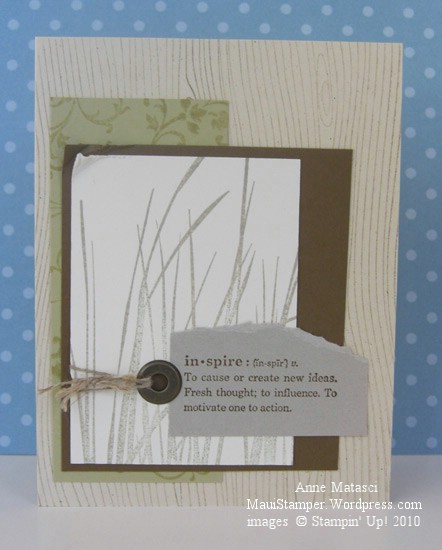
The new catalog uses a monochromatic theme for the pages that begin each new “chapter” of stamps, and the color theme for the All Natural section is neutrals.  It really inspired me when I saw it, and although all the stamps used on that page were new I wanted to recreate that feeling.  I looked through my stamps (never mind how many there are, I’m sure I’ll need new ones!!) and found the look I was seeking:

Inspired by Neutrals

  • Wood Grain, Elements of Style, Inspired by Life and Define Your Life stamp sets
  • Naturals Ivory, River Rock, Soft Suede, Crumb Cake (Kraft) and Very Vanilla card stock
  • Soft Suede, Sahara Sand and River Rock Classic ink pads
  • Crop-a-dile, Jumbo Eyelet and Linen Thread

Did you see that little scrap of River Rock?  I have a folder with just a few scraps that I was — you guessed it — hoarding jealously.  Now I can use them up!  As of July 1st, River Rock is back in the family.  I’ll admit that this Color Renovation is taking a little bite out of my stamping budget, but if it means that colors like Baja Breeze and River Rock are back  in the palette I’ll work with it.  I can make a budget and stick with it.  It’s not like I have to have everything all at once.  Really.  I don’t.  Not at all.

Excuse me, I have to go.  My hypnotist appointment is soon.  I don’t need it all at once…I don’t need it all at once…I don’t need it all at once…

Twitterpated

It’s been quite a day!  I’ve spent a lot of time with the new catalog and have had a few demonstrator friends in to see it.  I don’t know the exact number, but only a few demonstrators qualified for the early release of the 2010-2011 catalog and I feel very privileged to be one of them.  There’s a lot to like here!

Today’s card is actually the card I was preparing to photograph when I opened my front door and the envelope fell inside.  The afternoon light is best in the front of my house, and I was opening the door to get more light when I discovered my package.  You’ll have to forgive the quality of this photograph as I was all twitterpated when I took it 🙂

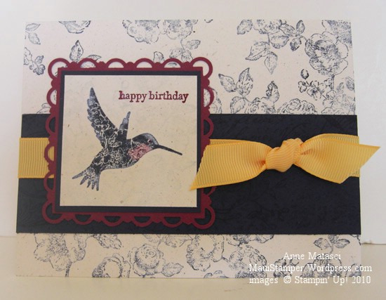
One more Elements of Style card

  • Elements of Style and Teeny Tiny Wishes stamp sets; Very Vintage Wheel
  • Night of Navy, Rich Razzleberry and Naturals White card stock
  • Night of Navy and Rich Razzleberry Classic ink pads; White Craft ink pad
  • Brocade Blue and Rich Razzleberry Stampin’ Write markers; Blender pen
  • Scallop Trim Border and Corner punches
  • So Saffron 5/8″ grosgrain ribbon (retired)

I’m having a good time playing with color combinations on this hummingbird.  I ink the stamp with a base color and use the Blender Pen to selectively remove ink from the stamp.  I add in new color with Stampin’ Write markers in the spaces cleaned by the Blender Pen and huff on the rubber before I apply the stamp to the paper.

It’s not apparent in this photograph, but I used Craft White ink to stamp the “roses” background image behind the hummingbird.  The result is a very soft look, almost like stamping on brocade.

Time to get something done.  My day has disappeared, but in a good way.  Tomorrow I’ll be back on schedule.  Mostly.

It’s gettin’ kinda Birdy around here…

Don’t know what it is about me and birds recently…I must be picking up Bird-Vibes from the cat.  He sits at the sliding glass door in the kitchen and watches the birds.  When they get too close to the door he barks.  Seriously.  He has this goofy sound he makes that sounds like a bark.  We refer to it as his “Birdy Bark”, and that should tell you all you need to know about how wacky this household is.  I think we’d better move onto the card before I  reveal any more deep, dark family secrets:

Elements of Style Ruby Throated Hummingbird

  • Elements of Style and Vintage Labels (SAB) stamp sets
  • Very Vanilla, Bermuda Bay, Rich Razzleberry and Garden Green card stock
  • Thoroughly Modern Designer Series Paper
  • Sahara Sand and Garden Green Classic ink pads
  • Bermuda Bay, Tempting Turquoise, Garden Green and Rich Razzleberry Stampin’ Write markers
  • Rich Razzleberry and Garden Green Classic ink refills; Aquapainter
  • Big Shot and Lattice Impressions folder
  • Scallop Trim border punch; Piercing tool, template and mat
  • Very Vanilla Taffeta ribbon

I really threw the tool box at this card!  I used the Sahara Sand ink pad to lay down the beautiful roses on the Vanilla card stock and then watercolored them with the Aquapainter and the ink refills.  I used markers directly on the stamp to color the hummingbird  and although the colors aren’t perfectly true to life I’m happy with the result.  Just in case you’re wondering, that’s not a new taffeta ribbon – I folded it in half – OK, the truth is I brought it downstairs and IRONED it in half.  It wouldn’t stay when I folded it.  The things I do to get a card just right!

Uh-oh.  Somebody’s barking again.  One of these days those sassy Mynah birds are gonna let him have it.

Regal Roses

The beautiful flowers in the new Elements of Style stamp set have to be old fashioned roses.  My grandmother had a beautiful pink rose that looked much like this growing on the fence in her back yard.  It was pink and it was named Carol – my mother’s name – and Gramsie took great pride in it.  All of the roses in her garden had such intoxicating scents – one time she gave me a bouquet to take back to school after I visited her, and a complete stranger actually stopped me and asked to smell them up close.  I imagine these roses to have that kind of wonderful fragrance:

Elements of Style Regal Roses

  • Elements of Style stamp set
  • Certainly Celery and Regal Rose card stock;  Watercolor paper
  • Sahara Sand Classic ink pad;  Chocolate Chip Stampin’ Write marker
  • Old Olive, Crushed Curry and Regal Rose Classic ink refills
  • Scallop Trim Border punch; Aquapainter
  • Chocolate Chip 5/8″ Satin Ribbon

I’m debating on whether or not I should add a sentiment.  The watercolor paper has quite a bit of texture so I’m not sure I would get the look I want.  I think I’ll add the appropriate message to the inside of the card when I’m ready to send it.  I like to have a few “ready to personalize” cards set aside for special occasions.

Are you wondering where that Sahara Sand Classic ink is?  When I want to watercolor something with this much detail but I don’t want to see the lines on the finished card, I use Sahara Sand to put the image on the paper and then use the Aquapainter to add my color.  If you look really closely you’ll see some lines in some of the roses, but for the most part the Sahara Sand ink disappears.  Pretty sneaky, wouldn’t you say?

Now we’re hummin’…

I grew up in Santa Barbara.  It’s one of the most beautiful cities in the country, tucked between the mountains and the ocean and blessed with beautiful weather all year round.  I’ve always joked that being raised in that temperate climate has given me a 7 degree comfort zone – I like it between 75° and 82° – and it’s really not much of a joke.  Moving to Maui over 20 years ago was a glorious adjustment!

One of the things that Maui lacks and Santa Barbara has in abundance is the hummingbird.  I love the brilliant colors, the zoom-zoom as they zip by, and their arrogant little territorial attitudes about feeders.  I can even pick out the sound of a hummer singing, though it took me a long time to learn that song.   Tough as hummingbirds are, the commute from the Mainland to the Hawaiian Islands is tougher, and we have to settle for paper hummers:

Hummingbird Elements of Style

  • Elements of Style stamp set
  • Whisper White, Rich Razzleberry, Certainly Celery and Tempting Turquoise card stock
  • Rich Razzleberry, Certainly Celery and Tempting Turquoise Classic ink pads
  • 1 and 1 1/4″ circle punches, Black Stampin’ Write Marker, Stampin’ Dimensionals
  • Certainly Celery 5/8″ satin ribbon, Golden Glow Smooch Spritz, Paper snips
  • Big Shot and the Lattice Textured Impressions Folder

I’ll thank you to notice that I managed to make a card using only ONE stamp set today!!

That new Lattice Impressions folder gives amazing results.  First of all, there are two patterns – a basketweave for the positive side and an open lattice for the negative side – take your pick.  Secondly, the impressions are so deep and so close together that it completely changes the character of the paper.  The paper softens, but has a beefier heft (I know, not a very kind description) and I think it will be really interesting to try in 3-D projects.  Stay tuned for more on this subject!