Graduation Season

It’s that time of the year…caps and gowns and diplomas, oh my!

No graduates in my house – or my immediate family – this year, but we have lots of friends graduating from high school and college.  I’ve enjoyed making cards for them with little nods to their schools and even their personalities.  That’s the whole point of a hand-made card, isn’t it?

Fifth Avenue Floral Congratulations

  • Fifth Avenue Floral, Elements of Style and Well Scripted (retired) stamp sets
  • Whisper White, Brocade Blue and Night of Navy card stock
  • Brocade Blue and Night of Navy Classic ink pads; Whisper White Craft ink pad
  • Versamark ink pad; Crushed Curry Stampin’ Write marker, Vanilla Smooch Spritz
  • Embossing Buddy, Powder Pal, Clear Embossing Powder and Heat Tool
  • Scallop Border punch, Elegant Bouquet Impressions Folder and Big Shot

My little point-and-shoot doesn’t pick up the details too well, but there’s Smooch Spritz (I can’t decide if I should laugh or cry when I say that) on the floral panel and the sentiment is embossed with clear embossing powder.  The Craft White ink is on the Night of Navy panel behind the sentiment.  It was originally larger and destined for another use but I scrapped the entire concept on the basis of irreconcilable differences – that card was NEVER going to work.  The pieces survived to find purpose in an alternate relationship!

I’m ought to apologize for using a retired sentiment, but I don’t feel too badly about it.  There are tons of great “Congratulations” stamps out there and I’m sure you’ll find a substitute if you don’t have this one.  There are always so many great sets in the mini catalog (this was the Occasions Mini) and it always seems as though there’s one set you should have purchased when you had the opportunity.

It’s a glorious Maui day and my son is finished with finals today, so his sister and I are going to take him out to lunch in Lahaina.  Too nice a day to stay inside, even for stamping!

Singin’ the Blues with PPA

In case you haven’t noticed, I’ve been cruising through a lot of different challenge blogs and forums recently.  It’s a great way to shake up my projects a little and keep things fresh.  It’s easy to use familiar color combinations and card layouts, but after a while it gets boring.

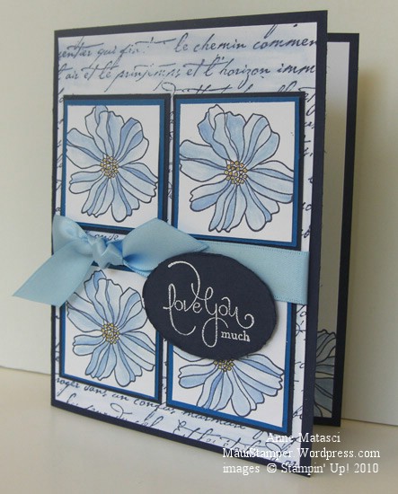
I haven’t settled on any particular favorites but if I do I promise I’ll share.  The layout for this card is from Sketch Girl, and it appeals to my sense of orderliness.  Today’s colors are courtesy of the Paper Pal Arts Monochromatic Blues Challenge (PPA40) and I knew the moment I saw the challenge that it would make me happy.  I don’t think there’s a shade of blue I dislike, and the clean look of blue and white is one of my favorites.  I had a lot of fun with this card:

5th Avenue Floral Paper Arts Pals Challenge

  • Fifth Avenue Floral, Well Scripted and French Script stamp sets
  • Whisper White, Night of Navy and Pacific Point card stock
  • Not Quite Navy Classic ink pad; Craft White ink pad
  • Crushed Curry Stampin’ Write Marker; Bashful Blue Ink refill and the Aquapainter
  • Bashful Blue Satin ribbon, Large oval punch, white embossing powder and the heat tool

And yes, I blurred the French Script lettering with the AQP on purpose!  Lately I can’t seem to make a card without using the Aquapainter for something.  For the past couple of days, I’ve only been able to find the small-brush AQP – the large-brush one is AWOL.  It’s driving me crazy (admittedly, a very short drive) because I’m somewhat OCD (or as my daughter likes to point out, CDO – alphabetical order).  I Do Not Like To Lose Things.  And I use that AQP a lot!  (deep breath…another one…it’s going to be okay…really.)

Ahem.  I had a marvelous time with this card.  The concept was clear in my head before I started, and although I made a few adjustments as I went along the process was very enjoyable.  This is not always the case, as evidenced by the card in the trash can in my craft room.  When I finished this lovely Ode to the Blues I thought my mojo was firmly in place and started in on another sketch challenge I’d seen.  I spent way more time than I’d planned trying to make it work, changing focal points and orientation and struggling mightily.  I finally finished it and set it aside to look at this morning, which is often the perfect solution.  Sometimes looking over a not-quite-there project after a good night’s sleep will produce that Ah-ha! moment that fixes everything.  But this card was immune to Good-Sleep-Therapy.  I ripped off the salvageable bits and threw the rest away.  It’s only paper, after all.

Keeping your feet firmly planted

Whew.

The past week has been so full.  Early Saturday morning we took Carol to the airport, said our goodbyes (a few extra times for good luck) and put her on the plane for Perth.  Getting to that point was physically and emotionally exhausting, but once we were there, it felt much better than I’d anticipated.  Of course we shed tears, and continue to do so (like right now, typing this post).  Her dad and I know this is the right move for her, and after all the sorting, packing and problem solving of last week we are ready to let go.  She’s ready too – sorry to leave Maui, but happy to finally live in the same time zone as her boyfriend.

I haven’t accomplished much since Saturday.  I did engage in something of a cleaning frenzy yesterday.  My son grumbled that it was his sister’s fault that I suddenly needed all his stuff  Put Away Now, but he knows I’ll get over it.  My next task is to clear out the debris that remains in Carol’s room, clean it up, and return it to the purpose it fulfilled so well for 4 years of university:  My Stamp Room.  Ah yes.  Every cloud does have its silver lining.

In the meantime, I sat down at the disaster area that currently functions as a stamp space and made a card.  Boy, did that feel good.  So good, I think I’ll make another later on!

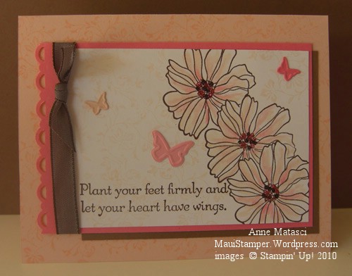
Plant your feet firmly and let your heart have wings

  • Fifth Avenue Floral, Vintage Vogue, and Hope Happens Stamp sets
  • Whisper White, Regal Rose, Blush Blossom and Close to Cocoa card stock
  • Chocolate Chip, Blush Blossom and Regal Rose Classic ink pads
  • Big Shot and Beautiful Wings Embosslit die
  • Chocolate Chip taffeta ribbon, Aquapainter and the Scallop Trim border punch
  • Stamp-a-ma-jig, Embossing Buddy, Fine Supernova Stampin’ Glitter and Tombo Adhesive

The color inspiration for this card came from colourQchallenge – this is ColourQ 19.  I used the same embellished leaf stamp from Vintage Vogue on the Blush Blossom card base and the Whisper White focal image, but I stamped it off on the Whisper White panel to make it more subtle.  To get the mixed colors with the glitter, I dotted Tombo adhesive in the center of the flower a few times and dusted with the Chocolate glitter, then repeated and dusted again with the Pink glitter.  Don’t forget to use your Embossing Buddy on your cardstock before glittering – it really makes a difference!

Bunches of flowers

These floral outline stamps make a quick and easy card.  It’s easy to layer them by using a simple mask:  stamp the image on a re-positionable note and cut the image out.  When you’ve stamped your first image, cover it with the mask and stamp an overlapping image.  I keep my masks in the plastic box the stamp sets come with, because a little bit of Dotto will refresh the “stickiness” of the mask for many more uses.  You can use scrap paper and dotto with the same results, but make sure the paper you use for the mask is lighter than cardstock weight or you’ll have gaps around the edges of your mask.

5th_Ave_Thanks_crop

  • Fifth Avenue Floral stamp set and a retired sentiment
  • Dusty Durango, Pumpkin Pie and Apricot Appeal Classic Ink pads
  • Very Vanilla, Dusty Durango and Apricot Appeal (sorry, it looks kinda yellow) card stock
  • Pumpkin Pie narrow grosgrain ribbon and Scallop Edge punch

The Stampin’ Up! color families make it so easy to design a monochromatic card.  It’s one of the things that sold me on Stampin’ Up! right from the start.  It would be simple to change this color scheme into pinks, reds, golds, lavenders, even blues and greens if your flower favorites run avant garde.