DIY CARD-MAKING TIPS FOR SPECIAL CELEBRATIONS

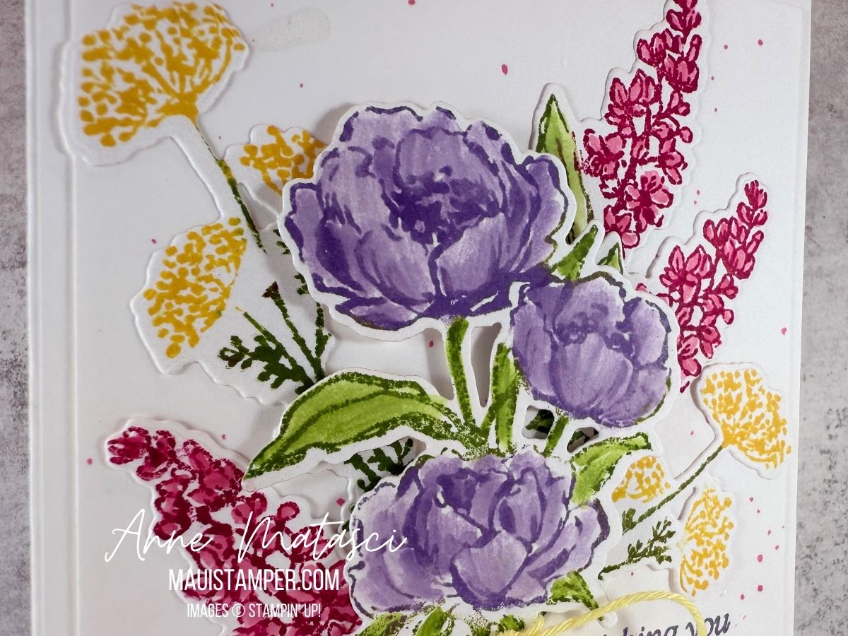
One of the best reasons I know for making a handmade card is to honor someone special. I was invited to a bridal shower last month that I couldn’t attend (something about 2,363 miles over the ocean). I really wanted to be there, so I sent my heart in a handmade card:

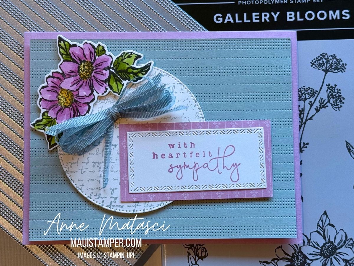
  • Stamps: Delightful Wishes
  • Color Palette: Basic White, Crumb Cake, Timid Tiger
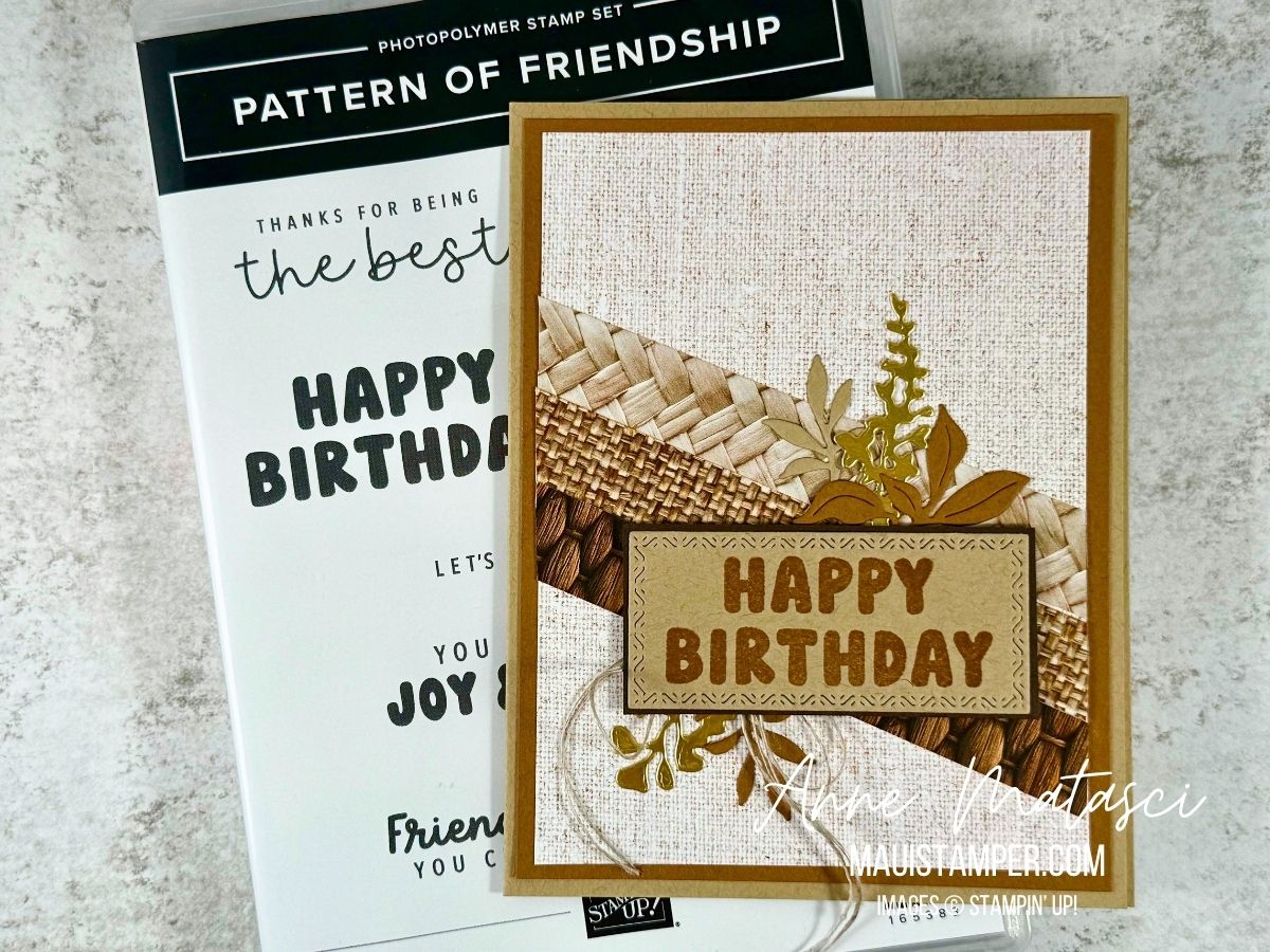
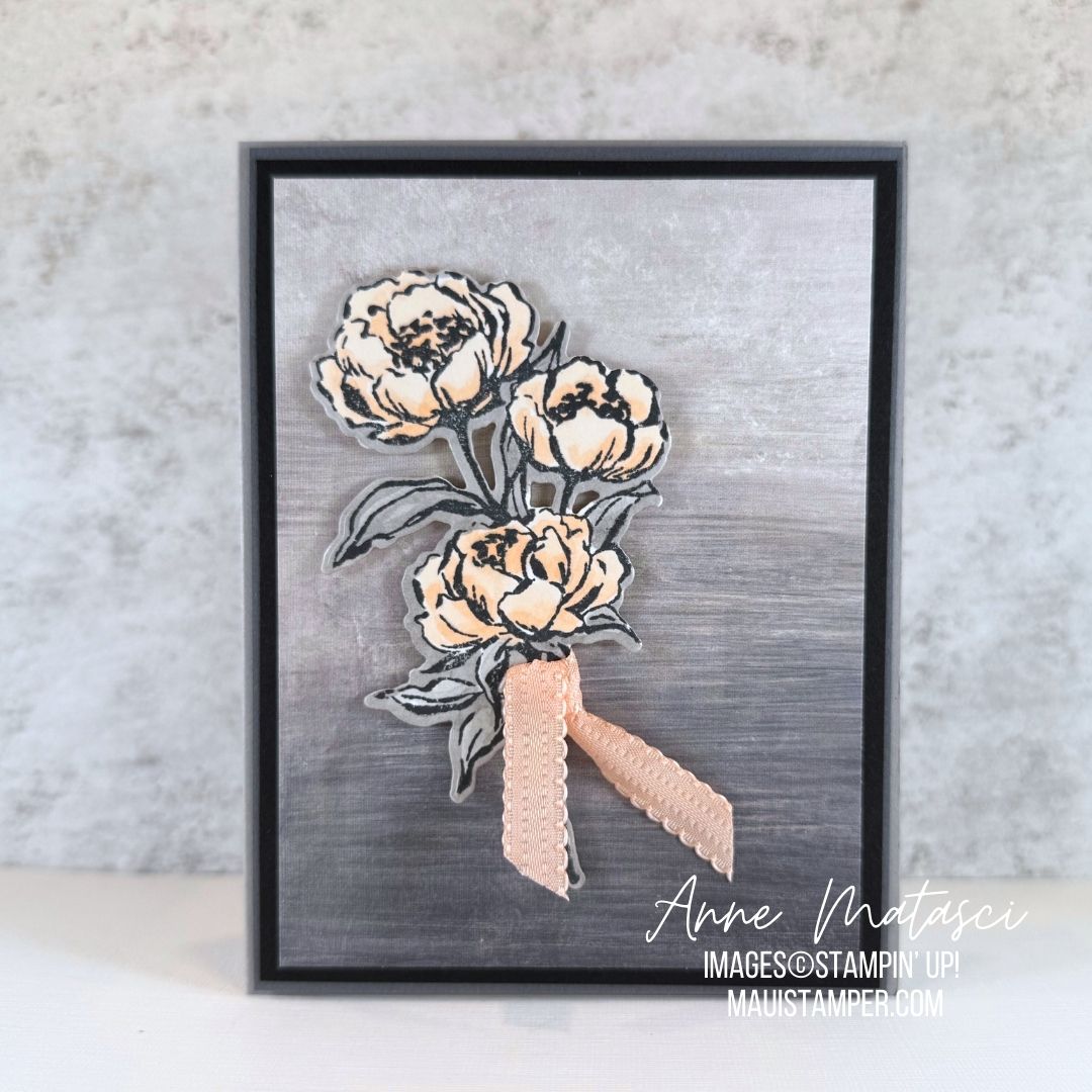
  • Accessories: Stamp Cut & Emboss Machine, Gallery Blooms dies, Textured Notes dies, Delightful Wishes dies, Patterns of Friendship die, Perfectly Pears die, Linen Thread, Dauber, vellum, Stampin’ Dimensionals

I used a LOT of different dies for this card. If it seems larger than usual, you have a good eye: I made this card a 5 inch x 7 inch format. I layered paper and texture, but since I had to mail it, I left off any embellishment other than my beloved Linen Thread.

My technique for this card was relatively simple: I set out a stack of papers of papers for layering and played with them, then die cut multiples of all my favorite floral bits and pieces and moved them in and out over the top panel until I was satisfied. It wasn’t exactly scientific, but it worked for me!

To add texture to the layers, I started with the Patterns of Friendship die. It’s one of my all-time favorites for texture, and I’m very sad to see it on the Last Chance list – but if you hurry, you can get a great deal on it. The Textured Notes dies are another product I consider indispensable for simple elegance – if they’re not in your crafty stash, maybe they should be!

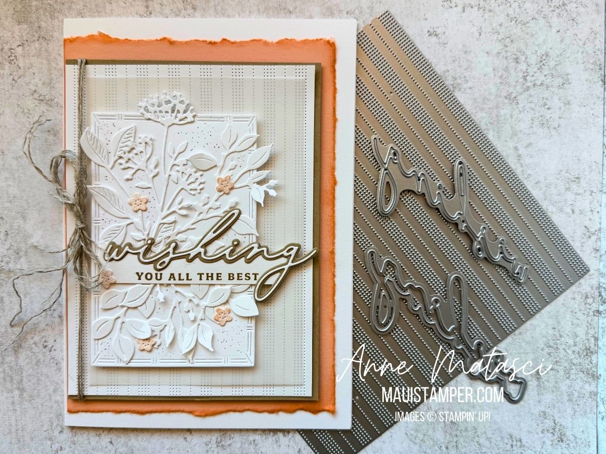
Our niece – and Goddaughter – will be married in November, and that flight has been on the books for months! I won’t miss the wedding for the world. But since I couldn’t be at the shower, I sent her my love with a paper hug.

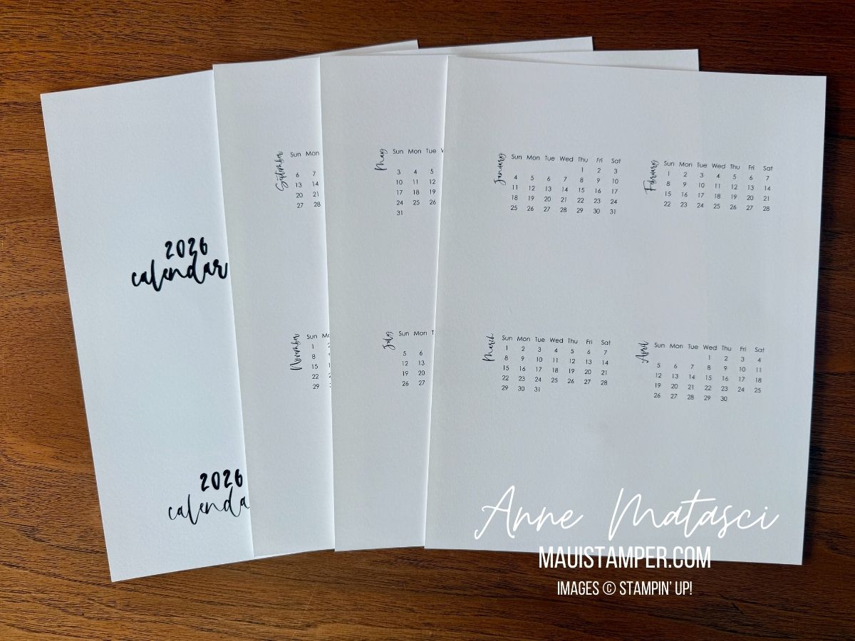
The 2026 DIY CALENDAR TEMPLATE is available! Buy it HERE.

Processing…
Success! You're on the list.

WOVEN TEXTURES FOR A MANLY CARD

The Woven Textures DSP is absolutely perfect for a Manly Card. This card is a CASE of a stunning card by my dear friend Cheryl Hamilton, and I didn’t make a lot of changes. I did choose to add some Gold Foil for a little shine, and of course every card needs Linen Thread!

  • Stamps: Patterns of Friendship
  • Color Palette:Crumb Cake, Pecan Pie, Early Espresso, Gold
  • Accessories: Stamp Cut & Emboss Machine, Textured Notes dies, Gallery Blooms dies, Woven Textures DSP, Gold Foil, Linen Thread, Stampin’ Dimensionals

Be sure you adhere your diagonal strips to the DSP panel BEFORE you attach the panel to the card stock mat. Ask me how I know. 😳

There are multiple variations within the Woven Textures pack, and there are certainly other die cuts that would work to embellish the sentiment panel. This is a design that can be adapted almost indefinitely – use what you have.

What DSP has been neglected in your stash? Isn’t it time you pulled it out? I’ve done my best to give you some ideas – let me know how it goes.

Processing…
Success! You're on the list.

PATTERNS OF FRIENDSHIP: THE BIG DIE YOU DIDN’T KNOW YOU NEEDED

I initially overlooked Patterns of Friendship because the stamps didn’t stand up and shout at me. But when I started seeing projects with this amazing texture, I went back to the Online Store and looked again, and there she was: the Patterns of Friendship die.

  • Stamps: Gallery Blooms, Elements of Text, Country Flowers (retired)
  • Color Palette: Basic White, Cloud Cover, Fresh Freesia, Daffodil Delight, Granny Apple Green
  • Accessories: Stamp Cut & Emboss Machine, Patterned Friendship dies, Gallery Blooms dies, Textured Notes dies, Stylish Shapes dies, Cloud Cover Faux Linen Ribbon, Floral Impressions DSP, Stampin’ Dimensionals

Have you added one of the In Color Faux Linen Ribbons to your crafty stash? Oh, my – it’s gorgeous! I sliced this one lengthwise and used just a single strand to secure the bundle. That keeps the bow a little softer and mailing-friendly.

Gallery Blooms are perfect for coloring, and I used Stampin’ Blends this time. This closeup reveals a little detail: I used a scrap of Floral Impressions DSP behind the sentiment. It’s a little extra bit of texture in a card that’s already bursting with texture.

The Patterns of Friendship die is 6″ x 6″ so you can cut your panel to run either horizontally or vertically. If you look closely, you’ll see that the rows of little dots are balanced so that a 4″ card stock panel lands exactly between the rows. I love those kind of (semi-OCD) details.

I’m a bit of a texture nerd, so you can imagine how pleased I am with this new die. (Bonus: when you peel the card stock off the die, it makes a very satisfying noise.) There are multiple layers here: the dies, the paper layers, the DSP, and that big crazy ribbon. Have fun with it! You can find everything you need in the Online Store.

Processing…
Success! You're on the list.

COLOUR CHALLENGES: COLOUR INKSPIRATION #189

My friends at Colour INKspirations know how to set up a proper challenge! This combination was a tough one, as Melon Mambo generally doesn’t get much my attention. But by toning it down using daubers, I came up with a project that met the challenge!

  • Stamps: Impressions Abloom, Elements of Text, Perfectly Pears, Inspiring Imperfections
  • Color Palette: Basic White, Darling Duckling, Melon Mambo, Cloud Cover, Secret Sea
  • Accessories: Stamp Cut & Emboss Machine, Impressions Abloom dies, Perennial Postage dies, Gallery Blooms dies, Exposed Brick 3D Embossing Folder, Kintsugi Inspirations DSP, Dauber, White Bakers Twine, Wink of Stella, Fine Tip Glue pen, Stampin’ Dimensionals

Here’s the inspiration photo. I knew right away I was going to have to be “INKspired” to work in that Melon Mambo! And while I adore Secret Sea, it’s a very bold color, so I used it sparingly as an accent.

Looking for elements for this card, I pulled out some treasures that are still available but have been sidelined in favor of newer releases. That 3D Exposed Brick EF is one of my absolute GO-TO elements. White Bakers twine is too, although it will never replace my beloved Linen Twine.

I used our Fine Tip Glue pen to add shine to the centers of those flowers. They have a little Cloud Cover daubed in the center to soften the white-white-white and tie in with the background DSP. My FTGP has lost its Fine Tip, so I unscrew the cap and use my trusty bamboo skewer to paint the glue over the circle. The skewer lets me control the amount I apply but doesn’t leave brush strokes or messy cleanup.

Cloud Cover ink has been a bit of a heartbreak, as it turns out the formula reacts with the foam in our ink pads, causing instability. The solution is to use one of our un-inked spots and Cloud Cover Ink Refill. It takes a bit longer to ink larger stamps, but I think it’s worth the effort!

There’s still a little time to join the challenge. It closes at 7pm Monday AEST (remember, for the US they are a day ahead). I’d love to see what you do with Melon Mambo!

Processing…
Success! You're on the list.

A BOUQUET OF GALLERY BLOOMS

Do you ever finish a card and sit back and sigh with delight? That’s what happened when I finished this one. It’s not quite the picture I had in mind when I started, but guess what: IT’S BETTER. That doesn’t happen every time!

  • Stamps: Gallery Blooms, Beautiful Motifs
  • Color Palette: Basic White, Daffodil Delight, Highland Heather, Strawberry Slush, Melon Mambo, Granny Apple Green
  • Accessories: Stamp Cut & Emboss Machine, Gallery Blooms dies, Dauber, Blender Pens, paint brush, Bakers Twine 3 color pack, Stampin’ Dimensionals

Gallery Blooms are perfect for coloring, and I chose to use Blender Pens. It’s been a while since I pulled them out. but I wanted more control over the shading. I was quite happy with the results, and to be honest, it was faster and easier than using Stampin’ Blends in this case!

I Inked and colored the largest flower with Highland Heather ink, but the spray was inked in Melon Mambo and then colored with Strawberry Slush. With those small, repeated blossoms, I found I liked the deeper outline.

The final touch was ink splatters with a paint brush. Smash the closed lid of your ink pad to transfer ink to the lid. Open it and add a few drops of water. Pick up that dilute solution with a paint brush and splish splash!

It’s easier than it looks. Give it a try! All products are available in the Online Store.

Processing…
Success! You're on the list.

BEAUTIFUL GALLERY #2

I tell you, I can’t get enough of the Beautiful Gallery DSP! It has a little bit of everything and today’s card showcases that variety. I chose one of the “B” sides of the paper – a brushed gradient of grays. I had lots of inspiration for focal points, but ultimately decided to use the largest floral image from the stamp set.

  • Stamps: Gallery Blooms
  • Color Palette: Very Vanilla, Basic Black, Basic Grey, Gray Granite, Petal Pink
  • Accessories: Stamp Cut & Emboss Machine, Gallery Blooms dies, Petal Pink 3/8″ Scalloped ribbon, Glue Dots, Stampin’ Blends , Stampin’ Dimensionals

I colored the blossom in Petal Pink and the leaves in Gray Granite. Then I took the Gray Granite Blend and went all the way around the edges of the die cut, covering any white paper. The card base is Very Vanilla, but I chose to use Basic White for the die cut to keep the colors true.

The ribbon is tied through a small opening in the die cut and looped once. I used Glue Dots to hold the edges of the ribbon in place.

I considered adding a sentiment to the front, but decided I would wait until I decided who would get this card. I love having a stash of blank cards!

Shop the Online Store for this beautiful new suite.

Processing…
Success! You're on the list.