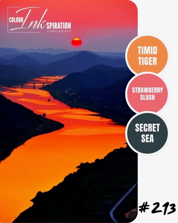
COLOUR INKSPIRATION 213 – ON THE BEACH WITH ROLLING WAVES

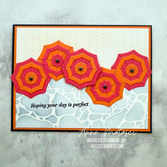
This reminds me of the color scheme of the local diner when I was in high school, and let’s just say that was the Flower Power Era. I struggled for a bit with those bold, bright colors, but decided a beach umbrella seemed like the perfect image.
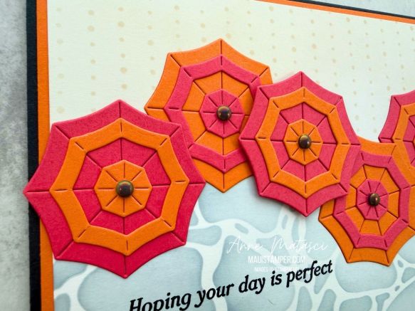
There are Rolling Waves dies to make a solid umbrella as well as a set of concentric shapes that coordinate with it. I alternated the shapes as well as the base colors of the umbrella.
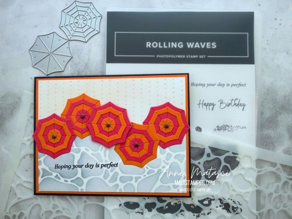
Our 12×12 Water and Dotted Line masks made perfect, subtle backgrounds for this bright card. I find myself reaching for them a LOT – expect to see them again!

Colour INKspirations is a Facebook based color challenge group. Take a minute to check out the CI#213 entries as well as previous color challenges – there are some very talented crafters participating in this group!
Processing…
Success! You're on the list.

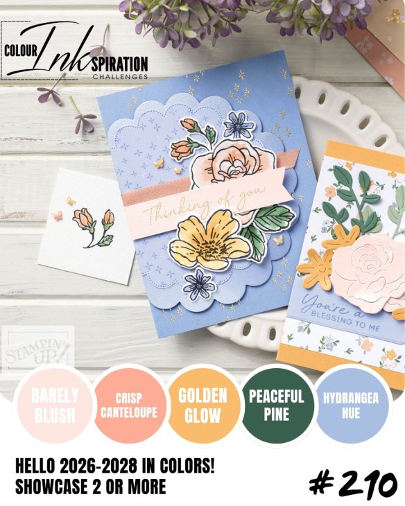
COLOUR INKSPIRATION #210: GUEST DESIGNER!

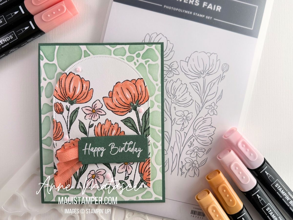
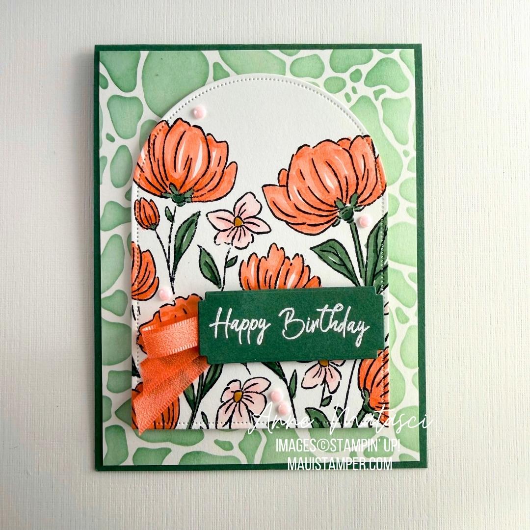
It took me a while to decide where to start as I love all five 26-28 In Colours. I ultimately chose to begin with Crisp Cantaloupe, as it’s a returning colour from the 2013-2015 Palette. Anyone else who has been around that long??

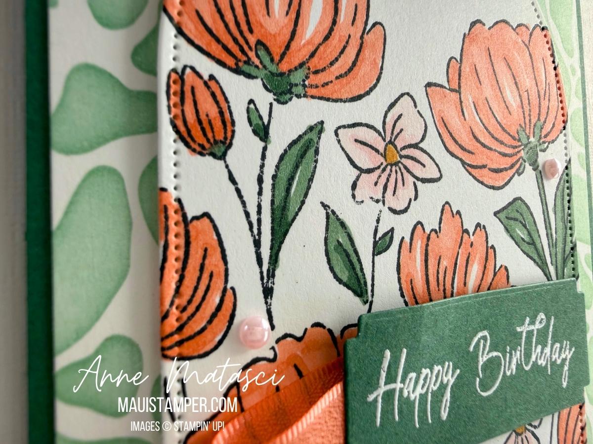
Flowers Fair can be used so many ways. Here I’ve coloured it, then cut it with one of the arch dies. Stampin’ Blends are my favorite way to colour these images, but you could use Watercolour Pencils, Blending Brushes, Watercolour, or even daubers to fill in the colour.

I decided to emboss the greeting with White Embossing Powder on a Peaceful Pine panel. I’m happy with the way the embossing makes the greeting “pop” on the card front.

Take a look at what the Design Team has created for this great colour challenge. If you’ve never played along, I hope you’ll give it a try! You can’t go wrong with such a gorgeous set of colours.

*Although I’m in the US and the standard spelling is “COLOR”, I’ve chosen to use the alternative spelling of “COLOUR” in recognition of the group identity. I’m sure you can make the translation. 😆

Processing…
Success! You're on the list.

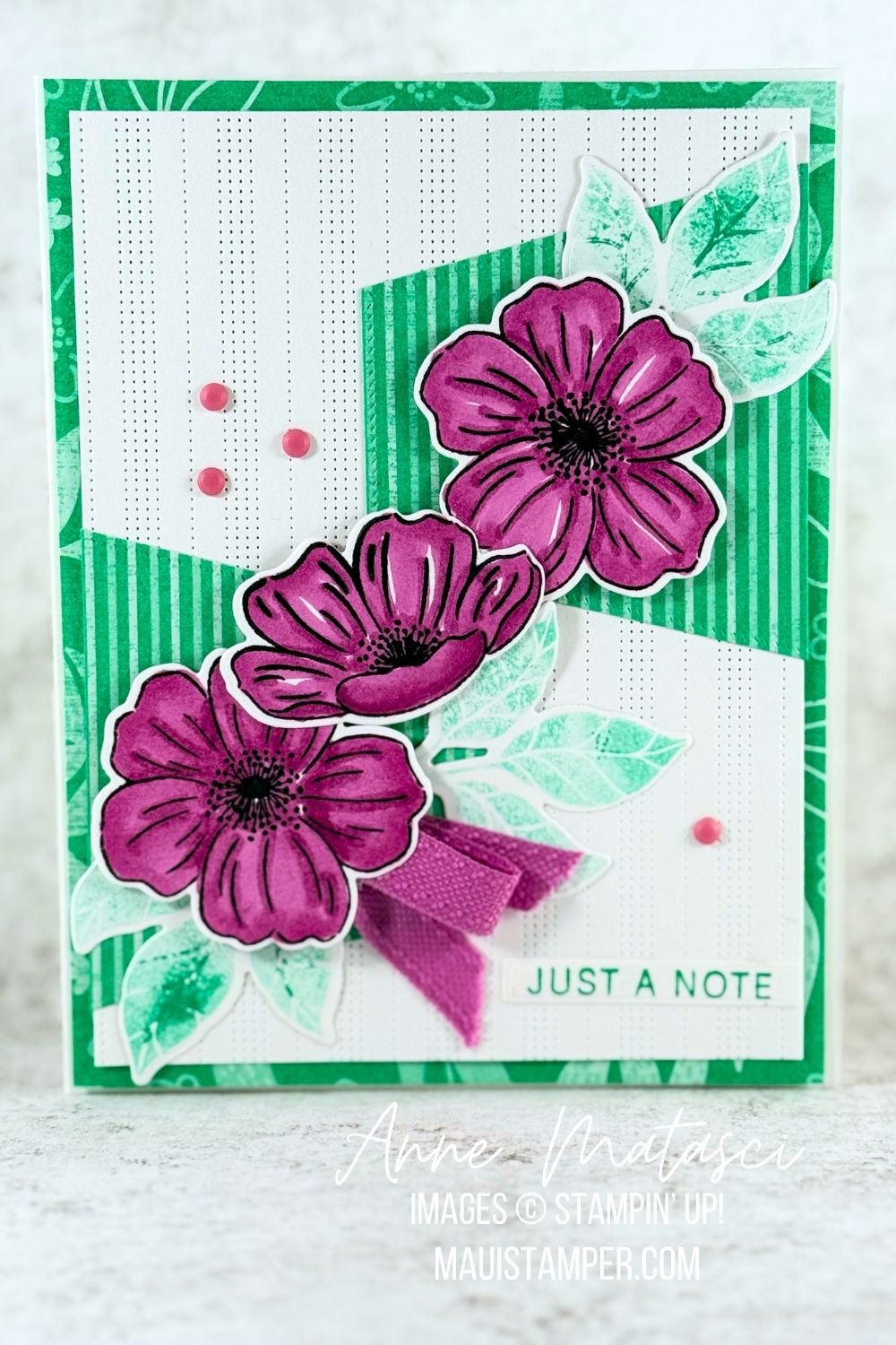
COLOUR INKSPIRATION #208: LOVELY ARRANGEMENTS

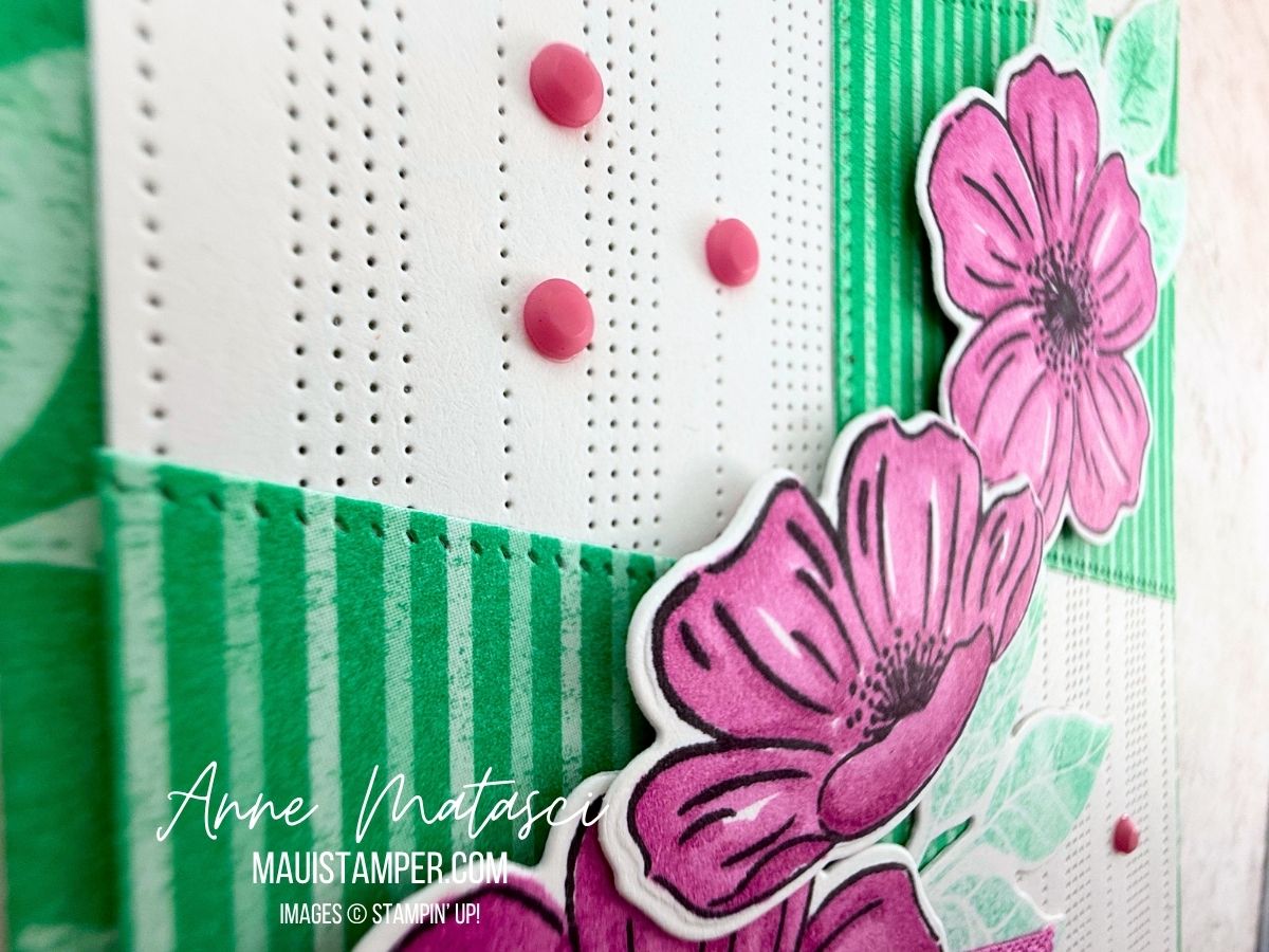
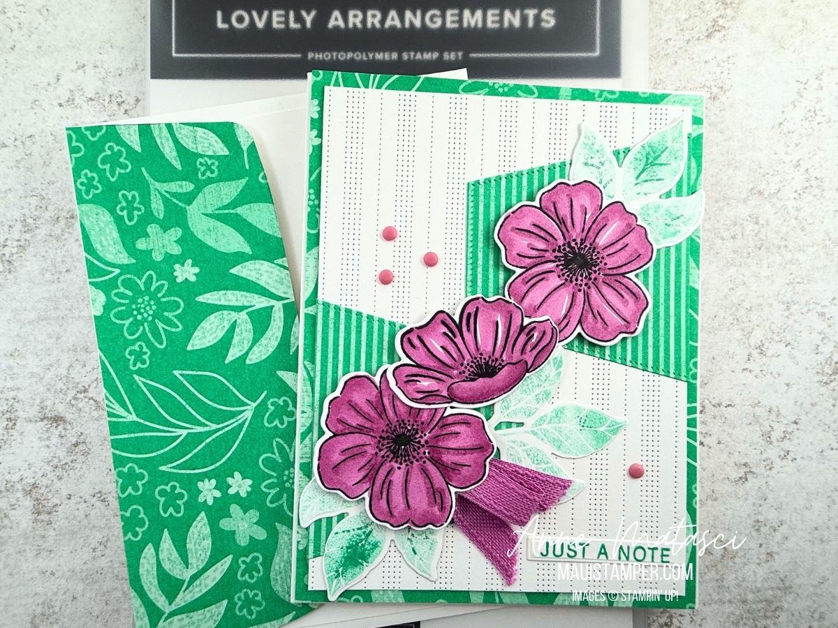
I stamped off the Lovely Arrangements leaves to keep them from competing with the other elements. I actually like the uneven result as it increases the textural feeling. The flowers are colored with Stampin’ Blends. I’m going to miss the 24-26 In Color Collection!

The Nested Essentials dies are new to my craft arsenal, and the biggest hexagon said “try me!” It was too wide for the card, but when I cut it in half it worked perfectly. And the stripes in the DSP played so well with the stripes in the (most sadly retired) Pattern of Friendship die – I hope you’re lucky enough to have that die in your arsenal!

Take a minute to check out the Colour INKspiration page on Facebook. The challenge is open until Monday, May 11th at 5pm (AEST). You’d best check your favorite time zone calculator on that, and don’t forget that Australia is on the other side of the International Date Line from the USA. 😉

Processing…
Success! You're on the list.

COLOUR INKSPIRATION 206: PUMPKIN PIE, SHADED SPRUCE AND GRAY GRANITE

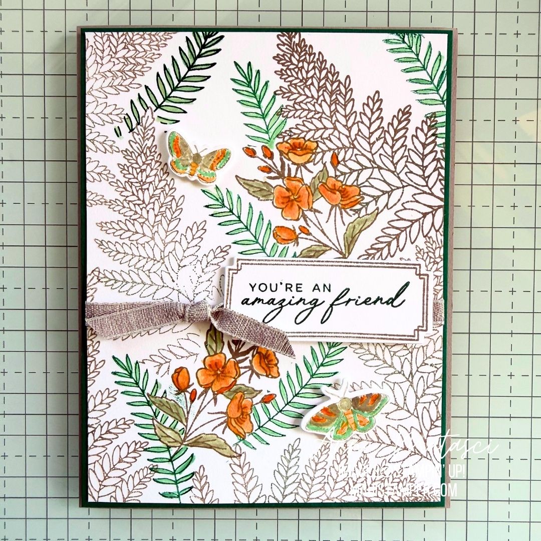
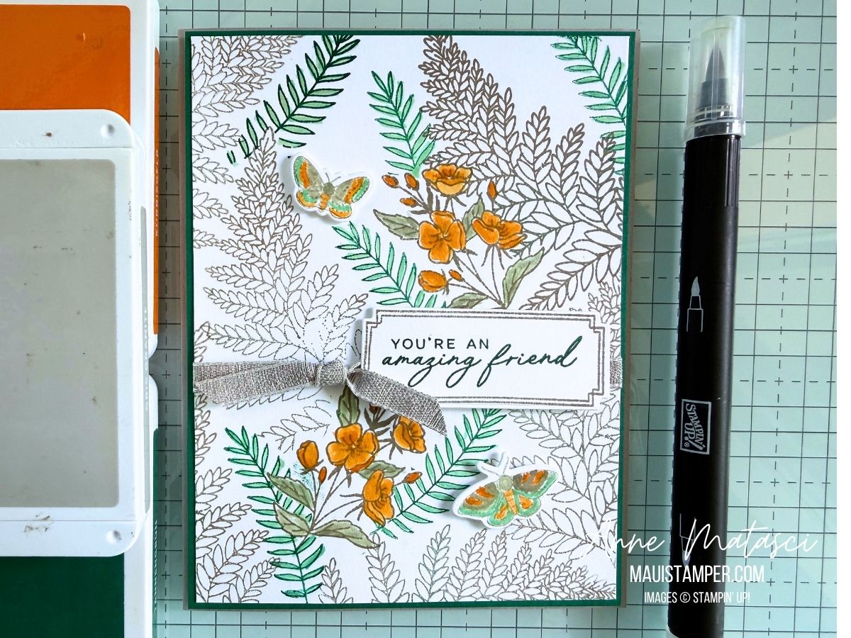
  • Stamps: Fern & Flora (May – August 2026 Stampin’ Up! catalog)
  • Color Palette: Basic White, Shaded Spruce, Pumpkin Pie, Gray Granite
  • Accessories: Stamp Cut & Emboss Machine, Fern & Flora dies, Blender pen, Gray Granite Variegated Trim, Stampin’ Dimensionals

I chose to use Blender Pens to color this image with these saturated hues. The Blender Pen allows a lot more control over the depth of color, and it’s easy to layer the color for more saturation. These are small images, so it was quick coloring.

I love this new Variegated Trim from the March 2026 Online Exclusive release. It’s like a wide Linen Thread – and we know how I feel about that.

Stop by the Colour INKspirations page to see the gorgeous entries to this challenge. You have time to create one yourself!

Processing…
Success! You're on the list.

COLOUR INKSPIRATION CHALLENGE #CI193 FEATURING BRANCHING OUT

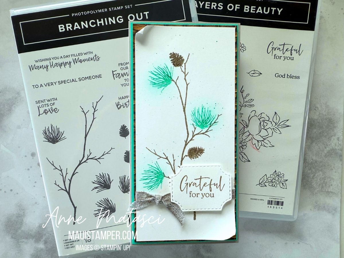
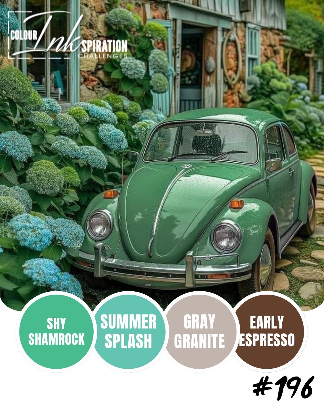
Oh, I loved colour challenge #CI196 – Shy Shamrock, Summer Splash, Gray Granite and Early Espresso. I knew I wanted to use a lot of white space with those intense In Colours and Branching Out provided just the image I needed.

  • Stamps: Branching Out, Layers of Beauty
  • Color Palette: Basic White, Shy Shamrock, Summer Splash, Gray Granite, Early Espresso
  • Accessories: Stamp Cut & Emboss Machine, Branching Out dies, White 1/4″ ribbon, Woven Textures DSP, Blending Brush, Stampin’ Blends, Stampin’ Write Marker, Stampin’ Dimensionals

Shy Shamrock and Summer Splash are next door neighbors, but I assure you they’re both here. I used Shamrock for the greenery, then added a gentle wash of Summer Splash behind it with the Blending Brush. The layer under the Woven Textures DSP is also Summer Splash. And the Stampin’ Write Marker splatters are Shy Shamrock. (I may have to stock up on markers just so I can make those fine splatters!)

The white ribbon was transformed to Gray Granite ribbon with the magic of Stampin’ Blends. That ribbon is now on the Last Chance list (sigh) so you might want to stock up while you can.

I enjoy the Colour INKspiration challenges so much, and the team is the nicest group of crafters you could ask for. Take a look at their page – maybe you’d like to give this challenge a try! Here’s the inspiration photo for CI#196

And as always, I’m grateful for your support at my Online Store.

Processing…
Success! You're on the list.

COLOUR INKSPIRATION #193: SPOOKY HALLOWEEN

Colour challenges are a lot of fun, but I often end up scratching my head as I begin.My starting point is generally a stamp set, not a colour set, so it throws me off a bit. CI #193 isn’t a traditional set of Halloween colours, but after a few false starts, I got them to work.

  • Stamps: Spooky Halloween
  • Color Palette: Basic White, Cloud Cover, Balmy Blue, Highland Heather, Memento Black
  • Accessories: Stamp Cut & Emboss Machine, Spooky Halloween dies, Stylish Shapes dies, Perennial Lavender DSP, Kintsugi Inspirations DSP, Cloud Cover Faux Linen Ribbon, Purple Fine Shimmer Gems, Blending Brush, Stampin’ Blends, dauber, Wink of Stella, Stampin’ Dimensionals

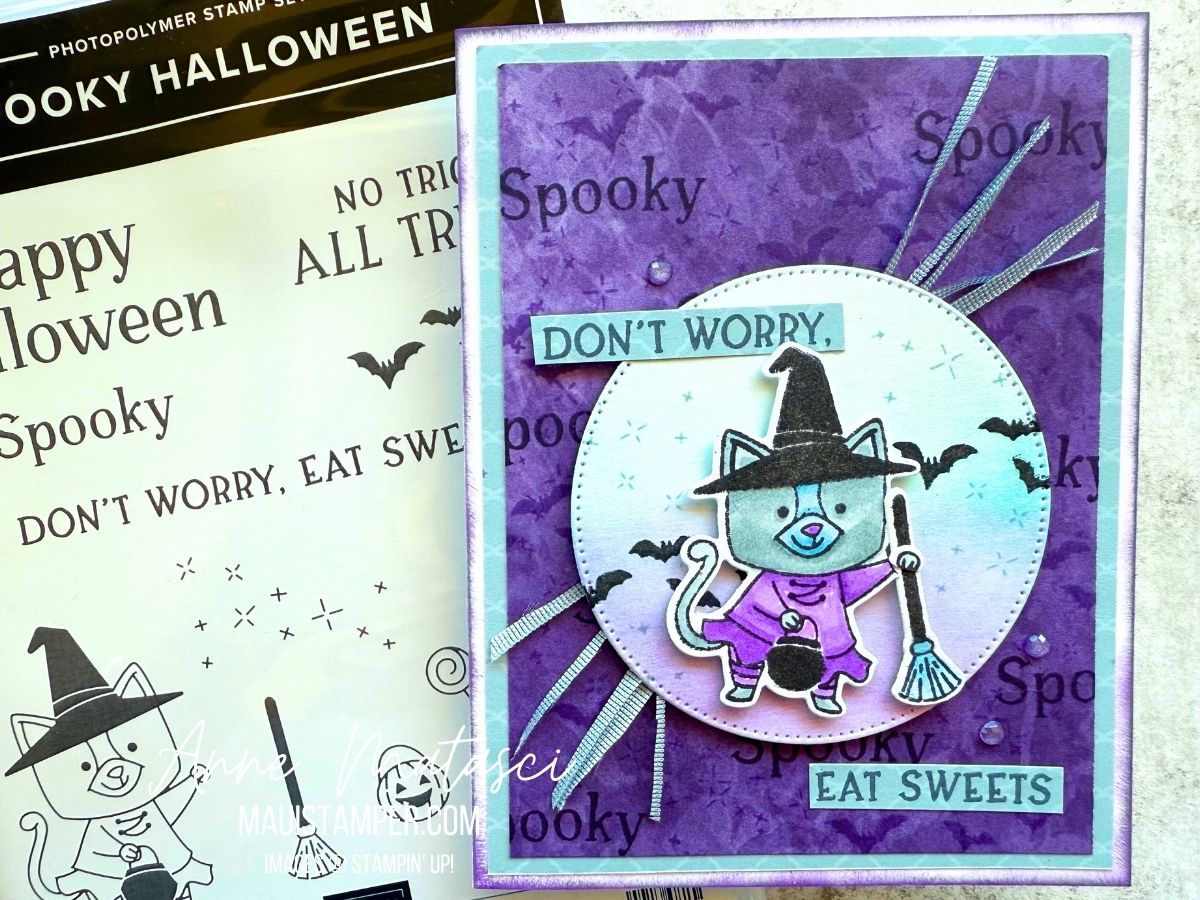
There are a few adaptations on this card – I stamped on the Perennial Lavender DSP with Memento Black and Highland Heather for the background, and I stamped the sentiment on the Kintsugi Inspirations DSP. I also cut up the Cloud Cover Faux Linen Ribbon because I like the way it gets skinny and stringy.

It’s a small detail, but I cut off the cat’s paw and arranged it on top of the broom because the original looked unnatural. And there’s Stella on all of the Memento Black elements, because every Halloween card needs a little sparkle!

Here’s the INKpiration photo – how do you think I did? I had fun, and in my book, that’s the most important thing.

Have you tried a Colour Challenge? You can find all the details at the Colour INKspiration Facebook page.

(Note: Yes, I know in the USA we spell it color, but this is a South Pacific group and they spell it colour. For this post, so do I.)

Processing…
Success! You're on the list.

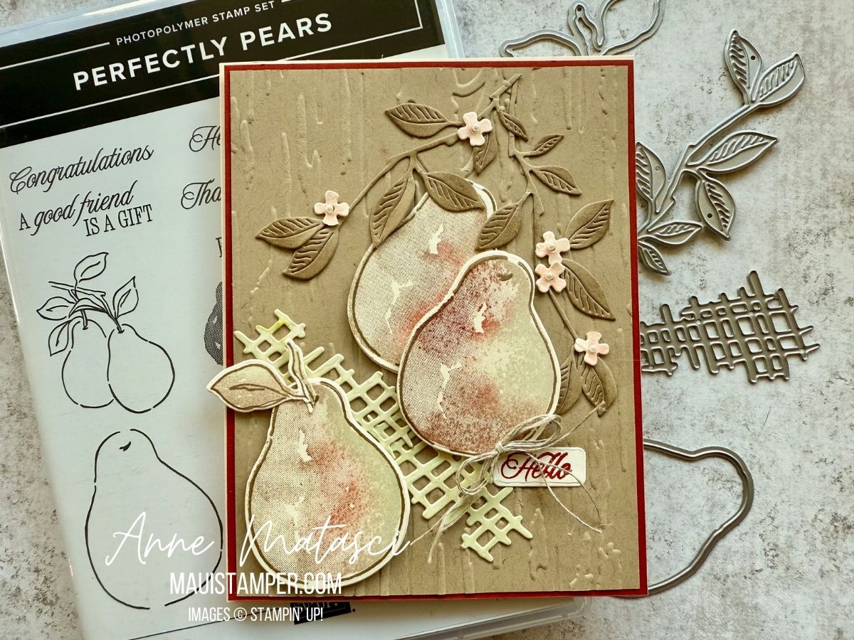
PERFECTLY PEARS FOR COLOUR INKSPIRATION 190

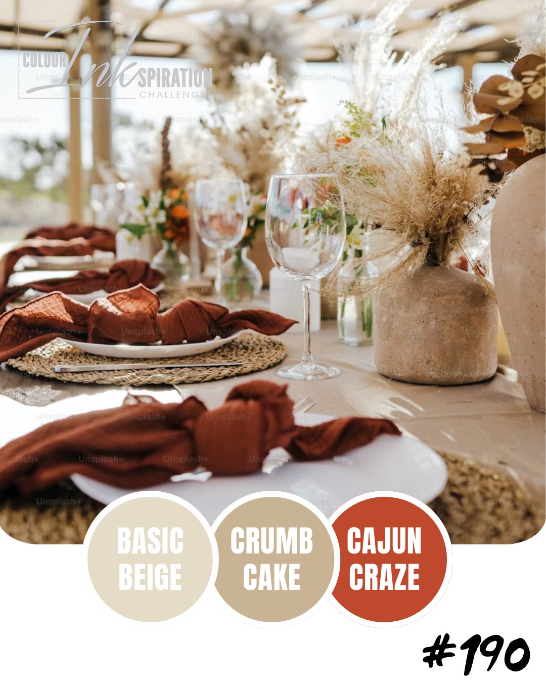
Last week I slipped a Colour INKspiration challenge under the wire. The challenge is based in the South Pacific, and I’m usually pretty good with time zone math, but not this time. Maybe it had something to do with the colour palette: Basic Beige, Crumb Cake and Cajun Craze. Definitely not a Maui Stamper combo!

  • Stamps: Perfectly Pears
  • Color Palette: Very Vanilla, Basic Beige, Crumb Cake, Cajun Craze
  • Accessories: Stamp Cut & Emboss Machine, Perfectly Pears dies, Birch Wood 3D Embossing Folder, daubers, Linen Thread, Stampin’ Dimensionals

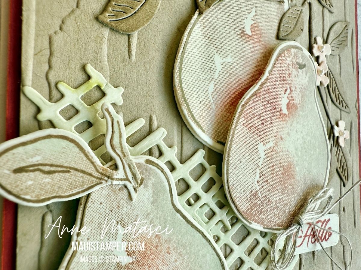
Honestly, I think this card would have been happier with more Very Vanilla and less Basic Beige and Crumb Cake. But I considered these colours a real challenge, and I was pleased with myself to have come up with a project that met the challenge.

I used daubers on the leaves, the tiny flowers, the grid, and directly on the pear stamps. Daubers allow subtle shading on card stock, and when applied to a stamp they tend to soften the colour. I love the range of colour I can get with daubers on the pear.

Take a look over on the Colour INKspiration page. It’s a lovely group of crafters, and they almost always allow two weeks to create an entry. Give it a go!

And don’t wait to add Perfectly Pairs to your shopping cart. It’s currently available in the Online Store.

Processing…
Success! You're on the list.

COLOUR CHALLENGES: COLOUR INKSPIRATION #189

My friends at Colour INKspirations know how to set up a proper challenge! This combination was a tough one, as Melon Mambo generally doesn’t get much my attention. But by toning it down using daubers, I came up with a project that met the challenge!

  • Stamps: Impressions Abloom, Elements of Text, Perfectly Pears, Inspiring Imperfections
  • Color Palette: Basic White, Darling Duckling, Melon Mambo, Cloud Cover, Secret Sea
  • Accessories: Stamp Cut & Emboss Machine, Impressions Abloom dies, Perennial Postage dies, Gallery Blooms dies, Exposed Brick 3D Embossing Folder, Kintsugi Inspirations DSP, Dauber, White Bakers Twine, Wink of Stella, Fine Tip Glue pen, Stampin’ Dimensionals

Here’s the inspiration photo. I knew right away I was going to have to be “INKspired” to work in that Melon Mambo! And while I adore Secret Sea, it’s a very bold color, so I used it sparingly as an accent.

Looking for elements for this card, I pulled out some treasures that are still available but have been sidelined in favor of newer releases. That 3D Exposed Brick EF is one of my absolute GO-TO elements. White Bakers twine is too, although it will never replace my beloved Linen Twine.

I used our Fine Tip Glue pen to add shine to the centers of those flowers. They have a little Cloud Cover daubed in the center to soften the white-white-white and tie in with the background DSP. My FTGP has lost its Fine Tip, so I unscrew the cap and use my trusty bamboo skewer to paint the glue over the circle. The skewer lets me control the amount I apply but doesn’t leave brush strokes or messy cleanup.

Cloud Cover ink has been a bit of a heartbreak, as it turns out the formula reacts with the foam in our ink pads, causing instability. The solution is to use one of our un-inked spots and Cloud Cover Ink Refill. It takes a bit longer to ink larger stamps, but I think it’s worth the effort!

There’s still a little time to join the challenge. It closes at 7pm Monday AEST (remember, for the US they are a day ahead). I’d love to see what you do with Melon Mambo!

Processing…
Success! You're on the list.

Discover Colour Inkspiration #188: Crafting with Vibrant Colors

Oh, it has been a long time since I’ve done a challenge! We have enjoyed a LOT of travel in the first half of 2025. It’s been WONDERFUL, but it’s meant a lot of time away from crafting. It’s great to be home, to sit with all my crafty things and to be inspired!

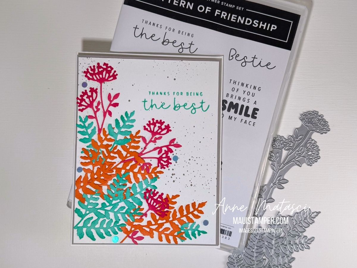
This is ColourInkspiration #188. The challenge colours are Strawberry Slush, Timid Tiger, Coastal Cabana, and Gray Granite. This is a lively bunch of colours if I do say so myself!

  • Stamps: Pattern of Friendship
  • Color Palette: Basic White, Strawberry Slush, Timid Tiger, Coastal Cabana, Gray Granite
  • Accessories: Stamp Cut & Emboss Machine, Beautiful Motif dies, Daubers, retired flat dots, Stampin’ Dimensionals

Here’s the inspiration photo:

This image has lots going on but it’s filled with things I love: the sea, beautiful landscape, flowers, and lots of books! I wouldn’t mind spending a little time in that cove.

I confess: the splatters are from an ancient Stampin’ Up! tool. I *think* it was called the Color Spritzer, and it works by funneling a blast of air past the tip of a Stampin’ Write marker. I love how fine a splatter it creates – more a spritz, if in fact that was the name.

I’m not usually a super-bright color-combo crafter, so this was a bit of a stretch for me. I cut a variety of pieces with the Beautiful Motif dies and played with them until I liked them. I chopped quite a few of them into smaller pieces, allowing me to blend the colours more. And I used our daubers to add a little extra ink to the die cuts for dimension.

Pattern of Friendship is an Online Exclusive bundle. I bought it for the die – oh, just you wait, there are projects coming – but the stamps are all sentiments. I’ve decided I liked them better once they were in my hands. Does that ever happen to you, or is it just me?

Colour Inkspirations is a really fun challenge group. There’s plenty of time to create for each one, assuming you’re not galavanting around the globe. Plus it’s the nicest group of crafters you’ll find anywhere. Check them out, and give it a try!

Processing…
Success! You're on the list.

TEXTURED NOTES:COLOUR INKSPIRATION #181

I am so overdue for a Colour INKspiration challenge! My life has been really full since the holidays, but when I saw this Colour combo I told myself I HAD to make time for it.

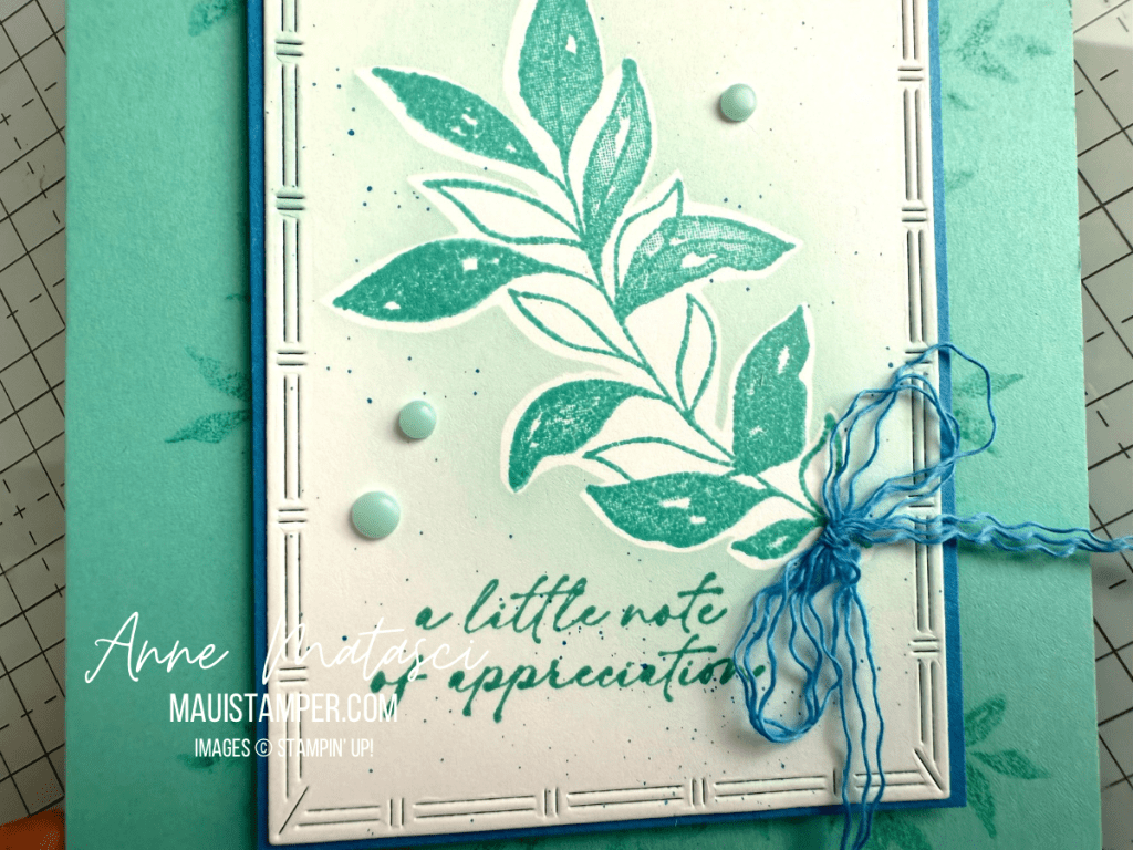
  • Stamps: Textured Notes
  • Color Palette: Basic White, Azure Afternoon, Pool Party, Coastal Cabana, Summer Splash
  • Accessories: Stamp Cut & Emboss Machine, Textured Notes dies, Stampin’ Write markers, Party Dots, Pack Your Bags Twine, Stampin’ Dimensionals

I’ve tried a lot of methods to get those tiny flecks. The one that works consistently for me is to use a Stampin’ Write marker and flick the brush tip against the cap. That gives me uniformly small, evenly dispersed flecks and that’s what I want.

The Textured Notes dies are an absolute must for your crafty stash!! They will be available on Wednesday March 5th as part of the new Online Exclusive release. Don’t miss it! You NEED these dies. Best way to find them is to long into the Online Store and click on What’s New.

Processing…
Success! You're on the list.