Happy Birthday, Sara

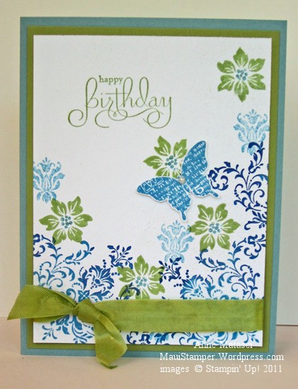
My Sara turned 21 last month…in Spain.  I’m sure it was wonderful, although not quite the thrill it is to turn 21 in the U.S.   It was a little challenging for her dad and me since we didn’t feel confident sending her birthday gift through the mail – a 21st birthday present should be something to remember, and entrusting such a gift to the Spanish postal system made me nervous.  So Sara has to wait until she’s back in the U.S. before she gets her gift, and we sent this card to let her know we were thinking of her:

Sara - Birthday Bliss

  • Bliss (SAB 2011), Charming and Well Scripted (retired mini) stamp sets
  • Whisper White, Pear Pizazz and Baja Breeze card stock
  • Pear Pizazz, Marina Mist and Night of Navy Classic ink pads
  • Vanilla Smooch Spritz; Stampin’ Sponges
  • Pear Pizazz Seam Binding
  • Pearl jewels

My little point-and-push doesn’t pick up the Smooch Spritz but trust me when I say it’s there.  I’ve discovered that if you want a nice, even Spritz you need to press the plunger with complete authority.  No hesitation here, my friends.  If you hesitate, you get blobs.  This isn’t such a big problem with Vanilla but it doesn’t work for me with Gold and Log Cabin.  Bloppy.  Blech.

The flourish stamp was inked in Marina Mist, then sponged with Night of Navy around the edges.   The butterfly is cut out and attached with a glue dot for just the tiniest bit of lift.  Yes, you guessed it; this is a One Stamp Card.  When the stamp costs $.98 (International rate) one should be enough – and we don’t want to give the Spanish post office any excuses for delaying these birthday greetings.

Why you shouldn’t roast Peeps

I have permission to share this with you:

Cheryl with a roasted Peep

That’s what a Peep looks like when it’s been roasted at Girl Scout camp!  And if that isn’t the perfect sweatshirt for a Girl Scout Leader, I don’t know what is.  The best part was when Cheryl started to eat it…but I think I was doubled over laughing so hard I didn’t get that photo.

Moving on…

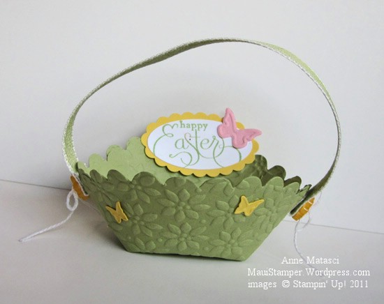
QBee's basket

  • Well Scripted (Retired) stamp set
  • Pear Pizazz, Daffodil Delight, Whisper White and Pretty in Pink card stock
  • Pear Pizazz Classic ink pad
  • Scallop oval, large oval and oval punches
  • Pear Pizazz 1/2 inch stitched poly ribbon and white crochet thread
  • Ice Cream Parlor (retired) buttons
  • Big Shot, Scallop Circle Bigz, Petals a Plenty Embossing folder and Beautiful Wings embosslit
  • Tombo, the wonder adhesive

I would love to tell you that I came up with this idea myself but I cannot tell a lie; I did not.  Brenda, aka QBee, designed this deceivingly simple basket and even made a video tutorial that is clear and very easy to follow.  Please check out QBee’s Quest, and tell her I sent you.  She put the little handle across the narrow portion of the basket, but I switched it to the wide end.  It’s cute either way.

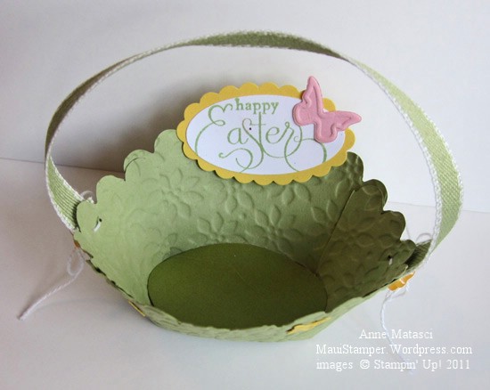
Here’s another view:

QBee's Easter basket from above

You could make a bunch of these very quickly, because once you’ve done one you can do oodles.   These would be very cute little Easter place card holders, filled with chocolates (aaack!  no!!) or an Easter egg on a bed of grass.


Graduation Season

It’s that time of the year…caps and gowns and diplomas, oh my!

No graduates in my house – or my immediate family – this year, but we have lots of friends graduating from high school and college.  I’ve enjoyed making cards for them with little nods to their schools and even their personalities.  That’s the whole point of a hand-made card, isn’t it?

Fifth Avenue Floral Congratulations

  • Fifth Avenue Floral, Elements of Style and Well Scripted (retired) stamp sets
  • Whisper White, Brocade Blue and Night of Navy card stock
  • Brocade Blue and Night of Navy Classic ink pads; Whisper White Craft ink pad
  • Versamark ink pad; Crushed Curry Stampin’ Write marker, Vanilla Smooch Spritz
  • Embossing Buddy, Powder Pal, Clear Embossing Powder and Heat Tool
  • Scallop Border punch, Elegant Bouquet Impressions Folder and Big Shot

My little point-and-shoot doesn’t pick up the details too well, but there’s Smooch Spritz (I can’t decide if I should laugh or cry when I say that) on the floral panel and the sentiment is embossed with clear embossing powder.  The Craft White ink is on the Night of Navy panel behind the sentiment.  It was originally larger and destined for another use but I scrapped the entire concept on the basis of irreconcilable differences – that card was NEVER going to work.  The pieces survived to find purpose in an alternate relationship!

I’m ought to apologize for using a retired sentiment, but I don’t feel too badly about it.  There are tons of great “Congratulations” stamps out there and I’m sure you’ll find a substitute if you don’t have this one.  There are always so many great sets in the mini catalog (this was the Occasions Mini) and it always seems as though there’s one set you should have purchased when you had the opportunity.

It’s a glorious Maui day and my son is finished with finals today, so his sister and I are going to take him out to lunch in Lahaina.  Too nice a day to stay inside, even for stamping!

Singin’ the Blues with PPA

In case you haven’t noticed, I’ve been cruising through a lot of different challenge blogs and forums recently.  It’s a great way to shake up my projects a little and keep things fresh.  It’s easy to use familiar color combinations and card layouts, but after a while it gets boring.

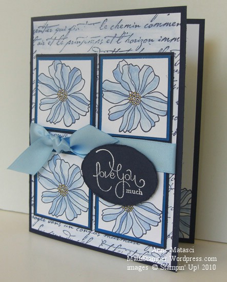
I haven’t settled on any particular favorites but if I do I promise I’ll share.  The layout for this card is from Sketch Girl, and it appeals to my sense of orderliness.  Today’s colors are courtesy of the Paper Pal Arts Monochromatic Blues Challenge (PPA40) and I knew the moment I saw the challenge that it would make me happy.  I don’t think there’s a shade of blue I dislike, and the clean look of blue and white is one of my favorites.  I had a lot of fun with this card:

5th Avenue Floral Paper Arts Pals Challenge

  • Fifth Avenue Floral, Well Scripted and French Script stamp sets
  • Whisper White, Night of Navy and Pacific Point card stock
  • Not Quite Navy Classic ink pad; Craft White ink pad
  • Crushed Curry Stampin’ Write Marker; Bashful Blue Ink refill and the Aquapainter
  • Bashful Blue Satin ribbon, Large oval punch, white embossing powder and the heat tool

And yes, I blurred the French Script lettering with the AQP on purpose!  Lately I can’t seem to make a card without using the Aquapainter for something.  For the past couple of days, I’ve only been able to find the small-brush AQP – the large-brush one is AWOL.  It’s driving me crazy (admittedly, a very short drive) because I’m somewhat OCD (or as my daughter likes to point out, CDO – alphabetical order).  I Do Not Like To Lose Things.  And I use that AQP a lot!  (deep breath…another one…it’s going to be okay…really.)

Ahem.  I had a marvelous time with this card.  The concept was clear in my head before I started, and although I made a few adjustments as I went along the process was very enjoyable.  This is not always the case, as evidenced by the card in the trash can in my craft room.  When I finished this lovely Ode to the Blues I thought my mojo was firmly in place and started in on another sketch challenge I’d seen.  I spent way more time than I’d planned trying to make it work, changing focal points and orientation and struggling mightily.  I finally finished it and set it aside to look at this morning, which is often the perfect solution.  Sometimes looking over a not-quite-there project after a good night’s sleep will produce that Ah-ha! moment that fixes everything.  But this card was immune to Good-Sleep-Therapy.  I ripped off the salvageable bits and threw the rest away.  It’s only paper, after all.

Happy Easter

Happy Easter

  • Embrace Life, Well Scripted, and Vintage Vogue stamp sets
  • Very Vintage jumbo wheel
  • Stazon black ink, So Saffron and Bermuda Bay Classic ink pads
  • Watercolor paper, Naturals White, Bermuda Bay, So Saffron and Basic Gray card stock
  • Aquapainter, Bermuda Bay ink refill and Champagne Mist shimmer paint
  • Stampin’ Sponge, Gray Taffeta ribbon, Big Shot and Perfect Details Texturz plate

Today Christians everywhere celebrate the triumph of life over death, light over darkness, love over hatred.  Whether or not you believe in Jesus Christ, we can all make our world just a little bit better by bringing light into our lives and choosing to love.  Happy Easter.

Love You Much

In my humble opinion, the Medallion stamp is one of the best values in the Stampin’ Up! catalog.  It can be a background or a focal point, it can be a single image or multiple layers, and it works in any color you can imagine.  Not only that, but it is really fun to dress up – kind of a Stamper’s Barbie doll.

Love You Medallion

  • Medallion, Well Scripted and Vintage Labels (SAB) stamp sets
  • Bashful Blue, Tempting Turquoise and Whisper White card stock
  • Bashful Blue and Tempting Turquoise Classic Ink pads
  • 3/4″ and Scallop Circle punches, Bashful Blue Satin ribbon, and Pretties kit
  • Stampin’ Sponge and brayer

I inked the Medallion stamp with Bashful Blue ink using a brayer.  Larger stamps with anything bolder than line art really need to be inked with the brayer to get even converage.

(I place the stamp rubber-side-up and roll the brayer on the ink pad and then on the stamp, repeating until I’m sure my coverage is complete.  I carefully position the cardstock on the inked rubber and put a large piece of scrap paper on top.  You need a steady hand to keep from moving that cardstock!  I use a separate brayer to run across the scrap paper, transferring the ink to my cardstock.  You can use the same brayer if you like, but I like to use a clean one when I’m creating multiple images because it doesn’t waste the ink.)

Back to this image – once I applied the Bashful Blue ink with the brayer, I used a Stampin’ Sponge to add Tempting Turquoise ink all the way around the outside of the Medallion.  I used a heavy hand since there isn’t a huge contrast between the two colors.  When I had both colors applied, I put the cardstock onto the stamp, layered the scratch paper on and used the brayer across the top.

The Vintage Labels image is stamped with Tempting Turquoise on Whisper White and punched with the Scallop Circle.  The last layer is the center of the Medallion inked with Bashful Blue, stamped on Bashful Blue cardstock and cut out with the 3/4″ circle.  A half pearl from the Pretties Kit is the finishing touch.

I think this is sort of a Wedding Barbie kind of Medallion.  One of these days I’m going to sit down and make this same card in a variety of color schemes.  The possibilities are endless.

Sweet Pea Mojo – Mojo121

I’ve been looking at these Sweet Pea Stitched Felt embellishments (117266, $7.95) on my craft table for weeks.  What should have been simple became really complicated in my head.  About a week ago, I saw a VERY simple card that really appealed to me, and that provided the Mojo to make this card come together.  Of course, my card isn’t simple, and we’ve already discussed my challenges with the Clean and Simple Style, so we don’t need to go back there again.

Sweet Pea Stitched Felt Mojo121

  • Simply Said and Well Scripted stamp sets
  • Naturals Ivory, Chocolate Chip, Pretty in Pink and Rose Red card stock
  • Sweet Pea Designer Series Paper Stack
  • Old Olive, Pretty in Pink and Chocolate Chip Classic ink pads; Very Vanilla Craft ink pad
  • Sweet Pea Stitched Felt, Chocolate Chip taffeta ribbon, piercing tool, sponge dauber
  • Oval Scallop punch, Oval punch, Corner rounder punch
  • Stampin’ Dimensionals, Mini Glue dots and Aquapainter

Check out that pink houndstooth paper.  It’s printed in Pretty in Pink on white, and when I realized I’d stamped my image on Naturals Ivory I thought I was going to have to start over.  I’d seen someone try this trick, though, and it works:  use a sponge dauber to rub Very Vanilla craft ink across the printed paper.  The combination of the smooth paper and the creamy consistency of the craft ink allows you to get nice even coverage that makes the papers blend well together.

There are a lot of layers on this card, but to my eye they’re subtle.  The Mojo Monday team did a great job with this week’s sketch, creating something out of the ordinary but not unreasonable.  I really enjoy playing along with this sketch challenge, and though I can’t fit it in every week, it’s a pleasure when I do.