Crafting a Rainbow: My First Pride Card Experience

Today is the final day of Pride month and I’m sharing my first-ever Pride card. I’ll confess it took me a while to create the design, as rainbows aren’t a big part of my style (and therefore my crafting supplies). But once I came up with the concept, this was a very satisfying project.

  • Stamps: None
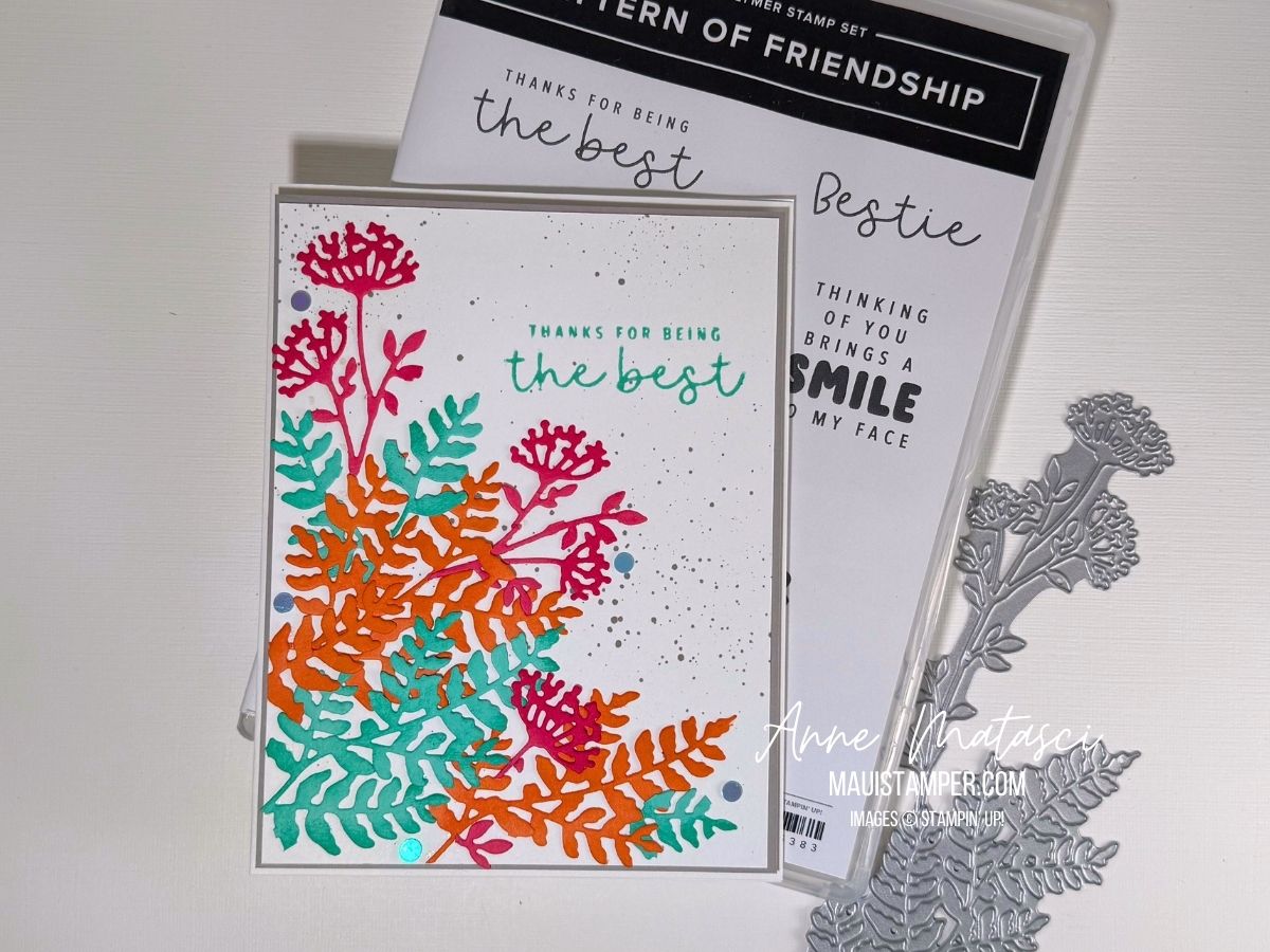
  • Color Palette: Basic White, Secret Sea, Real Red, Pumpkin Pie, Daffodil Delight, Shaded Spruce, Night of Navy, Highland Heather
  • Accessories: Stamp Cut & Emboss Machine, Alphabet Ala Mode dies, Pattern of Friendship die, Stampin’ Blends, Masking Paper, Stampin’ Dimensionals

The first step was to create the rainbow panel. I measured the height of the Alphabet Ala Mode dies: 1 9/16″, to be precise. I made my panel 2″ high, which meant each stripe was approximately 1/3″ high. Turns out this was easier to do in the metric system, so my panel was 50mm high and each stripe was 8 1/3mm (which was easier to estimate).

I cut a large focal panel with extra space on both the height and width. I marked my distances on the side of my focal panel, and used Masking Paper to block off each stripe. I colored each one with a Stampin’ Blend, and I found I got best results by using a fresh piece of Masking Paper for each edge.

Once the Rainbow panel was complete, I used Washi Tape to secure the letters evenly across the panel before running it through the Stamp Cut and Emboss Machine. I held my breath as I did this step, hoping that a) the letters were straight and b) the Washi wouldn’t stick to the rainbow. WHEW. I was so glad when it worked!

After that, it was super easy. I matted the rainbow, matted a second panel, and created a third panel with the Pattern of Friendship die. Add liberal quantities of Stampin’ Dimensionsals, and it’s done!

You could make someone’s day with this card. Let them know you support them. All products are available in the Online Store.

Processing…
Success! You're on the list.

COLOUR CHALLENGES: COLOUR INKSPIRATION #189

My friends at Colour INKspirations know how to set up a proper challenge! This combination was a tough one, as Melon Mambo generally doesn’t get much my attention. But by toning it down using daubers, I came up with a project that met the challenge!

  • Stamps: Impressions Abloom, Elements of Text, Perfectly Pears, Inspiring Imperfections
  • Color Palette: Basic White, Darling Duckling, Melon Mambo, Cloud Cover, Secret Sea
  • Accessories: Stamp Cut & Emboss Machine, Impressions Abloom dies, Perennial Postage dies, Gallery Blooms dies, Exposed Brick 3D Embossing Folder, Kintsugi Inspirations DSP, Dauber, White Bakers Twine, Wink of Stella, Fine Tip Glue pen, Stampin’ Dimensionals

Here’s the inspiration photo. I knew right away I was going to have to be “INKspired” to work in that Melon Mambo! And while I adore Secret Sea, it’s a very bold color, so I used it sparingly as an accent.

Looking for elements for this card, I pulled out some treasures that are still available but have been sidelined in favor of newer releases. That 3D Exposed Brick EF is one of my absolute GO-TO elements. White Bakers twine is too, although it will never replace my beloved Linen Twine.

I used our Fine Tip Glue pen to add shine to the centers of those flowers. They have a little Cloud Cover daubed in the center to soften the white-white-white and tie in with the background DSP. My FTGP has lost its Fine Tip, so I unscrew the cap and use my trusty bamboo skewer to paint the glue over the circle. The skewer lets me control the amount I apply but doesn’t leave brush strokes or messy cleanup.

Cloud Cover ink has been a bit of a heartbreak, as it turns out the formula reacts with the foam in our ink pads, causing instability. The solution is to use one of our un-inked spots and Cloud Cover Ink Refill. It takes a bit longer to ink larger stamps, but I think it’s worth the effort!

There’s still a little time to join the challenge. It closes at 7pm Monday AEST (remember, for the US they are a day ahead). I’d love to see what you do with Melon Mambo!

Processing…
Success! You're on the list.

Easy Gate-Fold Card Tutorial with Kintsugi Inspirations

Do you have a Designer Series Paper stash? Mine is threatening a semi-hostile take over, but that doesn’t stop me from adding to my collection. I loved Kintsugi Inspirations the moment I set eyes on it at OnStage 2025 in Brisbane, and I couldn’t wait to cut into it and make something!

This is an easy gate-fold card that uses narrow strips of DSP. I find I have a lot of those when I cut larger pieces for card fronts. I love using up those scraps!

Here are the measurements you’ll need to make this card:

  1. Cut a piece of card stock to 5 1/2″ x 11″ for your card base.
  2. Score the long side at 2″, 3 3/4″, 7 1/4″ and 9“.
  3. Fold the 2″ and 9” outer panels towards the back and the 3 3/4″ and 7 1/4″ scores towards the center of the card. This creates the gate fold shape.
  4. Cut 2 each of DSP, choosing coordinating papers: 1 3/4″ x 5 1/4″ and 1 1/2″ x 5 1/4″
  5. Cut 2 each of coordinating card stock: 1 7/8″ x 5 3/8″ and 1 5/8″ x 5 3/8″
  6. Layer the DSP on the card stock panels. Adhere the narrower panels to the inside folds and the wider panels to the front. Add a focal point, embellish, and admire your beautiful work!

Gate folds often have some kind of closure, but I prefer the simplicity of this card as it is. Ready to give it a try? Your choice of Designer Series Paper will determine the mood of your card. Have some fun with it, and enjoy using up those scraps!

Suites and suite products are BOGO this month in the Online Store. Learn more about Stampin’ Up! Designer Series Paper HERE.

Processing…
Success! You're on the list.

Discover Colour Inkspiration #188: Crafting with Vibrant Colors

Oh, it has been a long time since I’ve done a challenge! We have enjoyed a LOT of travel in the first half of 2025. It’s been WONDERFUL, but it’s meant a lot of time away from crafting. It’s great to be home, to sit with all my crafty things and to be inspired!

This is ColourInkspiration #188. The challenge colours are Strawberry Slush, Timid Tiger, Coastal Cabana, and Gray Granite. This is a lively bunch of colours if I do say so myself!

  • Stamps: Pattern of Friendship
  • Color Palette: Basic White, Strawberry Slush, Timid Tiger, Coastal Cabana, Gray Granite
  • Accessories: Stamp Cut & Emboss Machine, Beautiful Motif dies, Daubers, retired flat dots, Stampin’ Dimensionals

Here’s the inspiration photo:

This image has lots going on but it’s filled with things I love: the sea, beautiful landscape, flowers, and lots of books! I wouldn’t mind spending a little time in that cove.

I confess: the splatters are from an ancient Stampin’ Up! tool. I *think* it was called the Color Spritzer, and it works by funneling a blast of air past the tip of a Stampin’ Write marker. I love how fine a splatter it creates – more a spritz, if in fact that was the name.

I’m not usually a super-bright color-combo crafter, so this was a bit of a stretch for me. I cut a variety of pieces with the Beautiful Motif dies and played with them until I liked them. I chopped quite a few of them into smaller pieces, allowing me to blend the colours more. And I used our daubers to add a little extra ink to the die cuts for dimension.

Pattern of Friendship is an Online Exclusive bundle. I bought it for the die – oh, just you wait, there are projects coming – but the stamps are all sentiments. I’ve decided I liked them better once they were in my hands. Does that ever happen to you, or is it just me?

Colour Inkspirations is a really fun challenge group. There’s plenty of time to create for each one, assuming you’re not galavanting around the globe. Plus it’s the nicest group of crafters you’ll find anywhere. Check them out, and give it a try!

Processing…
Success! You're on the list.

DIY CALENDAR BLOG HOP: June 2025

Welcome to the June DIY Calendar Blog Hop. I took a look at the last few months and decided it was time I focus on something other than FLOWERS. Almost everyone loves them, but I think there can be too much of a good thing! My June calendar is definitely different:

  • Stamps: Along These Lines, Elements of Text
  • Color Palette: Memento Black, Basic White, Secret Sea, Misty Moonlight, Azure Afternoon, Crumb Cake, Smoky Slate
  • Accessories: DIY Calendar Template, Stampin’ Blends, Paper Snips, Stampin’ Dimensionals

I was inspired by Jay Soriano’s blended ocean background. He does a masterful job of creating a smooth transition in his colors. I chose a slightly different palette from Jay, but I followed his technique and was very pleased with the outcome.

If you don’t have Elements of Text, consider adding it to your next order. It’s my GO-TO set whenever I need a little extra something. Well. On a card, anyway. 😉

I fussy cut the dolphin so they would really stand out. I considered masking them, but I was afraid the movement of the brushes might dislodge the masks. They’re small and simple, and fussy cutting allowed me to put one of them up on a dimensional.

Please take a moment to follow along on our hop and see what Malia, Cheryl and Sharon have created for the month of June. We’re very glad you chose to join us!

Would you like to make your own DIY Calendars? The template is just $5 – let me know that’s what you want and I’ll send you an invoice. Please tell me you’re a real being in the message box – I’m getting increasing amounts of spam. Everything is done digitally, so you’ll have it quickly.

You are only purchasing a template, which you can download and print for your personal use.

Processing…
Success! You're on the list.