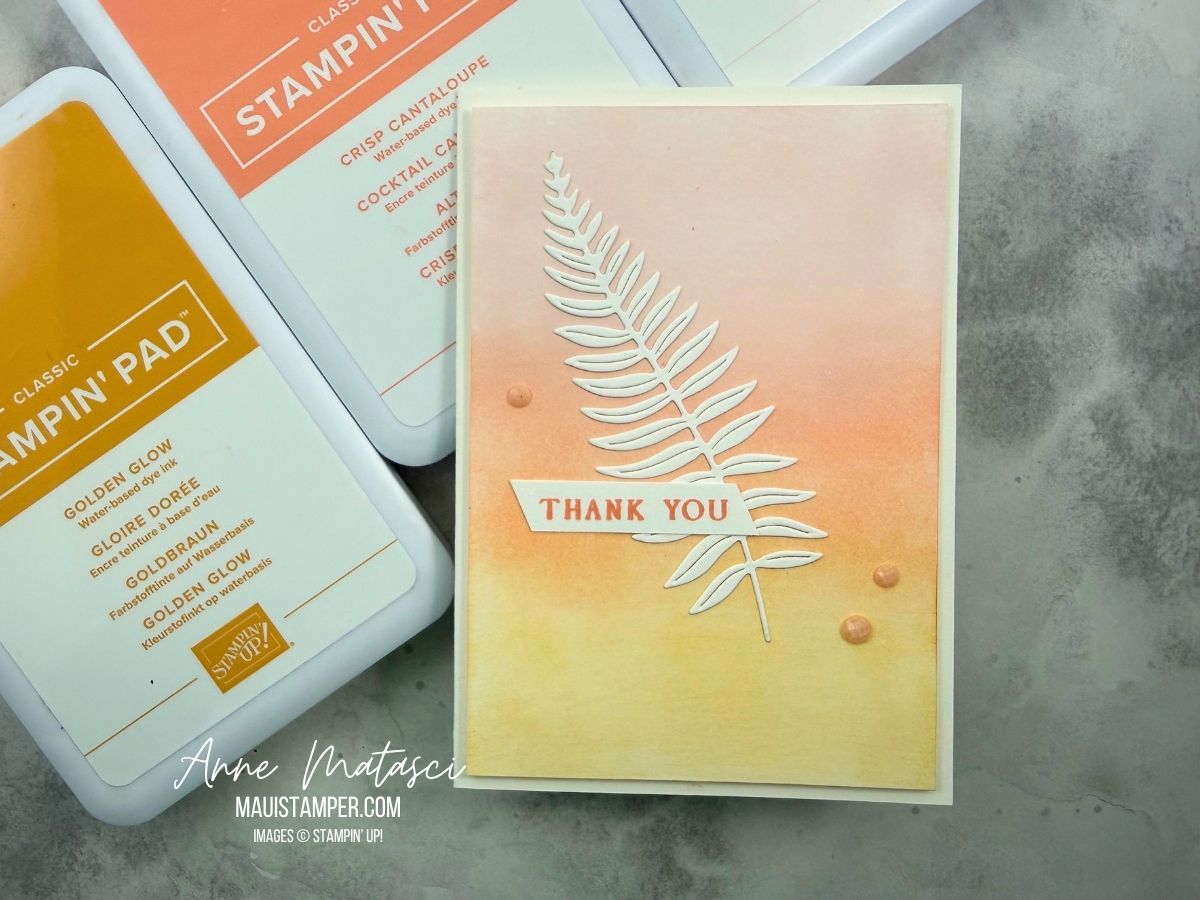
I love a blended background, and I was so inspired by one of our Artisans that I made a nearly exact CASE (Copy and Share with Everyone) of her project.
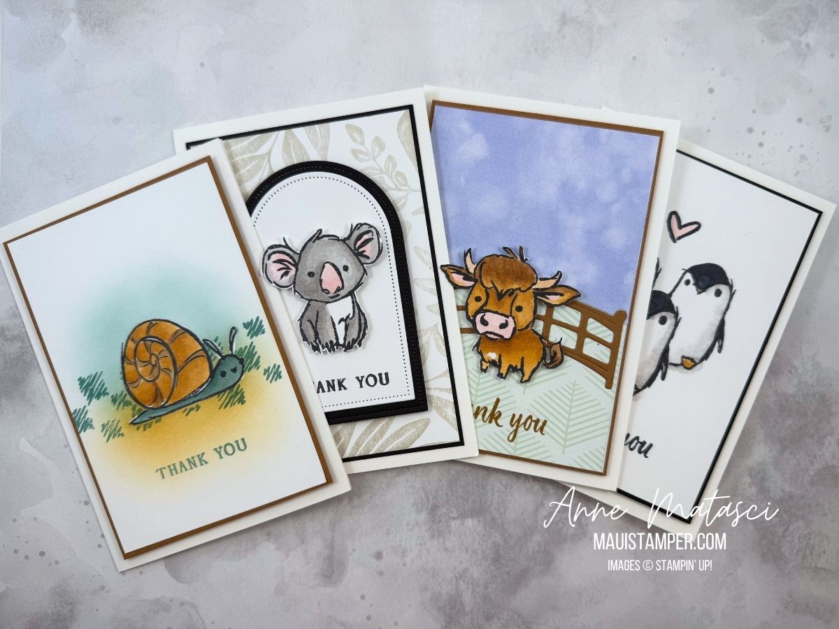
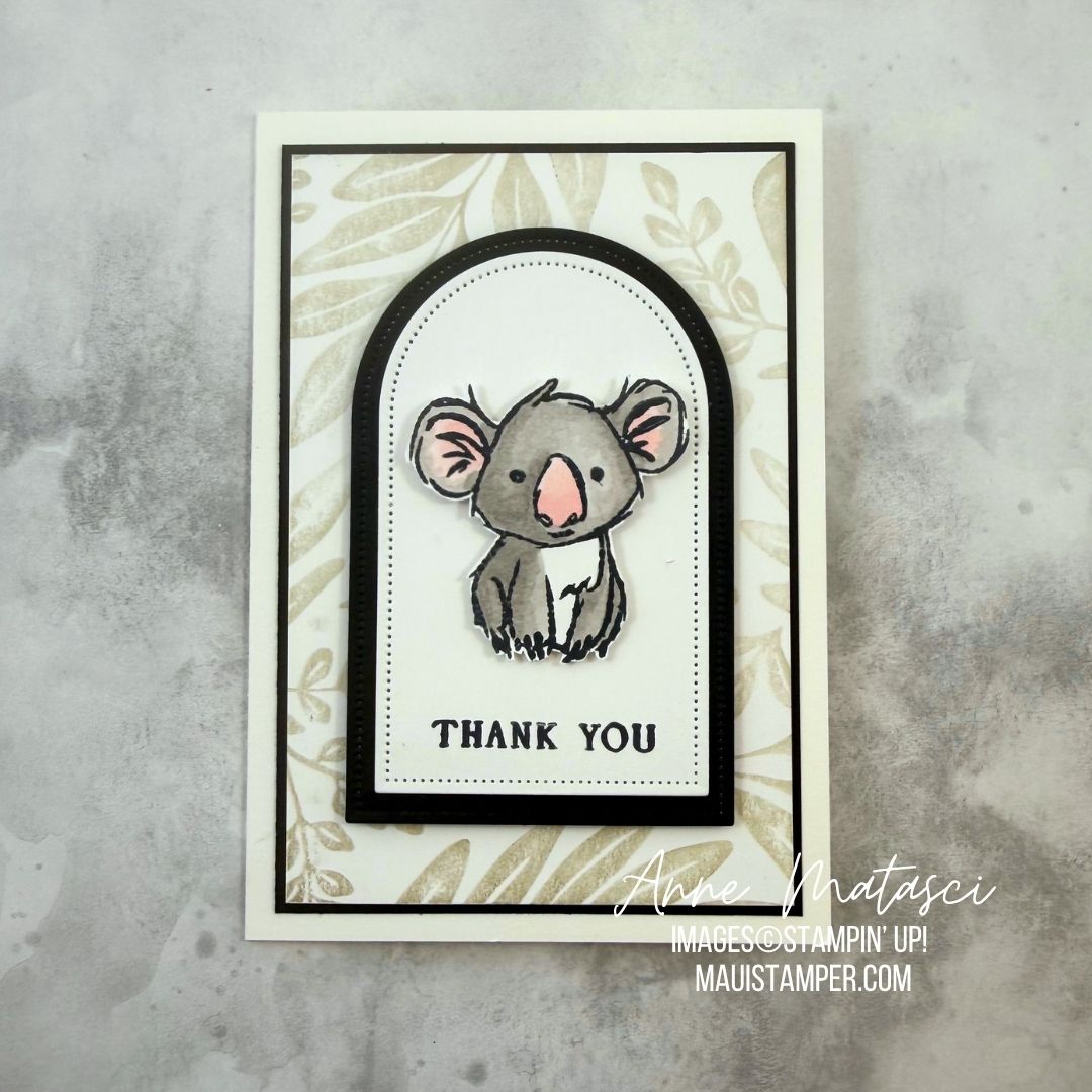
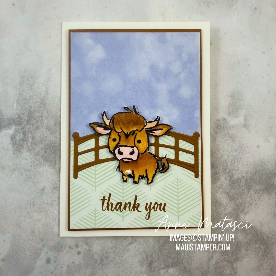
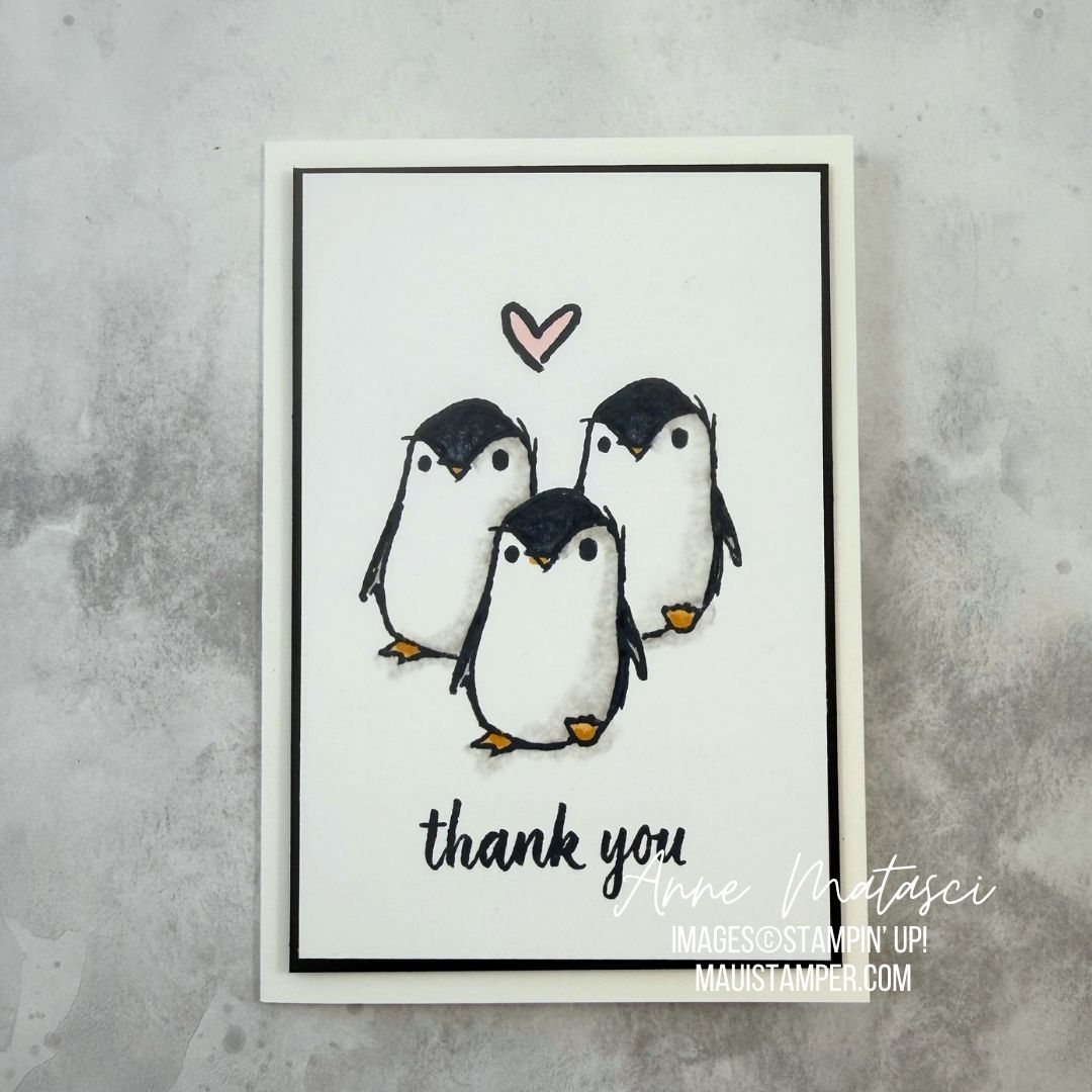
I hope you’re one of the lucky ones who was able to purchase Wild Bunch, the June Product of the Month, before it sold out. These whimsical animals have a certain sophistication to them, and I thought they would make a charming set of thank you notes for new parents.
Stamps: Wild Bunch, Stampin’ Up! Product of the Month for June 2026 (sold out early), Leaf Collection (retired)
Color Palette: Basic White, Basic Black, Smoky Slate, Barely Blush, Pecan Pie, Lost Lagoon, Golden Glow
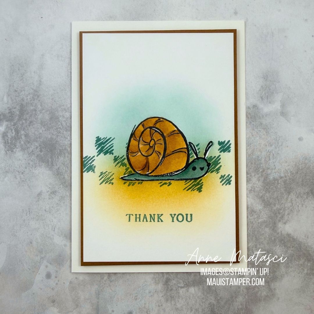
The snail was stamped directly on the focal panel and colored with blends. After I finished coloring, I masked the image and added a brushed background and the textural stamp from the set.
I had to fussy cut the Koala. Fussy cutting isn’t my favorite thing, but I don’t detest it either. This little marsupial is popped up on dimensional on a layered Everyday Arches matted panel. The background stamp is retired.
The cow was a coloring work in progress. I blended the light and dark Pecan Pie and Golden Glow to achieve this look, with bits of Barely Blush in the ears and nose. The cow is fussy cut and lifted on dimensional on top of a retired fence. The cloudy blue sky is from Silly Old Bear DSP and the soft green branches are from Moonlit Flora DSP.
The penguins are a CASE from Lisa Stenz, who did a brilliant job. She used a gray Stampin’ Blend and the Color Lifter to get those soft shadows.
Check out the current Product of the Month, and order early to avoid being disappointed!
Processing…
Success! You're on the list.
Whoops! There was an error and we couldn't process your subscription. Please reload the page and try again.
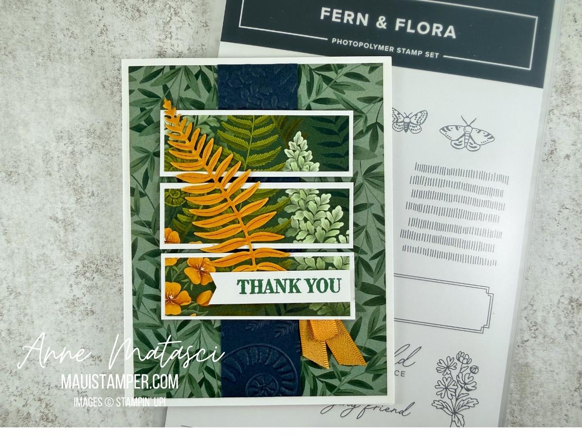
Stampin’ Up! Designer Series Paper (aka DSP) is one of the most versatile design elements in my crafting bag o’ tricks. Our papers are smooth, two-sided, and beautifully designed to accent any project. The Moonlit Flora DSP is especially lush, and it really satisfies my tropical little heart.
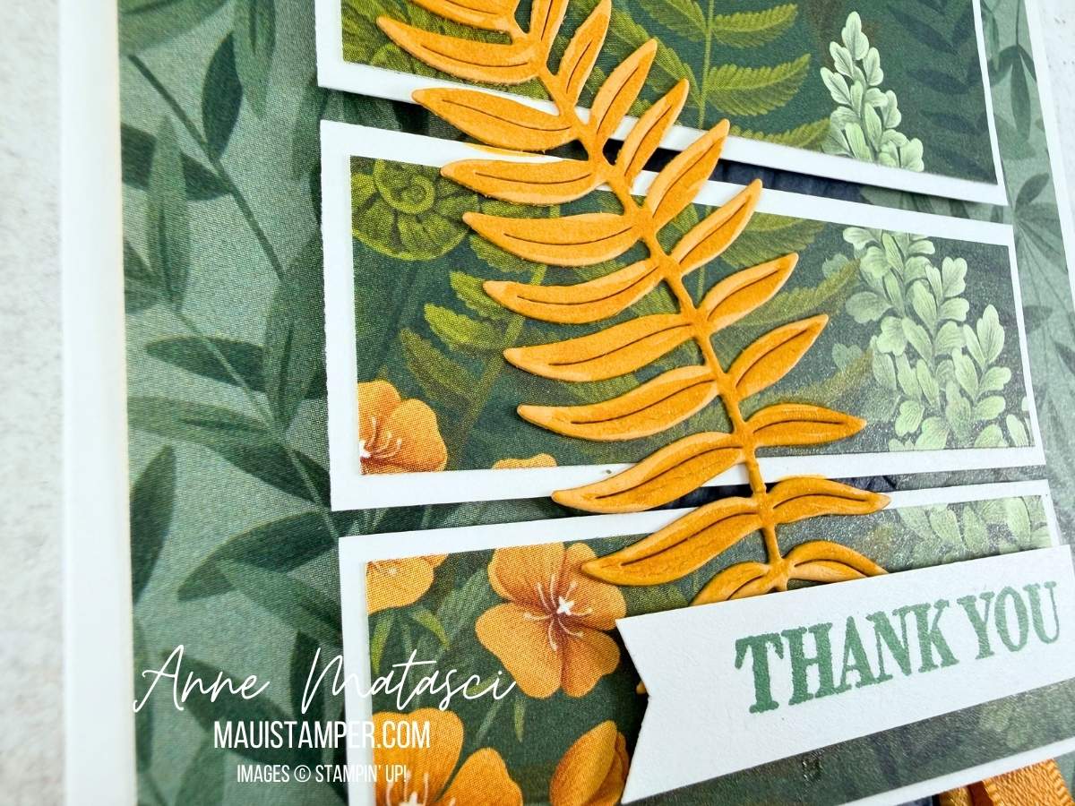
I’ve added some shimmer to the fern die cut with our new Shimmer Brush. I got the idea after I’d adhered the fern to the card front, so the accent isn’t as precise as I’d like. In my house we call this Delayed Intelligence. Sigh.
All of the Fern & Flora images are beautiful, but I chose to use just the paper and the die cuts for this card. This layout is very simple – it uses 2 pieces of DSP and a strip of Secret Sea run through the Fern & Flora embossing folder. The hardest part is choosing which papers to feature!
Give this one a try with the Moonlit Flora DSP or any other paper you have in your stash. You’ll love the results!
Processing…
Success! You're on the list.
Whoops! There was an error and we couldn't process your subscription. Please reload the page and try again.
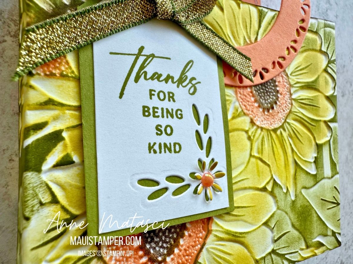
The Sunflower 3D Embossing Folder was at the very top of my July Online Exclusives list. It’s the large format 6″ x 8″ folder, so the options are endless for cards as well as 3D projects. I turned it into a sweet little tote.
Stamps: Spring Corners
Color Palette: Basic White, Darling Duckling, Timid Tiger, Mellow Moss
Accessories: Stamp Cut & Emboss Machine, Sunflower 3D Embossing Folder, Spotlight on Nature dies, Spring Corner dies, daubers, 25-27 In Color Flat Pearls, Paper Snips (gone 😭), Mossy Meadow 1/4″ Gold Ribbon, Stampin’ Dimensionals
It’s quick work to color the embossing folder with daubers. I began by dragging my Mossy Meadow ink pad lightly across the side of the embossed card stock where the sunflowers were recessed. (It’s called the debossed side, but who knows that?) Add ink to the design using daubers, and the result is a rustic, homespun look. If that’s not your style, use Stampin’ Blends, Watercolors, or Watercolor Pencils – but it will take a lot longer!
The handles are two big Spotlight on Nature circles, cut with a smaller circle centered inside. TIP: if you use washi tape across the circles, you can get an even and repeatable ring. Just be sure to take some of the stickiness off the washi by pressing it onto whatever you’re wearing once or twice so it doesn’t tear the paper when you remove it. There’s something about sending it through the Stamp Cut and Emboss Machine and smashing the daylights out of it that makes it want to stick to paper.
My tag is hand cut. I used a piece of chipboard from the back of a DSP package to make a pattern for the angles at the top. I snipped the corners with my Paper Snips and added the corner die cut from Spring Corners, along with a tiny 25-27 In Color Flat Pearl. A bow with the Mossy Meadow and Gold ribbon finishes it off!
Paper Snips, we will miss you. 😭😭😭 They sold out in a hot minute after Stampin’ Up! announced that they would no longer be available from the manufacturer. Stay tuned for an update on a replacement. In the meantime, take good care of your Snips!
Processing…
Success! You're on the list.
Whoops! There was an error and we couldn't process your subscription. Please reload the page and try again.
Oh, it has been a long time since I’ve done a challenge! We have enjoyed a LOT of travel in the first half of 2025. It’s been WONDERFUL, but it’s meant a lot of time away from crafting. It’s great to be home, to sit with all my crafty things and to be inspired!
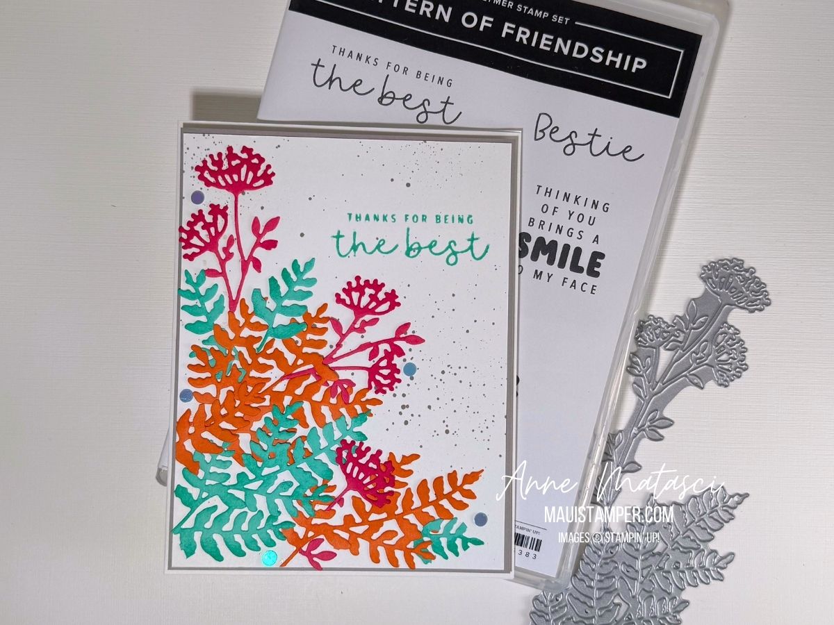
This is ColourInkspiration #188. The challenge colours are Strawberry Slush, Timid Tiger, Coastal Cabana, and Gray Granite. This is a lively bunch of colours if I do say so myself!
This image has lots going on but it’s filled with things I love: the sea, beautiful landscape, flowers, and lots of books! I wouldn’t mind spending a little time in that cove.
I confess: the splatters are from an ancient Stampin’ Up! tool. I *think* it was called the Color Spritzer, and it works by funneling a blast of air past the tip of a Stampin’ Write marker. I love how fine a splatter it creates – more a spritz, if in fact that was the name.
I’m not usually a super-bright color-combo crafter, so this was a bit of a stretch for me. I cut a variety of pieces with the Beautiful Motif dies and played with them until I liked them. I chopped quite a few of them into smaller pieces, allowing me to blend the colours more. And I used our daubers to add a little extra ink to the die cuts for dimension.
Pattern of Friendship is an Online Exclusive bundle. I bought it for the die – oh, just you wait, there are projects coming – but the stamps are all sentiments. I’ve decided I liked them better once they were in my hands. Does that ever happen to you, or is it just me?
Colour Inkspirations is a really fun challenge group. There’s plenty of time to create for each one, assuming you’re not galavanting around the globe. Plus it’s the nicest group of crafters you’ll find anywhere. Check them out, and give it a try!
Processing…
Success! You're on the list.
Whoops! There was an error and we couldn't process your subscription. Please reload the page and try again.
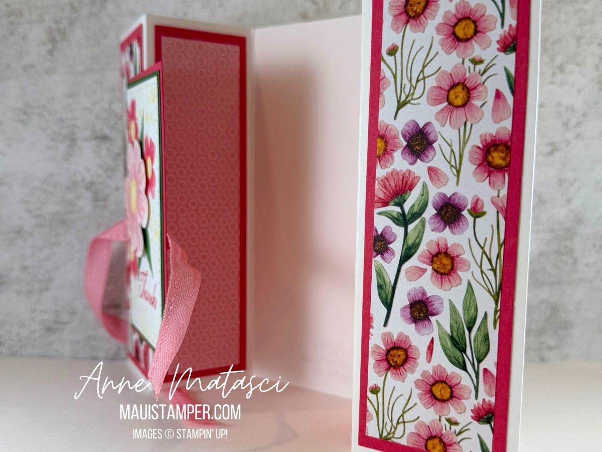
Do you like making Fun Fold cards? This one is super easy. Plus, if you follow my color choices, you’ll have a VERRRY GIRRLY card for that friend – you know the one – that LOVES pink!
Stamps: Impressions Abloom, Elements of Text
Color Palette: Basic White, Garden Green, Pretty in Pink, Strawberry Slush, Melon Mambo, Lemon Lolly
The Textured Notes dies step up any project. Every size has a different design around the edge, but they all coordinate. They’re one of my absolute Go-To products.
Here are the basic dimensions for the gate fold:
Cut a card base to 5 1/2″ x 11″
Score at 2″, 3 3/4″, 7 1/4″ and 9″
Add DSP panels (with or without mats) to each side. This version uses mats that are 1/4″ smaller for length and width from the card base panel, and DSP that are another 1/4″ than the mat.
I adhered ribbon under the center panel. The panel itself is adhered with sticky strip to the left front panel and the ribbon wraps around the entire card.
See the new Floral Impressions Suite in the Online Store.
Processing…
Success! You're on the list.
Whoops! There was an error and we couldn't process your subscription. Please reload the page and try again.
The Beautiful Gallery DSP is absolutely stunning. These 6×6 images are Old World masters quality, and they shine on the front of a card. I have two floral designs to share with you today, and the pair of cards took me less than 10 minutes to create.
Stamps: Layers of Beauty
Color Palette: Very Vanilla, Basic Black, Mossy Meadow
I cut the rectangle with the Textured Notes dies and added the sentiment. I scored one side of the rectangle and tucked it in between the layers. I added Linen Thread before securing the panel to the card front.
The sentiment on this card is from the Textured Notes stamps set, and the Basic Black mat is replaced by a Pecan Pie layer. That’s it!
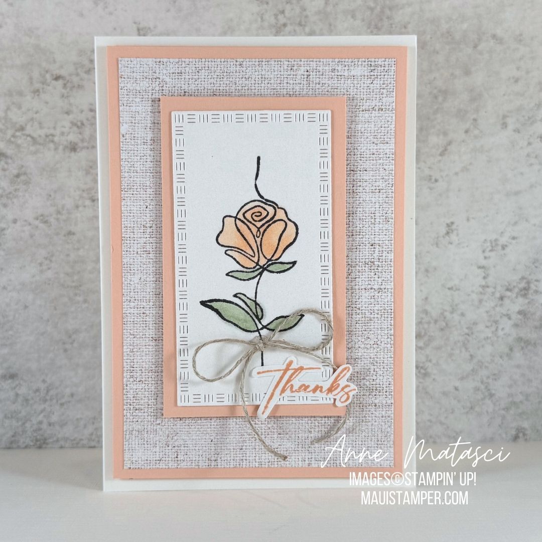
I have one more image to share from Along These Lines. I love the elegant vertical lines of this rose, and decided to pair it with the stunning Woven Textures DSP. To me, these linear images seem to work well with softer tones, so I chose Petal Pink for my rose.
Stamps: Along These Lines, Happy Hibiscus
Color Palette: Basic White, Petal Pink, Soft Sea Foam, Memento Black
This is our smaller format Note Card. I used my snips to trim out just the word THANKS from the sentiment from Happy Hibiscus. I chose the soft linen-look design from the DSP pack so it wouldn’t overpower the rose. It has the feeling of matted artwork, don’t you think?
Shop the Online store for all your paper crafting needs!
Processing…
Success! You're on the list.
Whoops! There was an error and we couldn't process your subscription. Please reload the page and try again.
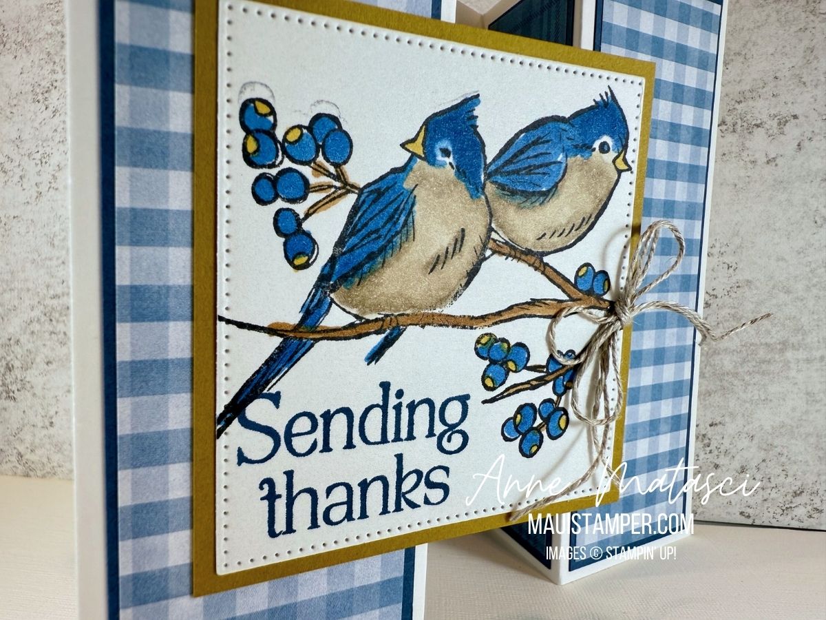
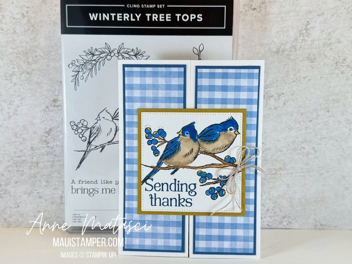
Welcome to my April Last Dance/Last Chance series! Here’s another beauty I’m sorry to see retire, because I have really enjoyed these birdies. I don’t know if there are any birds with this exact coloring in the wild, but I claim artistic license and I don’t care.
This square center panel is made with the Stylish Shapes dies, which are NOT on the Last Chance list (whew!!) It’s backed with a Wild Wheat panel, which IS Last Chance as it’s a retiring 23-25 In Color. You know, when I first saw Wild Wheat I had some rather *ahem* uncharitable thoughts about the color, but once I started pairing it with other colors I became a fan. I especially love it with blue, black and grey tones.
The double gate fold is a lot simpler than it looks. Score a 5 1/2″ x 11″ piece of card stock at 2″, 3 3/4″, 7 1/4″ and 9″ to create the side panels. Once you’ve embellished the side panels, add a focal point of almost any shape to one side and you’re done!
At this writing, the Winterly Tree Tops stamps have sold out, but the dies are still available. And of course, Stylish Shapes has its hand in the air saying “choose me, choose me!!” Visit the Online Store and see the updated Last Chance List.
Processing…
Success! You're on the list.
Whoops! There was an error and we couldn't process your subscription. Please reload the page and try again.
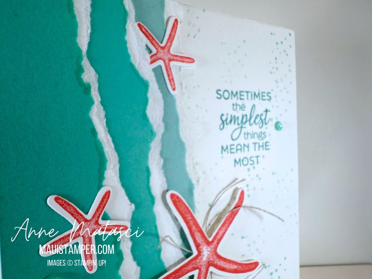
Welcome to my April Last Dance/Last Chance series! I have to tell you, saying goodbye to Seaside Wishes is going to hurt a bit. It’s not leaving my craft room, but once it’s no longer available in the Online Store, I don’t usually share it in a blog post. Farewell, beautiful images!
Stamps: Seaside Wishes
Color Palette: Basic White, Pool Party, Coastal Cabana, Summer Splash, Calypso Coral
Accessories: Stamp Cut & Emboss Machine, Seaside Wishes dies, 24-26 In Color Shimmer Gems, Linen Thread, Glue Dots, Stampin’ Dimensionals
I’ve made more than a few cards with these stamps – you can see some of them HERE and HERE and even a very simple one HERE. For this one, I tore the edge of the card stock. I used strips about 7 1/2″ long so that I could play with the angles on the card front, and I put a piece of Basic White torn card stock between the color layers to bring sea foam to mind. A couple of gems, a sentiment, and the “dits” from the stamp set finish this one off.