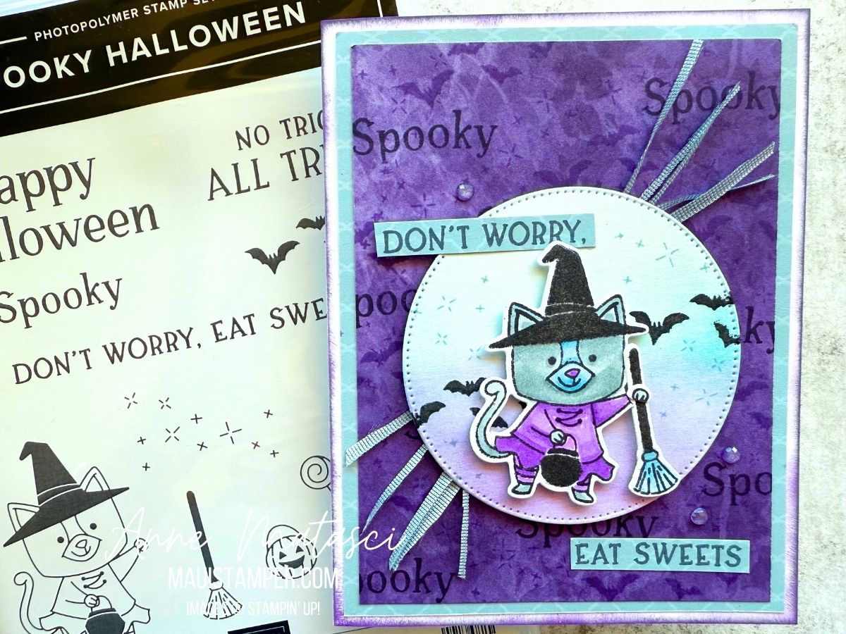
SUNFLOWER TOTE

The Sunflower 3D Embossing Folder was at the very top of my July Online Exclusives list. It’s the large format 6″ x 8″ folder, so the options are endless for cards as well as 3D projects. I turned it into a sweet little tote.

  • Stamps: Spring Corners
  • Color Palette: Basic White, Darling Duckling, Timid Tiger, Mellow Moss
  • Accessories: Stamp Cut & Emboss Machine, Sunflower 3D Embossing Folder, Spotlight on Nature dies, Spring Corner dies, daubers, 25-27 In Color Flat Pearls, Paper Snips (gone 😭), Mossy Meadow 1/4″ Gold Ribbon, Stampin’ Dimensionals

It’s quick work to color the embossing folder with daubers. I began by dragging my Mossy Meadow ink pad lightly across the side of the embossed card stock where the sunflowers were recessed. (It’s called the debossed side, but who knows that?) Add ink to the design using daubers, and the result is a rustic, homespun look. If that’s not your style, use Stampin’ Blends, Watercolors, or Watercolor Pencils – but it will take a lot longer!

The handles are two big Spotlight on Nature circles, cut with a smaller circle centered inside. TIP: if you use washi tape across the circles, you can get an even and repeatable ring. Just be sure to take some of the stickiness off the washi by pressing it onto whatever you’re wearing once or twice so it doesn’t tear the paper when you remove it. There’s something about sending it through the Stamp Cut and Emboss Machine and smashing the daylights out of it that makes it want to stick to paper.

My tag is hand cut. I used a piece of chipboard from the back of a DSP package to make a pattern for the angles at the top. I snipped the corners with my Paper Snips and added the corner die cut from Spring Corners, along with a tiny 25-27 In Color Flat Pearl. A bow with the Mossy Meadow and Gold ribbon finishes it off!

Paper Snips, we will miss you. 😭😭😭 They sold out in a hot minute after Stampin’ Up! announced that they would no longer be available from the manufacturer. Stay tuned for an update on a replacement. In the meantime, take good care of your Snips!

Processing…
Success! You're on the list.

CHARMING (BIRTH) DAY

Have you seen Charming Day? It’s a new Online Exclusive, and yes, it’s another flower set. Telling myself “NO more flowers!” doesn’t seem to be working very well. In this case, it was the sentiments and the fonts that pushed me to Add To Cart. 😆

  • Stamps: Charming Day, Spotlight on Nature
  • Color Palette: Basic White, Strawberry Slush, Pretty in Pink, Daffodil Delight, Granny Apple Green
  • Accessories: Stamp Cut & Emboss Machine, Charming Day dies, Impressions Abloom dies, Floral Impressions DSP, Stampin’ Blends, Blending Brush, Stampin’ Dimensionals

I used a couple of tricks to make this easy. I used a Blending Brush with Pretty in Pink ink to create a light wash of color on my Basic White card base, then added a few textural elements from Spotlight in Nature. I inked the words on the sentiment separately so that I could offset them on the card front.

I cut the DSP and the mat to size and used just a little adhesive to hold them in place, then ran them through the Big Boss together. DSP is lighter weight than card stock, so the two pieces cut through cleanly. I pulled out the center ovals, then finished adhering the card stock and DSP and added them to the card front. The stitched frame on the inside fits inside the opening, so it needs to be carefully glued into place.

The Floral Impressions DSP is all about gorgeous florals, but the “B” sides of the papers are gorgeous tone-on-tone designs. So many options! Time to get crafting, friends.

Processing…
Success! You're on the list.

FLORALS IN BLOOM DESIGNER SERIES PAPER TAKES THE STAGE

Cutting into beautiful Designer Series Papers (DSP) can be really hard to do. I have a stash of paper that I just can’t bear use precisely because it’s too beautiful to cut, and that’s a shame! I took my trimmer to the Florals in Bloom DSP and I’m so glad I did.

  • Stamps: Pretty Florals, Charming Day, Spring Corners
  • Color Palette: Basic White, Petunia Pop, Garden Green
  • Accessories: Stamp Cut & Emboss Machine, Pretty Florals dies, Spotlight on Nature dies, 2 3/8″ Circle punch, Stylish Shapes dies, 2, Florals in Bloom DSP, 24-26 In Color Shimmer gems (retired), Stampin’ Dimensionals

I was inspired by Lyssa Zwolanek at Embellish and CASED her project completely, although I chose a different set of designs from the DSP pack. This card is much easier than it looks, and it really highlights the beautiful designs and coordination of Stampin’ Up! DSP.

The card opens to reveal a narrow panel for your message. Personally, I love this kind of space. I often send birthday cards to friends I see regularly, because who doesn’t love a little happy mail with all the junk in their mailbox? But I don’t have news to share, just good wishes – so a small writing space suits me perfectly.

Once I started I needed to make more. I replicated Lyssa’s gorgeous card, then created a few more of my own. Color makes a big difference in a project! I can’t decide which of these two I prefer – what do you think?

If you’re looking for the Florals in Bloom DSP, it’s currently available. The Pretty Florals bundle is currently out of stock, but it’s expected the week of July 28th. Did you know you can request an email to notify you when a product comes back in stock? Just click “VIEW” when you find the item in the Online Store and add your email to be notified. Easy peasy!

Processing…
Success! You're on the list.

PERFECTLY PEARS FOR COLOUR INKSPIRATION 190

Last week I slipped a Colour INKspiration challenge under the wire. The challenge is based in the South Pacific, and I’m usually pretty good with time zone math, but not this time. Maybe it had something to do with the colour palette: Basic Beige, Crumb Cake and Cajun Craze. Definitely not a Maui Stamper combo!

  • Stamps: Perfectly Pears
  • Color Palette: Very Vanilla, Basic Beige, Crumb Cake, Cajun Craze
  • Accessories: Stamp Cut & Emboss Machine, Perfectly Pears dies, Birch Wood 3D Embossing Folder, daubers, Linen Thread, Stampin’ Dimensionals

Honestly, I think this card would have been happier with more Very Vanilla and less Basic Beige and Crumb Cake. But I considered these colours a real challenge, and I was pleased with myself to have come up with a project that met the challenge.

I used daubers on the leaves, the tiny flowers, the grid, and directly on the pear stamps. Daubers allow subtle shading on card stock, and when applied to a stamp they tend to soften the colour. I love the range of colour I can get with daubers on the pear.

Take a look over on the Colour INKspiration page. It’s a lovely group of crafters, and they almost always allow two weeks to create an entry. Give it a go!

And don’t wait to add Perfectly Pairs to your shopping cart. It’s currently available in the Online Store.

Processing…
Success! You're on the list.

DIY CALENDAR BLOG HOP: JULY 2025

I blinked and it was July. We have 6 months of beautiful DIY Calendars behind us, and 6 ahead – so let’s get started with this one! I’m featuring a brand new set, available today, called Perfectly Pears.

  • Stamps: Perfectly Pears
  • Color Palette: Basic White, Old Olive, Granny Apple Green, Daffodil Delight, Lemon Lolly, Darling Duckling
  • Accessories: Stamp Cut and Emboss Machine, Perfectly Pears dies, DIY Calendar Template, Daubers, Blender Pen, Masking Paper

Not much to this one! The outlines were first, done in Old Olive. I inked the pears in Darling Duckling, then added some Granny Apple Green with a dauber. I gave them the lightest of mists before I put them to paper. The flowers are outlined in Darling Duckling, colored with a Blender Pen in Daffodil Delight and Lemon Lolly. I added Granny Apple Green to the centers because there was a lot of yellow.

I die cut the leaves and added them across the top for a little dimension. I considered die cutting the “front” pear but yeah, nah. The leafy branch isn’t included as a stamp, so it had to be a die cut.

You can find Perfectly Pears in the Online Exclusive release for July. But I’m warning you, there are a lot of glorious new products in the Online Store!

Ready to see what the rest of the DIY team has done? Click the button below to see! And thanks for stopping by this month.

2026 Calendars will be available in September!

Processing…
Success! You're on the list.

Crafting a Rainbow: My First Pride Card Experience

Today is the final day of Pride month and I’m sharing my first-ever Pride card. I’ll confess it took me a while to create the design, as rainbows aren’t a big part of my style (and therefore my crafting supplies). But once I came up with the concept, this was a very satisfying project.

  • Stamps: None
  • Color Palette: Basic White, Secret Sea, Real Red, Pumpkin Pie, Daffodil Delight, Shaded Spruce, Night of Navy, Highland Heather
  • Accessories: Stamp Cut & Emboss Machine, Alphabet Ala Mode dies, Pattern of Friendship die, Stampin’ Blends, Masking Paper, Stampin’ Dimensionals

The first step was to create the rainbow panel. I measured the height of the Alphabet Ala Mode dies: 1 9/16″, to be precise. I made my panel 2″ high, which meant each stripe was approximately 1/3″ high. Turns out this was easier to do in the metric system, so my panel was 50mm high and each stripe was 8 1/3mm (which was easier to estimate).

I cut a large focal panel with extra space on both the height and width. I marked my distances on the side of my focal panel, and used Masking Paper to block off each stripe. I colored each one with a Stampin’ Blend, and I found I got best results by using a fresh piece of Masking Paper for each edge.

Once the Rainbow panel was complete, I used Washi Tape to secure the letters evenly across the panel before running it through the Stamp Cut and Emboss Machine. I held my breath as I did this step, hoping that a) the letters were straight and b) the Washi wouldn’t stick to the rainbow. WHEW. I was so glad when it worked!

After that, it was super easy. I matted the rainbow, matted a second panel, and created a third panel with the Pattern of Friendship die. Add liberal quantities of Stampin’ Dimensionsals, and it’s done!

You could make someone’s day with this card. Let them know you support them. All products are available in the Online Store.

Processing…
Success! You're on the list.

COLOUR CHALLENGES: COLOUR INKSPIRATION #189

My friends at Colour INKspirations know how to set up a proper challenge! This combination was a tough one, as Melon Mambo generally doesn’t get much my attention. But by toning it down using daubers, I came up with a project that met the challenge!

  • Stamps: Impressions Abloom, Elements of Text, Perfectly Pears, Inspiring Imperfections
  • Color Palette: Basic White, Darling Duckling, Melon Mambo, Cloud Cover, Secret Sea
  • Accessories: Stamp Cut & Emboss Machine, Impressions Abloom dies, Perennial Postage dies, Gallery Blooms dies, Exposed Brick 3D Embossing Folder, Kintsugi Inspirations DSP, Dauber, White Bakers Twine, Wink of Stella, Fine Tip Glue pen, Stampin’ Dimensionals

Here’s the inspiration photo. I knew right away I was going to have to be “INKspired” to work in that Melon Mambo! And while I adore Secret Sea, it’s a very bold color, so I used it sparingly as an accent.

Looking for elements for this card, I pulled out some treasures that are still available but have been sidelined in favor of newer releases. That 3D Exposed Brick EF is one of my absolute GO-TO elements. White Bakers twine is too, although it will never replace my beloved Linen Twine.

I used our Fine Tip Glue pen to add shine to the centers of those flowers. They have a little Cloud Cover daubed in the center to soften the white-white-white and tie in with the background DSP. My FTGP has lost its Fine Tip, so I unscrew the cap and use my trusty bamboo skewer to paint the glue over the circle. The skewer lets me control the amount I apply but doesn’t leave brush strokes or messy cleanup.

Cloud Cover ink has been a bit of a heartbreak, as it turns out the formula reacts with the foam in our ink pads, causing instability. The solution is to use one of our un-inked spots and Cloud Cover Ink Refill. It takes a bit longer to ink larger stamps, but I think it’s worth the effort!

There’s still a little time to join the challenge. It closes at 7pm Monday AEST (remember, for the US they are a day ahead). I’d love to see what you do with Melon Mambo!

Processing…
Success! You're on the list.

Easy Gate-Fold Card Tutorial with Kintsugi Inspirations

Do you have a Designer Series Paper stash? Mine is threatening a semi-hostile take over, but that doesn’t stop me from adding to my collection. I loved Kintsugi Inspirations the moment I set eyes on it at OnStage 2025 in Brisbane, and I couldn’t wait to cut into it and make something!

This is an easy gate-fold card that uses narrow strips of DSP. I find I have a lot of those when I cut larger pieces for card fronts. I love using up those scraps!

Here are the measurements you’ll need to make this card:

  1. Cut a piece of card stock to 5 1/2″ x 11″ for your card base.
  2. Score the long side at 2″, 3 3/4″, 7 1/4″ and 9“.
  3. Fold the 2″ and 9” outer panels towards the back and the 3 3/4″ and 7 1/4″ scores towards the center of the card. This creates the gate fold shape.
  4. Cut 2 each of DSP, choosing coordinating papers: 1 3/4″ x 5 1/4″ and 1 1/2″ x 5 1/4″
  5. Cut 2 each of coordinating card stock: 1 7/8″ x 5 3/8″ and 1 5/8″ x 5 3/8″
  6. Layer the DSP on the card stock panels. Adhere the narrower panels to the inside folds and the wider panels to the front. Add a focal point, embellish, and admire your beautiful work!

Gate folds often have some kind of closure, but I prefer the simplicity of this card as it is. Ready to give it a try? Your choice of Designer Series Paper will determine the mood of your card. Have some fun with it, and enjoy using up those scraps!

Suites and suite products are BOGO this month in the Online Store. Learn more about Stampin’ Up! Designer Series Paper HERE.

Processing…
Success! You're on the list.

Discover Colour Inkspiration #188: Crafting with Vibrant Colors

Oh, it has been a long time since I’ve done a challenge! We have enjoyed a LOT of travel in the first half of 2025. It’s been WONDERFUL, but it’s meant a lot of time away from crafting. It’s great to be home, to sit with all my crafty things and to be inspired!

This is ColourInkspiration #188. The challenge colours are Strawberry Slush, Timid Tiger, Coastal Cabana, and Gray Granite. This is a lively bunch of colours if I do say so myself!

  • Stamps: Pattern of Friendship
  • Color Palette: Basic White, Strawberry Slush, Timid Tiger, Coastal Cabana, Gray Granite
  • Accessories: Stamp Cut & Emboss Machine, Beautiful Motif dies, Daubers, retired flat dots, Stampin’ Dimensionals

Here’s the inspiration photo:

This image has lots going on but it’s filled with things I love: the sea, beautiful landscape, flowers, and lots of books! I wouldn’t mind spending a little time in that cove.

I confess: the splatters are from an ancient Stampin’ Up! tool. I *think* it was called the Color Spritzer, and it works by funneling a blast of air past the tip of a Stampin’ Write marker. I love how fine a splatter it creates – more a spritz, if in fact that was the name.

I’m not usually a super-bright color-combo crafter, so this was a bit of a stretch for me. I cut a variety of pieces with the Beautiful Motif dies and played with them until I liked them. I chopped quite a few of them into smaller pieces, allowing me to blend the colours more. And I used our daubers to add a little extra ink to the die cuts for dimension.

Pattern of Friendship is an Online Exclusive bundle. I bought it for the die – oh, just you wait, there are projects coming – but the stamps are all sentiments. I’ve decided I liked them better once they were in my hands. Does that ever happen to you, or is it just me?

Colour Inkspirations is a really fun challenge group. There’s plenty of time to create for each one, assuming you’re not galavanting around the globe. Plus it’s the nicest group of crafters you’ll find anywhere. Check them out, and give it a try!

Processing…
Success! You're on the list.

DIY CALENDAR BLOG HOP: June 2025

Welcome to the June DIY Calendar Blog Hop. I took a look at the last few months and decided it was time I focus on something other than FLOWERS. Almost everyone loves them, but I think there can be too much of a good thing! My June calendar is definitely different:

  • Stamps: Along These Lines, Elements of Text
  • Color Palette: Memento Black, Basic White, Secret Sea, Misty Moonlight, Azure Afternoon, Crumb Cake, Smoky Slate
  • Accessories: DIY Calendar Template, Stampin’ Blends, Paper Snips, Stampin’ Dimensionals

I was inspired by Jay Soriano’s blended ocean background. He does a masterful job of creating a smooth transition in his colors. I chose a slightly different palette from Jay, but I followed his technique and was very pleased with the outcome.

If you don’t have Elements of Text, consider adding it to your next order. It’s my GO-TO set whenever I need a little extra something. Well. On a card, anyway. 😉

I fussy cut the dolphin so they would really stand out. I considered masking them, but I was afraid the movement of the brushes might dislodge the masks. They’re small and simple, and fussy cutting allowed me to put one of them up on a dimensional.

Please take a moment to follow along on our hop and see what Malia, Cheryl and Sharon have created for the month of June. We’re very glad you chose to join us!

Would you like to make your own DIY Calendars? The template is just $5 – let me know that’s what you want and I’ll send you an invoice. Please tell me you’re a real being in the message box – I’m getting increasing amounts of spam. Everything is done digitally, so you’ll have it quickly.

You are only purchasing a template, which you can download and print for your personal use.

Processing…
Success! You're on the list.