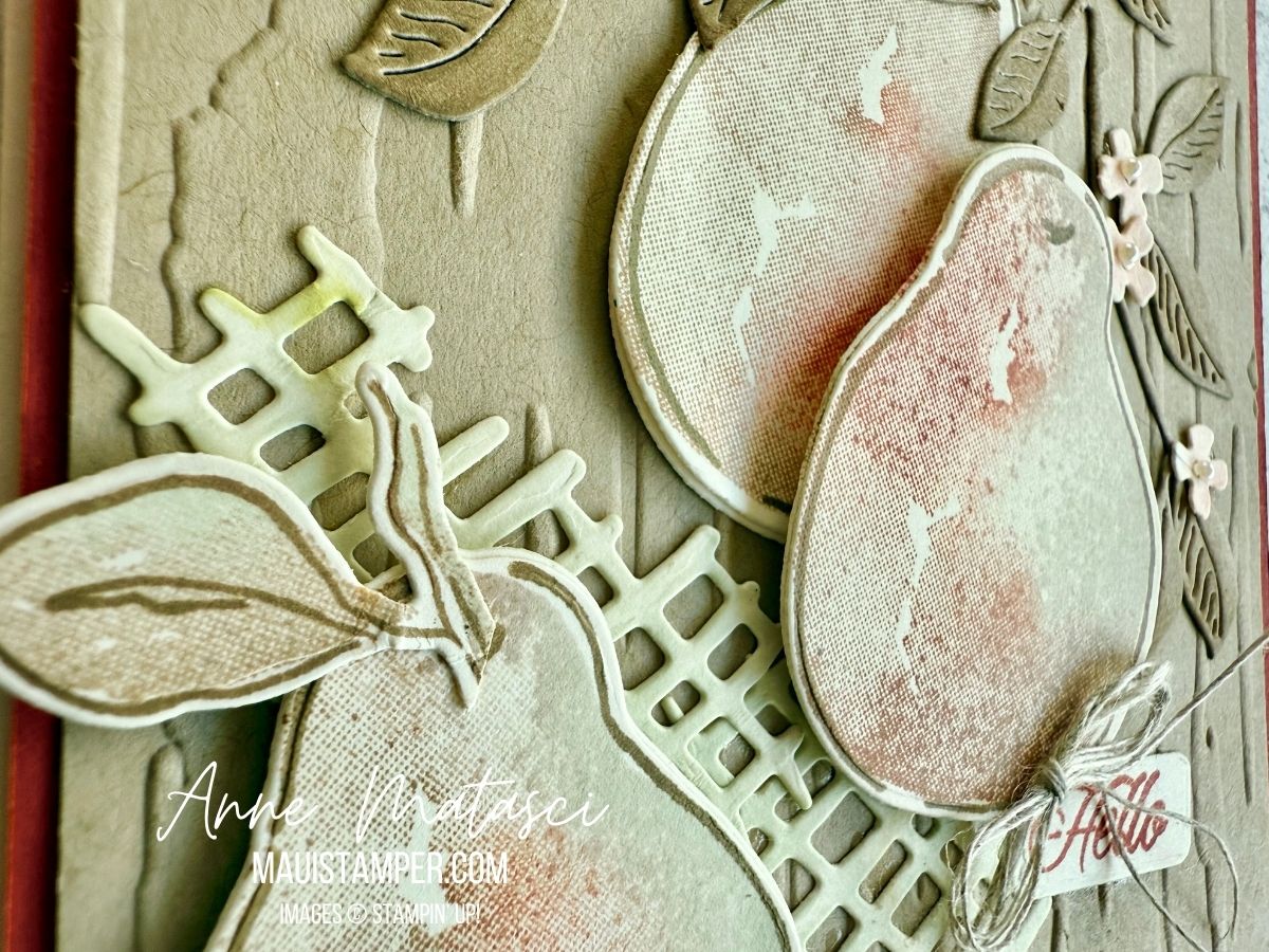
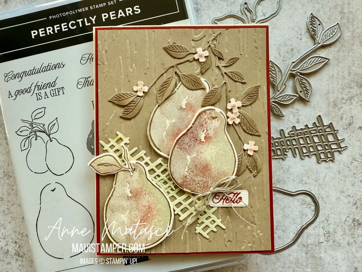
Yup, I’m still rockin’ that Patterns of Friendship die! Today I’ve paired it with the Memories and More Celebration Expressions card pack and the Along These Lines stamp set for a colorful birthday card. I used the Patterns of Friendship die on the card front and love the result!

- Stamps: Along These Lines, Spring Corners
- Color Palette: Basic White, Balmy Blue, Pretty in Pink, Berry Burst, Granny Apple Green, Memento Black
- Accessories: Stamp Cut & Emboss Machine, Patterns of Friendship die, Stylish Shapes die, Stampin’ Blends, Memories and More Celebration Expressions card pack, Stampin’ Dimensionals

I confess, there’s a bit of work to fussy cutting the balloons, but straight lines and simple curves are actually pretty easy. The cake is quick to color, and everything else is just layers. I love complex cards, but simple ones surely have their place!
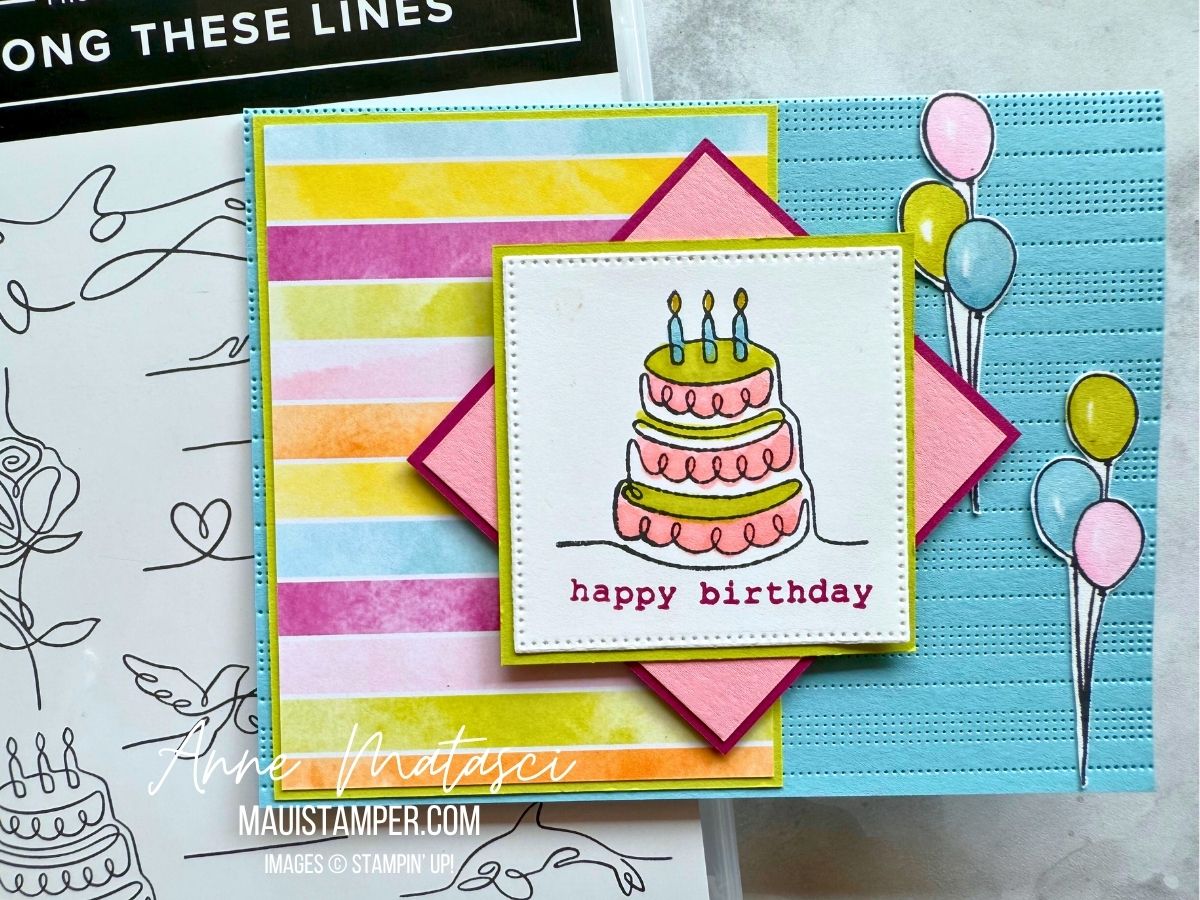
The best part is that all the elements for this card are currently available. Shop the Online Store and see!
Processing…
Success! You're on the list.
Whoops! There was an error and we couldn't process your subscription. Please reload the page and try again.