
And OH MY GOODNESS!! You are going to be in love too! Just wait until you get your hands on our new Stampin’ Up! Firm Foam Ink pads!!!
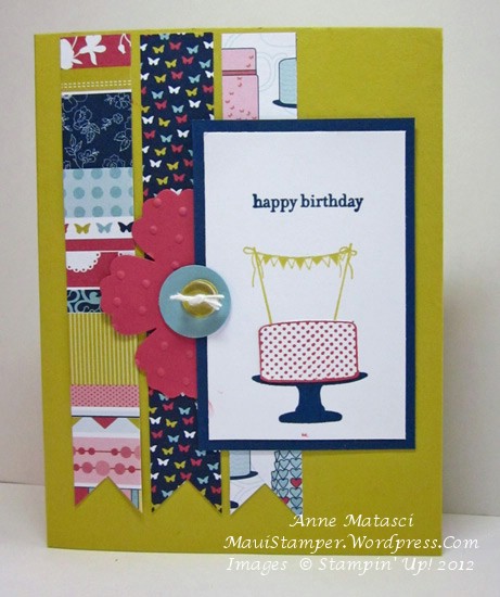
- Make a Cake and Teeny Tiny Wishes stamp sets
- Patio Party Designer Series Paper
- Whisper White, Summer Starfruit, Midnight Muse,Primrose Petals and Baja Breeze card stock
- Summer Starfruit, Midnight Muse and Primrose Petals FIRM FOAM INK PADS!!
- 1 inch square, Blossom, 3/4 inch circle and Bitty circle punches
- Bitty Buttons
- White Bakers Twine
- Big Shot and Perfect Polka Dots embossing folder
I am waiting for the rest of the colors – I only have the In Color 2012-2014 ink pads in Firm Foam but as soon as I used them I knew I had to have the rest! I am stalking my own front lanai because they should be here any day now!!!
{OK. Breathe. It’s going to be just fine. Breathe.}
In other news, if you choose to become a Stampin’ Up! demonstrator in June (for only $99 I must add) you’ll receive the Make a Cake stamp set, Patio Party Designer Series paper and Patio Party My Digital Studio Suite as a free gift! It’s a pretty sweet deal – check it out. Details at My Online Store – you can sign up in minutes and have your goodies on your doorstep in days. YES – you too can be a front-lanai-stalker!
For the record, I am also very much in love with my wonderful husband, Mr. Maui Stamper. In fact, the Firm Foam Ink Pads, as Fabulous as they are, do not hold a candle to Mr. Maui Stamper. Just sayin’.


