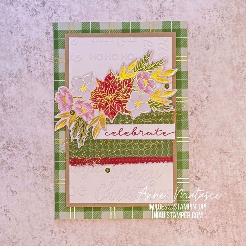
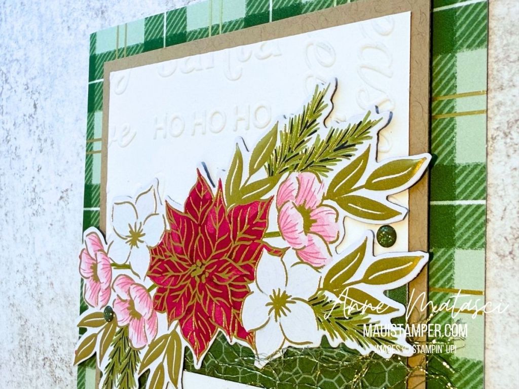
The Traditions of Christmas DSP does it again! This image can also be cut with the Stamp Cut and Emboss Machine using the Christmas Greenery dies. You’d be surprised how quickly this card comes together when you have a ready-made focal point.

- Stamps: Lasting Linen
- Color Palette: Basic White, Real Red, Pool Party, Garden Green, Gold
- Accessories: Stamp Cut & Emboss Machine, Peaceful Greenery Embossing Folder, Christmas Greenery dies, Traditions of Christmas DSP, Dear Dots, Stampin’ Dimensionals
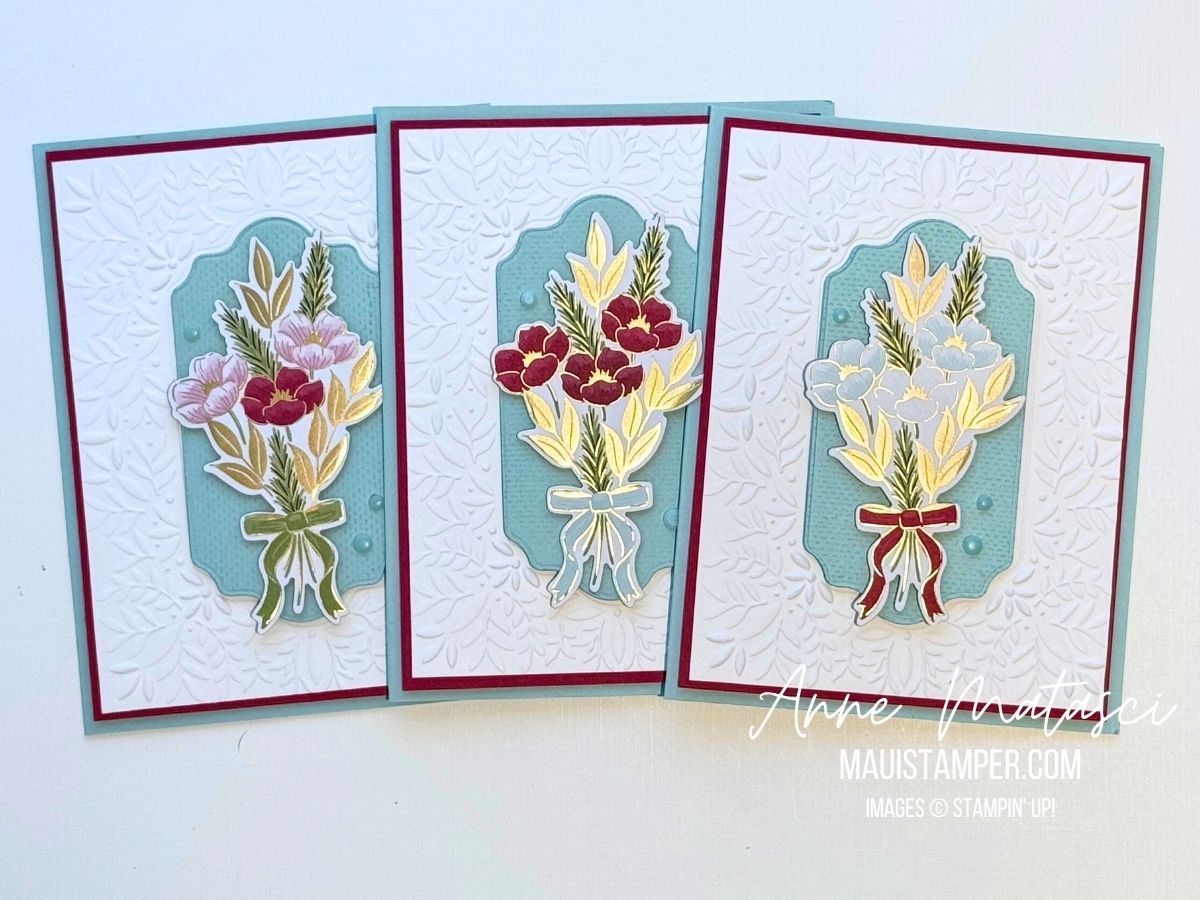
This image is plentiful on the page of DSP, and comes in 3 color ways. Look closely at the background of the Pool Party die cut, as it’s been stamped with our new Lasting Linen stamp. The texture is GORGEOUS and I hope this one sticks around for a very very very long time.
When the coloring is done for you, the cards go together very quickly. I don’t know about you, but it seems as though this time of year I need a LOT of cards. Head over to the Online Store if you need a little more DSP or some dies.
Processing…
Success! You're on the list.
Whoops! There was an error and we couldn't process your subscription. Please reload the page and try again.