Cheery and Bright

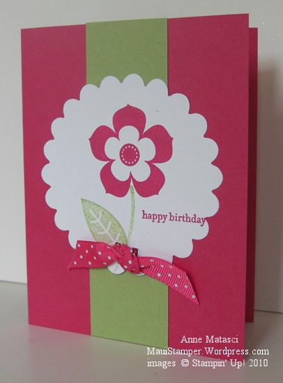
Time for a break from all these farewells!  Today’s card is very simple and cheerful and the colors are NOT retiring!

Petal Pizazz Stampin' Up! Melon Mambo Certainly Celery

  • Petal Pizazz and Teeny Tiny Wishes stamp sets
  • Whisper White, Certainly Celery and Melon Mambo card stock
  • Certainly Celery and Melon Mambo Classic ink pads
  • Big Shot, Scallop Circles #2 Bigz die and Stampin’ Up! Backgrounds 1
  • Melon Mambo Polka Dot grosgrain and double rectangle punch

Hard to see that texture from the Backgrounds 1 Texturz Plate but trust me, it’s there.  I’ve become accustomed to the sharp definition of the Impressions Embossing folders and forgot to adjust for the more subtle look of the Texturz Plate with my sophisticated photographic set-up.  (Ha!  One of these days I’ll show you same photo set-up and you will have a Very Good Laugh.)

We need a cheery card because today is Tax Day.  I’ve been an April 15th filer before and it’s no fun.  In truth I don’t find anything fun in taxes at all, and that’s why I have my wonderful Tax Man figure out the whole mess.  I still spend the better part of a day gathering records (generally spread over an entire week in order to optimize the irritation factor) but at least I don’t have to figure out all the forms.  I just write the check.  Ugh.

Back to cheery cards!  Each year when the In Color collection is announced there is always at least one color that I look at and say “hmmph” in that I-don’t-think-so sort of way.  Melon Mambo was that color for me this year, but it has grown on me.  Good thing, because it’s going to be part of the new Color Collection.  I’m looking at it with new eyes, realizing it won’t retire the end of June like In Colors in the past have done.  I can’t wait to try it out with Early Espresso…there’s an Espresso that will really wake you up!

A Fond Farewell to Ballet Blue

Ballet Blue.  All by itself it’s a lovely shade of blue.  I wear that color and I’ve decorated with that color.  But I seldom make cards with Ballet Blue.  Not exactly sure why but there you have it.

Stampin' Up! Medallion Joseph's Coat

  • Medallion, En Francais and Teeny Tiny Wishes stamp sets
  • Ballet Blue, Pale Plum, and Whisper White card stock
  • Ballet Blue, Pale Plum, Perfect Plum and Mellow Moss Classic ink pads
  • Oval Punch and Small oval punch, brayer
  • Clear Rhinestone brads, piercing tool and mat
  • Stampin Sponges, Embossing Buddy, Clear Embossing powder and Heat Tool

I’m playing with techniques – can you tell?  This is Joseph’s Coat and if I didn’t know better, I would think it was developed with this Medallion stamp in mind.  The tutorial shows the color applied to the base card stock in stripes using the (now retired) spectrum pad, but I applied color with Stampin’ Sponges.  I like the look better, especially with such a bold stamp.

This technique takes me back to grade school, back in the day when we did art projects in class.  We would color as hard as we could with crayons in the same sort of random pattern, then cover it all with a thick coat of black crayon.  The final step was to etch a design in the black, revealing the pattern of color underneath it.  It must have kept us occupied for a LONG time!  Our crayons never looked the same after one of those projects…especially the black crayon.

Farewell, Ballet Blue.

A Fond Farewell to Mellow Moss

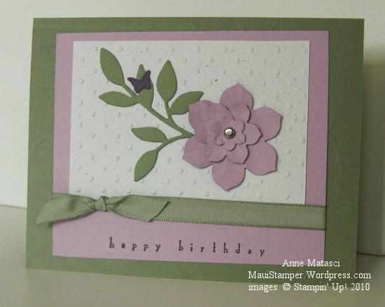
Ah, Mellow Moss – there’s a color I’m going to miss.  It’s soft, it’s versatile, and it plays so well with other colors.  But change is good and I am embracing this Color Renovation for all the wonderful new colors and color combinations it promises.

Stampin' Up! Big Shot Mellow Moss Color Renovation

  • All Holidays Stamp Set
  • Mellow Moss, Pale Plum, Perfect Plum and Naturals White card stock
  • Perfect Plum Classic ink pad
  • Big Shot, Little Leaves and Birds and Blooms Sizzlets, and Beautiful Wings Embosslit
  • Perfect Polka Dots impressions folder and Stampin’ Up! Backgrounds 1 Texturz plates
  • Mellow Moss taffeta ribbon, piercing tool and mat and a silver brad

The Birds and Blooms Sizzlets have 3 graduated flowers that are perfect for this layered technique.  I like to scrunch them a little so they have some dimension.  My scrunching technique isn’t very sophisticated – it amounts to twisting and bending the paper until it’s soft enough to work with.  Once I’m satisfied with the flowers, I stack them up on the piercing mat and push the piercing tool through them.  I pick up my brad and then lift the flower stack off the tool and right onto the brad before they can even think about getting disorganized.

This card would be easy to mass produce – the Sizzlets can all go through the Big Shot at one time and you could use at least 3 of the 5 butterflies produced by the Embosslit.  You wouldn’t have to use Mellow Moss.  And after June 30, if you don’t have a stash set aside, you won’t be able to.

Farewell, Mellow Moss.

A Fond Farewell to Lavender Lace

OK, well maybe only kinda fond.  Lavender Lace is one of those colors that I bought as a new demonstrator because I “needed” to have all the colors.  It’s never been a color that cried out “Me! Me!” in the stamp room.  More often than not, I would use it because I felt guilty that I had neglected it.

As of June 30, I will be 100% Lavender Lace Guilt Free.

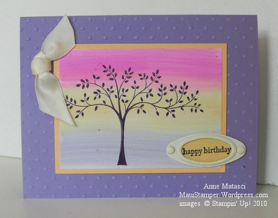
That said, I like the way it looks in this card:

Stampin' Up! Lavender Lace Thoughts and Prayers

  • Thoughts and Prayers and Teeny Tiny Wishes stamp sets
  • Lavender Lace, Apricot Appeal and Glossy White card stock
  • Elegant Eggplant Classic ink pad
  • Lavender Lace, Apricot Appeal, and Pixie Pink Classic ink refills
  • Styled Vanilla Hodgepodge Hardware; Big Shot and Perfect Polka Dots Impressions folder
  • Double Rectangle punch and 5/8 inch Vanilla Satin ribbon

The background behind the fabulous tree from Thoughts and Prayers is the oh-so-easy Striped Wipe technique.  I am such a fan of that tree.   It’s graceful and has just enough asymmetry to give you room to embellish away without disturbing the balance of the card.

Lavender Lace looks great with Pixie Pink, which ought to give you a clue to my feelings about Pixie Pink!  I’ll miss Apricot Appeal though – my upline uses it a lot and I’ve learned to love it.

Speaking of Crystal, I saw her twice last week and got to feed baby Isaac.  He’s a man-child, always hungry.  What is it about baby boys?  It’s hard to get their little tanks all filled up.

Off to fill up my Stampin’ Tank.

A Fond Farewell to Cameo Coral

If you’ve seen it once today, you’ve seen it a hundred times:  Stampin’ Up! announced a complete Color Collection Renovation yesterday.  30 (yes, thirty) colors from the Color Families are retiring at the end of June, making way for 5 brand new colors and a host of beloved In Color selections.  The Color Renovation will organize Stampin’ Up! colors into four Color Collections, each with 10 beautiful, trendy, inspiring colors.

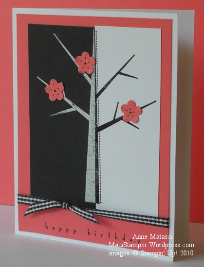
Some of the colors that are being retired are certainly ready for that honor, but there are some that it will be a little harder to bid farewell.  Today’s card uses the Split Negative technique (a great tutorial is at SplitCoastStampers) and features retiring color Cameo Coral:

Stampin' Up! Cameo Coral Split Negative Season of Friendship

  • Season of Friendship and All Holidays stamp sets
  • Whisper White, Cameo Coral and Basic Black card stock
  • Cameo Coral and Basic Black Classic ink pads; Whisper White Craft ink pad
  • Embossing Buddy, White Embossing Powder and Heat tool
  • Trio Flower punch,  Black Gingham ribbon and Black Stampin’ Write Journaler

I’m running a series of Technique Classes over the next few months – it’s a way to challenge myself to try new things – and this card is for the class on Saturday.

I’m a firm believer in change.  It isn’t always easy, but it always presents new opportunities.  As much as I have enjoyed some of these retiring colors, I am thrilled the Stampin’ Up! is moving forward with a contemporary new face lift and I think you’ll be really pleased when you see the new selections.  That said, if you’re a fan of Cameo Coral, I suggest you head on over to my Online Store and stock up on ink pads, ink refills, and paper (don’t forget the 12×12!).

Aloha, Cameo Coral!

One stamp, a thousand cards

I know I’ve said that if I could take only one stamp set to a desert island I would take Vintage Vogue, but if I could take only one stamp all by it’s lonesome I would take Medallion.

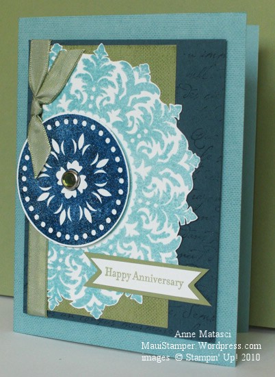
Happy Anniversary Medallion

  • Medallion, French Script and Linen (retired) background stamps; Teeny Tiny Wishes
  • Whisper White, Mellow Moss, Not Quite Navy and Baja Breeze (retired) card stock
  • Baja Breeze, Mellow Moss and Not Quite Navy Classic ink pads; Versamark ink
  • Champagne Mist Shimmer Paint in solution with rubbing alcohol as Shimmer Spray
  • Mellow Moss taffeta ribbon, Circle Ice Rhinestone brads, Photo Corner punch
  • Embossing Buddy, Clear Embossing powder and Heat Tool

I used the photo corner punch to make the points on the little banner, and I embossed the Not Quite Navy circle from the Medallion background stamp to add texture. Oh and ps, I relied on my favorite all time color combo of blues and greens.  You know this is a special card because I dug into my stash of retired Baja Breeze card stock!

My amazing husband and I celebrated 29 years of married on Easter Sunday.  It was a busy day filled with church and family (including skype conversations with the West Coast and Perth, Australia – lots of time zone math) plus dinner and a trip over to the beach to drink a little champagne and watch the sun go down.  I’m so blessed to be married to my best friend, and I wanted a special card to tell him how much he means to me.  My theme was “Classic Masculine Romance” – not quite sure I hit it, but I’m pleased with the card all the same.  He liked it too.

Happy Birthday, Carol

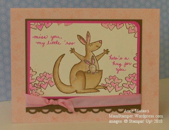
Today my oldest daughter celebrates her birthday…except of course she’s in Australia where it’s tomorrow, so she celebrated it yesterday.  I think.  Can you blame me for being confused?  I hope she’s gotten her package, and here’s what I tucked inside:

Happy Birthday Carol

  • Build a Roo stamp set
  • Very Vanilla, Soft Suede, Blush Blossom and Pixie Pink card stock
  • Blush Blossom and Soft Suede Classic ink pads
  • Soft Suede and Pixie Pink ink refill and Stampin’ Write marker; the Aquapainter
  • Corner Rounder, Scallop Trim border punch and Pretty in Pink taffeta ribbon

Love that little joey in the pocket!  I like to stamp the joey on a scrap, trim it and attach it with Tombo – there’s a little more dimension that way and it seems more real.

I took a deep breath and wrote my own sentiment.  I always worry I’ll mess it up but for this card I knew just what I wanted to say and nothing else would do.  Kristina Werner often hand writes her sentiments and they look great.  I just need to learn to be more bold and increase my “font” size.

Happy Easter

Happy Easter

  • Embrace Life, Well Scripted, and Vintage Vogue stamp sets
  • Very Vintage jumbo wheel
  • Stazon black ink, So Saffron and Bermuda Bay Classic ink pads
  • Watercolor paper, Naturals White, Bermuda Bay, So Saffron and Basic Gray card stock
  • Aquapainter, Bermuda Bay ink refill and Champagne Mist shimmer paint
  • Stampin’ Sponge, Gray Taffeta ribbon, Big Shot and Perfect Details Texturz plate

Today Christians everywhere celebrate the triumph of life over death, light over darkness, love over hatred.  Whether or not you believe in Jesus Christ, we can all make our world just a little bit better by bringing light into our lives and choosing to love.  Happy Easter.

Courage

I bought the Hope Happens stamp set because I liked this sentiment so much:

It Takes Courage

  • Hope Happens and Vintage Vogue stamp sets
  • Whisper White, So Saffron, Certainly Celery and Tempting Turquoise card stock
  • Certainly Celery and Tempting Turquoise Classic ink pads
  • Ribbon Originals Elementary, Piercing tool and mat, and scoring blade
  • Big Shot and Beautiful Wings Embosslit

It’s hard to see, but the white card base is scored  at right angles to create a texture.  I fiddled around for so long with other stuff that I ran out of steam when it came to doing what I’d planned with this scored grid, so I just used it as is.

I don’t consider myself especially courageous, and for that matter, I don’t consider myself especially grown up.  I’ve learned to ACT like a grown up at least some of the time, but being one is something altogether different.  I can dress the part, and I can certainly talk it too, but I find it hard to believe I’m really a grown up.  I suppose that to my kids and their peers I seem like a grown up, always reminding them to do responsible things like pick up after themselves and develop a budget they can stick to and tackle big problems one step at a time (hey, kids, look how I managed to nag each of you!!)  But the truth is, I have trouble with all of those things myself – that’s why I can see them so clearly in others (my kids, for example).    Real courage lies in looking honestly at ourselves, accepting what we find and stretching to become just a little bit better.  And if that’s being a grown up, well maybe I’m in the club after all.

Soft Daisies

Here’s another shot at Poppin’ Pastels.  I had a great time with my first attempt and was anxious to try it again.  I had a lot of fun with this:

Upsy Daisy Poppin Pastels ColourQ Challenge

  • Upsy Daisy and Thank You Kindly Stamp sets
  • Linen background stamp (retired) and Very Vintage jumbo wheel
  • Versamark ink and Lavender Lace and Certainly Celery Classic ink pads
  • Whisper White, Lavender Lace, Lovely Lilac, Bermuda Bay and Certainly Celery card stock
  • Stampin’ Pastels, Piercing tool and mat and White taffeta ribbon
  • Styled Silver Hodgepodge Hardware
  • Embossing Buddy, Clear Embossing Powder and Heat Tool

The colors came from Arielle’s ColourQ 26 challenge, and though I was skeptical at first, by the time I finished the card I was sold on this combination.  I love how the Upsy Daisy images look sort of Impressionistic.  Heaven only knows I could never do that with paint and a brush!  That’s why I love to stamp – I can’t draw worth beans.  Stamping does the drawing and I just get to be the creative genius that puts it all together 🙂

Once again I find myself apologizing for teasing you all with a retired stamp.  The Linen background stamp is one of my all time favorites, and though I’ve tried to avoid using it sometimes I just cannot resist.  It gives card stock that little extra something that causes it to stand out, and I just can’t make myself give it up.  Sorry!