Blast from the Past Page Two

This was the first paper I found in my foray through the scrap bin.  I loved this paper the first time I laid eyes on it, and it took me a while to cut into it – I kept thinking there was something I needed to save it for!  Upsy Daisy is so appealing.

Always Upsy Daisy

  • Always Stamp set
  • Baja Breeze, Brushed Silver and Gloss White card stock; Retired Designer Series Paper
  • Baja Breeze Classic ink pad
  • 1 3/4″ circle punch; Embossing Buddy, Clear Detail Embossing Powder and heat tool
  • White taffeta ribbon and Stampin’ Dimensionals
  • Paper Snips

I think I’ve rhapsodized about the Stampin’ Up! Paper Snips before, but if you weren’t listening, well, here I go again!  They are so sharp and precise and they making cutting details so easy.  Did you notice I even cut out the space between the bird’s two skinny bird legs?  I made an X with a craft knife then used the snips to finish the job.

Speaking of craft knives, I have the one that belonged to my grandfather.  I remember finding it in his desk drawer when my sister and I went through the house before it was sold, and at the time I just wanted it because it was his.  Now I keep it on my craft table and and I get so much pleasure from using it.  Such a small thing, but it reminds me of him.

In Color: Blast from the Past

I was digging through the DSP (Designer Series Paper, but you knew that) scrap bin the other night.  It’s not very organized, though it’s better than it used to be.  I kept running across retired paper and thinking about how much I loved this design or that color.  Before I knew it I had a handful of things I wanted to use, so this is a warning:  The next couple of days will be “SU Retro”.

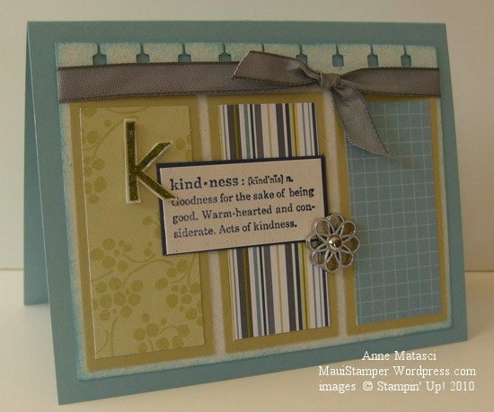
SU Retro Kindness

  • Define Your Life and Contempo Alphabet stamp sets
  • Baja Breeze (ret), River Rock(ret), Night of Navy and Naturals White card stock
  • Retired Designer Series Paper
  • Baja Breeze (ret), Old Olive and Night of Navy Classic ink pads
  • Spiral punch, Stampin’ Sponges, Basic Gray taffeta ribbon and Filigree Designer brads
  • Stampin’ Dimensionals, Clear embossing powder, Embossing buddy, and Heat tool

This layout came from the Stampin’ Addicts Sketch Challenge from this week (SASC44) but I twisted it around.  I’m getting kind of rebellious about that kind of thing lately!  It’s not intentional, it’s just that my mind sees the possibilities of doing something different.

I sponged around the edge of the Naturals White panel with Baja Breeze ink to soften it a little.  And while we’re on the subject of Baja Breeze, if I haven’t mentioned it before (though I know I have) Baja Breeze is one of my all-time absolute please-bring-it-back FAVORITE Stampin’ Up! colors.  Ever.

Twice as nice

Last night I couldn’t make a decision.  This isn’t news, by the way – I often have a hard time making decisions (Vanilla Swiss Almond or Deep Dark Chocolate??  Oatmeal Chocolate Chip or Peanut Butter Fudge??)  Last night’s choice, however, had nothing to do with food and everything to do with color.

The Color Dare Challenge this week was Regal Rose, Tempting Turquoise, Certainly Celery and Whisper White – a combination I would choose myself, so an easy one for me to work with.    My problem was proportions.  When I start a color challenge, the first thing I like to do is determine which color will be the dominant color – usually the card base – and which colors will be secondary.  I’m a blues-and-greens girl myself, so I knew Regal Rose would be an accent color, but I couldn’t decide which color to choose for my card base.

Birthday Gifts in Tempting Turquoise

What do you think?  Does it work in Tempting Turquoise?

Birthday Gifts in Certainly Celery

Or is it better in Certainly Celery?

  • Happy Moments, Crazy for Cupcakes, Itty Bitty Backgrounds and You & Moi stamp sets
  • Certainly Celery, Regal Rose, Tempting Turquoise and Whisper White card stock
  • Patterns II Designer Series Paper (retired)
  • Basic Black, Tempting Turquoise and Certainly Celery Classic ink pads
  • Ruby Red and Tempting Turquoise Stampin’ Write markers
  • Scallop Trim, Corner Rounder, Photo Corner and Modern Label punches
  • Piercing tool and mat, Fresh Favorites II Buttons, Stampin’ Sponges and Linen Thread

I still don’t know which one I prefer.

And if that sketch looks familiar, yes, it’s the Mojo Monday sketch for this week.  For some reason I’m fighting the circle thing.  Call it rebellion.  More likely I just need some Deep Dark Chocolate and everything will be fine.

Friendly little houses all in a row

Had to dig out the Stamp-a-ma-jig with this one.  When you’re stamping little boxes in a line, nothing but STRAIGHT will do.  I attempted this 3 times before I gave in.  After all, I was using my Good Neighbors Clear Mount stamps, wasn’t I?  Shouldn’t I be able to line the houses up that way?  The honest answer is No, at least if you’re as picky about straight as I am.

Friendly little houses all in a row

  • Good Neighbor (SAB) and Teeny Tiny Wishes stamp sets
  • Whisper White, Bermuda Bay, Soft Suede and So Saffron card stock
  • Welcome Neighbor (SAB) and Patterns Pack III (Hostess) Designer Series Paper pads
  • Bermuda Bay, Dusty Durango, Old Olive and Soft Suede Classic ink pads
  • Old Olive Stampin’ Write marker and Aquapainter
  • 1 3/4″ and 1 3/8″ circle punches;  corner rounder,  piercing tool and mat
  • Stamp-a-ma-jig and  Button Latte Designer Buttons
  • Big Shot and Matchbox Bigz XL die (label)
  • Ribbon Originals Elementary and Linen Thread
  • Non-SU:  A needle to sew on the button and “self-adhesive notes” to mask the images

This is based on this week’s Mojo Monday sketch, but I kept digressing so it’s not true to the original design.  I can’t begin to count how many little scraps of paper, buttons, labels and punches were littering my craft table when I finally decided I was finished.  Ah, the creative process is a messy state of affairs!

The papers in the Welcome Neighbor Designer Series pad are really inspiring.  They’re vibrant colors, but many of the designs have enough white mixed in to keep them from overwhelming a project.  Some of the patterns are whimsical, which makes them fun to play with, and the “B side” is always a great neutral-type design that gives you lots of room to play.  (I guess “B-side” is one of those phrases that will go the way of the “E-ticket”.  Sigh.)

I hope these little houses have juiced up my Mojo.  I have a little time tonight to play some more.

It’s good to be safe

We had a different sort of weekend.  Friday night, as we were finishing preparations for my son’s Scout troop rummage sale, someone came in and announced there had been a huge quake in Chile.  When I got home late that night, I looked online and saw the first tsunami advisory for the Hawaiian islands.  Since the first potential wave wasn’t forecasted to arrive until after 11am, I went to bed.

My son called about 4:45am from the site of the sale where the boys had camped out in the courtyard.  The sale was off and he needed me to come pick him up.  (At that time of the morning, it took an awful lot of repeating for him to get that message through the fog in my head.)  I got up, threw on some clothes, and headed out the door.

I couldn’t believe all the cars on the road.  Drivers were lined up outside service stations, the parking lot at the grocery store was full, and cars were already heading across the highway and up the slopes of Haleakala.  I am NOT a morning person, but I have been on the road at 4:45am once or twice, and what I was seeing was not normal.

When I picked up my son, he was as bleary eyed as I was.  We headed home, and since our house is outside of the inundation zone, we all went back to bed.  Or tried to…the first Civil Defense alarm went off at 6am.   I tried to go back to sleep, but after the third set of alarms I gave up.

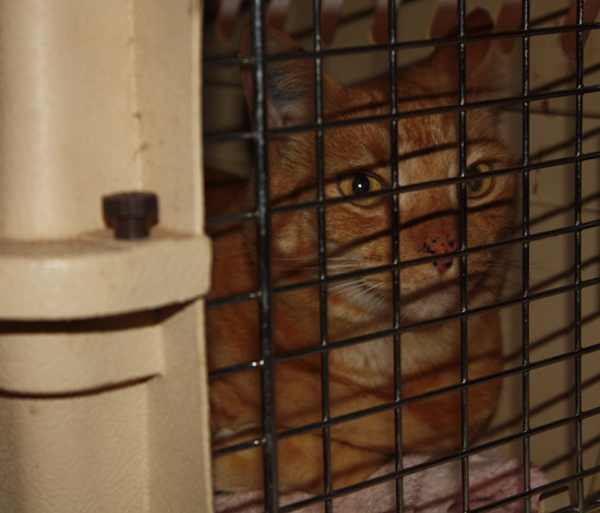
That’s about the time Cheryl called.    She lives a little higher up than we do, and was calling to ask if we wanted to come up.  The more we thought about it, the more we decided it was better to be safe than sorry.  With the Indonesian tsunami on our minds, we decided to pack a few things and head up the hill.  This included putting a very indignant feline in his kennel and he wasted no time in telling us how much he disliked this plan!  It was an hour and a half before he stopped complaining.

A very annoyed and indignant orange cat

As we sat together in Cheryl’s house, it felt like a party, except of course for the threat of enormous destruction.  We watched the live broadcast, eventually starting to make jokes about the news anchors trying to find something new and interesting to say as time ticked by and no significant wave appeared.  The biggest applause of the morning came for what appeared to be a wasp crawling across the lens of the camera that looked across Hilo Bay, and eventually we started shouting at the poor weather guy whenever he came on-screen and blocked our view.
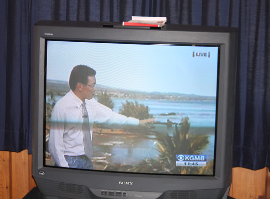
The weatherman just doin' his job

When it became apparent that the equivalent of Class II rapids through the mouth of the bay were all we would see, we opened a bottle of wine to celebrate and quit watching the newscast.  (It was noon by then!)  Since I wasn’t sure if we were going to be Cheryl’s guests through dinnertime, I’d grabbed some leftover spaghetti and a bottle of wine before we left the house.    As fate would have it, the wine was Chilean.
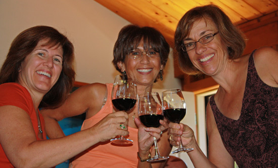
The mom's toast the Not-Tsunami

As much as we enjoyed ourselves, it was sobering to think of the people of Chile.  I grew up in California and know how destructive an earthquake can be.   I’ve never experienced a tsunami, and as fascinating as it would be to see the power of nature I think I’ll settle for the relative hum-drum of a near miss.

The tsunami alert system worked exactly as it should have, and we all had the opportunity to decide how we would react.  You don’t always have 12 to 15 hours of warning before disaster.  Do you know what you would do?
Exploring Shabby Chic

I’ve been exploring the concept of style.  There are a lot of things I’m attracted to, but I don’t see myself defined by any one type.  We know I’m not a classic “Clean and Simple” kind of person – much as I admire the look, I can’t seem to embrace it in my crafting.  Shabby Chic, however, is a style I can play with.   Last night I started looking at paper roses again and got the idea to put them on a box.

Cranberry Rose Matchbox

  • Certainly Celery and Cranberry Crisp (retired) cardstock; Retired Designer Series Paper
  • Big Shot, Matchbox Bigz die,  Perfect Details Texturz Plate, and Little Leaves Sizzlet
  • Scallop, 1 1/4″, 1″ and 3/4″ circle punches
  • Piercing tool, mat and silver brads
  • Very Vanilla taffeta ribbon and Mini Glue dots

It seems I can fiddle around with those crazy paper roses forever, but I like them best if I  just mash them up and leave them alone.  The ribbon seems a little top-heavy to me, but Shabby Chic is definitely a “more is more” kind of thing so I left it.  I could even see a little tulle and some seed pearls on this, but heaven knows where those things are right now – my craft things are still in chaos while I settle into my new space.  The stamping things are all in one room, at least, and if I look long enough I find what I want.  The beads, fabrics and embroidery supplies are another story altogether.  Shabby Chic is supposed to be a little messy, isn’t it?

Never enough birthday cards

Have you checked out the Stampin’ Addicts web site?  It’s a wonderful FREE resource for anyone who likes stamping, especially Stampin’ Up! stamping!  There are discussion forums, inspiration galleries, all sorts of weekly challenges, and a very positive attitude that will lift your spirits every time you log in.  Check it out!  They’re celebrating their first birthday.

It’s a good thing to need birthday cards – it means there are wonderful people in your life that you want to acknowledge.  I just wish I could get my act together sufficiently to send birthday cards on time.  Ah well.  As Popeye says, “I yam what I yam.”  And I “yam” sure there will always be room for improvement.

  • Upsy Daisy and Vintage Labels (SAB) stamp sets
  • Chocolate Chip and Bermuda Bay Classic ink pads
  • Very Vanilla, Chocolate Chip, So Saffron and Bermuda Bay card stock
  • Scallop Circle and 1″ Circle Punch
  • Champagne Mist shimmer paint, piercing tool, needle and Linen Thread

You don’t see the shimmer paint in the photo, but it’s there on the image panel, trust me.  Love that stuff.  It’s done wonders for my marriage, too — now, don’t go getting ideas — my husband HATES glitter.  Shimmer paint is the Anti-Glitter that keeps us both happy!  No more glitter in the furniture finish, correspondence or laundry!

Playing with color

We all have our favorites in the color world, and we have our favorite ways of combining those colors too.  The Stampin’ Up! color families make it easy to put colors together by organizing them into pleasing groups.  It’s soothing to work with those comfortable combinations – color evokes an emotional response in most of us, and seeing something in our favorite colors evokes happy thoughts.

It’s a challenge to stretch myself beyond my favorites but I keep working at it.  Sometimes I like the results, and sometimes they make me wince, but I’m learning to see color in new ways.  There’s  a basket full of scraps on my craft table (what a surprise!) and lately I’ve been pulling handfuls of scraps out to play with.  I arrange and re-arrange the scraps, bringing one color forward and another back to adjust the proportions of colors until I have something I want to work with.

Vintage Vogue Scripted Birthday

  • Vintage Vogue and Well Scripted Clear Mount stamp sets
  • Very Vanilla, Certainly Celery and So Saffron card stock
  • Certainly Celery and Rich Razzleberry Classic Ink pads
  • Rich Razzleberry polka dot grosgrain ribbon
  • Big Shot and Beautiful Wings embosslit

I came very close to making a big ol’ bow with that Rich Razzleberry ribbon, but this card was for a workshop and I wasn’t sure if a bow would through the new crafters too much of a curve ball.  I’ve seen a lot of really big bows lately and in all honesty, that’s not my style.  I would have probably ripped off the bow and changed it to a nice, flat square knot.  Playing with color is enough for one card – messing with bows will have to wait for another day.  Or maybe not at all.

Elegant and Easy Notes

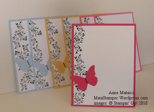
A few weeks ago I came across a black and white card with a single color accent.  It was so appealing to me that it has stayed on my mind.  Sometimes an idea just won’t go away, and this one was very persistent.  Last night I had time to play with it, and it took me no time to come up with this:

  • Vintage Vogue Clear Mount Stamp set
  • Basic Black Classic ink pad and Stampin’ Write Journaler
  • Whisper White,  Melon Mambo, Bashful Blue and So Saffron card stock
  • Big Shot and Beautiful Wings Embosslit
  • Mini Glue dots

The colors I used with black and white were drawn – literally – from a jar of Beautiful Wings Butterflies I have in my craft room.  I never seem to use all the butterflies that embosslit makes, and I can’t bear to throw them away so they collect in a jar.

This card would be very easy to reproduce in quantity, especially if you changed the stamp to a wheel.  As it was, I made a dozen of these in about 20 minutes.  Each note card is made from a quarter sheet of card stock and is just the right size for a quick thank you or invitation.

One last Valentine

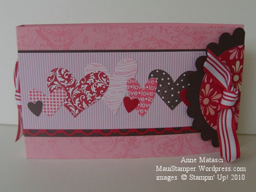
I’ve saved this post because it was the Valentine I gave my wonderful husband, and it didn’t seem right to post it before he received it.  The idea came from Becky Roberts, whose projects I continue to CASE with reckless abandon.  I fell for this folder as soon as I saw it, and thought it would make a great club project.  Once I developed my own sample, I realized it would not only be a great club project, but would work perfectly for my Valentine.  Here’s the outside:

Valentine Coupon booklet

This uses the I {Heart} Hearts stamp set (don’t forget $2 from the sale of each set goes to the American Red Cross through February 28) and the Very Vintage Jumbo Wheel. There’s also the Big Shot with the Scallop Circles #2 and Originals Circles #2 dies. I used the Full Heart, Heart to Heart, and Scallop Trim Border punches as well, and finished with the Real Red 1/2″ Striped Grosgrain ribbon.

Here’s the inside:

Open Valentine Folder with Tags

Isn’t it clever?  There’s a small Cello Bag attached with Sticky Strip to each side, and I can fit two little tags inside each bag.  You could use the tags as gift tags, but I was inspired to make the tags into coupons.  Each one has a little message on the back, and he can redeem them as he likes.  The possibilities for this idea are endless.

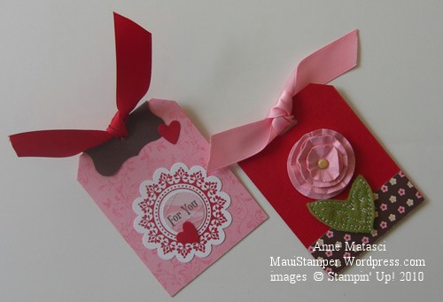
Here are the tags a little closer:

First two tags

I’ve used 5/8″ Satin Ribbon from the Occasions mini on all of the tags, and incorporated the Sending Love Specialty Designer Series Paper as well.

Here are the other two tags:

Second set of tags

These tags use the brand new XL Two Step Bird punch and the fabulous Beautiful Wings Embosslit for the Big Shot.  All these goodies made this project really easy to put together.

If there’s enough interest, I’ll put together a tutorial with dimensions and more instructions.  Becky said in her post that she had made hers and sent them off and didn’t plan a tutorial, so considering all I’ve gained from her blog I think it would be the least I could do.  Either way, enjoy and CASE away!!