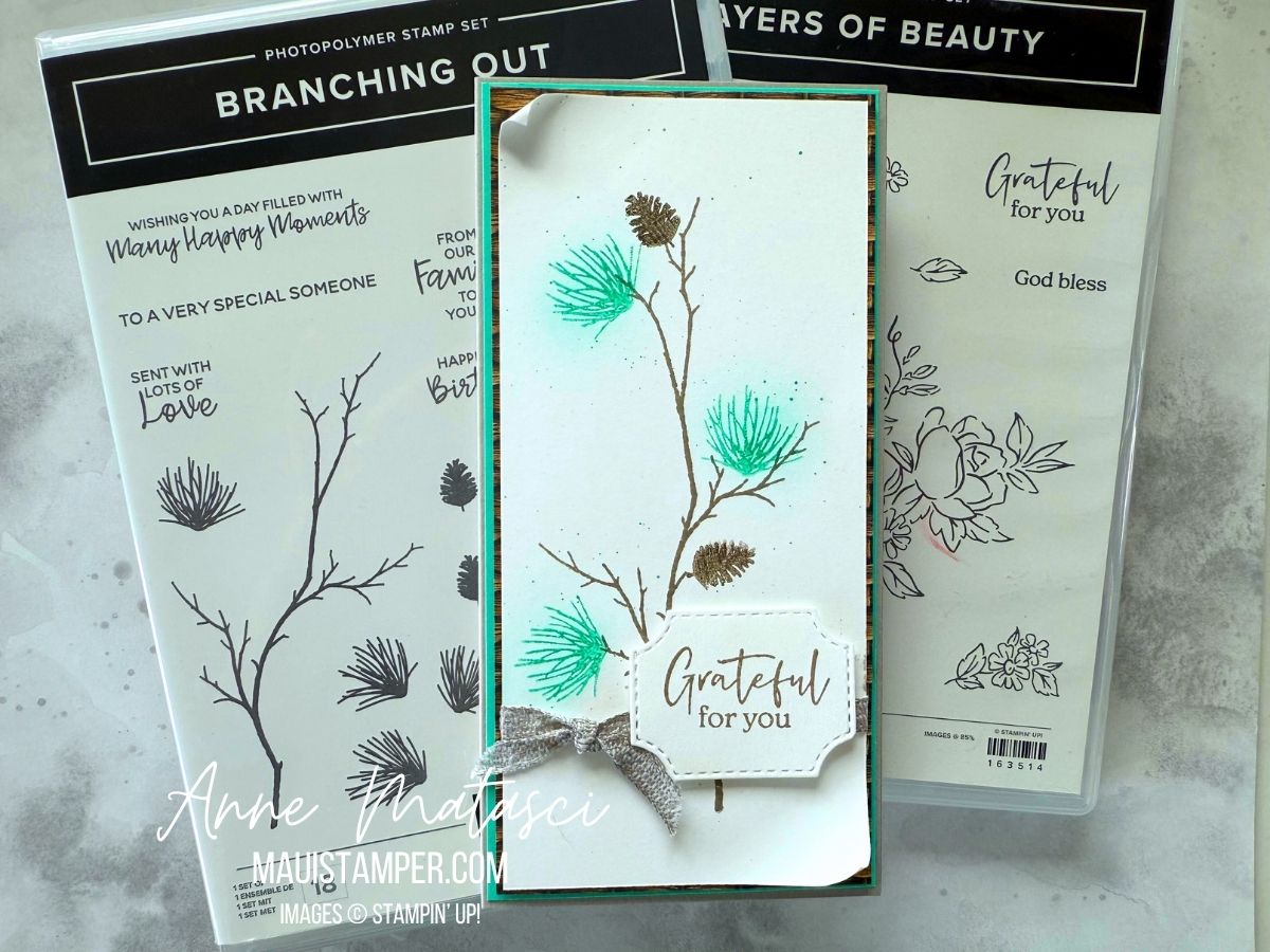
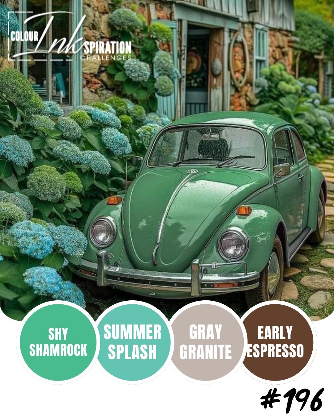
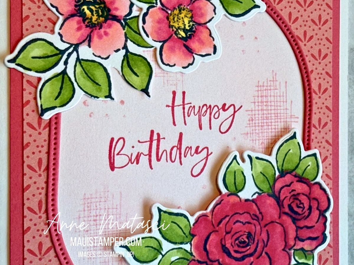
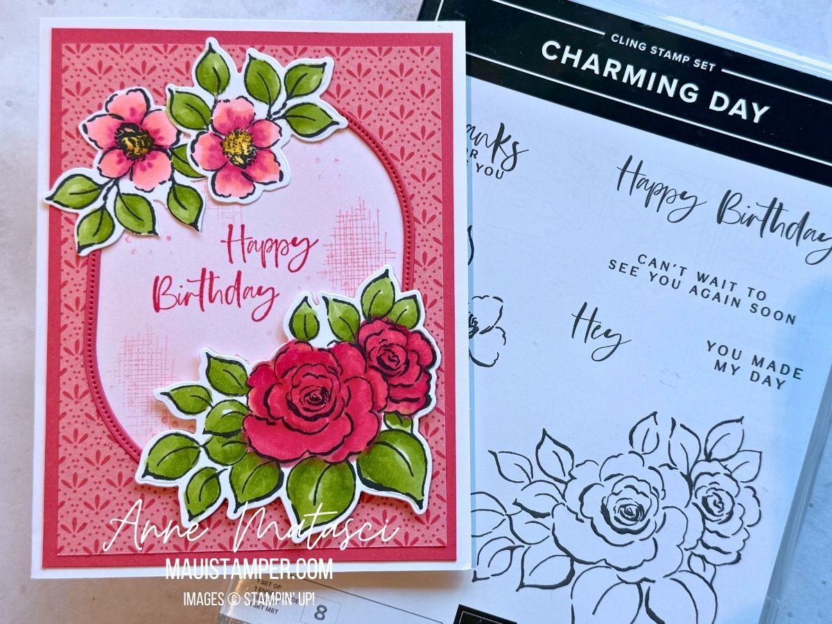
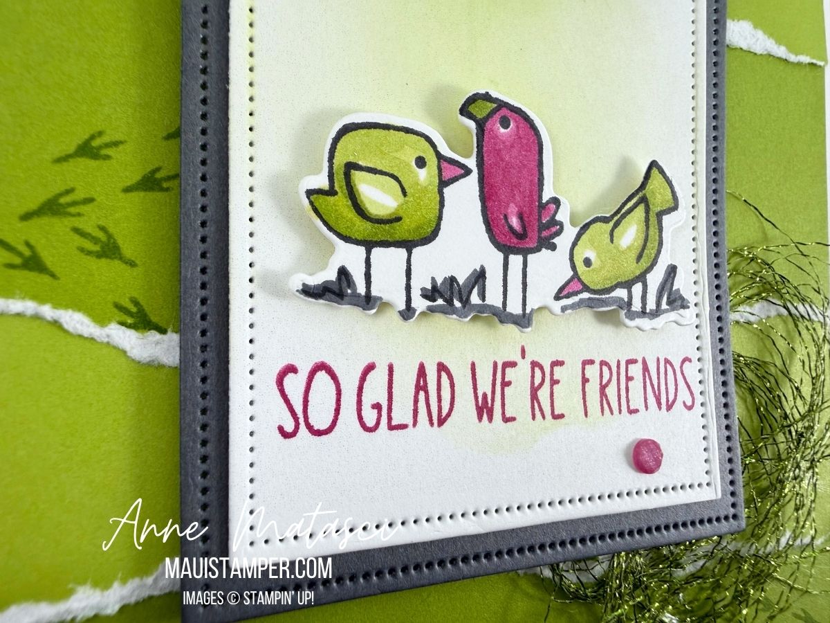
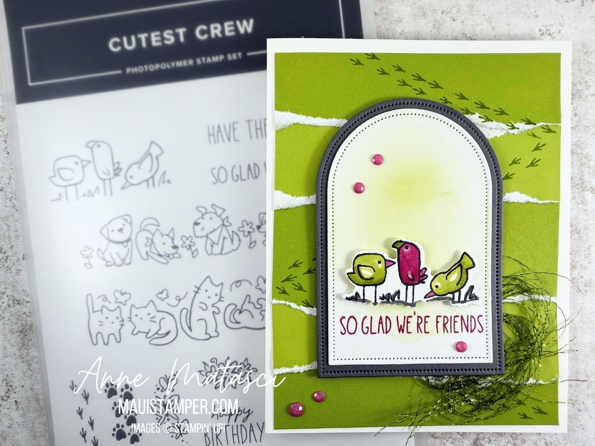
The Colour INKspirations Challenges are some of the best in social media. It’s been a while since I’ve joined in, and I promised myself I would find a way to use Granny Apple Green, Berry Burst, and Basic Gray in a card for CI 205. The Cutest Crew birds flapped their collective wings and said “choose us, choose us!!”
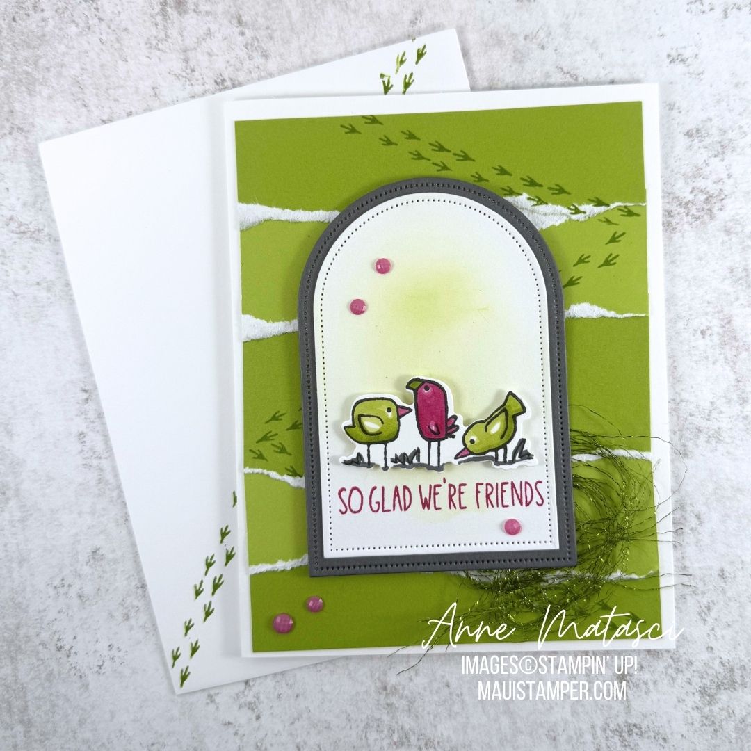
- Stamps: Cutest Crew
- Color Palette: Basic White, Berry Burst, Basic Gray, Granny Apple Green
- Accessories: Stamp Cut & Emboss Machine, Cutest Crew dies, Everyday Arches dies, Made with Sweetness Two Tone Card Stock pack, Charming Shimmer Faceted Dots, Metallic Trim (retired), Blending Brush, Stampin’ Blends, Stampin’ Dimensionals
This project is a LOT simpler than it looks 😎
I began by cutting a piece of Granny Apple Green Two Tone card stock from the Made With Sweetness Two Tone Card Stock Pack (go ahead, say that a few times.) I cut it a little longer than a normal panel for a card front – about 4″ x 6″ instead of by 5 1/4″. That gave me room to overlap the torn pieces. Then I tore it up. I LOVE DOING THIS. I alternated the sides and used Tombo Multipurpose Glue to fix them in place, overlapping the white core edges.
After that it was just stamp, color, assemble! I used a little Granny Apple Green ink on a Blending Brush on the Arch die cut. I colored the Cutest Crew Birds with Stampin’ Blends, and popped them up on dimensionals. I stamped some birdie feet across my card front panel before I added the layered arch, and I completely disassembled some of the metallic trim from a while ago and rolled it up into a little nest for the corner.
I put birdie feet on the envelope too, because why not?
Please visit the Colour INKspiration page to see all the CI#205 projects. And if Cutest Crew has caught your eye, I’d put it in my cart ASAP and buy it. It’s already gone to unavailable status once!