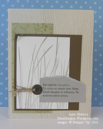
Monochromatic inspiration

The new catalog uses a monochromatic theme for the pages that begin each new “chapter” of stamps, and the color theme for the All Natural section is neutrals.  It really inspired me when I saw it, and although all the stamps used on that page were new I wanted to recreate that feeling.  I looked through my stamps (never mind how many there are, I’m sure I’ll need new ones!!) and found the look I was seeking:

Inspired by Neutrals

  • Wood Grain, Elements of Style, Inspired by Life and Define Your Life stamp sets
  • Naturals Ivory, River Rock, Soft Suede, Crumb Cake (Kraft) and Very Vanilla card stock
  • Soft Suede, Sahara Sand and River Rock Classic ink pads
  • Crop-a-dile, Jumbo Eyelet and Linen Thread

Did you see that little scrap of River Rock?  I have a folder with just a few scraps that I was — you guessed it — hoarding jealously.  Now I can use them up!  As of July 1st, River Rock is back in the family.  I’ll admit that this Color Renovation is taking a little bite out of my stamping budget, but if it means that colors like Baja Breeze and River Rock are back  in the palette I’ll work with it.  I can make a budget and stick with it.  It’s not like I have to have everything all at once.  Really.  I don’t.  Not at all.

Excuse me, I have to go.  My hypnotist appointment is soon.  I don’t need it all at once…I don’t need it all at once…I don’t need it all at once…

A Fond Farewell to YoYo Yellow

Fond may be stretching it!  I think I am still working from my original package of YoYo Yellow, and my stamp pad looks brand new.  In my opinion, it’s time to go – but Arielle decided to push my buttons with this week’s Colour Q challenge.   I’ll admit that the dinnerware she used for her inspiration looks pretty cool, but honestly – Whisper White with Bravo Burgundy, Tangerine Tango, Yoyo Yellow and Green Galore???  Aaack!!

Colour Q Challenge 29 Splitcoaststampers Sketch Challenge 277

  • Sense of Time and Define Your Life Stamp sets; Texture Jumbo Wheel
  • Whisper White, Bravo Burgundy, Tangerine Tango and Yoyo Yellow card stock
  • Bravo Burgundy, Tangerine Tango, Yoyo Yellow and Green Galore Classic ink pads
  • Aquapainter;  Piercing tool, template and mat;  and Vintage Brads

To add a little more challenge, I used the Splitcoaststampers Sketch Challenge 277 for the layout of this card.  The white balance on this card seems off, but with this color combination I couldn’t bear to add any more solids!  I compromised by using the Aquapainter to blur the Bravo Burgundy ink in the background of the card base.  I’m not too crazy about Yoyo Yellow (can you tell??) but Green Galore positively gives me fits.

Ah, but enough complaining.  These colors are Bold Brights and bright they are.  There are lots of crafters that love them and will lament their retirement, and I understand that feeling.   The world would be a dreary place if we all loved the same colors.  Farewell, Triple Y and Double G.

Gratitude

How easily the words “Thank you” roll off our lips.  We say thanks so easily for so many small things…a kind gesture, a small gift, a thoughtful compliment.

Gratitude implies something more.  It implies we’ve thought about what was given or done for us, turned it over in our minds and acknowledged that extra effort was put into the gift.  It feels more Thankful, not just thanks.

This card was inspired by a couple of challenges at Splitcoast.  One of them was to use the color red, and after a couple of false starts, everything fell into place.   I’m grateful.

Gratitude

Gratitude

  • Naturals White, Real Red, Chocolate Chip and Sahara Sand card stock
  • Real Red and Chocolate Chip Classic Ink
  • Real Red Stampin’ Write Marker, Paper piercing mat (used with marker)
  • Versamark ink, Clear Detail Embossing Powder, Heat Tool
  • Button Latte assortment, Red Hemp twine (retired, sadly)
  • Petals a Plenty Embossing Folder, Big Shot