Inking up the butterflies

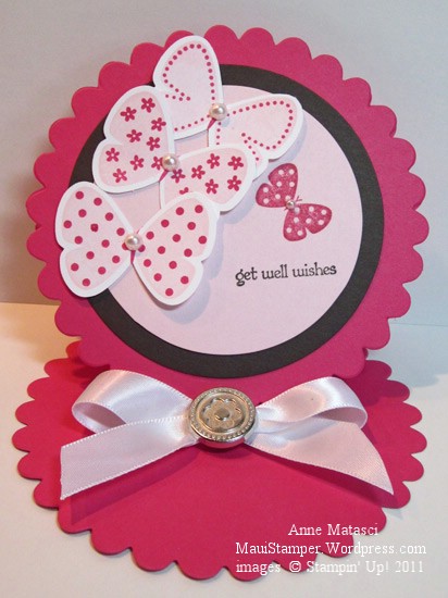
Flight of the Butterfly has been collecting a little dust on my shelves.  Another gorgeous WOW swap inspired me to brush it off, and I must confess that I cased this creation almost exactly:

Dawn's Butterfly Easel card

  • Flight of the Butterfly and Teeny Tiny Wishes stamp sets
  • Whisper White, Melon Mambo, Pink Pirouette and Early Espresso card stock
  • Melon Mambo, Early Espresso and Pink Pirouette Classic ink pads
  • Butterfly punch
  • Pearl Jewels
  • Flower Designer brads
  • Whisper White 5/8 inch satin ribbon
  • Big Shot and Scallop Circle die

Now that I’ve gotten my hands on a few samples of easel cards, I’m having a lot of fun putting them together.  It’s a perfect format for an announcement – like a baby announcement – when you would like to feature a photo.

This is one of the cards we’ll make at the specialty folds card class next weekend (September 4th) at Ramona’s house in Wailuku.  Space is limited, so check the calendar at the Online Store or contact me directly to hold your place.

I’d like to give credit to the demonstrator who designed the original card.  Her name is Dawn Shearer, and she’s a Stampin’ Up! demonstrator in Canada –  and a very talented one at that!

Great combinations with the Color Coach

The new Stampin’ Up! Color Coach is a great way to jump start a project when you’re stuck for something new.  I’ve used this combination before, and liked it so well I tried it again:

Wisteria Butterflies Easel card

  • Flight of the Butterfly, 5th Avenue Floral, and Teeny Tiny Wishes stamp sets
  • Whisper White, Pink Pirouette, Cherry Cobbler and Wisteria Wonder card stock
  • Pink Pirouette, Cherry Cobbler and Wisteria Wonder Classic ink pads
  • Butterfly and Scallop trim border punches
  • Big Shot, Petal Cone Bigz L and Scallop Square Bigz dies
  • In Color Designer Printed brads
  • Stamp-a-ma-jig
  • Rhinestone jewels
  • Stampin’ Dimensionals

There are loads of tutorials for easel cards out there, so I’m not going to re-invent the wheel – just Google it (Easel card tutorial, not the wheel).  Trust me, this is another case of  “much easier than it looks”!

We did pull out the Stamp-a-ma-jig for this project.  If you’re picky – and I am the first to admit that I am – some things just can’t be done by the eye-ball method.  I need those little dots around that butterfly to line up Just Right.  Even if Flight of the Butterfly were available as a clear mount stamp set, I would still use the SAMJ.

When we did this in class, I was demonstrating the SAMJ to a newer stamper.  I cracked up when she pulled her stamp away from the positioner, looked at the results, and happily exclaimed, “It worked!”  I have to confess that I have that same feeling every time I use that tool to get perfect alignment – I’m just so happy it works.

There’s another Getting to Know the In Colors class featuring Pool Party on September 18th.  If you head on over to the calendar at my Online Store, you can see the details.  Did you know that you can RSVP on that calendar?  If you do, I’ll even give you a reminder.  Oooh la la!

An In Color Trifecta

Whew!  Time for some antidote to pink!  Not that there’s anything wrong with pink…but I’m swimmin’ in the stuff this week.  Some friends are expecting a baby girl the beginning of next month and we’re getting having a small get together this weekend to celebrate.  I’ve got a couple of Pink Projects in various stages of completion and it’s time to put the pedal to the metal and get them done!

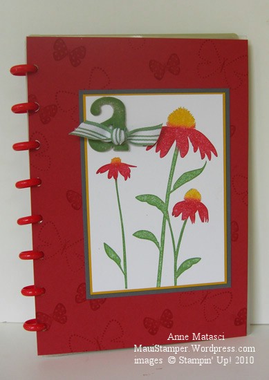
In the meantime, I made another cover for one of my many Circa notebooks. I have a LOT of these notebooks that I use for a variety of purposes.  If  I don’t personalize the covers, then I tend to get a little cranky when I’m looking for a particular one and have to flip through 2 or 3 others in the process.  (By the way, if you read the post where I lamented my AWOL Aquapainter, it was hidden in plain sight.)  I like to make fresh covers for the pleasure of it and to keep myself on my toes.

This notebook has red Rollabind discs, so I knew red would be in my color scheme.  I chose Riding Hood Red (IC’09) to celebrate the new Color Renovation, and Wild Wasabi (IC’08) and Crushed Curry (IC’10) just fell into place behind it.  A three-generational-In-Color trifecta!

Inspired by Nature Levenger Circa Cover

  • Inspired by Nature and Flight of the Butterfly stamp sets
  • Whisper White, Riding Hood Red, Wild Wasabi, Crushed Curry and Basic Gray card stock
  • Wild Wasabi, Crushed Curry and Riding Hood Red Classic ink pads
  • Wild Wasabi striped ribbon (retired), chipboard letters (retired) and Sponge Daubers

Inspired by Nature was one of the sets demonstrators received at the 2008 Stampin’ Up! convention.  I learned a great technique at convention when we did our Make ‘n Takes:  we used Sponge Daubers to selectively apply ink to the stamp.  The sponges avoid streaks that sometimes appear when you use a marker on bold images, and they give the image a slight softness.  You can also spritz the entire stamp very lightly for a watercolor effect.   I added the Basic Gray into the mat layers because the Riding Hood combined with the Wild Wasabi and Crushed Curry created  a confused Christmas/Rasta kind of look…not quite the effect I was going for.  Serendipitously, I realized  I really like Basic Gray paired with Crushed Curry – I’ll be putting those two together very soon.

The message comes later

Nope, this isn’t some weird puzzle.  It’s how I make my cards most of the time.

I usually make a card for the creative satisfaction and don’t add the sentiment until I’m ready to send the card.   That way it’s easier for me to choose the right card for the right person.  Once in a while I make a card that insists on a particular message – red and green cards with pine trees are a good example – but that’s the exception.  When it’s time to send the card, I pull out the message I want, ink it up, and add it to the front…or in the case of this card, I’ll put it on a word window and attach that to the striped paper.

Spring_Stripe_Butterflies_crop

  • Flight of the Butterfly stamp set
  • Chocolate Chip, Certainly Celery, So Saffron and Bashful Blue Classic ink pads
  • Whisper White and Certainly Celery (the carde base)  cardstock and Sale-a-bration 2009 Designer Series Paper
  • Sale-a-bration Certainly Celery Poly-twill ribbon
  • Stamp-a-ma-jig

This card looks a little empty and off balance now, but when there’s a message nestled into those stripes, it’ll be just right.