Unraveling the twine

RemARKable Holiday 2010 Madness

It’s Day Three of the RemARKable Holiday Madness blog tour and I think it’s about time I started moving through the holidays, don’t you?  I’m still living large with my Attitude of Gratitude, so it makes sense for me to share a couple of thankful-type cards with you.

This card makes me feel really, really happy.  I’m happy with the colors, I’m happy with the fuzzy ends of the hemp twine, I’m happy with that gorgeous brad, and I’m just flat out happy with the way it looks:

Paisley Prints So Many Thanks

  • Paisley Prints and So Many Thanks stamp sets
  • Very Vanilla, Cajun Craze, Chocolate Chip, Peach Parfait and So Saffron card stock
  • Cajun Craze, Chocolate Chip, Peach Parfait and So Saffron Classic ink pads
  • Cajun Craze and Peach Parfait Stampin’ Write markers
  • Big Shot and Lattice Impressions Folder
  • Hemp Twine and Antique brad

I love all these textures!  Of all the different elements in a card I think it’s texture that gives the most interest.  There are so many ways to add dimension and I think I’ve hit a mother lode of them here:  the twine, the multiple colors, the Big Shot texture, the torn edges, and the brad.

Oh, that brad!!  I put a hole in the Very Vanilla panel and tied the twine through the hole and around the card.  Then I had the brilliant idea (if I do say so myself) of putting that brad through the hole, but the ends of the twine looked funny…kind of stiff…and, well, moustachey.  I started to fiddle with them and they began to unravel, and the rest, as they say, is history.

Next Stop on the Holiday Madness Blog Tour

Missed it by that much…

Anybody else an old Maxwell Smart fan?  I loved Get Smart back in the day, but I thought the movie was dumb.  Some things shouldn’t be re-done.

Anyway, what does all this have to do with the price of tea in China?  (My we ARE digging out the old chestnuts today!)  I had the ColourQ 45 Challenge colors listed on my craft table all week and finally finished the card yesterday, only to realize that I’d just missed the posting deadline.   Well, I missed being considered for Colour Queen, but of course I can still upload to the site.  Would you vote for me?

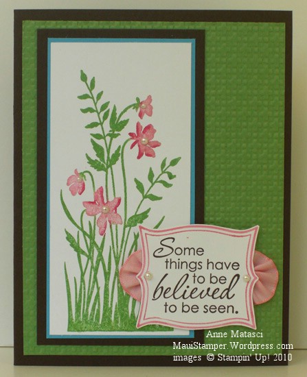
ColourQ45 Believing is Seeing

  • Just Believe stamp set
  • Whisper White, Tempting Turquoise, Early Espresso and Wild Wasabi card stock
  • Wild Wasabi and Early Espresso Classic ink pads
  • Regal Rose and Rose Red Stampin’ Write markers
  • Big Shot and Lattice Embossing folder; Stampin’ Dimensionals
  • Pretty in Pink 3/8 inch taffeta ribbon and Pearls Stick-on Jewels

I couldn’t get into the Tempting Turquoise in the Colour Q scheme, and I thought I would be really sneaky and just put a teeny tiny border in to satisfy the requirements.  Who would have guessed that it would work so well??  I was astonished to say the least.

Today’s ribbon treatment does NOT involve sticky, tacky adhesive, thank you very much.  There’s a simple running stitch on one side of a 2 inch scrap of ribbon, pulled together and knotted to make a half-rosette.  A pair of those are on either side of the sentiment and I am very pleased with they way they turned out.  I’m sure someone has done this before but I haven’t seen it done so for now I am claiming this brilliant concept.

You know you’re gonna need this stamp set…

Back to the Circle Circus

When is a circle more than a circle?  When it collaborates with others to form a topiary:

Circle Circus matter of Moments

  • Circle Circus and Elements of Style stamp sets; Vintage Vogue wheel
  • Whisper White, Daffodil Delight, Cajun Craze, Crumb Cake and Certainly Celery card stock
  • Cajun Craze, Crumb Cake and Certainly Celery Classic ink pads
  • Modern Label punch, XL Decorative Label punch (Holiday Mini), various circle punches
  • Big Shot, Top Note die and Lattice Impressions folder
  • Hemp twine, Antique Brads, Stampin’ Sponges and Stampin’ Dimensionals

I had the brilliant idea to twist two strands of Hemp Twine together to make the trunk of the topiary, but my execution was flawed – there’s not enough space between the “topes” and you can hardly see it.  This card is finished, but I’ll be back to the drawing board to try that one again.

The new XL Decorative Label punch makes a pretty terra cotta planter, doesn’t it?  I cut it in half and sponged it with Cajun Craze and Old Olive.  I was trying to get a moss-stained look but I think it would be more effective on a lighter color of cardstock – next time I’ll try Peach Parfait.  Oh, and please don’t judge Daffodil Delight – that’s operator error with the camera.  It’s a lovely buttery shade, not that bright yo yo color!

Beautiful Wings In Color

A couple of weeks ago, I CASE-d a card using all of the new In Colors in the 2010-2011 Idea Book and Catalog. Laurie Zoellmer at www.stampingnut.blogspot.comstampingnut.blogspot.com had such a great idea that I wanted to try a couple of other versions. Of course, I wasn’t thinking about cutting out all of those butterflies – even with the help of the Big Shot – when I decided to do this for a swap that turned out to have 25 participants:

In Color Butterflies

I worked on this one at Boy Scout camp too – a friend was there, and she helped me with the stamping. Each card is a little different since I just mixed and matched the butterflies. They’re made with the In Color selections for 2010-2011: Concord Crush, Blushing Bride, Pear Pizzazz, Peach Parfait and Poppy Parade. Just a couple of dots of Tombo Adhesive holds each one in place. That stuff is amazing. I wish it had been around when my kids were small! (JUST KIDDING. Don’t report me.)

Good-Bye (Kiwi) Kiss

One thing that crafters in all mediums have in common is a stash.  We hoard special goodies we bought at that out-of-the-way shop we found while traveling, expensive goodies we splurged on in some high-end store, or perhaps most precious, RETIRED goodies.  These are things we can’t get anymore.

I have goodies in all three catagories, but I’m finally relenting and using up some of my retired and retiring paper.  Stampin’ Up! has announced a Color Renovation effective July 1 (You haven’t heard?  Have you been off the planet?) and there just isn’t room for ALL of the old and ALL of the new.  One of my stashes is Kiwi Kiss – paper, ink, and ribbon – and I’m going to use it up. (gasp!)

Colour Q Challenge 33 Vintage Vogue

  • Vintage Vogue and Teeny Tiny Wishes stamp sets; Very Vintage Wheel
  • Kiwi Kiss, Bermuda Bay, Whisper White and Summer Sun card stock
  • Kiwi Kiss, Soft Suede and Summer Sun Classic ink pads; Whisper White Craft ink pad
  • 1 1/4 inch, 1 3/8 inch square punches; Round tab punch; 1/8 inch circle punch (non-SU)
  • Soft Suede polka dot grosgrain ribbon; White gel pen
  • Big Shot and Lattice Impressions Folder

This is a Colour Q Challenge and when I saw it included Kiwi Kiss my first thought was to substitute Old Olive and continue hoarding my precious stash.  When I put the colors (oops!  Colours!) together I realized the brighter tone of the Kiwi Kiss made a big difference and I decided to be brave.  What’s the point of hoarding something if you never intend to use it?

I’m feeling very brave…maybe it’s time to go take a look into my closet.   Maybe…

It’s gettin’ kinda Birdy around here…

Don’t know what it is about me and birds recently…I must be picking up Bird-Vibes from the cat.  He sits at the sliding glass door in the kitchen and watches the birds.  When they get too close to the door he barks.  Seriously.  He has this goofy sound he makes that sounds like a bark.  We refer to it as his “Birdy Bark”, and that should tell you all you need to know about how wacky this household is.  I think we’d better move onto the card before I  reveal any more deep, dark family secrets:

Elements of Style Ruby Throated Hummingbird

  • Elements of Style and Vintage Labels (SAB) stamp sets
  • Very Vanilla, Bermuda Bay, Rich Razzleberry and Garden Green card stock
  • Thoroughly Modern Designer Series Paper
  • Sahara Sand and Garden Green Classic ink pads
  • Bermuda Bay, Tempting Turquoise, Garden Green and Rich Razzleberry Stampin’ Write markers
  • Rich Razzleberry and Garden Green Classic ink refills; Aquapainter
  • Big Shot and Lattice Impressions folder
  • Scallop Trim border punch; Piercing tool, template and mat
  • Very Vanilla Taffeta ribbon

I really threw the tool box at this card!  I used the Sahara Sand ink pad to lay down the beautiful roses on the Vanilla card stock and then watercolored them with the Aquapainter and the ink refills.  I used markers directly on the stamp to color the hummingbird  and although the colors aren’t perfectly true to life I’m happy with the result.  Just in case you’re wondering, that’s not a new taffeta ribbon – I folded it in half – OK, the truth is I brought it downstairs and IRONED it in half.  It wouldn’t stay when I folded it.  The things I do to get a card just right!

Uh-oh.  Somebody’s barking again.  One of these days those sassy Mynah birds are gonna let him have it.

Cheery and Cheep

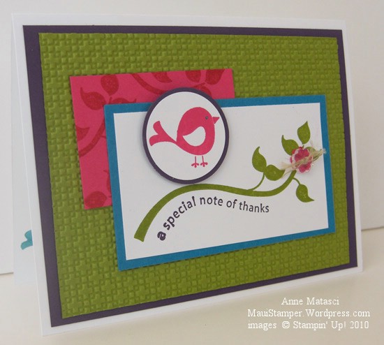
It’s been a while since I’ve done a color challenge – I’ve made notes about at least half a dozen of them but that’s as far as they’ve gotten – until today.  So many challenges, so little time!  Fortunately, the Color Dare 67 challenge was a winner and the card practically made itself:

Cheep Talk Color Dare 67

  • Cheep Talk stamp set
  • Whisper White, Melon Mambo, Bermuda Bay, Old Olive and Elegant Eggplant card stock
  • Melon Mambo, Old Olive and Elegant Eggplant Classic ink pads
  • Bermuda Bay Stampin’ Write marker
  • Stampin’ Dimensionals
  • 1 1/4″ and 1 3/8″ Circle Punches
  • Itty Bitty Shapes punch pack, Bitty Buttons and linen thread
  • Big Shot and Lattice Impressions folder

I’m very proud of myself; ANOTHER one-stamp-set-card!  Stampin’ Up! really does a great job of assembling complementary images in a stamp set – I’ve done so many very different cards using just Cheep Talk.  It’s a great value, in my humble opinion.  And as long as I’m running a commercial, have I mentioned how much I love this Lattice Impressions folder?  The two sides, front and back, have a very different look, and the texture is so deep and condensed that it really creates something entirely different from the original sheet of paper.

I’m hooked on Bitty Buttons, too – another “nah, I don’t need it” product when I saw it in the Mini Catalog, but then Robbie brought some over and I couldn’t resist them.  I love that they’re clear, that there are little bitty punches that match them, and that they’re small enough that they don’t overwhelm a project.  I REALLY hope they make it into the 2010-2011 catalog…but I feel that way about a lot of mini catalog products.  Carpe diem and all that.  Use the buttons today!!

Now we’re hummin’…

I grew up in Santa Barbara.  It’s one of the most beautiful cities in the country, tucked between the mountains and the ocean and blessed with beautiful weather all year round.  I’ve always joked that being raised in that temperate climate has given me a 7 degree comfort zone – I like it between 75° and 82° – and it’s really not much of a joke.  Moving to Maui over 20 years ago was a glorious adjustment!

One of the things that Maui lacks and Santa Barbara has in abundance is the hummingbird.  I love the brilliant colors, the zoom-zoom as they zip by, and their arrogant little territorial attitudes about feeders.  I can even pick out the sound of a hummer singing, though it took me a long time to learn that song.   Tough as hummingbirds are, the commute from the Mainland to the Hawaiian Islands is tougher, and we have to settle for paper hummers:

Hummingbird Elements of Style

  • Elements of Style stamp set
  • Whisper White, Rich Razzleberry, Certainly Celery and Tempting Turquoise card stock
  • Rich Razzleberry, Certainly Celery and Tempting Turquoise Classic ink pads
  • 1 and 1 1/4″ circle punches, Black Stampin’ Write Marker, Stampin’ Dimensionals
  • Certainly Celery 5/8″ satin ribbon, Golden Glow Smooch Spritz, Paper snips
  • Big Shot and the Lattice Textured Impressions Folder

I’ll thank you to notice that I managed to make a card using only ONE stamp set today!!

That new Lattice Impressions folder gives amazing results.  First of all, there are two patterns – a basketweave for the positive side and an open lattice for the negative side – take your pick.  Secondly, the impressions are so deep and so close together that it completely changes the character of the paper.  The paper softens, but has a beefier heft (I know, not a very kind description) and I think it will be really interesting to try in 3-D projects.  Stay tuned for more on this subject!