Sending love and sympathy

Recently I needed sympathy cards.  I try to have one or two on hand, but I much prefer making just the right card.  It allows me to create something just for the person who has lost a loved one, and I can also spend some time thinking about them and praying for them as they grieve.

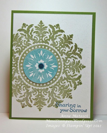
These cards were made for young adults – a brother and sister who lost their dad.  This is the card I made for the young woman:

Simply Soft Sympathy

  • Simply Soft and Faith in Nature stamp sets (both hostess sets)
  • Old Olive, Baja Breeze and Naturals White card stock
  • Old Olive, Baja Breeze and Not Quite Navy Classic ink pads
  • Baja Breeze seam binding

I considered adding pearls and other embellishments, but ended up rejecting all of that for the simplicity of the flowers.  I folded the seam binding in half – it’s so soft that it takes that treatment easily and can still be mailed without extra postage.

Lately, cards that can be mailed without extra postage have become more of a focus for me.  I think twice before adding buttons, big brads and other heavy bling.  I LOVE those embellishments – don’t get me wrong – but I mail a lot of cards and those extras create headaches at the post office.  I’m keeping the 3-D goodies for hand-delivered cards, and there are plenty of those, too.

Here’s the companion card for the young man:

Medallion Sympathy

  • Medallion and Thoughts and Prayers stamp sets
  • Old Olive and Naturals White card stock
  • Old Olive, Baja Breeze and Not Quite Navy Classic ink pads
  • 1/2 and 1 3/4 inch circle punches
  • Stampin’ Dimensionals
  • Crystal Effects

The “brad” in the center is nothing more than a circle of cardstock covered with Crystal Effects, and I left off that girly-frou-frou ribbon stuff.

Although these cards are similar in color and general style, the fact that they coordinate was more for my benefit than that of my young friends.  As I thought of the two of them,  putting these complimentary cards together gave me a little comfort.  I hope it did the same for them.


Merry Christmas

It’s been a lovely week, despite an unusual sequence of rainy days.  Visitors detest rainy days on Maui because there isn’t much for them to do, but those of us who live here relish the rain, especially those of us who live on the south (dry) side of the island.  Our gardens are dusty, our homes are dusty, and the sound of rain is music to our ears.  After a couple of days, we’re like everyone else; we stare hopefully into the heavens seeking a peek of blue sky and sunshine.  My daughter home from Boston joined the cat at the back door, both hoping for a change in weather.

You would think with all of that “weather” that I would have a load of projects to show you, but I was running errands and baking cookies and wrapping packages instead.  Imagine that!!  We’ve had some lovely, lazy family days but I am ready to get back to the business of stamping.  Here’s the card we sent this year:

  • Medallion and Angelic Joy stamp sets
  • Black Staz-on Ink pad; Marina Mist Classic ink pad
  • Marina Mist, River Rock, Daffodil Delight, More Mustard and Blush Blossom ink refills
  • Aquapainter and Champagne Mist Shimmer Paint
  • Brayer
  • Whisper White and Marina Mist card stock
  • 2 1/2 inch XL circle punch

These are slightly larger cards – about 4 1/4 inches by 6 1/2 inches – in order to enclose a 4 x 6 inch print.  I couldn’t find anyone who prints 3 x 5 inch prints any more, and I wasn’t interested in trimming all the photos I needed.  Next year I’m making my card with My Digital Studio and saving myself a lot of trouble.

The concept is an interpretation of a wreath card done by the extraordinary Jackie Topa.  I posted an early CASE of her project HERE and at that time came up with this idea.  The Medallion stamp is brayered to get even coverage, and the angel image is stamped in Black Staz-on because of all the watercoloring I chose to do.  After over 100 cards, you can believe I was questioning that decision!  I used an inexpensive water color palette to make the job go faster, and I worked with one color at a time:

I watered down the ink from the refills in order to keep it more translucent, and I really watered down the Shimmer Paint because all I wanted was a little sparkle for the angel’s wings.  There isn’t much other embellishment as I didn’t want to fuss with extra postage or cushioning in the envelope.  If I didn’t have to mail these…but hand-delivering them is out of the question, so we’ll just let that thought fade away into the sunset.

Merry Christmas.


Thanks so much, Medallion

It’s been such a long time since I’ve inked up my Medallion stamp.  I still love it just as much as I did the first time I laid eyes on it, but it seems there has been a lot of competition for my time in the stamp room.  The other day I decided to give that Medallion a little inky love:

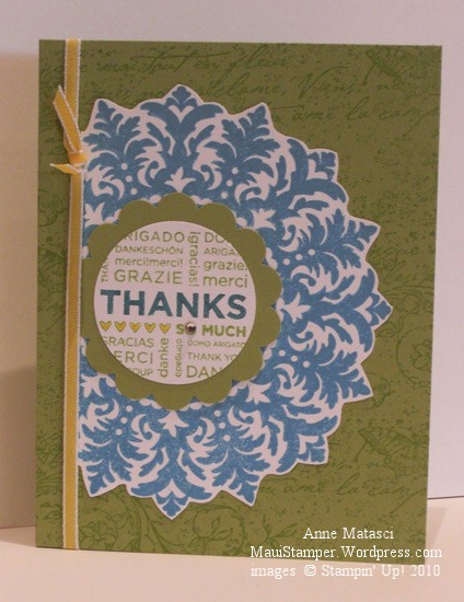
Thanks So Much Medallion

  • Medallion and Thanks So Much stamps
  • Vintage Vogue Jumbo Stampin’ Around Wheel
  • Whisper White and Pear Pizazz card stock
  • Marina Mist and Pear Pizazz Classic ink pads
  • Marina Mist and Daffodil Delight Stampin’ Write markers
  • Basic Rhinestone Jewels
  • 1/8 inch Daffodil Delight taffeta ribbon
  • 1 3/8 and Scallop Circle punches

I just can’t help cutting out that Medallion.  I’ve done it before and I love the look.  It’s really not that much work and I think it’s well worth the effort.  Matter of fact, when things slow down a little bit (ha ha ha, I crack myself up) I want to make this card in a bunch of different color combinations.  I think it would make a great set.

All spritzed up and nowhere to go

Someone may have to pry the Smooch Spritz out of my hands…I think I’ve become dangerous.  A definite case of  “More is More”, and I’m not convinced it’s a good thing:

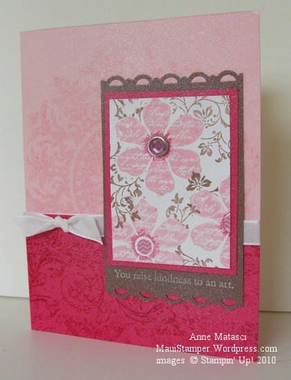
All Smooched up and nowhere to go

  • Vintage Vogue and Medallion Stamp sets; Very Vintage Wheel
  • Whisper White, Pretty in Pink, Melon Mambo and Close to Cocoa card stock
  • Pretty in Pink, Melon Mambo and Close to Cocoa Classic ink pads; Whisper White Craft ink pad
  • Melon Mambo Stampin’ Write marker, Vanilla Smooch Spritz
  • Scallop Trim Border punch, Rhinestone brad, Whisper White taffeta ribbon
  • 1/4″ circle punch and a teeny scrap of DSP – I think from SAB but don’t quote me

A couple of days ago I went on a rant about challenges that wouldn’t cooperate.  This card uses the survivors from that challenge – a lot of pieces went into the round file (trash) in my craft room.  I have to admit, my concept was good but it just wouldn’t tolerate being forced into a sketch that I disliked.  You can see I’m still playing with the same colors I used yesterday for the Inkspiration Challenge – it’s getting pretty girly around here.  Maybe tomorrow I’ll go Rasta for a change!

A Fond Farewell to Ballet Blue

Ballet Blue.  All by itself it’s a lovely shade of blue.  I wear that color and I’ve decorated with that color.  But I seldom make cards with Ballet Blue.  Not exactly sure why but there you have it.

Stampin' Up! Medallion Joseph's Coat

  • Medallion, En Francais and Teeny Tiny Wishes stamp sets
  • Ballet Blue, Pale Plum, and Whisper White card stock
  • Ballet Blue, Pale Plum, Perfect Plum and Mellow Moss Classic ink pads
  • Oval Punch and Small oval punch, brayer
  • Clear Rhinestone brads, piercing tool and mat
  • Stampin Sponges, Embossing Buddy, Clear Embossing powder and Heat Tool

I’m playing with techniques – can you tell?  This is Joseph’s Coat and if I didn’t know better, I would think it was developed with this Medallion stamp in mind.  The tutorial shows the color applied to the base card stock in stripes using the (now retired) spectrum pad, but I applied color with Stampin’ Sponges.  I like the look better, especially with such a bold stamp.

This technique takes me back to grade school, back in the day when we did art projects in class.  We would color as hard as we could with crayons in the same sort of random pattern, then cover it all with a thick coat of black crayon.  The final step was to etch a design in the black, revealing the pattern of color underneath it.  It must have kept us occupied for a LONG time!  Our crayons never looked the same after one of those projects…especially the black crayon.

Farewell, Ballet Blue.

One stamp, a thousand cards

I know I’ve said that if I could take only one stamp set to a desert island I would take Vintage Vogue, but if I could take only one stamp all by it’s lonesome I would take Medallion.

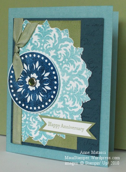
Happy Anniversary Medallion

  • Medallion, French Script and Linen (retired) background stamps; Teeny Tiny Wishes
  • Whisper White, Mellow Moss, Not Quite Navy and Baja Breeze (retired) card stock
  • Baja Breeze, Mellow Moss and Not Quite Navy Classic ink pads; Versamark ink
  • Champagne Mist Shimmer Paint in solution with rubbing alcohol as Shimmer Spray
  • Mellow Moss taffeta ribbon, Circle Ice Rhinestone brads, Photo Corner punch
  • Embossing Buddy, Clear Embossing powder and Heat Tool

I used the photo corner punch to make the points on the little banner, and I embossed the Not Quite Navy circle from the Medallion background stamp to add texture. Oh and ps, I relied on my favorite all time color combo of blues and greens.  You know this is a special card because I dug into my stash of retired Baja Breeze card stock!

My amazing husband and I celebrated 29 years of married on Easter Sunday.  It was a busy day filled with church and family (including skype conversations with the West Coast and Perth, Australia – lots of time zone math) plus dinner and a trip over to the beach to drink a little champagne and watch the sun go down.  I’m so blessed to be married to my best friend, and I wanted a special card to tell him how much he means to me.  My theme was “Classic Masculine Romance” – not quite sure I hit it, but I’m pleased with the card all the same.  He liked it too.

Love You Much

In my humble opinion, the Medallion stamp is one of the best values in the Stampin’ Up! catalog.  It can be a background or a focal point, it can be a single image or multiple layers, and it works in any color you can imagine.  Not only that, but it is really fun to dress up – kind of a Stamper’s Barbie doll.

Love You Medallion

  • Medallion, Well Scripted and Vintage Labels (SAB) stamp sets
  • Bashful Blue, Tempting Turquoise and Whisper White card stock
  • Bashful Blue and Tempting Turquoise Classic Ink pads
  • 3/4″ and Scallop Circle punches, Bashful Blue Satin ribbon, and Pretties kit
  • Stampin’ Sponge and brayer

I inked the Medallion stamp with Bashful Blue ink using a brayer.  Larger stamps with anything bolder than line art really need to be inked with the brayer to get even converage.

(I place the stamp rubber-side-up and roll the brayer on the ink pad and then on the stamp, repeating until I’m sure my coverage is complete.  I carefully position the cardstock on the inked rubber and put a large piece of scrap paper on top.  You need a steady hand to keep from moving that cardstock!  I use a separate brayer to run across the scrap paper, transferring the ink to my cardstock.  You can use the same brayer if you like, but I like to use a clean one when I’m creating multiple images because it doesn’t waste the ink.)

Back to this image – once I applied the Bashful Blue ink with the brayer, I used a Stampin’ Sponge to add Tempting Turquoise ink all the way around the outside of the Medallion.  I used a heavy hand since there isn’t a huge contrast between the two colors.  When I had both colors applied, I put the cardstock onto the stamp, layered the scratch paper on and used the brayer across the top.

The Vintage Labels image is stamped with Tempting Turquoise on Whisper White and punched with the Scallop Circle.  The last layer is the center of the Medallion inked with Bashful Blue, stamped on Bashful Blue cardstock and cut out with the 3/4″ circle.  A half pearl from the Pretties Kit is the finishing touch.

I think this is sort of a Wedding Barbie kind of Medallion.  One of these days I’m going to sit down and make this same card in a variety of color schemes.  The possibilities are endless.

CASE-ing the morning away

Kellie came over this morning to stamp.  We spent the first 15 minutes stalking the Stampin’ Up! Demonstrator Web site, trying to figure out if our shipments were going to make it to Maui today.  The delivery confirmation looked promising, but I’ve been disillusioned by these things before so I remained skeptical.  Kellie, though, is an optimist, and kept checking her cell phone all morning to see if her husband had taken delivery of her order.  Shortly after she left she called to say her package had arrived, and within an hour or so, my package arrived too.

We’d started this card but needed something that came in my box to finish it:

Medallion andVintage Labels

  • Medallion and Vintage Labels (Sale-a-bration) stamp sets
  • Sage Shadow, Soft Suede, and Naturals White card stock; White Vellum card stock
  • Sage Shadow, Soft Suede, and Pretty in Pink Classic ink pads
  • Scallop Circle punch, 1″ circle punch, and hand-held circle punch
  • Paper snips,  Vintage brads, and Tombo multipurpose adhesive

We CASE-d this card (Copy And Share with Everyone, or alternatively, Copy And Share Everything)  from the January Stampin’ Success magazine, a publication sent monthly to Stampin’ Up! demonstrators for training and inspiration.  We changed the color scheme but little else.  I could see this card in a lot of other color combinations.

We had a great morning, and you’ll see more of our projects over the next few days.  Kellie brought something she’d made for me to see, and you’re going to LOVE it – I can’t wait to CASE it myself.

Ah, Medallion!

If I had to choose only a few stamps to work with, Medallion would be very near the top of the list.  It’s elegant, it’s symmetrical, it’s layerable, and it looks great even if you cut part of the image off.  There are so many ways to embellish it, and it looks wonderful all by itself with no embellishment.

I felt the need to step away from Christmas.  This is the week to give thanks, to remember, to be grateful.  I looked for a color combination that I hadn’t worked with lately, and pulled out a sheet of Bravo Burgundy.  What a wonderful, rich color…a perfect Autumn color…but I wasn’t necessarily looking for an Autumn card.  It wasn’t until I had this card put together with Brocade Blue that I realized these were the colors from my oldest daughter’s high school.  I really like the medium blue with the burgundy.

  • Medallion and Thank You Kindly stamp sets
  • Brocade Blue, Bravo Burgundy and Very Vanilla cardstock
  • Brocade Blue and Bravo Burgundy Classic ink pads; Versamark ink pad
  • Clear embossing powder, heat tool, 1/8″ circle hole punch (retired), Stamp-a-ma-jig, Very Vanilla Taffeta ribbon, Wine Organza ribbon (retired)

Those little burgundy dots are just holes punched from cardstock and attached with the indispensable Tombo All purpose adhesive.  I apologize for using a retired ribbon, too….it used to be a regular product in the catalog, and I happen to have a stash of it because I’d used it for a custom invitation a few years ago.  Seems like organza has fallen out of favor, but I enjoy using it as a layer.

I found a great use for the Stamp-a-ma-jig.  Sometimes I can’t decide what image, especially sentiment, I want to use to finish a card.  I was goofing off one day and realized I could put the options on different corners of the SAMJ and layer them over my project to see how each would look – like this:

“Thanks” on the Stamp-a-ma-jig

“A Note of Thanks” on the Stamp-a-ma-jig

I think it looks good with either choice, but I liked the more ornate font on the “Thanks” stamp to dress up the simple layout of this card.

The added bonus of this trick is that your SAMJ is all ready to go when it’s time to add your sentiment, so you’re less tempted to wing it – and end up with a crooked sentiment.  Not that I ever have crooked sentiments.


A Medallion Tri-fold

It’s rare that I see a completed card in my head before I start it but that was the case with this card.  Some of the details came along as I worked, but I saw that Medallion on the front of the tri-fold and knew it would work.

Tri_Fold_Medallion_crop

  • Medallion, Wonderful Favorites, and All Holidays stamp sets
  • Kiwi Kiss and Baja Breeze Classic Ink pads (ret’d); Champagne Mist shimmer paint
  • Kiwi Kiss textured card stock, Baja Breeze and River Rock card stock, andDesigner Series Papers, all sadly retired
  • Vanilla Hodge Podge Hardware; Circle Ice Rhinestone brads; Flower Fusion II (retired)
  • White gel pen; ticket corner punch; Circle Scissors Plus

I free-hand cut around the Medallion, then adhered it to the Baja Breeze Designer Series paper and cut a border.  I know, I know, it’s kind of ridiculous, but it had to be done.  I stamped the center again in Baja Breeze and cut it with the Circle Scissors Plus, then stamped it one more time in Kiwi Kiss, sponged it with Champagne Mist (my go-to product of the moment!) and punched that with the scallop circle.  The rest of the embellishments are fairly simple because I wanted the Medallion to really pop.

I really miss these colors.  I think last year’s In Color collection was the absolute best and if I had to choose colors to bring back, Baja Breeze and Kiwi Kiss would be at the top of the list.  I’ll eventually get over it.  Eventually.