Manly cards – collage

My Frou-Frou-Ribbon card got me started playing with collage, and when I edited out the ribbon and switched up the colors a bit I thought it was a worthy Man-Card:

Manly Time

  • Sense of Time and Charming stamp sets
  • Very Vanilla, Crumb Cake, Pacific Point and Garden Green card stock
  • Garden Green Patterns Designer Series Paper
  • Chocolate Chip, Crumb Cake, Pacific Point and Garden Green Classic ink pads
  • Square Punch (just about any one will do, I used 1 1/4 inch)
  • Mini Library Clips

I’m not quite certain that a stamp set named “Charming” belongs on a Manly card, but I guess we’ll just have to imagine that the name refers to the Prince.  The images from the Bliss set didn’t have the right look.

Let me tell  you a secret about cutting out that clock face.  I didn’t want to struggle with lining up a die cut, or even with the Circle Scissors Plus, so I just cut it out free hand.  I did a decent but not fabulous job, because I had a plan:  I was going to distress the edges.  It’s a sneaky little trick, but it hides every imperfection and adds texture to boot.

The pennant edge is really simple – just cut your cardstock to the width you want, stamp your sentiment, and use a corner of the square punch to create a perfect little pair of points.

So…masculine colors, no ribbon, rough edges and a pair of easy techniques…surely it’s a Man Card.

A Frou Frou ribbon

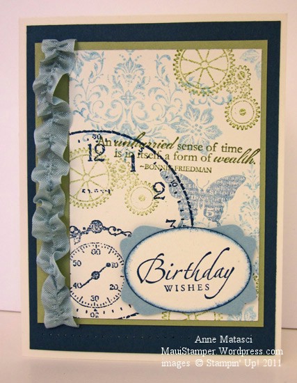
This card didn’t make the Manly card cut – the ribbon was too Frou-Frou:

Blissful Sense of Time collage

  • Sense of Time, Bliss (SAB) and Sincere Salutations stamp sets
  • Naturals White, Baja Breeze, Pear Pizazz and Night of Navy card stock
  • Baja Breeze, Pear Pizazz and Night of Navy Classic ink pads
  • Large oval and Decorative Label punches
  • Baja Breeze seam binding and Sticky Strip
  • Piercing tool, mat and template
  • Stampin’ Sponges

Collage is such fun.  I have to remind myself not to get too fussy with it, but to just let it flow and be happy with the results.  Doesn’t that sound like a good way to live your life?

That ruffled ribbon is VERY easy – just brush the cut edges of the seam binding until you can grab a couple of threads in the middle – I use tweezers – and pull.  When the ribbon is bunched up halfway, turn it around and do the same thing from the other end.  Don’t trim the ends too much – stick those long strings on some sticky strip and then press the ruffled ribbon down and Voila! – it will be fabulous, dahling.

Happy Father’s Day, Dad

I won’t be spending Father’s Day with my dad this year…most years I don’t.  We’re on the road, mid-way between a week of total R&R in Door County, Wisconsin and conference-plus-Big-City-fun in Chicago.  My dad’s on the West Coast, and though I’m not there, I’ll be sending my son to spend a couple of weeks with him and my mom when we leave Chicago.  It’s a fabulous time for everyone – Grandma and Grandpa enjoy my son a great deal, and my son is a big fan of his grandfather’s very specific diet:  Ice cream daily, twice if you can get it.  My dad and my son are a well-matched pair.

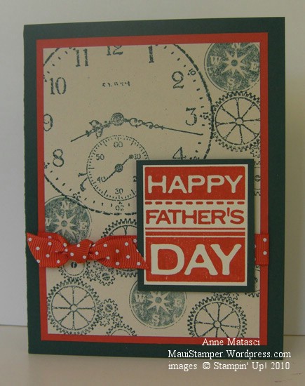
Happy Father's Day

  • Sense of Time, Sentimental Journey and All Holidays Stamp sets
  • Very Vanilla, Dusty Durango and Handsome Hunter card stock
  • Dusty Durango and Handsome Hunter Classic ink pads
  • Dusty Durango polka dot ribbon; Stampin’ Dimensionals

This card is simple to make.  I stamped the big clock face image first, then just filled in with the images from Sense of Time and Sentimental Journey.  Some of them I stamped off (ink, stamp once on scrap paper, then stamp on project) and some I used “full strength”.  The “Happy Father’s Day” image is stamped onto a scrap of Very Vanilla and trimmed to fit – trying to stamp that squared image perfectly on a piece of cardstock would make me crazy.  (OK.  Crazier.)  That image is lifted on Stampin’ Dimensionals to help it to clear the ribbon and to add some, well, dimension.

Whenever I make a card base with a deep color like Handsome Hunter, I always cut a panel of light cardstock to insert on the inside.  If my card is 4 1/4″ x 5 1/2″ I cut my panel to 4″ x 5 1/4″ – you get the idea.

Happy Father’s Day to all of you dads out there.

Travel Time Collage

It’s a busy day for Stampin’ Up! demonstrators.  Last night (or early this morning, depending on where you live) the new catalog Sneak Peak products were released.  There was a frenzy of posting on various forums as we waited for the new information to load on the demonstrator site.  Since Hawaii is four hours behind Riverton, Utah (where Stampin’ Up! is located) I was doing my waiting at a very respectable 8pm.  Demonstrators east of Riverton were not so fortunate!

I’ve ordered some new goodies, and though we’re not allowed to show you any pictures of actual products until they are released, we ARE allowed to show you things we MAKE with those products.  Watch for some exciting new images hitting this blog soon!

Today I have a card that is entirely different from anything I’ve ever done:

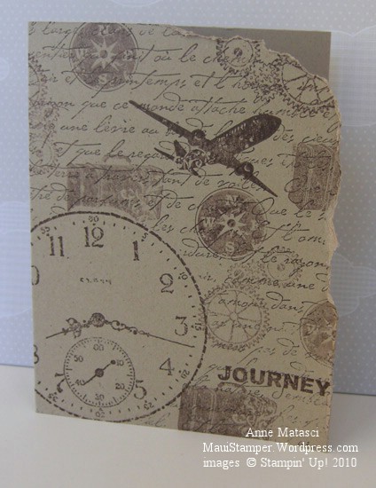
Timeless Journey CAS

  • Sentimental Journey, Sense of Time and French Script Stamp sets
  • Kraft (soon to be Crumb Cake) card stock
  • Chocolate Chip Classic ink pad

Are you shocked?  I’m still trying to decide if I like it.  I’ve admired other stampers collage work, and these sets seemed to fit together well for the purpose.  Some of the images were stamped with fresh ink and others were stamped off before I put them to the card.  Three stamp sets, one paper, one ink.  That’s it.  The whole enchilada.

I masked the large clock before I stamped the large background French Script stamp.  I like the way it makes the clock face take center stage, although sometimes I wish the clock wasn’t such a priority in life.  Many years ago, my husband and I drove across the country and we packed away our watches and covered up the dashboard clock.  It was a wonderful trip.

I couldn’t stamp this way all of the time – it would bore me to tears.  Once in a while, though, it’s nice to do something different.

A Fond Farewell to YoYo Yellow

Fond may be stretching it!  I think I am still working from my original package of YoYo Yellow, and my stamp pad looks brand new.  In my opinion, it’s time to go – but Arielle decided to push my buttons with this week’s Colour Q challenge.   I’ll admit that the dinnerware she used for her inspiration looks pretty cool, but honestly – Whisper White with Bravo Burgundy, Tangerine Tango, Yoyo Yellow and Green Galore???  Aaack!!

Colour Q Challenge 29 Splitcoaststampers Sketch Challenge 277

  • Sense of Time and Define Your Life Stamp sets; Texture Jumbo Wheel
  • Whisper White, Bravo Burgundy, Tangerine Tango and Yoyo Yellow card stock
  • Bravo Burgundy, Tangerine Tango, Yoyo Yellow and Green Galore Classic ink pads
  • Aquapainter;  Piercing tool, template and mat;  and Vintage Brads

To add a little more challenge, I used the Splitcoaststampers Sketch Challenge 277 for the layout of this card.  The white balance on this card seems off, but with this color combination I couldn’t bear to add any more solids!  I compromised by using the Aquapainter to blur the Bravo Burgundy ink in the background of the card base.  I’m not too crazy about Yoyo Yellow (can you tell??) but Green Galore positively gives me fits.

Ah, but enough complaining.  These colors are Bold Brights and bright they are.  There are lots of crafters that love them and will lament their retirement, and I understand that feeling.   The world would be a dreary place if we all loved the same colors.  Farewell, Triple Y and Double G.