A RemARKable Ending to World Card Making Day

Well, my blog-hopping friends, we’ve reached the last moments of World Card Making Day – at least on the East Coast.  Here in Hawaii, it’s time for pupu and a glass of wine, and Mr. Maui Stamper and I are heading over to the beach with our picnic basket for the sunset.  I’m sure to lift my glass to all of you!!  Thanks for sharing this day with all of us.

I left the neutrals for last because after my favorite blue + green combo, I love a neutral card.  Granted, I often use an neutral palette to set of a pop! of color – Real Red, Daffodil Delight, Marina Mist – but by themselves I find the neutrals very elegant.  Tell me what you think:

Have you tried our new Core’dinations card stock yet?  Hie thee off to thine own Stampin’ Up! Demonstrator and order thyself some of this paper of the kings!!  It is royally fabulous!  And that tulle is pretty sweet too, and it sticketh to sticky strip quite welleth!  (OK.  Enough of that nonsense.)
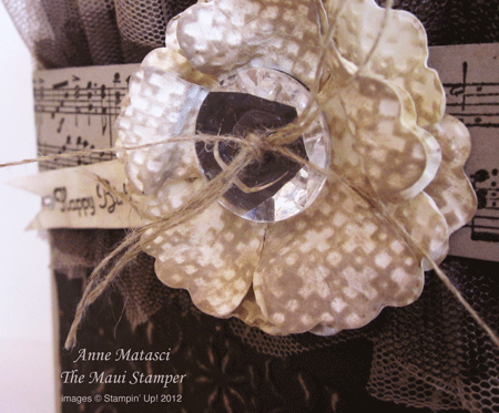
There’s a little 3/4 inch circle of Early Espresso cardstock behind that Vintage Faceted Button to give it depth.

Black and white is classic, but black with Very Vanilla is just splendid – like deep, dark chocolate hot fudge with rich vanilla bean ice cream (did I send you off to the freezer there?  Sorry ’bout that!)  Our First Edition Specialty paper is one of my stamp room staples; it’s flexible enough for nearly any card-making situation.
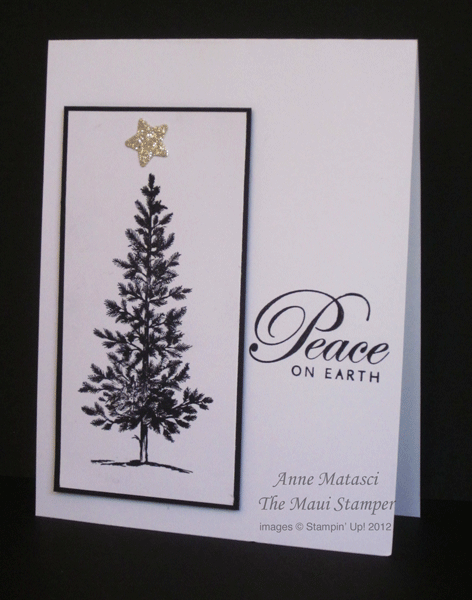
Although the Neutral color family lends itself well to luxurious, elaborate cards, it certainly works well with other styles.  This is about as close as I get to a Clean and Simple card, and I’m pretty sure that sparkly star at the top disqualifies me from the genre.

That’s my last card for this hop – or as Mr Maui Stamper called it the other day, the Blog Parade.  We are all very grateful for each of you taking the time to hop, skip, jump and parade through our posts.  If we’ve done our job well, you are inspired; perhaps you’ve left a comment or two, or pinned a few samples to your Pinterest board for later study.   I’ll be reviewing some of these projects over the next couple of weeks with a little more detail – if there’s one you’d especially like to see featured, just leave a comment.

A hui hou…until we meet again.

Next Stop on the World Card Making Day RemARKable Blog Tour

Ah, Medallion!

If I had to choose only a few stamps to work with, Medallion would be very near the top of the list.  It’s elegant, it’s symmetrical, it’s layerable, and it looks great even if you cut part of the image off.  There are so many ways to embellish it, and it looks wonderful all by itself with no embellishment.

I felt the need to step away from Christmas.  This is the week to give thanks, to remember, to be grateful.  I looked for a color combination that I hadn’t worked with lately, and pulled out a sheet of Bravo Burgundy.  What a wonderful, rich color…a perfect Autumn color…but I wasn’t necessarily looking for an Autumn card.  It wasn’t until I had this card put together with Brocade Blue that I realized these were the colors from my oldest daughter’s high school.  I really like the medium blue with the burgundy.

  • Medallion and Thank You Kindly stamp sets
  • Brocade Blue, Bravo Burgundy and Very Vanilla cardstock
  • Brocade Blue and Bravo Burgundy Classic ink pads; Versamark ink pad
  • Clear embossing powder, heat tool, 1/8″ circle hole punch (retired), Stamp-a-ma-jig, Very Vanilla Taffeta ribbon, Wine Organza ribbon (retired)

Those little burgundy dots are just holes punched from cardstock and attached with the indispensable Tombo All purpose adhesive.  I apologize for using a retired ribbon, too….it used to be a regular product in the catalog, and I happen to have a stash of it because I’d used it for a custom invitation a few years ago.  Seems like organza has fallen out of favor, but I enjoy using it as a layer.

I found a great use for the Stamp-a-ma-jig.  Sometimes I can’t decide what image, especially sentiment, I want to use to finish a card.  I was goofing off one day and realized I could put the options on different corners of the SAMJ and layer them over my project to see how each would look – like this:

“Thanks” on the Stamp-a-ma-jig

“A Note of Thanks” on the Stamp-a-ma-jig

I think it looks good with either choice, but I liked the more ornate font on the “Thanks” stamp to dress up the simple layout of this card.

The added bonus of this trick is that your SAMJ is all ready to go when it’s time to add your sentiment, so you’re less tempted to wing it – and end up with a crooked sentiment.  Not that I ever have crooked sentiments.


Bunches of flowers

These floral outline stamps make a quick and easy card.  It’s easy to layer them by using a simple mask:  stamp the image on a re-positionable note and cut the image out.  When you’ve stamped your first image, cover it with the mask and stamp an overlapping image.  I keep my masks in the plastic box the stamp sets come with, because a little bit of Dotto will refresh the “stickiness” of the mask for many more uses.  You can use scrap paper and dotto with the same results, but make sure the paper you use for the mask is lighter than cardstock weight or you’ll have gaps around the edges of your mask.

5th_Ave_Thanks_crop

  • Fifth Avenue Floral stamp set and a retired sentiment
  • Dusty Durango, Pumpkin Pie and Apricot Appeal Classic Ink pads
  • Very Vanilla, Dusty Durango and Apricot Appeal (sorry, it looks kinda yellow) card stock
  • Pumpkin Pie narrow grosgrain ribbon and Scallop Edge punch

The Stampin’ Up! color families make it so easy to design a monochromatic card.  It’s one of the things that sold me on Stampin’ Up! right from the start.  It would be simple to change this color scheme into pinks, reds, golds, lavenders, even blues and greens if your flower favorites run avant garde.

Gratitude

How easily the words “Thank you” roll off our lips.  We say thanks so easily for so many small things…a kind gesture, a small gift, a thoughtful compliment.

Gratitude implies something more.  It implies we’ve thought about what was given or done for us, turned it over in our minds and acknowledged that extra effort was put into the gift.  It feels more Thankful, not just thanks.

This card was inspired by a couple of challenges at Splitcoast.  One of them was to use the color red, and after a couple of false starts, everything fell into place.   I’m grateful.

Gratitude

Gratitude

  • Naturals White, Real Red, Chocolate Chip and Sahara Sand card stock
  • Real Red and Chocolate Chip Classic Ink
  • Real Red Stampin’ Write Marker, Paper piercing mat (used with marker)
  • Versamark ink, Clear Detail Embossing Powder, Heat Tool
  • Button Latte assortment, Red Hemp twine (retired, sadly)
  • Petals a Plenty Embossing Folder, Big Shot