FLOWERS FAIR WITH A GINGHAM DSP

  • Color Palette: Basic White, Peaceful Pine, Hydrangea Hue, Golden Glow, Barely Blush, Hybrid Black
  • Accessories: Stamp Cut & Emboss Machine, Everyday Arches dies, 26-28 In Color Dots, Gingham Gallery DSP (coming July 1), 26-28 In Color Ribbon, Stampin’ Blends, Stampin’ Dimensionals

I am absolutely smitten with Flowers Fair and love experimenting with new color combinations. I have a stamped stack of images sitting on my craft desk for whenever I’m inspired!

Processing…
Success! You're on the list.

FLOWER FAIR: GET TWO CARDS FROM ONE IMAGE

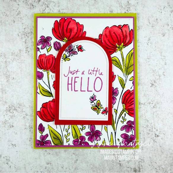
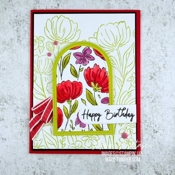
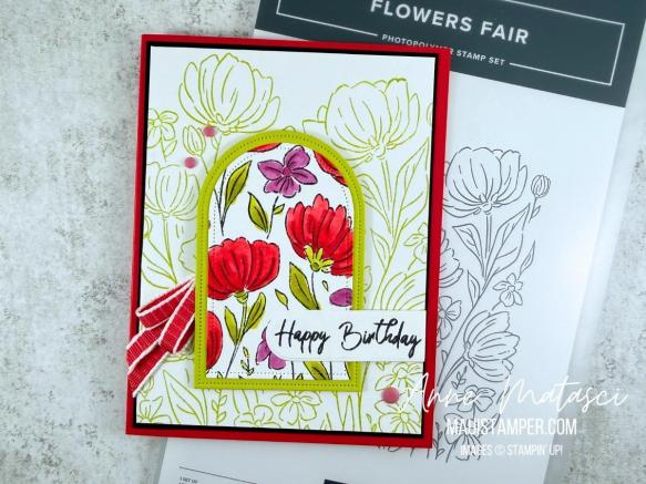
Don’t you love getting double the results from one image? A large image like Flowers Fair is a great candidate for double dipping. Take a look at what I did:

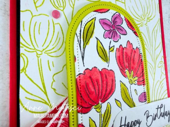
After I’d colored the original image, I cut out middle with the Everyday Arches dies and used it for the second card. It was easy to cover the opening on the first card with a matted second image, and I stamped the same full image for the second card in Lemon Lime Twist to keep it softly in the background.

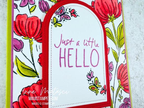
I kept the focal panel for the first card simple with plenty of white since the background was so colorful. The little butterflies from Cutest Crew fit perfectly on the edges.

Keeping the background softer allowed the focal panel to, well, be the focus. I stamped the sentiment in black to mute what was otherwise a very colorful card.

Flowers Fair was released during the March 2026 Online Exclusives. It’s a keeper – have some fun with it!

Processing…
Success! You're on the list.

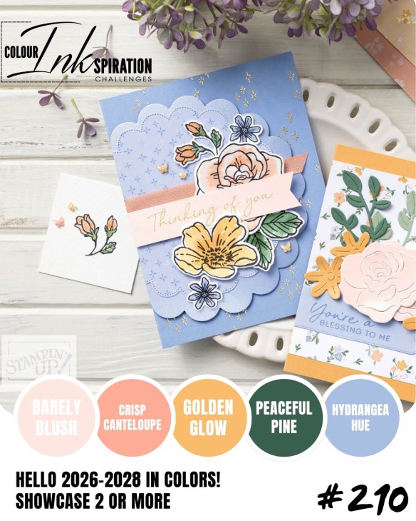
COLOUR INKSPIRATION #210: GUEST DESIGNER!

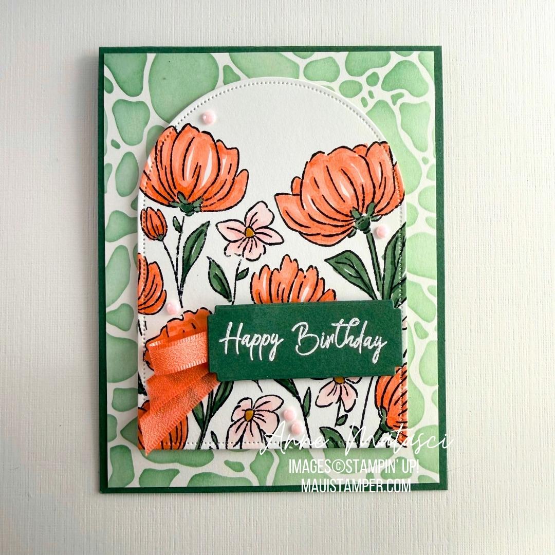
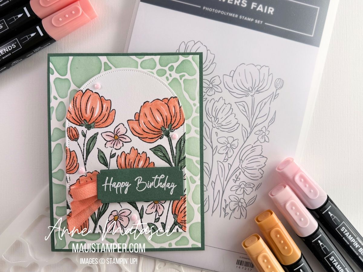
It took me a while to decide where to start as I love all five 26-28 In Colours. I ultimately chose to begin with Crisp Cantaloupe, as it’s a returning colour from the 2013-2015 Palette. Anyone else who has been around that long??

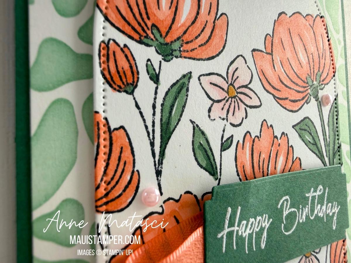
Flowers Fair can be used so many ways. Here I’ve coloured it, then cut it with one of the arch dies. Stampin’ Blends are my favorite way to colour these images, but you could use Watercolour Pencils, Blending Brushes, Watercolour, or even daubers to fill in the colour.

I decided to emboss the greeting with White Embossing Powder on a Peaceful Pine panel. I’m happy with the way the embossing makes the greeting “pop” on the card front.

Take a look at what the Design Team has created for this great colour challenge. If you’ve never played along, I hope you’ll give it a try! You can’t go wrong with such a gorgeous set of colours.

*Although I’m in the US and the standard spelling is “COLOR”, I’ve chosen to use the alternative spelling of “COLOUR” in recognition of the group identity. I’m sure you can make the translation. 😆

Processing…
Success! You're on the list.