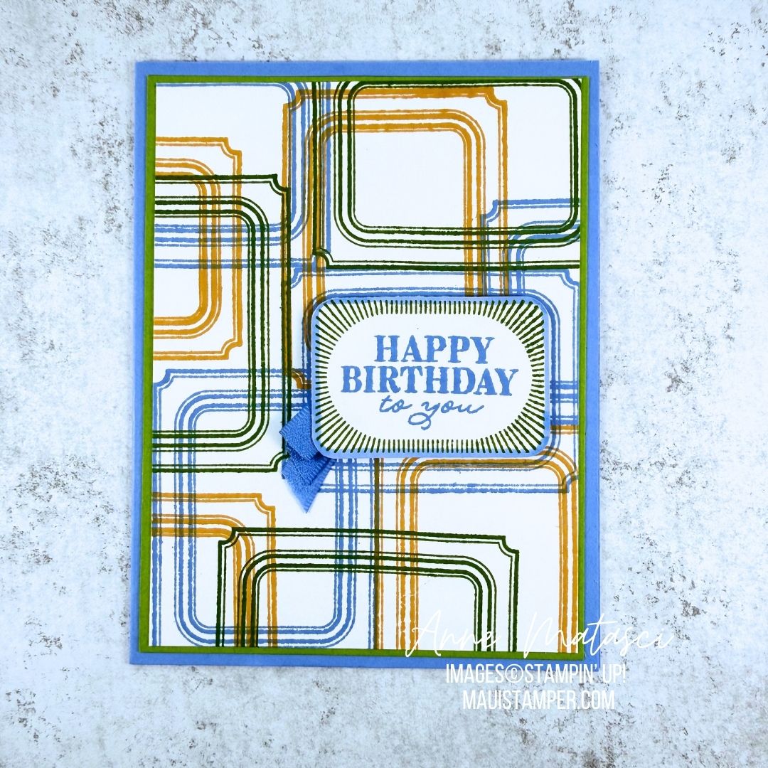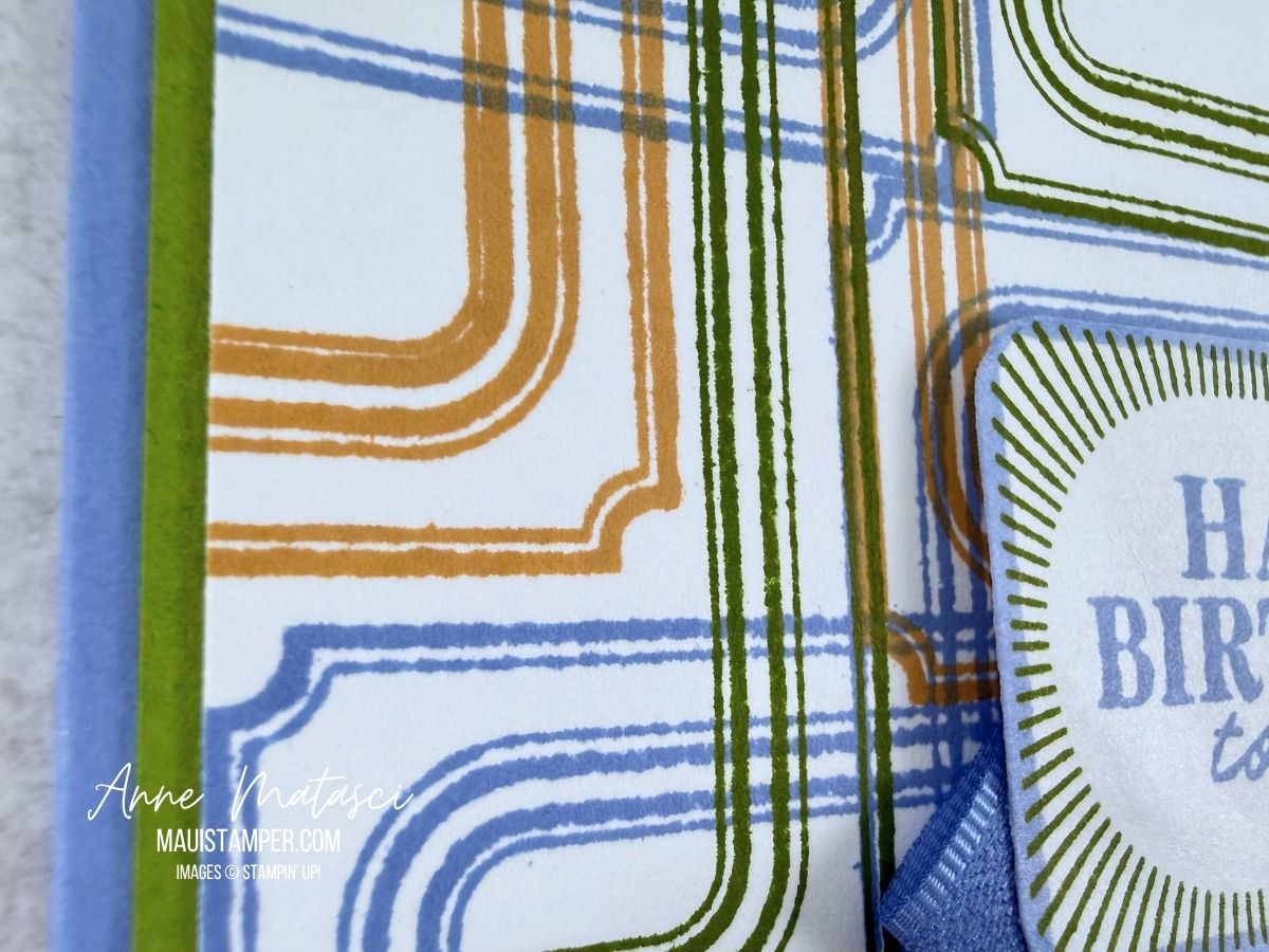
There’s a new release of Online Exclusives arriving in the store on July 1, and I’m really excited about the new Gingham Gallery DSP! It features all of the 2026-2028 In Colors, and I’ve think you’ll love it.
Color Palette: Basic White, Peaceful Pine, Hydrangea Hue, Golden Glow, Barely Blush, Hybrid Black
Accessories: Stamp Cut & Emboss Machine, Everyday Arches dies, 26-28 In Color Dots, Gingham Gallery DSP (coming July 1), 26-28 In Color Ribbon, Stampin’ Blends, Stampin’ Dimensionals
I am absolutely smitten with Flowers Fair and love experimenting with new color combinations. I have a stamped stack of images sitting on my craft desk for whenever I’m inspired!
Take a look at the Online Exclusives available July 1st – and don’t forget the new Product of the Month! It’s another stamp set, and the June set sold out quickly. Don’t miss this one.
Processing…
Success! You're on the list.
Whoops! There was an error and we couldn't process your subscription. Please reload the page and try again.
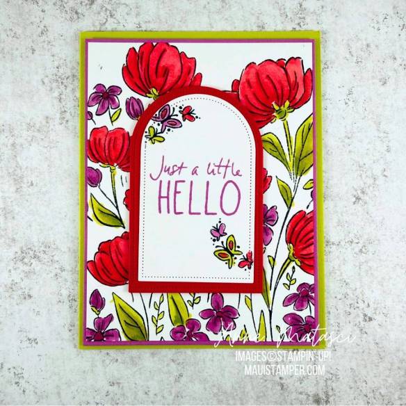
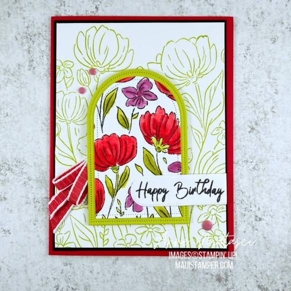
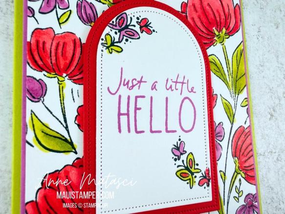
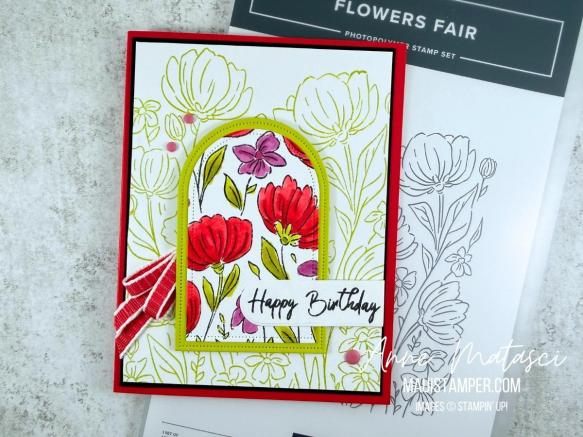
Don’t you love getting double the results from one image? A large image like Flowers Fair is a great candidate for double dipping. Take a look at what I did:
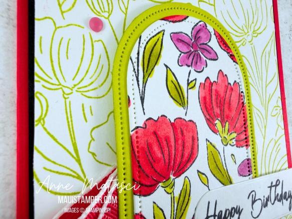
After I’d colored the original image, I cut out middle with the Everyday Arches dies and used it for the second card. It was easy to cover the opening on the first card with a matted second image, and I stamped the same full image for the second card in Lemon Lime Twist to keep it softly in the background.
I kept the focal panel for the first card simple with plenty of white since the background was so colorful. The little butterflies from Cutest Crew fit perfectly on the edges.
Keeping the background softer allowed the focal panel to, well, be the focus. I stamped the sentiment in black to mute what was otherwise a very colorful card.
Flowers Fair was released during the March 2026 Online Exclusives. It’s a keeper – have some fun with it!
Processing…
Success! You're on the list.
Whoops! There was an error and we couldn't process your subscription. Please reload the page and try again.
The latest LAST CHANCE update has some amazing deals – have you taken a look? Here, let me show you a few:
Handmade and Heartfelt is my favorite kit – I’ve purchased multiples – and it’s only $16. It makes a fantastic gift, too.
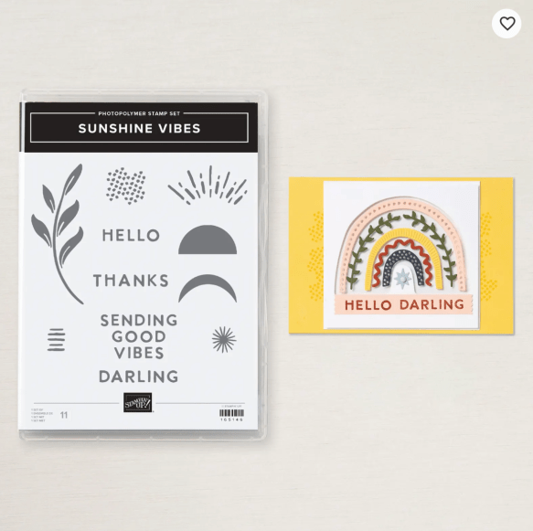
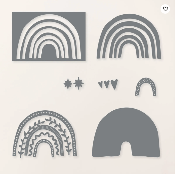
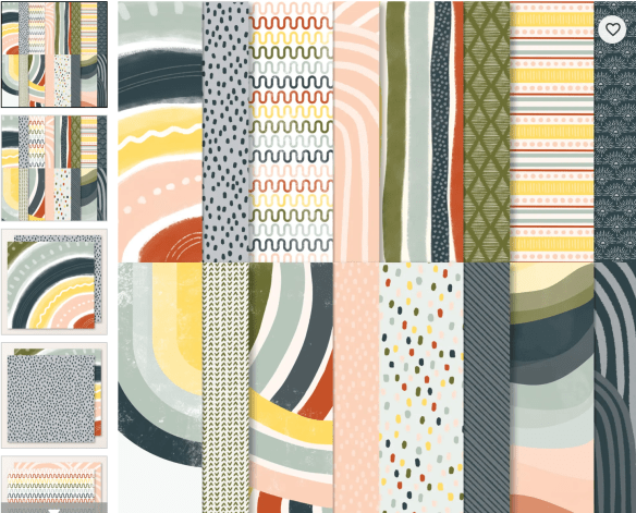
This bundle and DSP – Sunshine/Boho Vibes – is fun, colorful, and perfect for cheery cards. Buy the stamps ($9) and dies ($15) separately, not in the bundle, and save big bucks. The DSP is just $7.50!
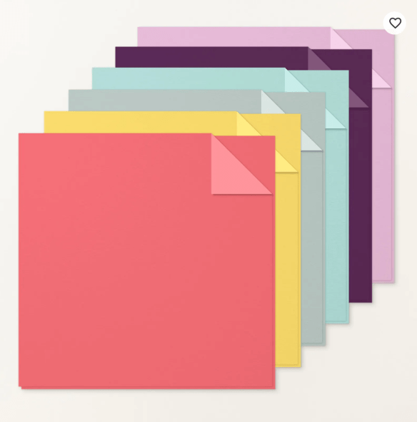
Pro tip: Watch for Two Tone Card Stock Assortments to go to Last Chance. It’s a great way to build a small collection and try out this awesome product!
Finally, there are just too many In Color products to list, but go check out the full Last Chance list to see them. Ribbon, card stock, ink, Stampin’ Blends – this is your chance to stock up on this gorgeous palette before it retires and save a little cash while you’re at it!
Stampin’ Up! Designer Series Paper (aka DSP) is one of the most versatile design elements in my crafting bag o’ tricks. Our papers are smooth, two-sided, and beautifully designed to accent any project. The Moonlit Flora DSP is especially lush, and it really satisfies my tropical little heart.
I’ve added some shimmer to the fern die cut with our new Shimmer Brush. I got the idea after I’d adhered the fern to the card front, so the accent isn’t as precise as I’d like. In my house we call this Delayed Intelligence. Sigh.
All of the Fern & Flora images are beautiful, but I chose to use just the paper and the die cuts for this card. This layout is very simple – it uses 2 pieces of DSP and a strip of Secret Sea run through the Fern & Flora embossing folder. The hardest part is choosing which papers to feature!
Give this one a try with the Moonlit Flora DSP or any other paper you have in your stash. You’ll love the results!
Processing…
Success! You're on the list.
Whoops! There was an error and we couldn't process your subscription. Please reload the page and try again.
Today I’m quite pleased to be a Guest Designer for Colour* INKspiration Challenge #210. This one is really fun, as it’s all about the 2026-2028 In Color Palette from Stampin’ Up!
It took me a while to decide where to start as I love all five 26-28 In Colours. I ultimately chose to begin with Crisp Cantaloupe, as it’s a returning colour from the 2013-2015 Palette. Anyone else who has been around that long??
The background paper isn’t DSP. It’s our new(ish) Water and Dotted Lines Decorative Masks, colored with a Blending Brush. They’re quite large – 12″ x 12″ – so you could cover an entire page for a scrapbook layout or a 3D project. I’m quite smitten 💕
Flowers Fair can be used so many ways. Here I’ve coloured it, then cut it with one of the arch dies. Stampin’ Blends are my favorite way to colour these images, but you could use Watercolour Pencils, Blending Brushes, Watercolour, or even daubers to fill in the colour.
I decided to emboss the greeting with White Embossing Powder on a Peaceful Pine panel. I’m happy with the way the embossing makes the greeting “pop” on the card front.
Take a look at what the Design Team has created for this great colour challenge. If you’ve never played along, I hope you’ll give it a try! You can’t go wrong with such a gorgeous set of colours.
*Although I’m in the US and the standard spelling is “COLOR”, I’ve chosen to use the alternative spelling of “COLOUR” in recognition of the group identity. I’m sure you can make the translation. 😆
Processing…
Success! You're on the list.
Whoops! There was an error and we couldn't process your subscription. Please reload the page and try again.
It’s a Stampin’ Up! shopping trifecta! Lots of new products, not to mention a new JOIN offer and a brand new Product of the Month! I hope you’ve got your list ready.
Let’s start with the new 2026 May-August catalog. It’s a brand new format, with lots of brand new products – including the 2026-2028 In Color Collection. Click on the catalog above to see a digital copy, or click HERE to shop the Online Store.
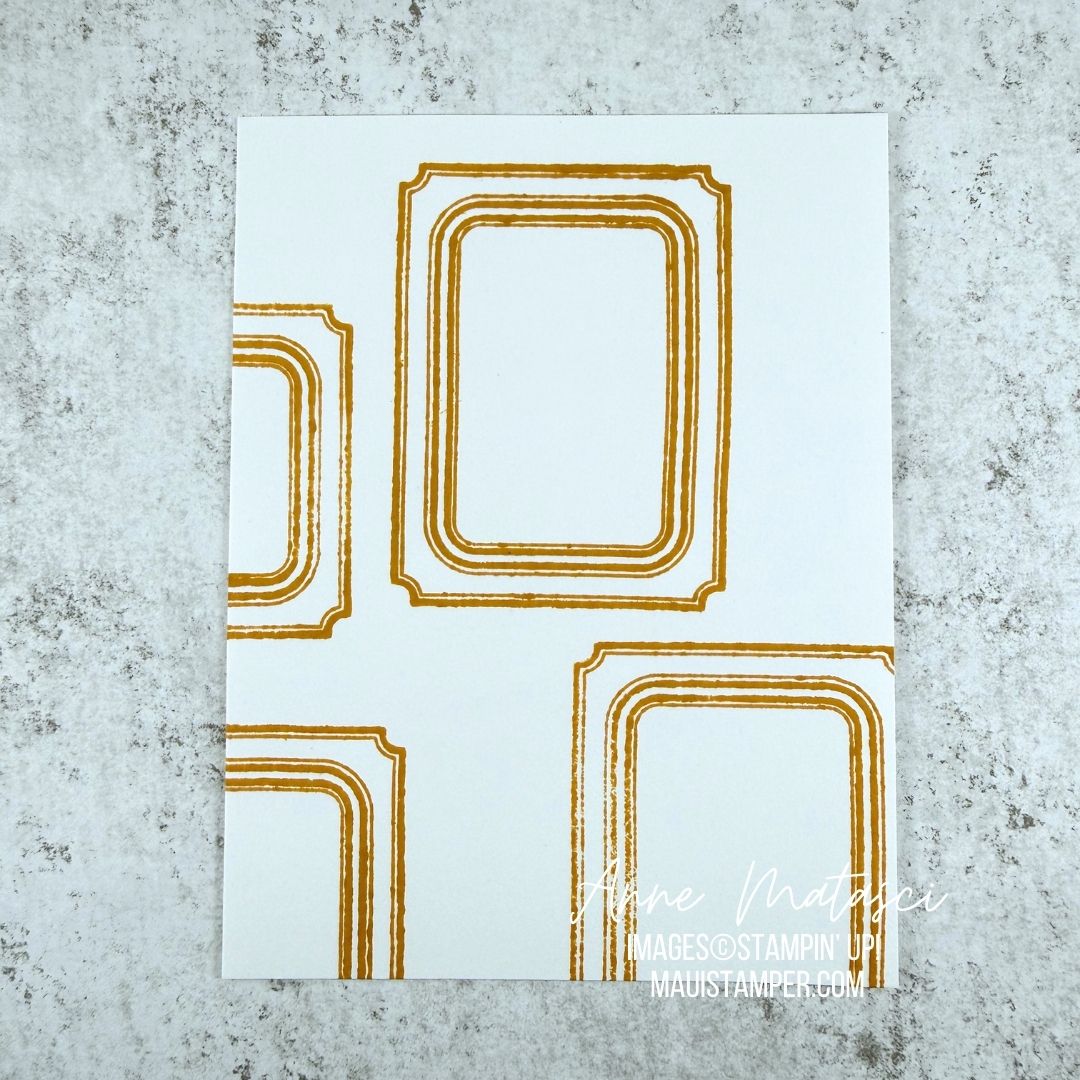
This Specialty DSP is likely to be another hot seller. It’s just $5 with a qualifying order – don’t miss the chance to add it to your cart.
These two new kits are just the thing for that last minute card – they’re both stamping kits, which means you can use the included sentiments or substitute your own. Choose Serene Scenes, choose Pretty Party, or choose them both!
Before you place that order, take a look at the bonus you’ll earn when you become a Stampin’ Up! demonstrator in May. In addition to all the kit benefits, you’ll get all five NEW Magnetic Ink Pads in the 2026-2028 In Colors! It’s a sweet deal – message me if you want to chat about whether or not it’s a good fit for you.
Happy Browsing, Shopping, and Deciding!! Get started HERE.
Processing…
Success! You're on the list.
Whoops! There was an error and we couldn't process your subscription. Please reload the page and try again.
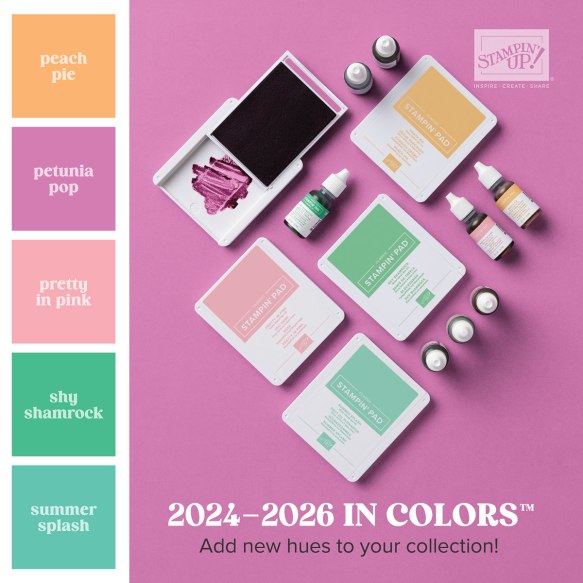
The Colour INKspiration crew has a fun challenge this time around. It’s time to say farewell to the Stampin’ Up! 2024-2026 In Color Collection: Shy Shamrock, Pretty in Pink, Peach Pie, Petunia Pop and Summer Splash. The challenge is to use at least one, or as many as all five retiring colors in a project. I chose Shy Shamrock and Petunia Pop.
Color Palette: Basic White, Shy Shamrock, Petunia Pop, Hybrid Black
Accessories: Stamp Cut & Emboss Machine, Lovely Arrangements dies, Nested Essentials dies,Stampin’ Blends, Pattern of Friendship die (retired), Petunia Pop Bordered Ribbon (retired), 24-26 In Color Designer Series paper, In Color Resin Dots (retired), Stampin’ Dimensionals
I stamped off the Lovely Arrangements leaves to keep them from competing with the other elements. I actually like the uneven result as it increases the textural feeling. The flowers are colored with Stampin’ Blends. I’m going to miss the 24-26 In Color Collection!
The Nested Essentials dies are new to my craft arsenal, and the biggest hexagon said “try me!” It was too wide for the card, but when I cut it in half it worked perfectly. And the stripes in the DSP played so well with the stripes in the (most sadly retired) Pattern of Friendship die – I hope you’re lucky enough to have that die in your arsenal!
Take a minute to check out the Colour INKspiration page on Facebook. The challenge is open until Monday, May 11th at 5pm (AEST). You’d best check your favorite time zone calculator on that, and don’t forget that Australia is on the other side of the International Date Line from the USA. 😉
Processing…
Success! You're on the list.
Whoops! There was an error and we couldn't process your subscription. Please reload the page and try again.
Color Palette: Basic White, Memento Black, Pretty in Pink, Crumb Cake, Gray Granite, Pebble Path
Accessories: Stamp Cut & Emboss Machine, Cutest Crew dies, Eyelet 3D Embossing Folder, Two Tone Card Stock, Stampin’ Blends, 1/8″ Ribbon (Bubble Bath), Pebble Path DSP (retired), Stampin’ Dimensionals
I hope you’ll excuse my use of retired DSP – I didn’t have Gray Granite, but I had Pebble Path, and I thought it worked pretty well! (A moment of silence, please, for Pebble Path, I loved that In Color!)
Along the same lines, I slipped in the Bubble Bath ribbon as it played very nicely with Pretty in Pink. Sometimes embellishments will give you double duty that way 😉
The kittens are a lot of fun to color with Stampin’ Blends. This little crew is an active bunch and they make for a very playful card!
The Cutest Crew dies are out of stock and due in the Warehouse the week of April 27th. Have you used the “Notify Me” option in the Online Store for out of stock products? It works like a charm!
Processing…
Success! You're on the list.
Whoops! There was an error and we couldn't process your subscription. Please reload the page and try again.
I love the patterns of lines, both horizontal and vertical, anchored by the Misty Moonlight circle in the middle. The patterns in the embossing folder lined up almost perfectly with the Designer Series Paper – what a lucky coincidence! Oh, and have I mentioned the kittens??? 😉
I love how our embellishments are flattened out. I usually add a piece of card stock to the front of my cards before I put them in the mail, and I haven’t had any problems. Stampin’ Up! really does listen when we tell them things that work – and that don’t work!
Processing…
Success! You're on the list.
Whoops! There was an error and we couldn't process your subscription. Please reload the page and try again.
The technique is quite similar – tear the paper, alternate sides as you apply it, and finish with the Rolling Waves die cut. I changed the sentiment panel to a Stylish Shapes banner, and the color palette is Pool Party and Coastal Cabana instead of Cloud Cover and Lost Lagoon.
We made this card in my crafting groups, and one of our members shared a hilarious story about someone in an aquarium rather arrogantly correcting her children: they are NOT Star Fish, they are not fish at all, they are Sea Stars. Oh my gosh, we laughed so hard – you had to be there.
That’s why we make cards together, isn’t it? For the fun, the laughter, and the connection.
Maybe you could send a birthday card to someone this week. It will bring a little joy to both of you. If you need supplies, shop the Online Store.
Processing…
Success! You're on the list.
Whoops! There was an error and we couldn't process your subscription. Please reload the page and try again.