I spent a marvelous afternoon a couple of weeks ago playing with Stampin’ Blends and the alcohol technique in Crystal’s Stampin’ Garage. It took a few tries to get the hang of it, but once we got over that bump we couldn’t stop. All you really need are Stampin’ Blends, vellum, a small paintbrush, and 91% rubbing alcohol.
(Who knew 91% Rubbing Alcohol was so hard to find? Thanks, Covid.)
Stamps: Art Gallery
Color Palette: Basic White, Misty Moonlight, Garden Green, Balmy Blue
Accessories: Big Boss, Stitched Rectangle dies, Forever Flourishing dies, Poinsettia dies, vellum card stock, 91% rubbing alcohol, small paint brush, small dropper, Stampin’ Spritzer, Stampin’ Dimensionals
You need a non-porous paper like vellum for this technique to work. It’s pretty simple: add color with Stampin’ Blends in any pattern you like. Use 91% rubbing alcohol to reactivate the ink and gently move it around, color by color. Finally, add interest by dripping the alcohol with a small dropper, the Stampin’ Spritzer, or the flick of your paintbrush.
I chose to add these leafy elements, but some of my results needed nothing more than a sentiment. I learned that I like more monochromatic combinations, especially blues and greens. (HUGE surprise there, eh?)
Shop early, shop often – your supplies for this project or your holiday crafting can earn free stamps, paper and accessories! SALE-a-bration runs through 30 September 2021, but supplies are limited! Shop HERE.
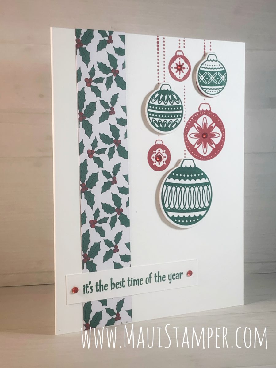
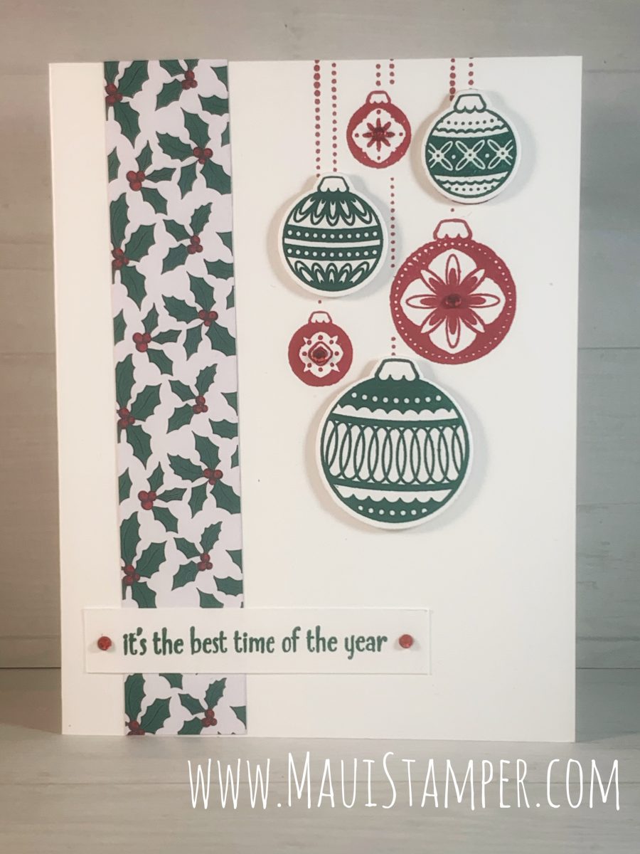
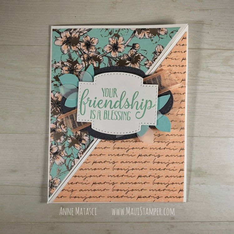
A stamp and die set named Ornamental Envelopes may not evoke cards, but think twice, my dear Crafty Friends! You’ll want this combo all year long for the details that make a handmade card stand out from the rest.
Stamps: Ornamental Envelopes, A Merry Hello (host)
Color Palette: Whisper White, Shaded Spruce, Real Red
Accessories: Envelopes dies, Stampin Cut & Emboss, Stamparatus, Tis the Season Designer Series paper, Stampin Dimensionals, Red Rhinestone Jewels
I’ve CASEd this project from the classic style of Mary Fish. I’ve made very few changes, although I chose to simplify the DSP strip and layer it on top of the card front rather than recess it. I’m stamping this with a group, so simple made sense! The Stamparatus really helps when you want to be sure that group of ornaments is hanging perfectly straight off the top of your card.
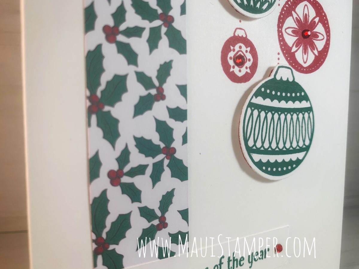
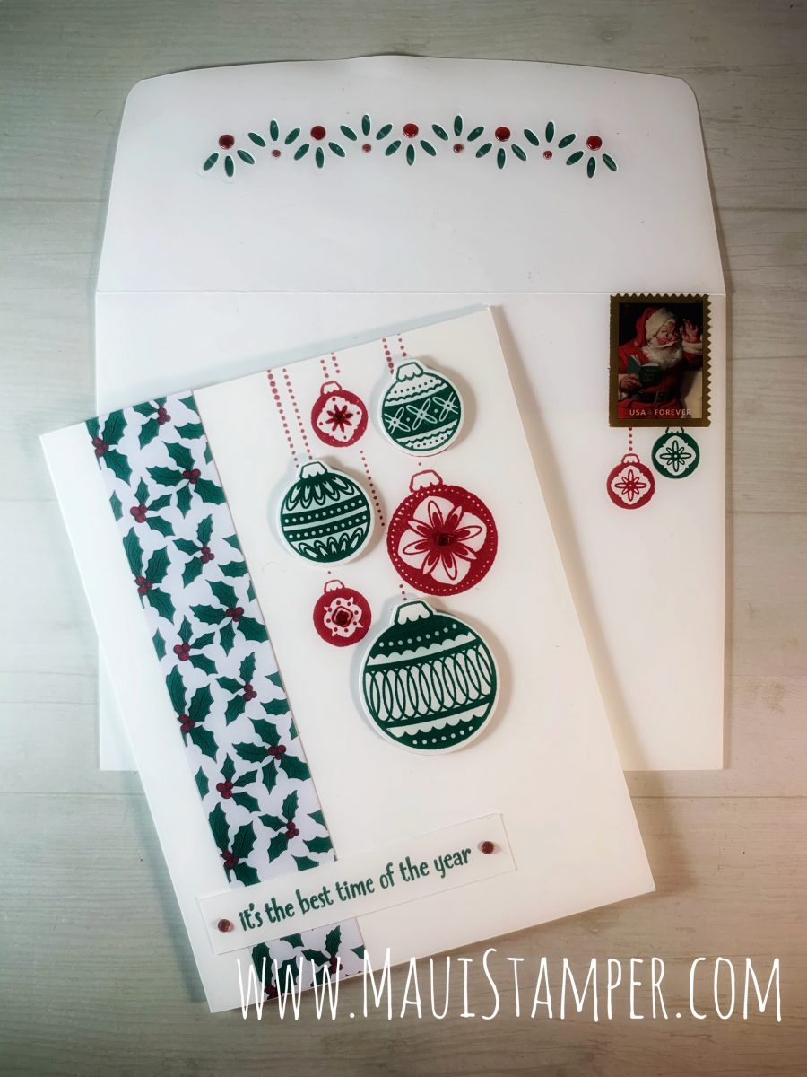
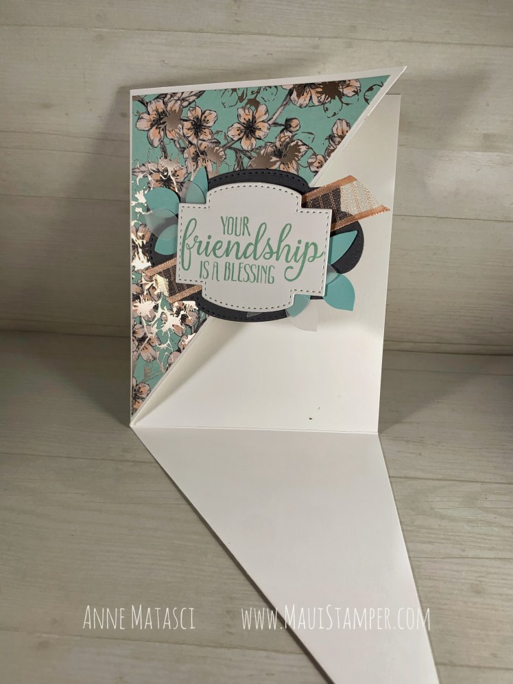
The talented Ms. Fish embellished her envelope (how could we not?) but I had another idea. It was a little over-the-top, and I wouldn’t do it for a huge stack of envelopes, but I love how it turned out:
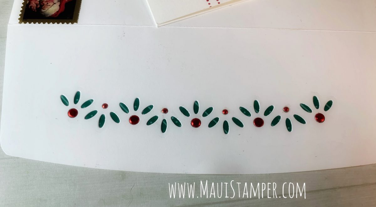
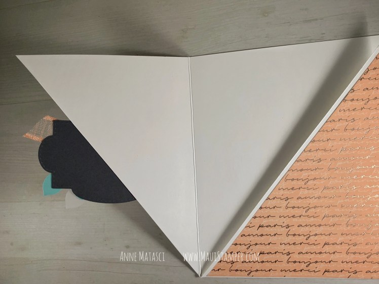
I am quite pleased with myself to have found a Santa postage stamp – this is last year’s edition (or who knows, it could be 2013.) The front of the envelope is stamped, but it’s the flap that is the pièce de résistance:
I created an envelope liner with the envelope die using a piece of the Tis the Season DSP and then I cut the envelope with this embellishing die. I ran that die through the Stamp Cut & Emboss again using Red Foil and picked out the little red circles and adhered them in the pukas (Hawaiian word for holes) using Tombo Multi Purpose Glue.
You NEED the Envelope dies, and if you’re going to order them, you really ought to take advantage of the savings you’ll get when you purchase the whole bundle. The bundle is only available until January 4, 2021, so get it while it’s hot!! Visit the Online Store and check that little to-do off your list.
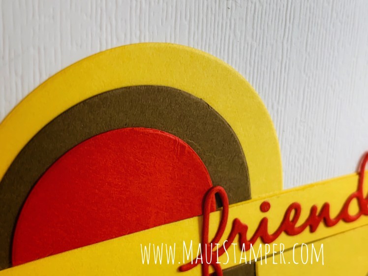
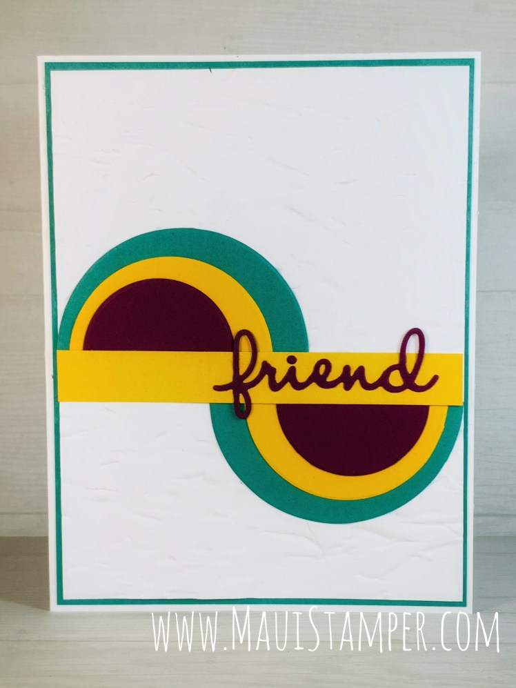
Playing with shapes – circles, squares, triangles – yields great graphic images. Well, maybe not every single time, but when it happens, it pops! I’ve seen this Split Circle Technique and spent a couple of afternoons with a desk full of circles.
Stamps: None!
Color Palette: Whisper White, Poppy Parade, Daffodil Delight, Soft Suede
Accessories: Stamp Cut & Emboss, Layering Circles Dies, Well Written Dies, Subtle Embossing Folder, Tombo Multipurpose Glue
Now you can see the texture – there’s a reason it’s called Subtle! Note that the Daffodil Delight strip that runs across the width of the card is actually two layers glued together. Because there are 3 layers of circles, it looks odd if that strip is only one layer thick.
Same concept, different colors and embossing folder. This is the Old World Paper Embossing Folder with Just Jade, Daffodil Delight, and Rich Razzleberry.
If you look closely, you’ll see a subtle difference in these two cards. The Poppy/Daffodil/Suede circles are reversed to create a color flow. Notice that the top largest circle is Daffodil, and its edge aligns with the smallest circle on the bottom. The reverse happens with the smallest circle on the top and the largest on the bottom.
In the second card, all circle pairs are the same color, so the only place where you see a “flow” from top to bottom is in the center set of circles.
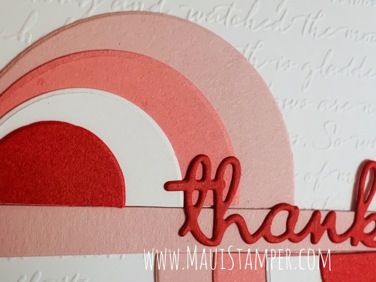
Here’s one more alternative! This is the Scripty Embossing folder with Blushing Bride, Flirty Flamingo, Whisper White, and Poppy Parade circles, and the word Thanks. I’ve used 4 circles here and worked small to large from the outside in.
You can see how I ended up with heaps and heaps of circles on my craft desk – it was hard to stop once I got going! If you’re one of those people who keeps odd die cut bits, pull out the circles and get to work. These cards go together really quickly.
Get your Layering Circles and Well Written dies HERE.
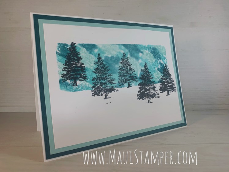
I’m at it again with the Acrylic Block Technique, and I’m very pleased with this version. This is a single layer card with very limited embellishment, but the background technique catches your eye:
Stamps: Rooted in Nature, Beautiful Friendship, Forever Fern
Color Palette: Whisper White, Basic Black, Bermuda Bay, Coastal Cabana, Pool Party
Accessories: Rhinestone jewel, Water brush, Acrylic Block H, Wink of Stella, Stampin’ Write Markers, Stampin’ Spritzer
The technique is simple. Scribble on an acrylic block with Stampin’ Write markers. If you place the block on a piece of white paper, you can see your color distribution and coverage. Mist the inky block with as little or as much water as you’d like – the amount you choose will impact the look you get – and press the block firmly into a Whisper White card stock panel. Lift and admire!
You need very sharp eyes to see the sparkle, but I painted the little splooshes stamp from Forever Fern with Wink of Stella and stamped it directly onto the card. It’s quite lovely in person, but challenging to photograph.
I also used our Water Painter and a bit of Pool Party ink to make very soft shadows underneath the trees.
This could just as easily have been a Christmas card, or a birthday card, or any other type of card. I originally intended to post it without the sentiment, as I often leave that step for the moment I need a card. Having a variety of cards without sentiments allows me more flexibility when I need something at the very last minute. But this one looked forlorn, and I’m very glad I added the linear element of this wish.
Don’t you agree? It’s more versatile to keep it this way but it’s much better with the sentiment (and my sentiment hides that little black bit that doesn’t belong!)
These is my favorite set of tonal colors: Bermuda Bay, Coastal Cabana, and Pool Party. Add them to your stash and see how happy they can make you! Shop HERE.
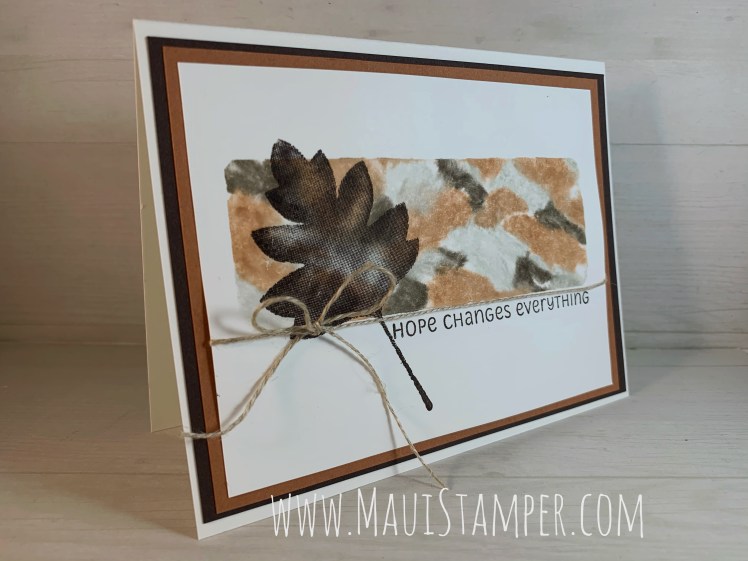
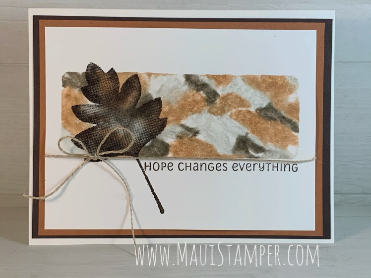
You know how some techniques look simple but just don’t turn out right? I’ve always felt that way about the watercolor background. I watch the videos, I study the instructions, and STILL…
If you’re anything like me, you will LOVE this technique (sorry, the Mister and I are still staying at home and I find myself shouting quite a bit when I have the chance to talk to someone else). Anyway…I started using blocks to apply color to paper and discovered to my delight that I could make it work!
Stamps: Love of Leaves
Color Palette: Whisper White, Early Espresso, Cinnamon Cider, Sahara Sand
The technique is just about fail-proof. Choose your colors, scribble on an acrylic block, spritz with water and stamp. Voila! If you add color to the block while it’s on a piece of white paper, it’s easy to see where you’ve added color and where the block is blank.
You can see that I created pretty regular color patches. I’ve since experimented a little more (stay tuned!) and found larger, less regular patches and more water give more “watercolored” results. I thought the way this one turned out was interesting as it reminded me of granite. Do you see that, or am I imagining things? (This would not be the first time.)
The font used in this set is something a little different for Stampin’ Up! and it reminds me of a printing style I used when I was in school. This particular sentiment is one I will use over and over. In fact, it may be my theme song for 2020.
There are coordinating dies for this set but I chose to keep it super simple and stamp that leaf – maybe a Hawthorne? – directly on the card. I can’t remember the last time I made a one-layer card.
Could you please help me with something? In the past I’ve added a direct link to the store for every product I’ve used. It takes a little extra time, and I’m wondering if I should continue investing my time that way. If you use those links, I’d love your feedback. And if you don’t, well, you can tell me that, too!
In the meantime, you can shop my beautiful, new, easier-to-navigate Online Store here.
You’ve probably seen it – stamp once, split the results, and BOOM! two cards. It’s been on my list of things to try, and today I can share the happy results.
This is an easy technique. In order to make your double card front, you start with a half sheet of card stock, 8 1/2 x 5 1/2 inches. I use a pencil to make a light mark at the 4 1/4 inch point along the top and bottom of the paper. (If you have eagle eyes, you can just see it in this image.) Then just stamp down the middle…
Just like that! You might notice a couple of things: I used two different accent leaves in different colors from left to right, and I smudged on the right. Smudges are not always an insurmountable problem! It depends on the location of the smudge, and this one was easy to cover
The next step is to cut your half sheet of card stock into quarters. This yields two pieces, 4 1/4 by 5 1/2 inches – the perfect size to create a card front!
I love this gold trim – just tie a knot where you want it to stop fraying. It frays all by itself, such a time saver!
This side of the split panel uses Gray Granite ink instead of Cinnamon Cider, so my accessories and accents use that color. The ribbon is retired, and I’m sorry, but I have been waiting since Moses signed up to be a demonstrator for my 1/4 inch Gray Granite shimmer ribbon!! This was in the archives and I dragged it out for this card. I used the Layering Ovals dies for the sentiment on this card.
Adding a little extra color to the sentiment panel helps to tie it together with the rest of the card.
Ready to make your own? Grab some stamps, ink and a half sheet of card stock and have some fun. I used some sticky notes to mask my images, creating a sense of depth, but do whatever it is that makes you happy. Try monochromatic color schemes as I used here, or go big and bold with bright colors. Flowers are a great way to start, but other images will work too. Just a note: I couldn’t come up with a satisfactory card using images of people or animals. They look odd cut in half, and inevitably one side gets stuck with a “back side”.
Just 10 more days to earn Bonus Days Bucks! Beautiful Friendship is one of my all-time favorite stamp sets for the lushness of the images and the many different types of cards they allow you to create. Shop HERE.
These cards have been everywhere – I’ll bet you’ve seen them too. Kylie and Bruno Bertucci in Australia popularized this technique they call #ScrappyStripTechnique and created a video to show how it’s done. It’s just as easy as they say!
Once I got started, it was hard to stop! I had a desk full of strips cut every which way and spent a delightful afternoon arranging, adhering, and adding sentiments to my cards. (The sentiment and dies are from the So Sentimental Bundle.)
I think this one is my favorite. I used all neutrals with a few Bermuda Bay strips added in for contrast and no DSP. It would be a great masculine card, but I think it works for anyone. I love the way the neutrals are so, well, you know, neutral.
This one is based on the Lily Impressions DSP offered as a SAB 2020 choice (and no longer available, I’m sorry!) This was one of the first cards I did and it has a decidedly chaotic feeling.
The fun thing is that this is the reverses side of the above DSP. Even though some of the colors are repeated, the feeling of the design is completely different.
Honestly, I could go on and on (actually, I did!) I hope you’ll pull out some scraps and your paper trimmer and have some fun. The video gives great instructions so I’m not going too replicate the Bertucci’s fabulous effort – just cut up some paper and get started with cut and paste!
LAST CHANCE products are available WHILE SUPPLIES LAST or through June 2, 2020, whichever comes first. Don’t miss out.
If you happen to be flat out of paper (SERIOUSLY? Is that possible?) or perhaps if you’ve used the last of your Multipurpose Glue, I’d be delighted if you chose to shop HERE.
I made a big stack of cards to swap at an event…that has been deferred. This was to have taken place a couple of weeks ago, and I was so discouraged that I set the entire project aside for a while, but they’re done now – and I’m quite happy with them, if I do say so myself:
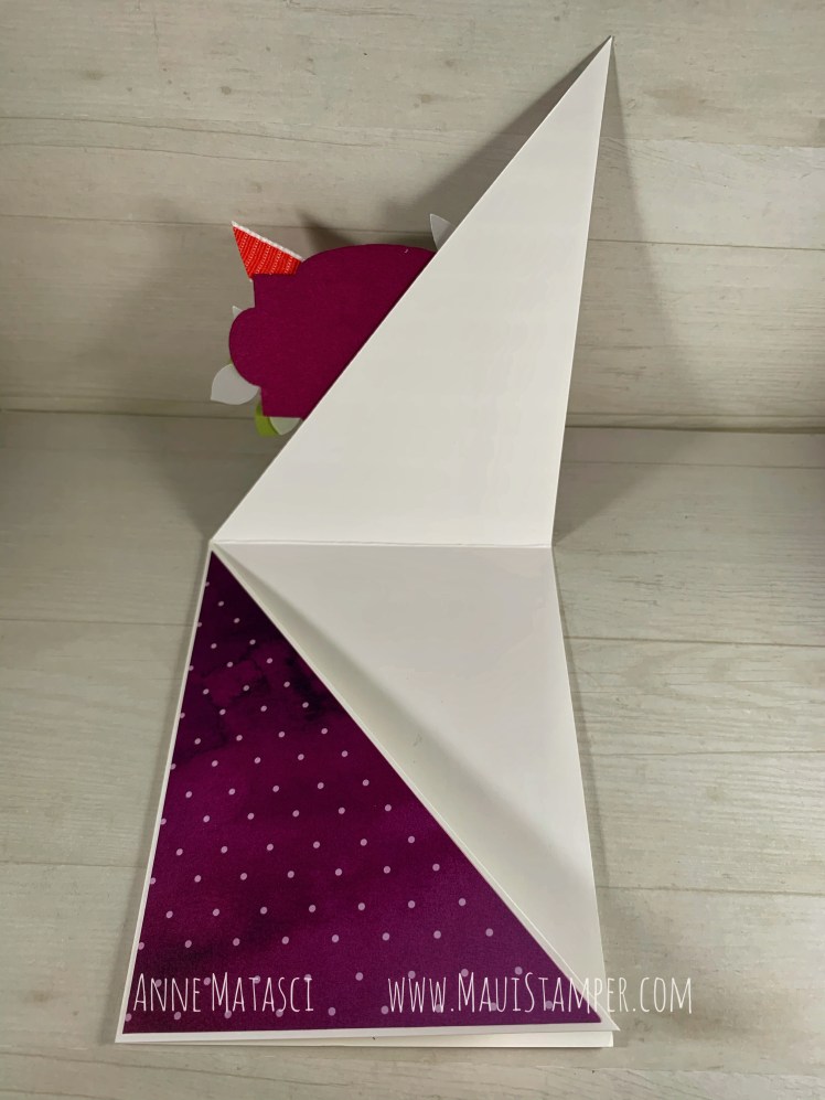
This is an exceptionally easy fun fold to do, especially with our paper trimmer. Score a sheet of 8 1/2″ x 11″ card stock both horizontally and vertically. Place it diagonally along the cutting edge of your trimmer, making certain that you’ve centered the top and bottom corners. (The “X” in the center of the scored lines should be along the cutting line of the trimmer as well.) Cut your card stock diagonally – the trimmer cutting edge isn’t quite long enough to make it to the ends, but if you slide the cut piece of card stock out of the trimmer, you can finish it up with your snips – it’s less than 1″ on either side.
Cut your DSP into 4″ x 5 1/4″ rectangles, and cut them diagonally as well. One design goes on one triangular panel, the other design goes on the other. A focal point/shaped image attached to one panel finishes the card and helps to keep it closed at the same time.
Here’s what it looks like with one panel open. And here it is with the other panel open:
I used the Stamparatus to mass-produce those white die cut sentiment panels. It’s MUCH easier to cut them without the sentiment – you don’t have to position the die so precisely, and if it wiggles a little before it goes through the die cutting machine it’s NBD (No Big Deal). If you use the lighter weight Whisper White card stock, you can even cut two at a time!
Now you have a stack of die cut panels ready to be stamped.
Create a template by cutting your die cut out of the center of a good sized piece of card stock. Place your mass-produced die cut blank in the center of that template.
Align the clean sentiment stamp you have chosen on top of the positioned die cut and close your plate, picking up the stamp.
Add ink to your stamp, press the plate, and lift. Perfect placement every time – and you can do a stack of these in a hurry!
Since this design was being mass produced for a swap, I used two different DSP combinations to finish them. I didn’t realize it at the time, but I oriented the card stock on the opposite diagonal between the batches, so they open differently. Here’s the second version:
You can see the difference in the way the card opens:
This opens up instead of down compared with the card above, but the side still opens to the left – the shape is just inverted.
This card uses the gorgeous Peaceful Poppies DSP, and the sentiment is from Love What You Do. The two cards are the same layout, with the same embellishments. The difference is the DSP and color palette, and the sentiment on the focal point.
There are just a few more days until Sale-a-bration 2020 is in the rear view. We have one final release of SAB Rewards that include current catalog product, so be sure and take a look at the choices available as a free reward for your $50 purchase. You can start shopping HERE!
It’s been a delightful summer in my craft room, and I’m ready to get the show back on the road and share some of it with you. Would you like to see what I’ve been doing?
I seldom use Very Vanilla card bases, and when I look at this one I wonder why! I especially like the way it works with the braided linen, which is just an abundance of linen thread – and you know I love linen thread!!
I have a few great tips for you when you’re working with vellum:
The Fine Tip Glue Pen is VELLUM MAGIC. Use it to adhere vellum to any project and it doesn’t show through!!!
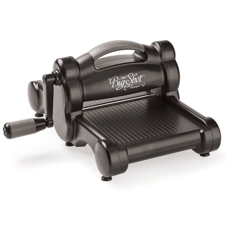
When I run it through my die cut machine I layer a piece of waxed paper between the paper and the die (and yes, I have a Big Shot, which Stampin’ Up! no longer sells – but something BIGGER is coming!) It helps to release the vellum from the die, especially the Stitched Shapes, which have a tendency to hang onto the die cut.
I use my trusty Bone Folder when I’m removing a vellum die cut from the die, since it’s thin and helps to avoid creases in the vellum.
I used sponge daubers to ink the foliage in Granny Apple Green and Shaded Spruce. Once they were inky, I colored the trunk with the Soft Suede Stampin’ Write marker. If you try to color the trunk first, it’s easy to accidentally cover the ink with the daubers. Coloring it second allows you to push off any GAG or SS ink (yup. That’s what I call it. GAG. Love that color.)
Today is the FINAL BONUS DAY!! Skedaddle on over to my Online Store to earn your savings – a $5 voucher for every $50 in merchandise you choose! You’ll be glad you did.
This technique has been making the rounds again as the Press’n’Seal Floating Frame card, and if I had Press’n’Seal I would have used it…but my entire kitchen is Furnished By Costco, so it’s the Kirkland Cling Wrap technique today, my friends!
This is a really enjoyable technique, but it takes time and patience to color all of the elements you need to create the floating frame. It’s a great project for when you’re at home recovering from the flu (ahem). One of the complaints I read when crafters used Press ‘n Seal was that it stuck too well to the card stock, causing the surface to tear. Trust me, that’s not a problem with the Kirkland wrap!
As you can see, when I ran everything through the Big Shot it cut the pieces quite nicely, but things moved around quite a bit once I removed the cutting plates. I had to be patient when I adhered the pieces to the frame, but by using the corner shapes as anchors everything else fell into place nicely. It’s quite similar to assembling a puzzle! You’ll want to be VERY VERY generous with the Stampin’ Dimensionals on this one – be prepared to find a lot of those little paper hexagons floating around your craft room!
Speaking of the Big Shot, you may have heard the announcement that Stampin’ Up! is terminating its relationship with Sizzex at the end of the 2018-2019 Annual Catalog period, effective June 3, 2019. This change will streamline design and production, and allow Stampin’ Up! to work directly with a manufacturer. This in turn will provide a more nimble response to inspiration, supply and demand. While Stampin’ Up! will still sell dies and embossing folders that are compatible with the Big Shot, we will no longer market the machine itself or any accessories (cutting pads, specialized platforms, etc). A new die cutting machine is in development, but it is not ready for the 2019-2020 catalog. If you need any accessories, I encourage you to shop soon, as supplies of retiring products are not guaranteed.
Similarly, Stampin’ Up! is also discontinuing the Stampin’ Trimmer. While this product has been extremely popular, recent concerns with blade quality have caused Stampin’ Up! to seek an alternate supplier. Again, a new Trimmer is in development but will not be available in time for the 2019-2020 Annual Catalog. If you would like to stock up on cutting blades, I urge you to act quickly as these accessories will also retire at the end of the catalog. As we all know too well, supplies of retiring items are not guaranteed! There is currently a limit of 3 packages of cutting blades per order, but that limit will be raised to 6 when the Retiring Products List is released on April 15, 2019.
If you’ve made it this far, congratulations – you get a bonus question! Lyssa Zwolaneck, a generous demo friend, created a fun graphic now that demonstrators have seen the NAMES of the 2019-2020 In Colors but not the shades!! What do YOU think???