Thanks, Friends

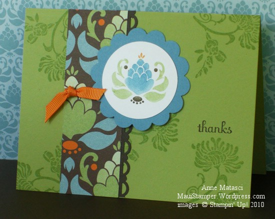
Here’s the final card in my “Friends Never Fade/Greenhouse Garden” suite:

Friends Never Fade in Pear Pizazz

  • Friends Never Fade and Fabulous Phrases stamp sets
  • Whisper White, Marina Mist, Chocolate Chip and Pear Pizazz card stock
  • Greenhouse Garden Designer Series Paper
  • Pear Pizazz and Chocolate Chip Classic ink pads
  • Pear Pizazz, Chocolate Chip, Marina Mist and Pumpkin Pie Stampin’ Write markers
  • 1 3/4″ circle, 2 3/8″ scallop circle, and scallop trim border punches
  • Pumpkin Pie 1/4″ grosgrain ribbon

I love that artichokey-pineappley-image and I especially love seeing it repeated in the paper and the stamp.  What a perfect example of Stampin’ Up! coordination:  paper, stamps, colors…everything works together.  Back in my BSU (Before-Stampin’-Up!) days I would have gone crazy trying to put something like this together.  Oh, and I really love the font used for Fabulous Phrases.

A friend and I were talking about Thanksgiving the other day.  She reflected on how wonderful it is to set aside a day to be grateful for your blessings.  Although I’ve always thought of Thanksgiving in that way, something about our conversation put me in a different frame of mind about that concept of gratitude.  Our family focuses on our blessings at Thanksgiving, but I can’t really say I’ve made an effort to personally express my gratitude.  That seems like a very appropriate way to celebrate Thanksgiving.   I need more “thanks” cards.

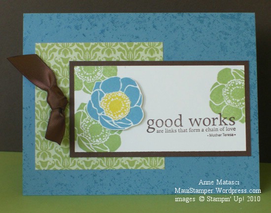
Blue and green…my favorite combination

You didn’t think I’d show you all the cards I made in one post, did you?

Friends Never Fade in Marina

  • Friends Never Fade, Inspired by Nature and Wonderfully Worn stamp sets
  • Whisper White, Chocolate Chip and Marina Mist cardstock
  • Greenhouse Garden Designer Series Paper
  • Marina Mist,  Pear Pizazz, Daffodil Delight and Chocolate Chip classic ink pads
  • Chocolate Chip Satin Ribbon (retired, substitute Early Espresso)
  • Stampin’ Dimensionals; brayer

I think I love the monochromatic designs in the Greenhouse Gardens Designer Series Papers as much as if not more than the beautiful multi-colored pages.  And in case you haven’t figured it out, blue and green is my all-time favorite color combination ever.  It doesn’t matter which blue or which green – but don’t go trying to find some hideous combination and make me look ridiculous, ok?  You know what I mean.

This is my debut of the Wonderfully Worn background stamp.  You know I’m a tone-on-tone kinda girl, and this stamp is perfect for adding just a little depth to a layer without being distracting.    Just to be thorough, let me remind you that the best way to cover a background stamp is to brayer it – it’s the easiest method for getting an even coat of ink.

You could so cut that yellow center out with the 3/4″ circle punch, but it wasn’t doing it for me so I trimmed it with my paper snips.

Friends Never Fade, Baggy

Yesterday I had a short window of time to make some cards.  It seems like it’s been ages since I’ve had the opportunity to sit and let the mojo have its way.  I didn’t want to do a challenge or make a card for a specific purpose, I just wanted to stamp.  It felt really luxurious to begin that way.

I decided to play with the Friends Never Fade stamp set and Greenhouse Garden Designer Series papers.  Using the papers gave me a general color palette to work with but it wasn’t as restrictive as a challenge.   My time was limited but my results were very satisfying:

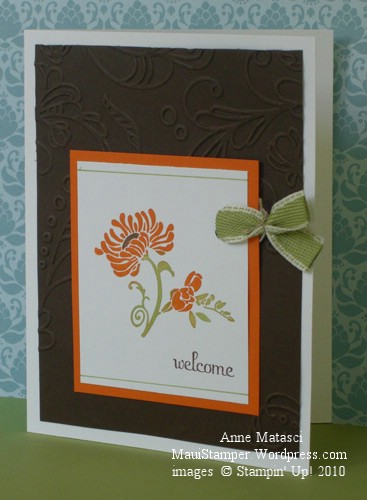
Friends Never Fade in Espresso

  • Friends Never Fade and Fabulous Phrases stamp sets
  • Whisper White, Pumpkin Pie, and Early Espresso cardstock
  • Early Espresso and Pumpkin Pie Classic ink pads
  • Early Espresso and Pear Pizazz Stampin’ Write markers; Blender Pen
  • Pear Pizazz 1/2″ ribbon, Linen thread and Crop-a-dile
  • Big Shot and Elegant Lines Embossing Folder

I love the look that hand-coloring a stamp gives, but it does get a little tedious.  This time I inked the flower image in Pumpkin Pie and then used the blender pen to remove the ink from the stem bits so that I could add Pear Pizazz with a Stampin’ Write marker.  I added the Espresso accent in the middle of the flower right over the top of the Pumpkin Pie because I’m lazy like that.  There are little bits and edges of Pumpkin Pie ink on the stem and I like the feeling that creates…a little edgy.

If you don’t have a Big Shot, please don’t pay any attention to the Elegant Lines folder because it will just make you flat-out crazy.  If you do have a Big Shot, I hope you’ve already ordered this folder – if you haven’t, what are you waiting for???

That funny little not-knot on the ribbon has been popping up on samples all over the place and I decided it was time I got with the program.  Do you remember Baloo telling Bagheera “Get with the beat, Baggy!” in the Disney version of Jungle Book?  That’s the phrase that always comes to mind when I’m trying to update myself.  (Can you tell how old my children are by the Disney movies I have watched so often they are committed to memory?   I can sing all of the songs, too.)

Enough silliness.  Time to get with the beat.

I believe this is my favorite…

It’s a gorgeous day today and it started in the best possible way with Irene’s gentle yoga class at Kihei Community Yoga.  Everything gets put in the right place when I make the time for that class, and it helps me be energized and centered.  It’s a  perfect start for a busy week.

Today I’m sharing my absolute favorite Make-and-Take from convention.  If you’ve read my last post you won’t be at all surprised to find we used Just Believe (wood mount #116948 $33.95, clear mount #120453 $25.95) for this project.  Honestly, you need this stamp set!

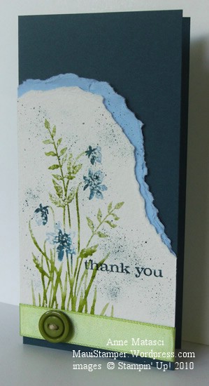
Watercolor Just Believe from Stampin' Up! 2010 convention

  • Just Believe stamp set
  • Not Quite Navy and Bashful Blue card stock; Watercolor paper
  • Not Quite Navy, Bashful Blue, Old Olive and Pear Pizazz Stampin’ Write markers
  • Old Olive Satin ribbon; Brights Designer Buttons; Linen thread
  • Color Spritzer tool;  small spray bottle filled with water

I’m thrilled with the look of this card.  The image is colored with markers and then lightly spritzed with water before being stamped on watercolor paper.  Everyone at my table got different results depending on how they used the markers and how they spritzed the stamp, but each card was uniquely beautiful.   I still struggle with tearing – I’m too particular by nature to just give it a cavalier rip and let it go at that.  One of these days I’m just gonna let go and let ‘er rip and it will surprise us all!!

If you’re ready to let ‘er rip and put Just Believe on your craft desk, head on over to my Online Store and click that Shop Now button.  It will be one of the most versatile, well-used, beloved stamp sets you own.

Just Believe

One of the free stamp sets we received at convention was Just Believe.  I have to tell you that I had mixed feelings when I saw the notice on the Demonstrator Website that told us that set would be part of our convention package.  Part of me was really excited because I fell in love with that stamp set the first time I laid eyes on it, and part of me was terribly disappointed because I fell in love with that stamp set the first time I laid eyes on it and I didn’t want to wait until almost the end of JULY to get to stamp with it!

The set is worth the wait, believe me.  (Get it?  Believe?  Ok, I know, you get it.)  We did some beautiful projects during our Make and Take session at convention, and since then I’ve continued to experiement with this set.  If you like this style at all, this set should be your very next purchase because you will reach for it over and over until it’s paid for itself ten-fold.

Here’s the swap we did:

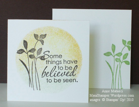
Some things have to be believed to be seen

This is a simple, one layer 3 x 3 card and envelope.  We used the negative image from the Sizzix Originals Circles #2 die as a reverse mask to sponge the circle, then stemped the two images in Early Espresso.  I decided to step it up just a little for one of my hostess club projects this week:

Believed to be seen step-up

  • Just Believe stamp set
  • Pear Pizazz, Chocolate Chip and Whisper White card stock
  • Pear Pizazz, Chocolate Chip, Pumpkin Pie and Daffodil Delight Classic ink pads
  • Chocolate Chip satin ribbon, Hemp twine, Designer Brights Buttons
  • Stampin’ Sponges, Hobby blade

The ribbon is threaded through a slit in the side of the card so that I could wrap it all the way around.  The Chocolate Chip ribbon is retired, but you should use the Early Espresso ribbon, ink and cardstock because that new color is absolutely gorgeous.  Never mind that coffee is my nectar of life…that deep dark brown is luscious.

I can’t wait to spend some more time with this set.

Embarassing the kids from 2,440 miles away

You know that feeling when you’re on information overload and your brain is bouncing ideas and pictures and emotions around the inside of your head like countless superballs ricocheting around?  That’s what my head has been like this week.  It’s an exciting, crazy, even frightening place…but of course the inside of my head is almost always in one of those states.  Having all three co-existing at once is…well…exciting, crazy and even frightening!

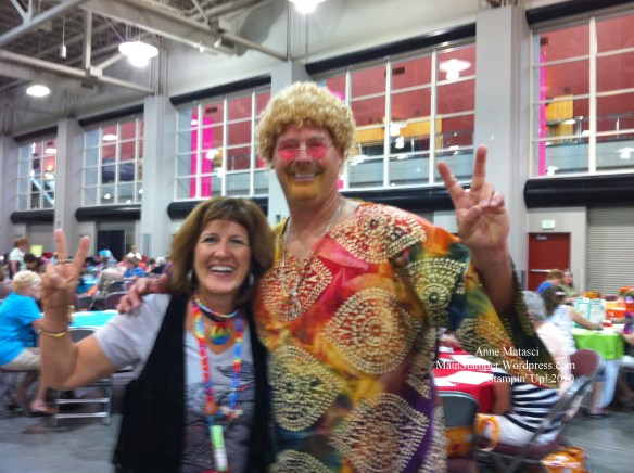
Convention was an amazing, inspiring and highly memorable experience on many levels.  Personally, I had a wonderful time meeting so many other talented demonstrators and spending time with my friend Robbie.  You learn a great deal about someone when you travel with her.  We laughed and explored and learned and celebrated and ate and drank and fell into bed exhausted every night, only to jump up early the next day in order to do it all over again.  I took her on some mis-guided adventures – she kindly referred to them as “walkabouts” – and we made the best of a miserable airline delay on the way home.  Better than that, we found our alter-egos.  Yes, we were children of the 70’s and the Stampin’ Up! Flower Power party was one groovy blast from the past.  I even managed to embarass my son from 2,440 miles away.

Groovin'

Every day there was new inspiration.  Our fellow demonstrators submitted astonishing artwork for display, the Stampin’ Up! Creative Genius department had ideas that knocked our socks off, and we swapped with some of the most talented and innovative paper-crafters in the world.  That’s a lot of inspiration!  I’m hoping to share with you some of the incredible swaps I received at convention, but I won’t publish them here until I have the permission of the artist.  In the meantime, I can share with you some of the Make-and-Takes we did at convention.  Our M&T session wasn’t until the morning of the third day of convention, and by then you’d better believe my hands were itchin’ to stamp!

Thanks Make and Take

This uses the single stamp So Many Thanks with Marina Mist, Daffodil Delight and Real Red cardstock and ink.  The little package tied with ribbon is an envelop for a 6×6 card folded in half and made into a portfolio for the cards.  Quick and easy and very cute…this is a project I’ll do again with a variety of colors.  Wouldn’t you like to be my hostess and receive a hostess gift like this?  Call me and we can make it happen!

Not quite the finish we expected

Our 4am wake-up call wasn’t pretty but we were on time for the shuttle to the airport. Our flight from Salt Lake into Seattle arrived a few minutes early and we were pretty pleased with ourselves until I picked up my voicemail.

Our flight into Maui was delayed in spectacular fashion. Our 10:50am departure was now scheduled for 4:50pm.

Can you say “ugh” with me?

We were given breakfast vouchers with a promise of more towards lunch. We “shopped” in the airport – Seattle actually has a pretty nice retail environment – and then headed to the gate. We’ve been sitting here for a couple of hours trying to be productive.

I can hardly wait to get on the plane for 5 hours. Wish I had some paper, ink and stamps. Oh! I do have stamps. I would never check my new sets from convention. They’re in my carry-on. Let’s see…catsup, mustard and shoyu…what do you think of those new “In Colors”?

Beautiful Wings In Color

A couple of weeks ago, I CASE-d a card using all of the new In Colors in the 2010-2011 Idea Book and Catalog. Laurie Zoellmer at www.stampingnut.blogspot.comstampingnut.blogspot.com had such a great idea that I wanted to try a couple of other versions. Of course, I wasn’t thinking about cutting out all of those butterflies – even with the help of the Big Shot – when I decided to do this for a swap that turned out to have 25 participants:

In Color Butterflies

I worked on this one at Boy Scout camp too – a friend was there, and she helped me with the stamping. Each card is a little different since I just mixed and matched the butterflies. They’re made with the In Color selections for 2010-2011: Concord Crush, Blushing Bride, Pear Pizzazz, Peach Parfait and Poppy Parade. Just a couple of dots of Tombo Adhesive holds each one in place. That stuff is amazing. I wish it had been around when my kids were small! (JUST KIDDING. Don’t report me.)

Stampin’ Hats

Stampers do some pretty crazy things to find each other in the crowd. After a couple of days I started taking photos of the interesting hats I saw. I’m not sure I would wear one myself, but they were a great source of entertainment! I know I didn’t get them all, but the ones I was able to photograph were priceless:

The Bize Bees

Not sure who this group was, but there were a lot of them!

This woman told us her hat had been to 12 conventions with her

Thank you, Stampin’ Up

Seems like we just unpacked yesterday.  This afternoon Robbie and I returned to our room after the final session of Stampin’ Up! Convention 2010 and tried to fit 75 pounds of potatoes in a pair of pantyhose…well, it felt that way.  We had everything we came with plus our swaps, make-and-takes, hand-outs and materials, and of course our FREE STAMPS.  Yes, Stampin’ Up! treats its demonstrators well!  And no, I’m not going to show them to you yet, but I’ll be crafting with them soon and you’ll be able to see what I make.

I have lots of photos.  Some are crisp and clear and wonderful to see, but a lot of them are blurry and only suited for my own reference.  I didn’t take pictures of every single sample but I do have some I’ll share with you.  In the next few days I’ll tell you a couple of stories, too.

I want to add an important update:  I posted a photo of a fabulous paper cake a few days ago and didn’t credit the artist.  Her name is Elizabeth Price and she is from San Jose, CA.

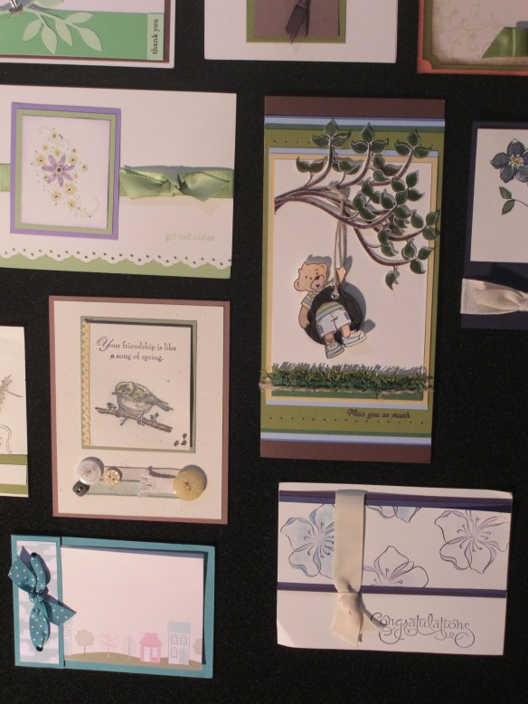
We have a hideously early wake-up call in the morning for our flight out of Salt Lake, so enjoy a few samples and I’ll be back soon.  Here’s one card I thought was exceptional and a couple more photos of complete boards:

Bear on a swing

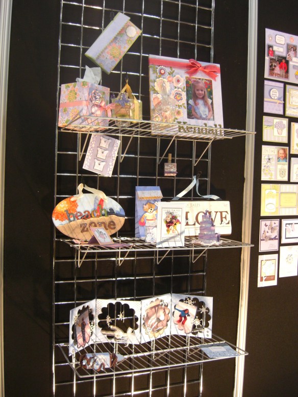
Stampin' Up! Convention 2010 display boards

Stampin' Up! Convention 2010 display boards