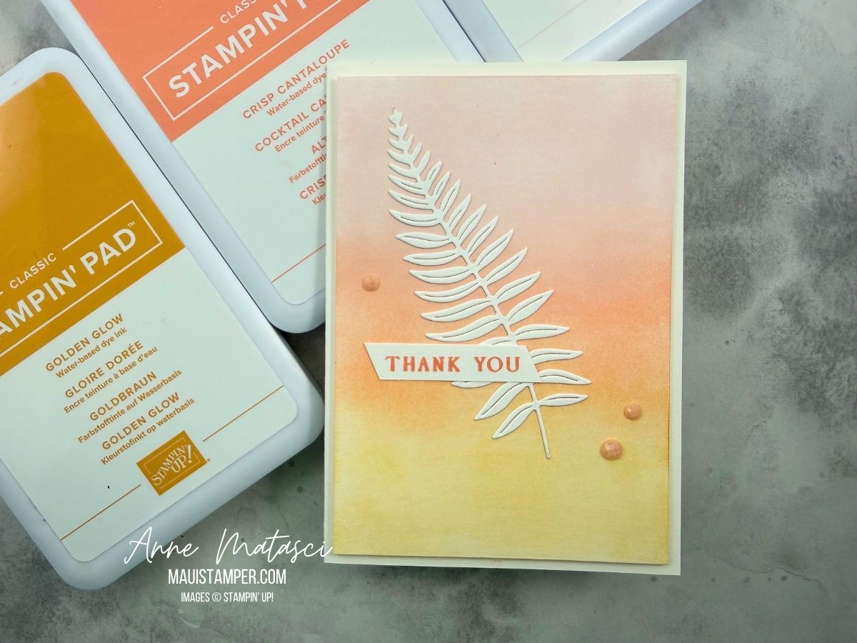
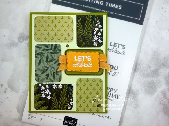
I love a blended background, and I was so inspired by one of our Artisans that I made a nearly exact CASE (Copy and Share with Everyone) of her project.
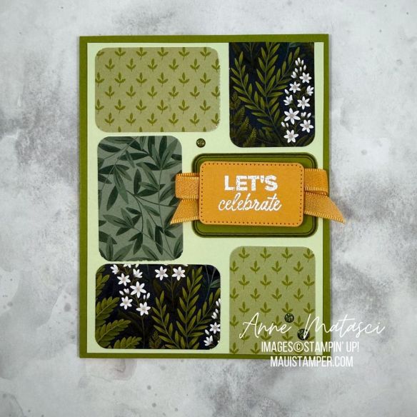
I’m a big fan of quick and easy. The hardest part of making this card is choosing from all the gorgeous patterns in the Moonlit Flora Designer Series package. Once you’ve made those decisions, you’re practically finished with the card.
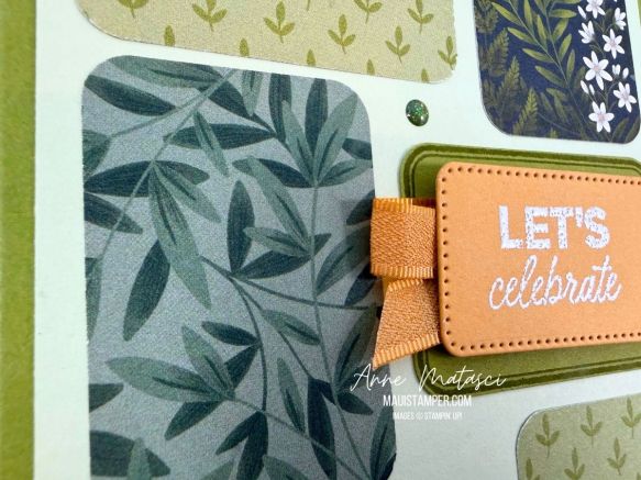
Stamp the framed image on Old Olive card stock with Old Olive ink and punch it out. Emboss your greeting on Golden Glow card stock and die cut it with the smallest Nested Essentials rectangle dies – it happens to be a perfect fit! Wind the ribbon back and forth between those two pieces, no need to tie a knot. Stampin’ Seal holds it in place!
I find it easiest to punch all my rectangles and arrange them on my front panel, then adhere them. When I shared this project with a group earlier this month, there were a lot of variations on the layout of these shapes. Go ahead and have some fun! Everything you need is in the Online Store.
Processing…
Success! You're on the list.
Whoops! There was an error and we couldn't process your subscription. Please reload the page and try again.
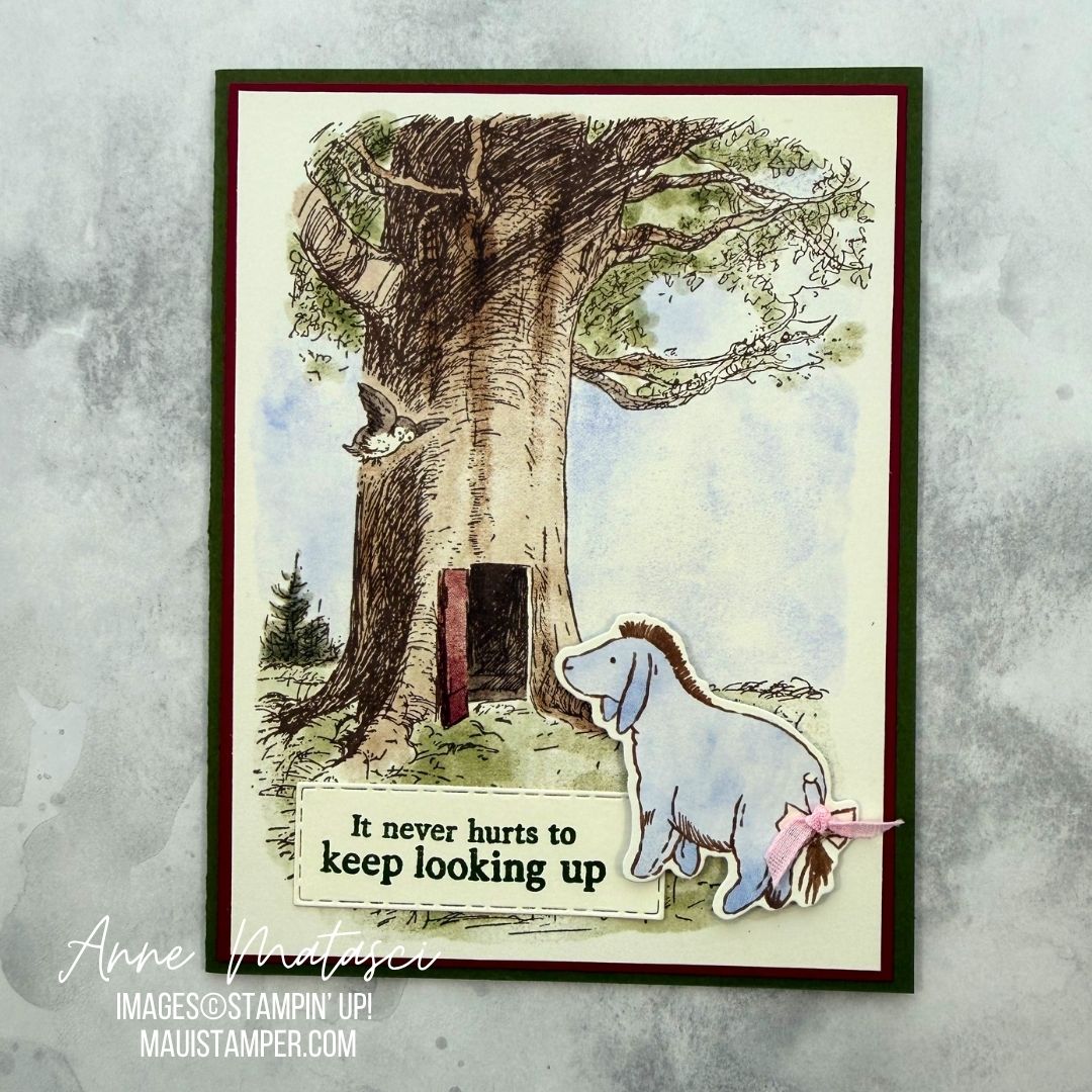
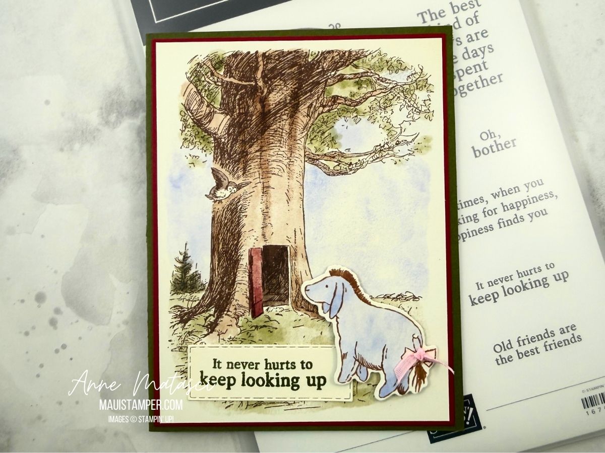
I have a very deep fondness for all the residents of the 100 Acre Wood, but Eeyore is one of my favorites. There’s something about his mournful state of mind that tugs at my heart. He brings his gloomy disposition on himself, but I can’t help but feel sorry for him!
There are multiple pages in the Silly Old Bear DSP collection that make instant backgrounds. I trimmed this one to fit my card front, die cut Eeyore out of another page of designs, and stamped a sentiment on a retired die cut that’s been sitting in my bits and pieces bin. (Do you have a bits and pieces bin on your craft desk? Quirky bits that need to find a home? This one finally did!)
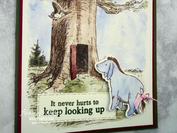
The DSP truly does all the work for this card. A stamped sentiment and some adhesive is all I added – oh, and of course, the little bow on Eyesore’s tail. I confess that was a bit fiddly to tie, but I am persistent.
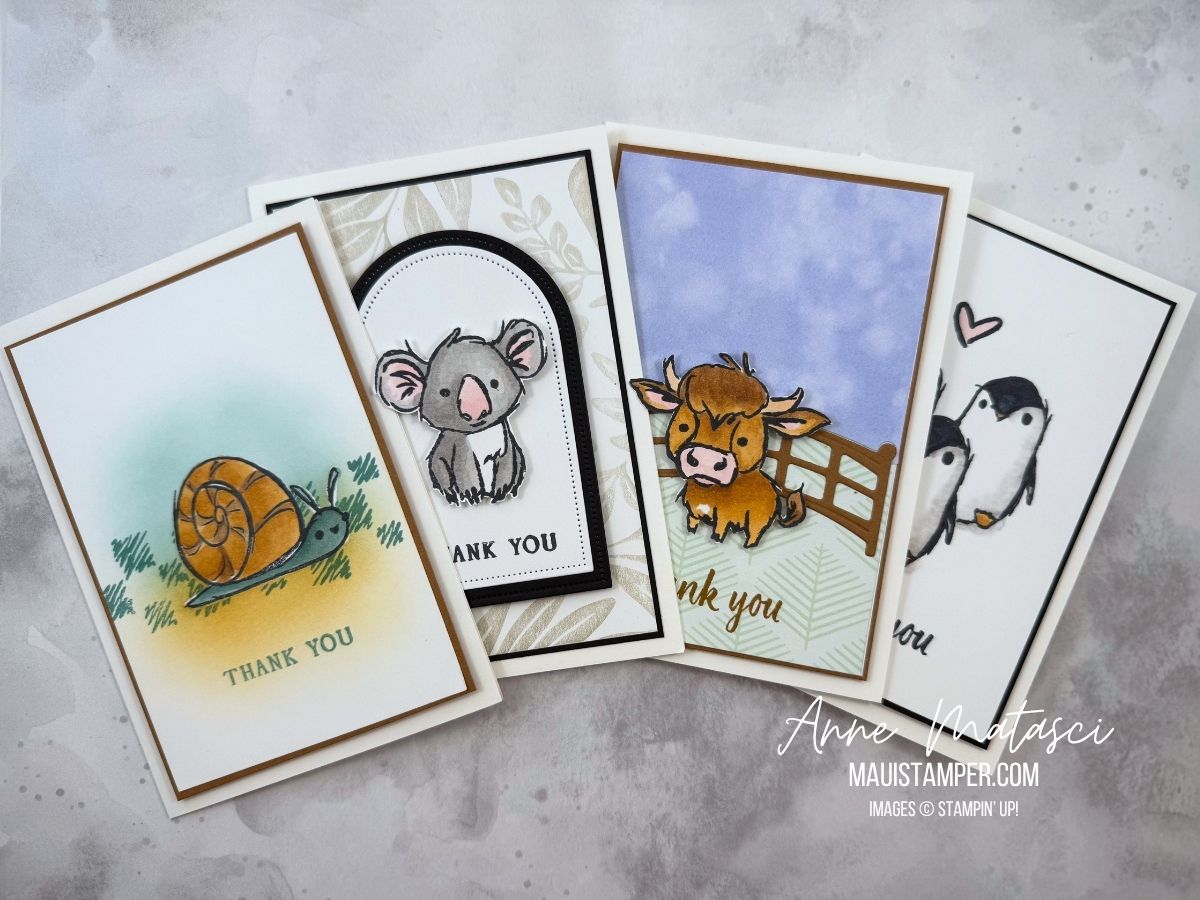
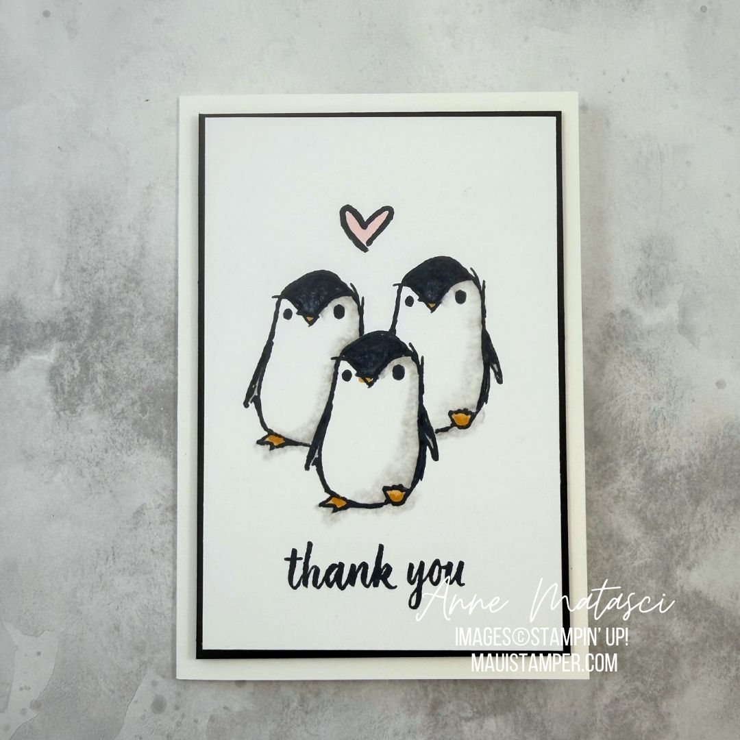
I hope you’re one of the lucky ones who was able to purchase Wild Bunch, the June Product of the Month, before it sold out. These whimsical animals have a certain sophistication to them, and I thought they would make a charming set of thank you notes for new parents.
Stamps: Wild Bunch, Stampin’ Up! Product of the Month for June 2026 (sold out early), Leaf Collection (retired)
Color Palette: Basic White, Basic Black, Smoky Slate, Barely Blush, Pecan Pie, Lost Lagoon, Golden Glow
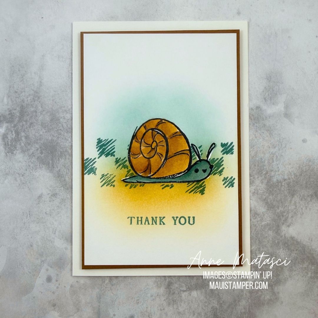
The snail was stamped directly on the focal panel and colored with blends. After I finished coloring, I masked the image and added a brushed background and the textural stamp from the set.
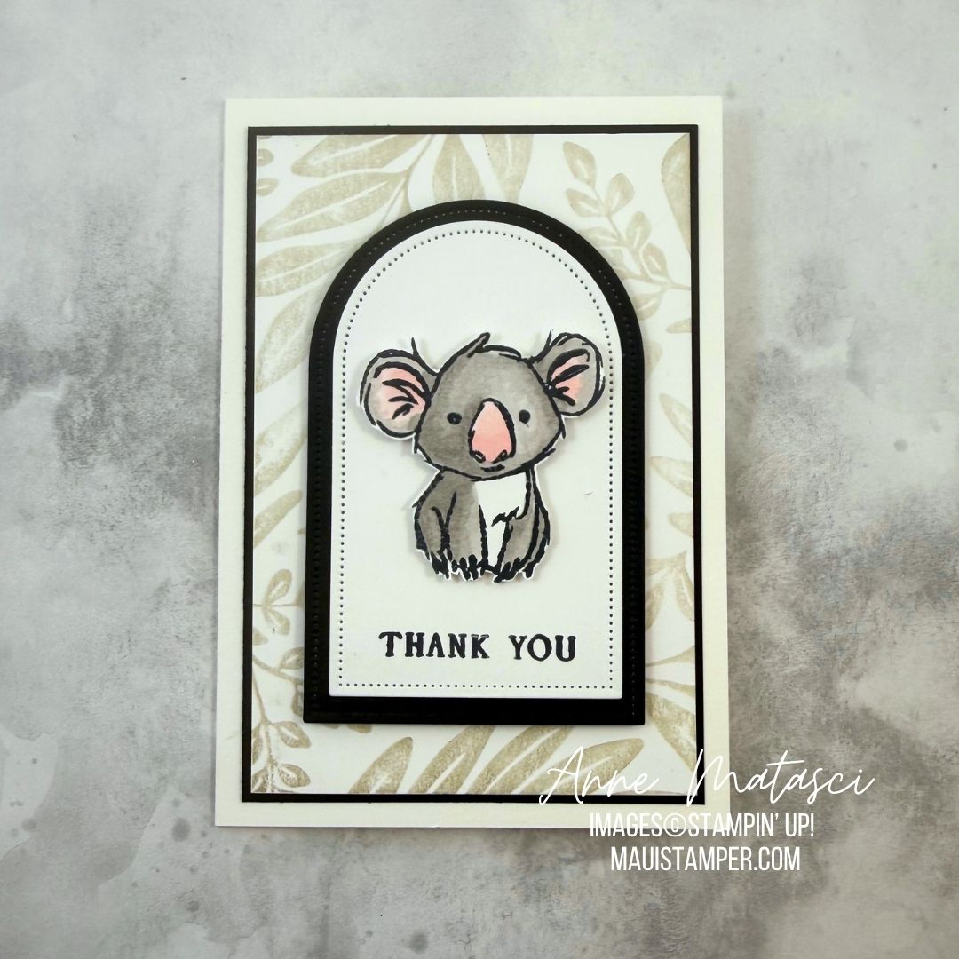
I had to fussy cut the Koala. Fussy cutting isn’t my favorite thing, but I don’t detest it either. This little marsupial is popped up on dimensional on a layered Everyday Arches matted panel. The background stamp is retired.
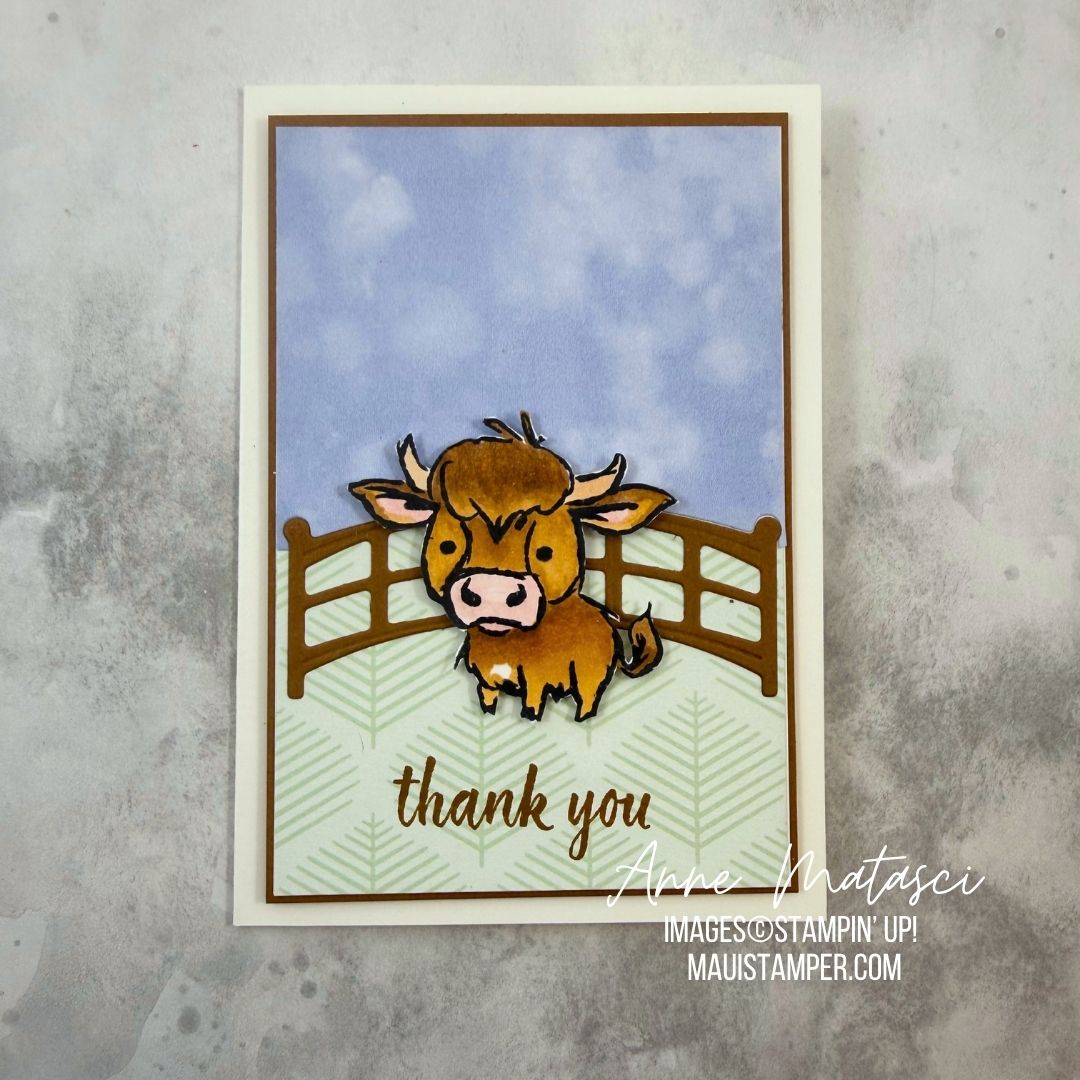
The cow was a coloring work in progress. I blended the light and dark Pecan Pie and Golden Glow to achieve this look, with bits of Barely Blush in the ears and nose. The cow is fussy cut and lifted on dimensional on top of a retired fence. The cloudy blue sky is from Silly Old Bear DSP and the soft green branches are from Moonlit Flora DSP.
The penguins are a CASE from Lisa Stenz, who did a brilliant job. She used a gray Stampin’ Blend and the Color Lifter to get those soft shadows.
Check out the current Product of the Month, and order early to avoid being disappointed!
Processing…
Success! You're on the list.
Whoops! There was an error and we couldn't process your subscription. Please reload the page and try again.
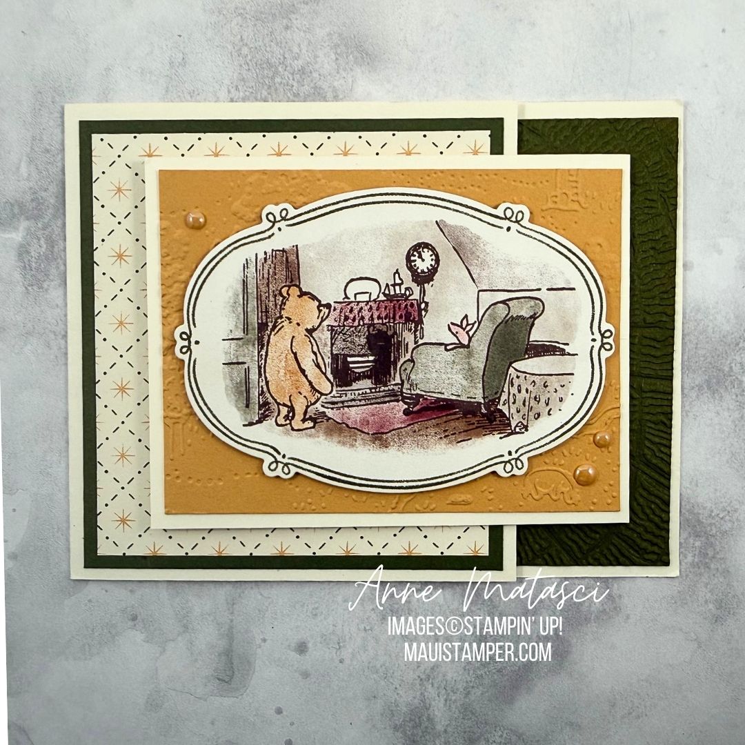
I can’t get enough of the Silly Old Bear Designer Series paper. The images are true to the originals, and they’re presented in shapes and designs that are easy to use. I chose one of the framed images to die cut for my focal point in this double flip card.
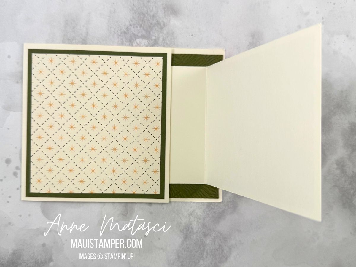
The card base is 4 ¼” x 9 ½” scored at 5 ½”, smaller flip is 8 ½” x 3 ¼” scored at 4 ¼”, and DSP is 1/4″ narrower than each panel. Add the layers to all the card panels, then adhere the smaller card to the inside of the larger one but facing the opposite direction.
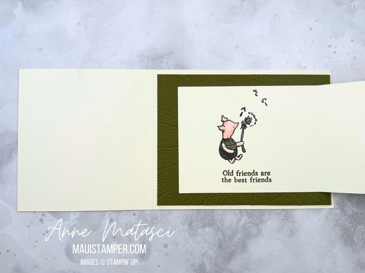
Now all that’s left is to put a sentiment inside – or leave it blank for lots of writing space! Last I looked, Silly Old Bear DSP was available in the Online Store. Don’t wait for it!
Processing…
Success! You're on the list.
Whoops! There was an error and we couldn't process your subscription. Please reload the page and try again.
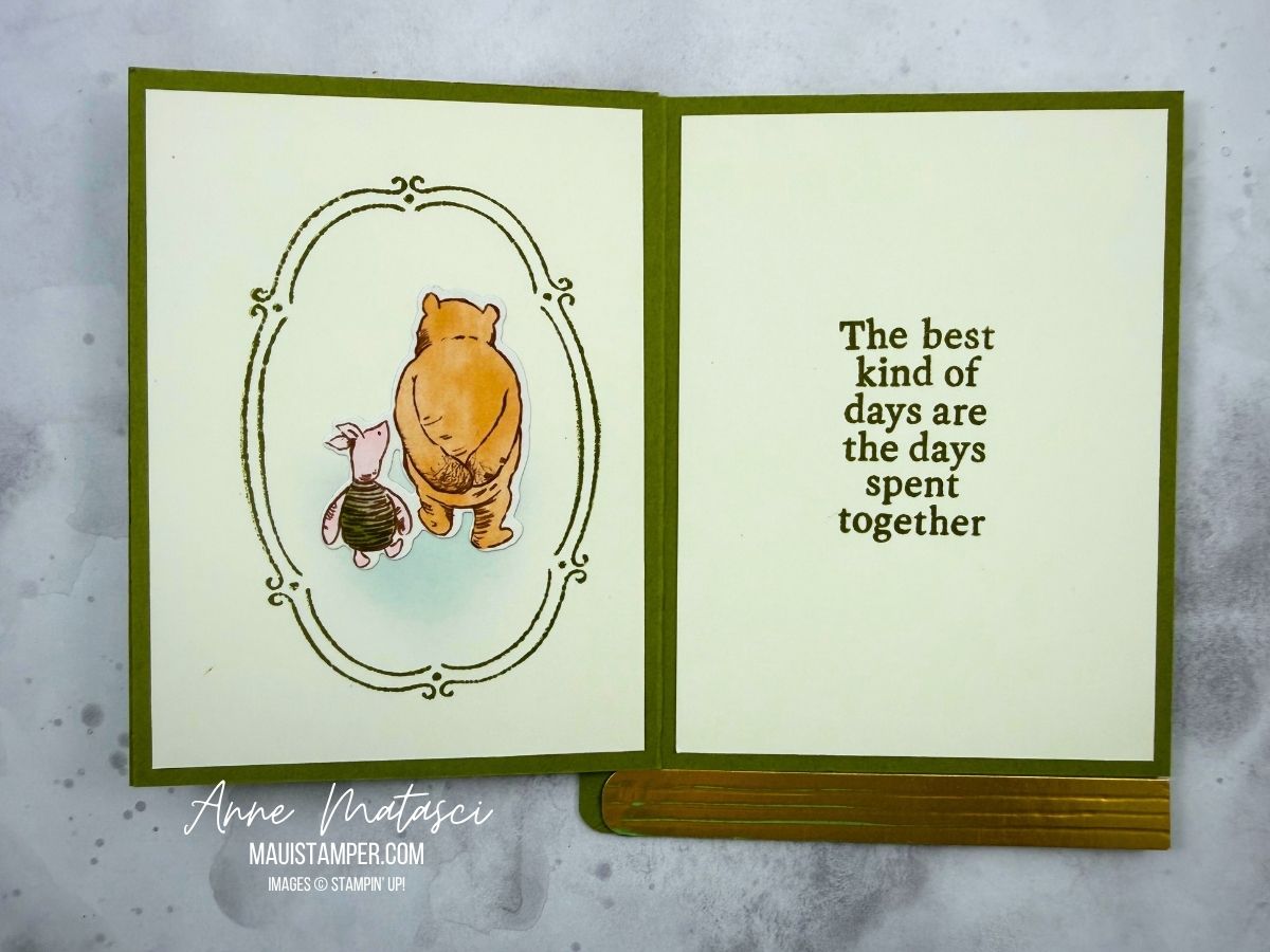
I grew up with Winnie the Pooh, the A.A.Milne version. The stories were gentle, the characters varied and relatable. When Stampin’ Up! announced the Silly Old Bear Suite, I knew I was going to dive in.
Deb Smeak runs a mystery stamping event on Facebook, and she offered this concept in February. I just discovered it, and I knew it would be perfect for the Silly Old Bear.
I created a second project because I wanted to put the book title on the spine. It turned out very “Winnie-the-Pooh”-like, a bit wobbly. I used an old alphabet set and I’ve sadly lost the name.
I changed the inside, too. Not sure which one I like best – let’s vote! Leave a comment as to which one you like best.
Processing…
Success! You're on the list.
Whoops! There was an error and we couldn't process your subscription. Please reload the page and try again.
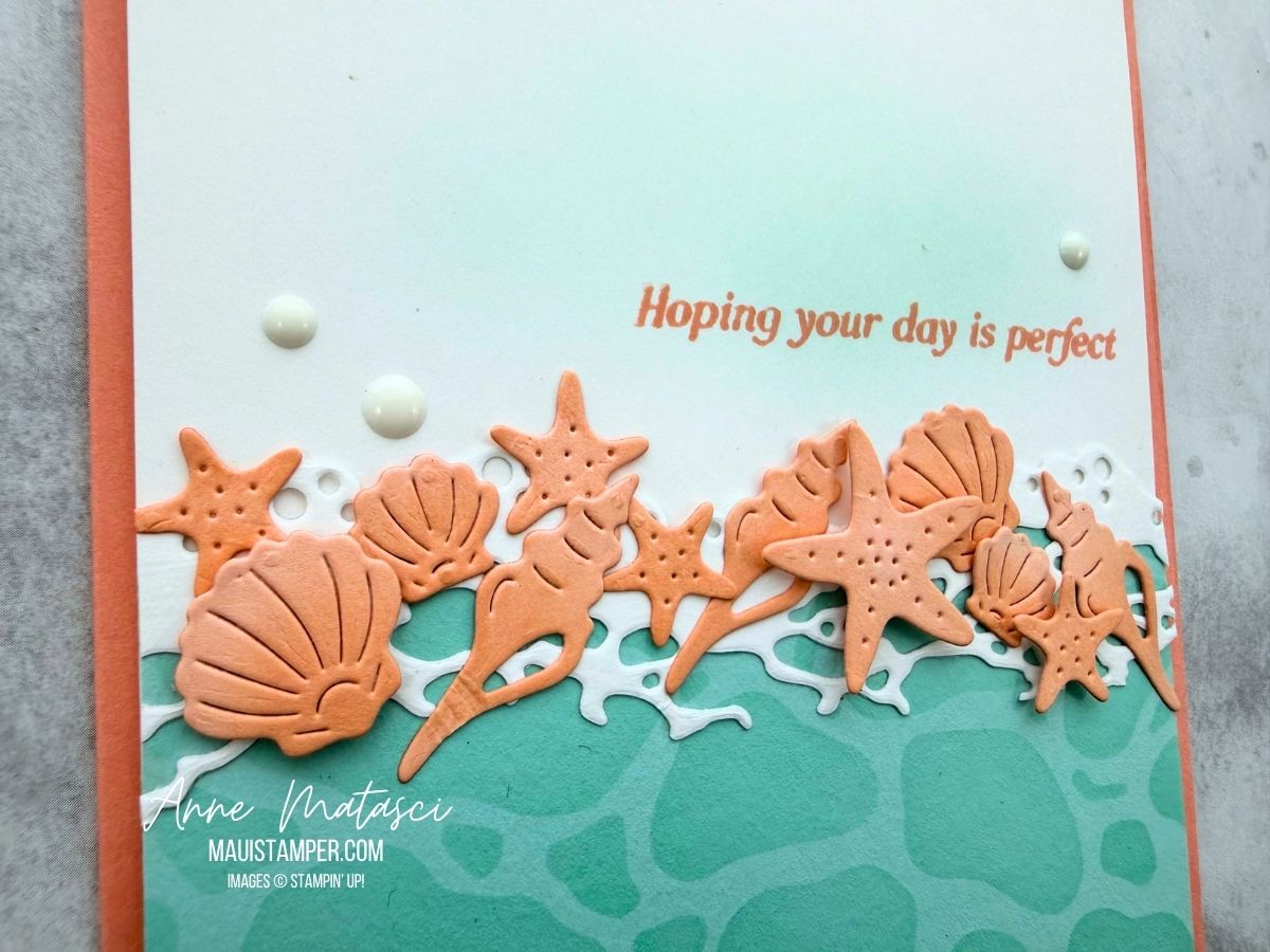
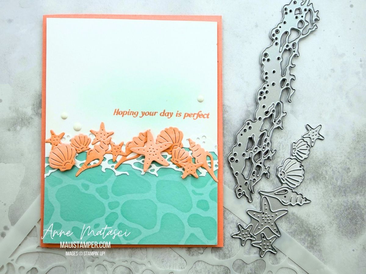
The Rolling Waves dies have gorgeous sea foam and water dies, but don’t overlook the seashells and umbrellas included in the set. I love the collection of shells, and had a couple left over from another project to get me started with this card.
I brushed the Water mask with Pool Party ink on Pool Party card stock. I also added a little Petal Pink ink to the shells with a dauber. These small additions give the card depth and keep it from feeling flat.
I’ve found so many uses for Rolling Waves! Take another look beyond the sea foam.
Processing…
Success! You're on the list.
Whoops! There was an error and we couldn't process your subscription. Please reload the page and try again.
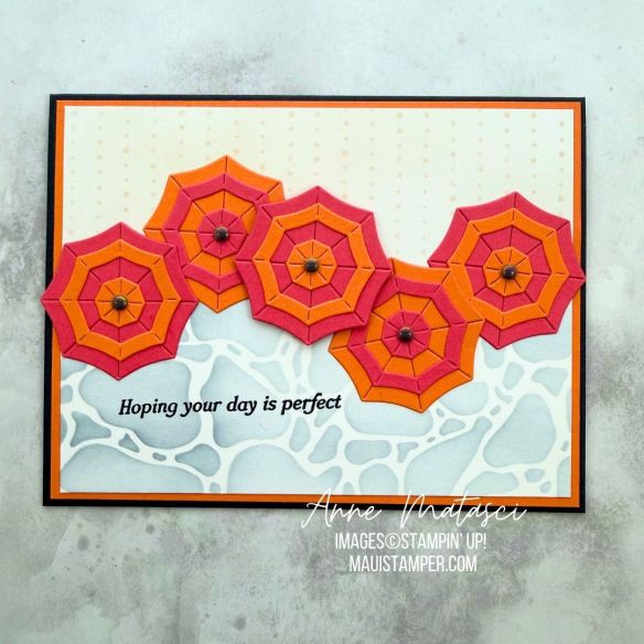
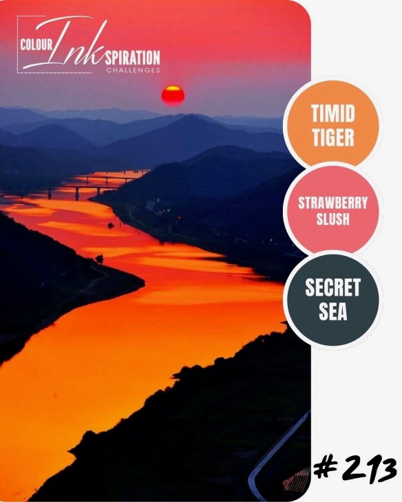
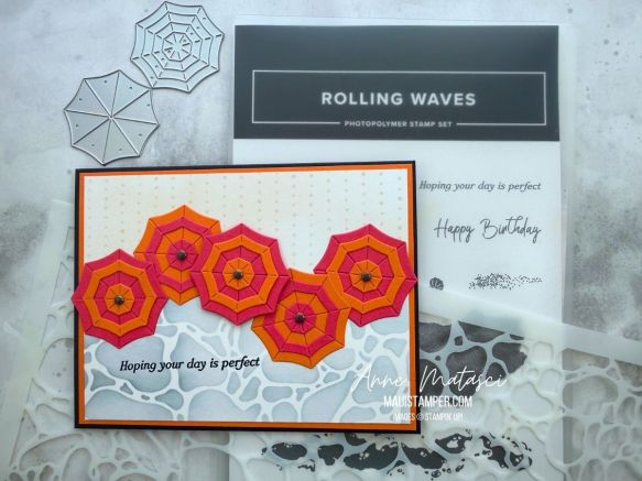
Time for another color challenge – I’ve missed the last couple of Colour INKspiration challenges. CI#213 is BOLD, my friends: Strawberry Slush, Timid Tiger, and Secret Sea. I chose a beach theme using the Rolling Waves dies.
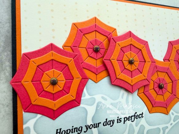
This reminds me of the color scheme of the local diner when I was in high school, and let’s just say that was the Flower Power Era. I struggled for a bit with those bold, bright colors, but decided a beach umbrella seemed like the perfect image.
There are Rolling Waves dies to make a solid umbrella as well as a set of concentric shapes that coordinate with it. I alternated the shapes as well as the base colors of the umbrella.
Our 12×12 Water and Dotted Line masks made perfect, subtle backgrounds for this bright card. I find myself reaching for them a LOT – expect to see them again!
Colour INKspirations is a Facebook based color challenge group. Take a minute to check out the CI#213 entries as well as previous color challenges – there are some very talented crafters participating in this group!
Processing…
Success! You're on the list.
Whoops! There was an error and we couldn't process your subscription. Please reload the page and try again.
There’s a new release of Online Exclusives arriving in the store on July 1, and I’m really excited about the new Gingham Gallery DSP! It features all of the 2026-2028 In Colors, and I’ve think you’ll love it.
Color Palette: Basic White, Peaceful Pine, Hydrangea Hue, Golden Glow, Barely Blush, Hybrid Black
Accessories: Stamp Cut & Emboss Machine, Everyday Arches dies, 26-28 In Color Dots, Gingham Gallery DSP (coming July 1), 26-28 In Color Ribbon, Stampin’ Blends, Stampin’ Dimensionals
I am absolutely smitten with Flowers Fair and love experimenting with new color combinations. I have a stamped stack of images sitting on my craft desk for whenever I’m inspired!
Take a look at the Online Exclusives available July 1st – and don’t forget the new Product of the Month! It’s another stamp set, and the June set sold out quickly. Don’t miss this one.
Processing…
Success! You're on the list.
Whoops! There was an error and we couldn't process your subscription. Please reload the page and try again.
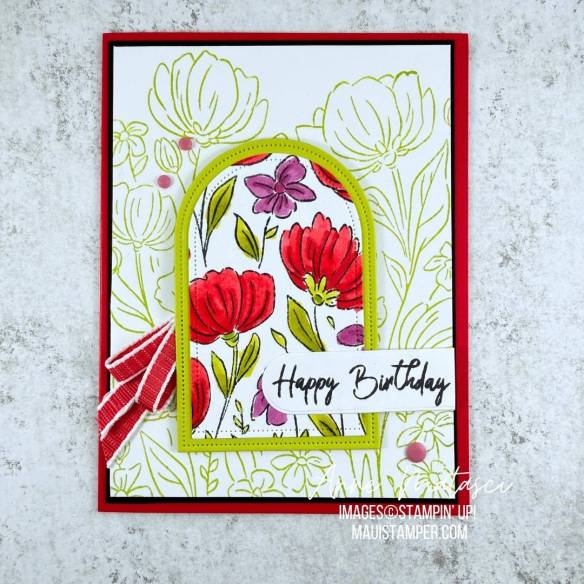
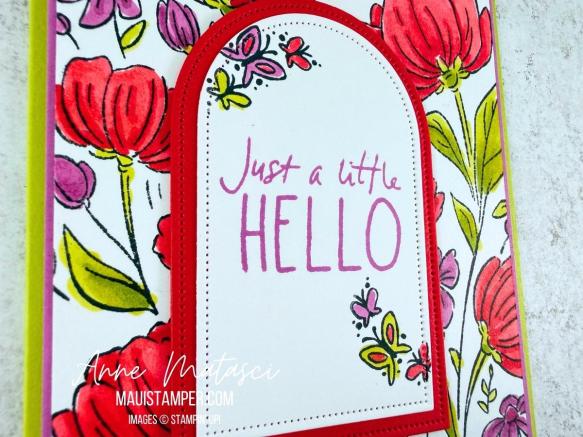
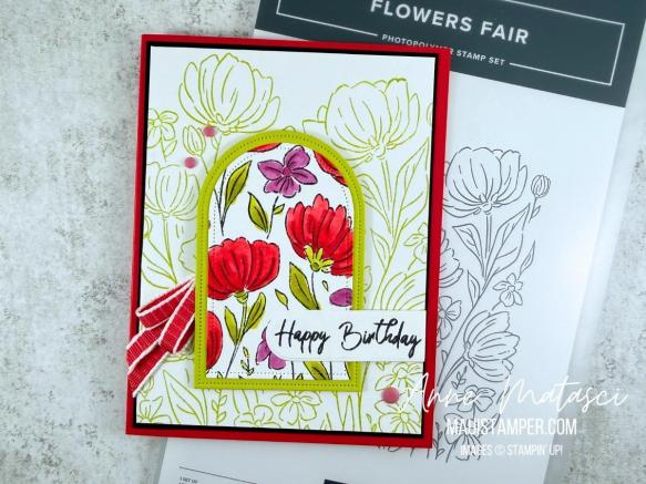
Don’t you love getting double the results from one image? A large image like Flowers Fair is a great candidate for double dipping. Take a look at what I did:
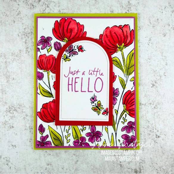
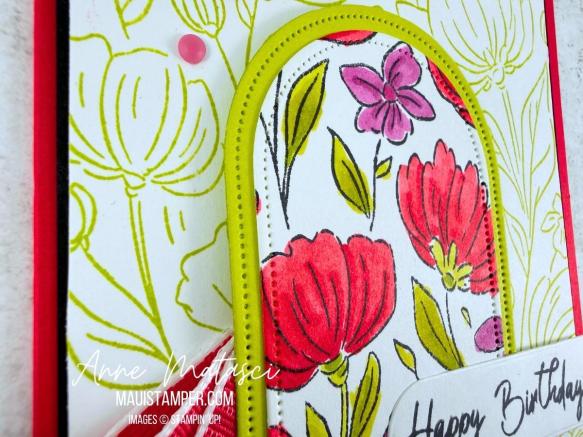
After I’d colored the original image, I cut out middle with the Everyday Arches dies and used it for the second card. It was easy to cover the opening on the first card with a matted second image, and I stamped the same full image for the second card in Lemon Lime Twist to keep it softly in the background.
I kept the focal panel for the first card simple with plenty of white since the background was so colorful. The little butterflies from Cutest Crew fit perfectly on the edges.
Keeping the background softer allowed the focal panel to, well, be the focus. I stamped the sentiment in black to mute what was otherwise a very colorful card.
Flowers Fair was released during the March 2026 Online Exclusives. It’s a keeper – have some fun with it!
Processing…
Success! You're on the list.
Whoops! There was an error and we couldn't process your subscription. Please reload the page and try again.