Give Thanks

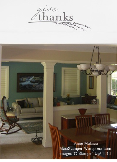
There has been a lot to be grateful for in my life recently.  Gratitude has really been on my mind, so a couple of weeks ago when I was ordering supplies for classes I added on the Give Thanks Decor Elements image.  I wanted to put it somewhere that would be regularly visible, and for me it was clear that would be the kitchen.  As in most homes, our kitchen is the family hub.  We spend the majority of our family time there, and it seemed the best place to put up a reminder to be thankful:

Give Thanks in my kitchen

It’s beautiful, isn’t it?  This is the medium sized image in Chocolate (#117951, $14.95).  It was VERY easy to put up.  I think I spent more time washing the wall than I did working with the Decor Elements!  Start to finish was less than 15 minutes, and that included time for the wall to dry.

Here’s the view from the kitchen island:

Give Thanks view from the island

Every time someone walks into my kitchen, Give Thanks is over their head.  Isn’t that a lovely thought?

Give thanks.

Fuzzy Bats and Spooky Eyes

My friend Kellie came over to play on Friday and brought a couple of cards to share with me.  I don’t make many Halloween cards so I don’t buy many Halloween stamps, but her cards just about had me putting in an order with my favorite Stampin’ Up! demo (yeah, ha ha, three guesses who that might be!!).

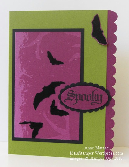
Kellie's Spooky bats

Since I didn’t make this card, I can’t give you all of the details but she did say she used the Wicked Fun Specialty Designer Series papers and the Wicked Cool stamp set.  I REALLY didn’t plan on getting that set!

The Wicked Fun DSP has flocking on it so the bats are fuzzy…I like those fuzzy bats…not that I really like bats or anything, but how can you not love fuzzy bats??  Just tell me that.

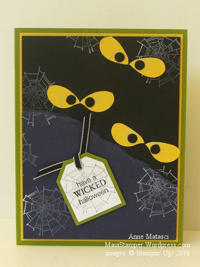
Kellie's Spooky Eyes

Don’t you LOVE these eyes?  They’re the wing from the XL Two Step Bird punch!  I like them even better than Googlie Eyes, and I really love googlie eyes.  The spider web is from that dog-gone Wicked Cool stamp set too.  Hmmmph.

Kellie CASE-d these two cards and even brought me the names of the stampers, so if you love these cards, be sure to Google these two talented women and give them a little love too.  The Eyeballs card was inspired by Sandi Maciver and the Fuzzy Bats are courtesy of Deb Currier.

Have a little Halloween fun!

Gratitude: Expressing Appreciation

Gratitude is a feeling I try to keep at the top of my mind.  I have so much to be grateful for, and I find if I focus on those things I can always see the glass as half full.  It takes so much energy to be grumpy, resentful and negative, but being grateful is life-giving.  I look for the Thanksgiving moment in every situation, no matter how serious it may be.

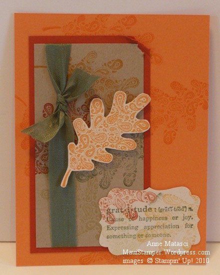
Gratitude in Paisley

  • Paisley Prints and Define Your Life stamp sets
  • Peach Parfait, Cajun Craze, Crumb Cake and Naturals Ivory card stock
  • Peach Parfait, Cajun Craze, Crumb Cake, River Rock, Always Artichoke and More Mustard Classic ink pads
  • Decorative Label punch
  • Stampin’ Dimensionals and Always Artichoke Seam binding

Have you tried the new 1/2 inch Seam Binding from the Holiday Mini catalog yet?  It is so fun to work with – I’m a seamstress too, and it’s the real deal.  The color is gorgeous but what I really love is that the knot isn’t bulky and I think I might be able to squeak this one past the Fat-Card-Police at the post office.  Now that’s something to be grateful for.

The final touch

Last week I packed my overnight bag to go visit my friend Cheryl.  OK, not really…I mean the overnight bag part.  I know I whine about this regularly, but she used to live 5 minutes up the hill and she moved to HAIKU.  Now it’s a 50 minute drive, except last Wednesday I think I made it in 45.  It has to be that I’m getting used to the route because I certainly wouldn’t be driving any faster.

WARNING:  You can’t get this Decor Elements design any more.  It’s gone, done, finito.  This post is to help you visualize how easy it is to put a multi-piece Decor Elements on the wall, but don’t get attached to the image!!!

Cheryl hostessed a workshop last spring with the goal of earning the Level III Decor Elements Hostess gift.   She rustled up orders from I-don’t-know-where and made her goal so that she could have this delightful birdcage image to put in her new entry way.  She bought bird houses and hooks with birds on them and books about birds…you get the idea.  With nearly all the moving boxes emptied and her second daughter securely settled in college, it was time to bring out the Decor Elements Applicators:

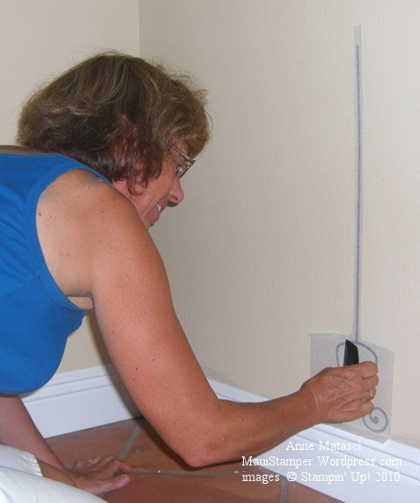
The bottom of the stand goes on the wall

We measured carefully and even made our own “plumb bob” to get the stand straight.  When we pulled away the paper and saw the base of the stand on the wall we were thrilled and got right to work with the rest of the stand.
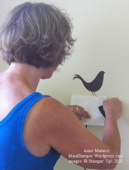
Revealing the happy bird

We were about to put the birdcage on the top of the stand when we realized that the bird needed to go on the wall first so that it would look like it was really inside the cage.   She looked a little funny sitting on the wall floating above the stand, but we weren’t finished with her:

The bird cage

The cage had the most elaborate lines and we were very careful to burnish them all thoroughly before we placed it on the wall.  Our diligence made the birdcage go up very easily.

The bird cage is almost done!

As Cheryl peeled back the application sheet we were thrilled to see our careful measurements paid off.  The bird was lined up perfectly in the cage, and the cage was centered on top of the stand.  We thought it looked so cool!!
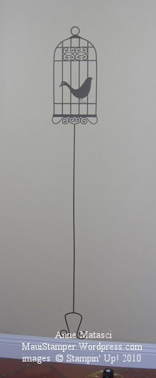
Ta Da!!  The final result

The final result – I wish you could see the rest of the room.  There will be a vase to the left of the bird cage in the corner of the entry, and there’s a gorgeous bench with storage baskets underneath it to the right, and there are birds and birdcages everywhere.  If you look very closely in the bottom of the photo you can see our very sophisticated plumb bob – we tied some ribbon to a punch and let it hang to determine a straight line for placing the stand on the wall.  I’d say we did a good job!

Really? I get all that??

In case you haven’t noticed (or perhaps have just awakened from a Rip-Van-Winkle-esque 20 year nap) Stampin’ Up! has outstanding enticements for our workshop hostesses.  It seems no matter how carefully I explain our benefits to a new hostess, when it comes time to place her workshop order and I show her what she’s earned her eyes open wide and she says “REALLY???”

YES!!

REALLY!!

I recently was a hostess myself and enjoyed the same benefits as any other Stampin’ Up! hostess, and earned a level two hostess set.  (Read all about benefits on page 9 of the Idea Book and Catalog, and if you don’t have a catalog, call me).

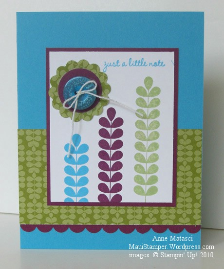
Bright Apple Blossoms

  • Apple Blossom Level II Hostess Exclusive Stamp set
  • Rich Razzleberry, Tempting Turquoise and Pear Pizazz Classic ink pads
  • Whisper White, Rich Razzleberry and Tempting Turquoise card stock
  • Play Date Designer series paper
  • 1 1/4 inch and scallop circle punches; scallop border punch
  • Brights Designer button collection; white crochet thread (non-SU)

I don’t know what’s gotten into me lately, but I have had a thing for really bright and bold color combinations.  Our Color Renovation has really shaken up the way I look at our colors….in the past I seldom considered Tempting Turquoise, but lately it’s practically a neutral for me!    To tell the truth, if you look into my closet you’ll see that color quite a bit, so the surprise should be that it’s taken me this long to embrace it in paper.

Perkin’ up

Do they even make percolators anymore?  I remember one sitting on my grandmother’s kitchen counter, and I think every church I’ve ever been to has at least one of the ginormous 30 or 60 cup monsters, but there isn’t one in my house.  We have lots of coffee-making devices:  two regular drip brew coffee makers, one 6 cup and one travel french press, and an espresso machine (two if you count the little silver stove-top one like they use in Europe).   This one is so charming that I’m willing to overlook the fact that it’s obsolete:

A little note to perk you up

  • Morning Cup stamp set
  • Very Vanilla, More Mustard, Rich Razzleberry and Early Espresso (ha!) card stock
  • Early Espresso Classic ink pad
  • Blender pen and Stampin’ Pastels

I started out just fiddling around with the Stampin’ Pastels….it’s been a very long time since I’ve had them out of the drawer.  I liked the slightly uneven nature of the color even though I suspect it’s really Operator Error.  Don’t laugh, but this actually looks much better in person…from about 3 feet away.    I had such fun I tried it again:

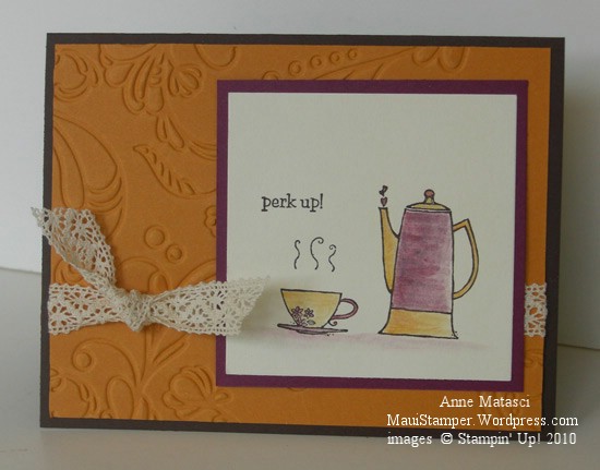
Perk Up full card

  • Morning Cup stamp set
  • Very Vanilla, More Mustard, Rich Razzleberry and Early Espresso (ha!) card stock
  • Early Espresso Classic ink pad
  • Blender pen and Stampin’ Pastels
  • Big Shot and Elegant Lines Textured Embossing Folder
  • Victoria 5/8 inch crochet trim

I’m not ready to go back to percolator coffee, but I’m pretty fond of this little pot.

Starting the day out right

While the Morning Cup set was on my desk I put together a quick 3×3 notecard:

My Coffee Means Everything to Me

  • Morning Cup and Always stamp sets
  • Whisper White and Early Espresso card stock
  • Play Date Designer Series Paper
  • Early Espresso Classic ink pad
  • Blender Pen and Stampin’ Pastels
  • Real Red 1/8 inch ribbon
  • 1 1/4, 1 3/8 inch and scallop circle punches

This sentiment from the Always stamp set struck me as the perfect complement to this image.  That first cup in the morning is what makes my day come to life.  We have an espresso machine and my dear husband makes me a cappucino every morning.  It’s one of the many ways he spoils me, and so in a way this card is all about him, too.

My morning cuppa

If you know me, you know I love coffee.  I’m a teeny tiny bit of a coffee snob – can’t drink just anything.  If the coffee is weak I’ll pass.  I brew what I refer to as “Manly Coffee”, and if it’s too strong for you, there’s the hot water!

I need that first cup to make any sense in the morning, especially if I have to be up early.  I love the smell, I love the taste, and I admit it, I love the oomph from my morning cuppa.  My daughters used to give me a bad time about my coffee addiciton, but college life silenced that.  The oldest tried to deny she was addicted – I think her exact words were “I’m not addicted, I’m just dependent” – but I’m under no such illusions.  I need my coffee.

Give me my caffeine

  • Morning Cup stamp set
  • Pear Pizazz, Marina Mist, Very Vanilla, and (OF COURSE) Early Espresso card stock
  • Early Espresso Classic ink pad
  • Blender pens and Stampin’ Pastels
  • Pretty in Pink 1/4″ grosgrain ribbon
  • Big Shot and Perfect Polka Dot Impressions folder

I made a serendipitous discovery:  Many of our retired Stampin’ Pastel colors can pass for some of our new Color Renovation colors.  The pastel chalk colors are soft and you can layer them to the depth of color that you want.

The Clearance Rack

You know, I’m in the same boat as all of you when it comes to the Clearance Rack.  Stampin’ Up! doesn’t let the demonstrators know when they put new goodies up in the Rack for sale, and over the weekend it occurred to me that I hadn’t shopped there for a while.  Oh boy, was that ever a mistake!  Some of my favorite retired items were there…including the tiny square and rectangular glassine envelopes.  Naturally, I had to find a project for them:

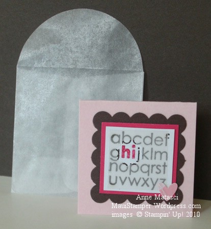
ABC Bitty Note with Square Glassine Envelope

  • Cute by the Inch Stamp set
  • Early Espresso Classic ink pad; Melon Mambo Stampin’ Write marker
  • Pink Pirouette, Early Espresso, Melon Mambo and Whisper White card stock
  • Vellum card stock; scrap retired Designer Series Paper
  • Scallop Square, XL Two Step Owl and Bitty Punch
  • Square glassine envelopes $1.99 for 20

I used the Bitty Circle to make a little Peek-a-boo window through the vellum for “hi”.

And another…

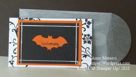
Batty Note with Rectangle Glassine Envelope

  • Teeny Tiny Wishes and Elements of Style stamp sets
  • Basic Black Classic ink pad
  • Whisper White, Basic Black and Pumpkin Pie card stock
  • White Gel pen; Champagne Mist Shimmer paint
  • Bat punch; rectangle glassine envelopes $2.49 for 20

Get these envelopes while they last at my Online Store!

Just little tags…

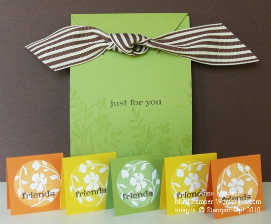
The convention Make-and-Takes always include some sort of 3-D project… Stampin’ Up! likes to keep us well-rounded.  This year was no exception.  We made a charming pouch style package that was quick and easy:

Just Believe pouch with tags

  • Just Believe stamp set
  • Pear Pizazz, Peach Parfait, Daffodil Delight and Whisper White card stock
  • Pear Pizazz, Peach Parfait, Daffodil Delight and Early Espresso Classic ink pads
  • Versamark ink pad
  • Word Window and 1 1/4 inch circle punches
  • Crop-a-dile and Early Espresso striped grosgrain
  • Small flat cello bag and Sticky Strip adhesive

This is a simple project that would make a great gift and can be easily re-interpreted to suit any color scheme or season.  When you open the pouch you can see the bag inside all ready for the little tags:

Just Believe pouch open

Look how cute those tags look in the cello bag – and they just jumped right in there!  The bag is attached to the pouch with some Sticky Strip so you can take the tags out one at a time – the top stays open.

That ribbon is cracking me up.  You can’t begin to imagine how many times I positioned and re-positioned it while I was taking the photos, and every time it made me think of a handlebar moustache.  Maybe the ribbon is just too long, but more likely my brain is just too weird.