Happy thoughts

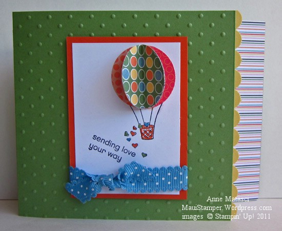
Here is another light-hearted card from this month’s Hostess Club:

Sending love

  • Sending Love stamp set
  • Wild Wasabi, Daffodil Delight, Tangerine Tango and Whisper White card stock
  • Just Add Cake Designer Series Paper
  • Basic Black Classic ink pad
  • Wild Wasabi, Daffodil Delight, Tangerine Tango and Marina Mist Stampin’ Write markers
  • 1 1/4 inch circle and scallop border punches
  • Marina Mist polka dot ribbon
  • Stampin’ Dimensionals

I based this card on Kelly’s convention swap, and I’m sorry to say I don’t have a photo of her card to share with you.  We helped her put together the last few of them sitting at a table at convention, but we were too busy to take photos at that point – people were literally walking up and asking to swap as we were working on them, and each card was snapped up as soon as it was finished.

My beautiful middle daughter is home this week, and we are having a lovely time doing not-so-much.  Last night was sunset picnic basket at the beach night with Mom and Dad (while brother went to a meeting), followed with Ono Gelato (brother’s meeting was done and he was very happy to meet us there).   Today I think we’re going to see if we can’t get pedicures.

I’m thrilled that both of my daughters are confident and successful, but not so thrilled that they live a bazillion miles from  me.  Fortunately, Mom and Dad have chosen a pretty nice place to live, so it’s not too hard to persuade them to come and visit.

Inking up the butterflies

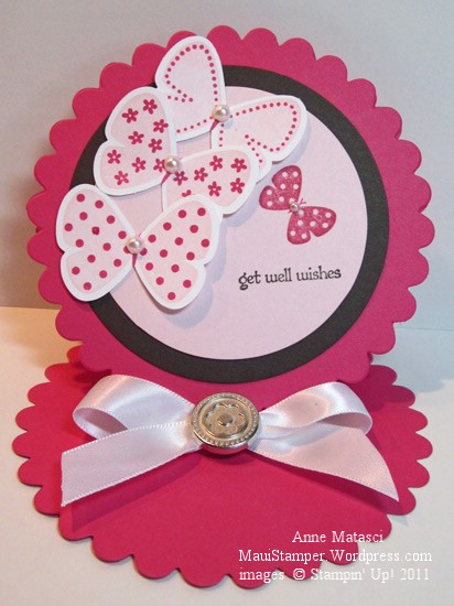
Flight of the Butterfly has been collecting a little dust on my shelves.  Another gorgeous WOW swap inspired me to brush it off, and I must confess that I cased this creation almost exactly:

Dawn's Butterfly Easel card

  • Flight of the Butterfly and Teeny Tiny Wishes stamp sets
  • Whisper White, Melon Mambo, Pink Pirouette and Early Espresso card stock
  • Melon Mambo, Early Espresso and Pink Pirouette Classic ink pads
  • Butterfly punch
  • Pearl Jewels
  • Flower Designer brads
  • Whisper White 5/8 inch satin ribbon
  • Big Shot and Scallop Circle die

Now that I’ve gotten my hands on a few samples of easel cards, I’m having a lot of fun putting them together.  It’s a perfect format for an announcement – like a baby announcement – when you would like to feature a photo.

This is one of the cards we’ll make at the specialty folds card class next weekend (September 4th) at Ramona’s house in Wailuku.  Space is limited, so check the calendar at the Online Store or contact me directly to hold your place.

I’d like to give credit to the demonstrator who designed the original card.  Her name is Dawn Shearer, and she’s a Stampin’ Up! demonstrator in Canada –  and a very talented one at that!

All in Good Fun

I received so many incredible cards at Joan Cristo’s WOW swap at convention this year.  Honestly, I could spend an entire year creating new projects based on these beautiful cards.  I made 130 cards to swap, and yes, that was insane.  I don’t like production, and even though I made 2 different designs (so that I “only” had to create 65 of each) I found myself grumbling through the process.  Then I would remind myself of the rewards and start humming, thinking about the possibilities.

There’s something about holding a design in your hand – versus seeing a photograph of it – that inspires me.  If you’ve never participated in a swap, I highly recommend you give it a try.  There are swaps of all shapes and sizes in a variety of forums online, or your stamp club or demo team might be willing to give it a try.  Not every card will be to your taste or liking, but every card contains a possibility!

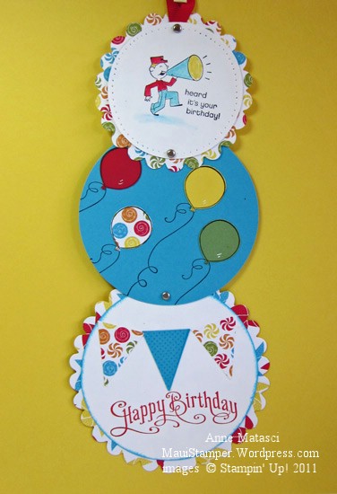
Last night at hostess club I worked from a design that I received in 3 or 4 different versions.  It’s a relatively simple design, and I’ve seen it referred to as a telescoping card.  We made our version in the bright, happy colors of the Big Top Birthday Designer Series Paper:

Telescoping Big Top Birthday

  • Perfectly Penned, Ain’t Love Grand, Pennant Parade and Crazy for Cupcakes stamp sets
  • Whisper White, Tempting Turquoise, Wild Wasabi, Daffodil Delight and Real Red card stock
  • Big Top Birthday Designer Series paper
  • Basic Black, Tempting Turquoise, and Real Red Classic ink pads
  • Daffodil Delight and Real Red Stampin’ Write markers
  • Aquapainter
  • Unibal Signo White gel pen
  • Stampin’ Sponges
  • Piercing tool, template and mat
  • Petite Pennants Builder punch
  • Silver brads 
  • Real Red 1/4 inch grosgrain ribbon
  • Big Shot and ALL the Scallop Circle and Circle Bigz and Originals dies

There must have been some fumes coming off those ink pads last night!  The Piercing Tool, formerly known as the Pokey Doodle, suddenly became the Stabber.  We had balloons  and Stampin’ Sponges flying every which way, and I think we disturbed the concentration required to watch Sports Center in the other room 🙂  Ah well, all in the name of good fun and good times.

Great combinations with the Color Coach

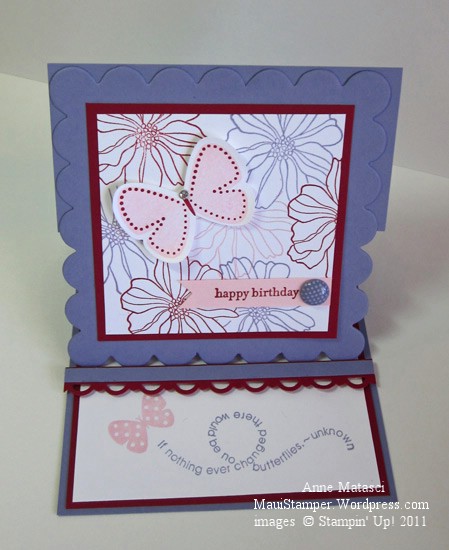
The new Stampin’ Up! Color Coach is a great way to jump start a project when you’re stuck for something new.  I’ve used this combination before, and liked it so well I tried it again:

Wisteria Butterflies Easel card

  • Flight of the Butterfly, 5th Avenue Floral, and Teeny Tiny Wishes stamp sets
  • Whisper White, Pink Pirouette, Cherry Cobbler and Wisteria Wonder card stock
  • Pink Pirouette, Cherry Cobbler and Wisteria Wonder Classic ink pads
  • Butterfly and Scallop trim border punches
  • Big Shot, Petal Cone Bigz L and Scallop Square Bigz dies
  • In Color Designer Printed brads
  • Stamp-a-ma-jig
  • Rhinestone jewels
  • Stampin’ Dimensionals

There are loads of tutorials for easel cards out there, so I’m not going to re-invent the wheel – just Google it (Easel card tutorial, not the wheel).  Trust me, this is another case of  “much easier than it looks”!

We did pull out the Stamp-a-ma-jig for this project.  If you’re picky – and I am the first to admit that I am – some things just can’t be done by the eye-ball method.  I need those little dots around that butterfly to line up Just Right.  Even if Flight of the Butterfly were available as a clear mount stamp set, I would still use the SAMJ.

When we did this in class, I was demonstrating the SAMJ to a newer stamper.  I cracked up when she pulled her stamp away from the positioner, looked at the results, and happily exclaimed, “It worked!”  I have to confess that I have that same feeling every time I use that tool to get perfect alignment – I’m just so happy it works.

There’s another Getting to Know the In Colors class featuring Pool Party on September 18th.  If you head on over to the calendar at my Online Store, you can see the details.  Did you know that you can RSVP on that calendar?  If you do, I’ll even give you a reminder.  Oooh la la!

The Wonder of Wisteria

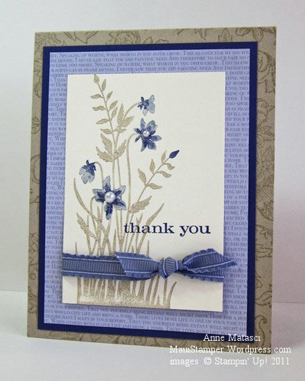
Wisteria Wonder was the first 2011-2012 In Color selection featured in my Getting to Know the In Colors class series.  I had one of those happy moments when I held it up and everyone ooohed and aahhhed:

  • Just Believe and Bella Toile stamp sets
  • Crumb Cake Classic ink pad
  • Wisteria Wonder and Concord Crush Stampin’ Write markers
  • Very Vanilla, Crumb Cake and Concord Crush card stock
  • Wisteria Wonder Patterns Prints Designer Series Paper (In Color collection)
  • Wisteria Wonder 3/8 inch ruffled ribbon
  • Blender pen
  • Pearl Jewels

It’s a very simple card, but I love the combination of colors, and I love that Just Believe stamp set.   Someone in class asked if that was an “old” stamp set – it was brand new LAST year!  It doesn’t seem old to me, because I always find new ways to use the images in the set.

The main image in this card is inked with Crumb Cake ink, and the ink is removed from the flower portions of the image with a Blender Pen.  We used the Wisteria Wonder Stampin’ Write marker to add color back to the flowers, and then used the flat edge of the Concord Crush marker to accent the centers of the flowers before we stamped the image.

I’ve seen many cards using Wisteria Wonder and neutrals.  That seems to be a really popular pairing, especially Wisteria Wonder and Crumb Cake.   (hijack:  I know Stampin’ Up! likes colors to have two-word, alliterative names, but really, what was wrong with Kraft??)  I like that look myself, but enough is enough.  We did some projects with other color combinations too. (stay tuned)

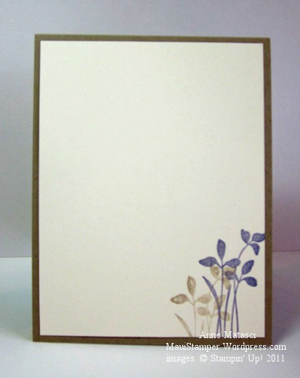
Here’s the inside of the card:

Just Believe In Wisteria Wonder inside

Oh dear, my title is going to create havoc with Google searches by gardeners in love with a vine.  My bad 🙂


Composition Books the Maui Stamper Way

I love to write, and I’m addicted to notebooks of all sorts…but I prefer it when they’re interesting (I was going to say “pretty” but that sounds like an 8 year old girl.)

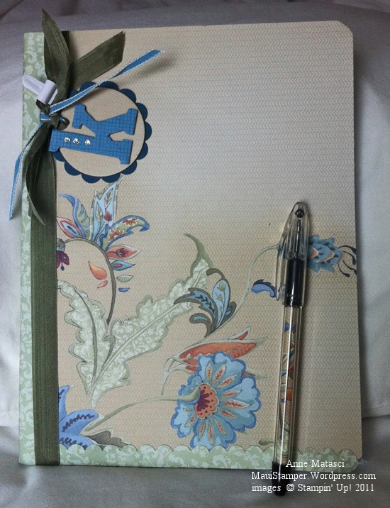
Last weekend I made a very quick trip to Portland, Oregon for some training with Weight Watchers.  I was meeting three other Hawaii WW staff there, and I wanted to bring them a little “something”.  What could be better than some “interesting” composition books?

Katie's composition book

This one was for Katie – and of course, there had to be a coordinating pen.

Shawndra's composition book

I love this page of Designer Series Paper, but you can see that Shawndra’s scallops got a little mashed in my suitcase.  They’ll be fine with a smidgen of Tombo.

Kim's composition book

Blue and green for Kim – my favorite color combination!

Anne's composition book

Well, yes – yes, I did make one for myself!

These all use the Pocketful of Posies Designer Series paper.  I have loads of gorgeous papers right now because DSP is  Buy 3 get one Free!   You can get some too, but just through August 31 (I just did the knuckle trick to be sure that was right!)

Wow cards: Tre

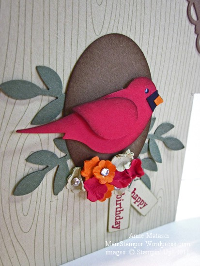
This final WOW card is based on a swap I received from Sacha Wilson at convention:

Bird house card

  • Woodgrain and Teeny Tiny Wishes stamp sets
  • River Rock, Soft Suede, Riding Hood Red, Always Artichoke, Basic Black and Pumpkin Pie card stock
  • River Rock and Soft Suede classic ink pads
  • XL 2 Step Bird, Medium Jewelry Tag, Bitty Flower, Wide oval and Scallop Border Trim punches
  • Stampin’ Dimensionals and Mini Glue dots
  • Stampin’ Sponges and Rhinestone jewels
  • Basic Black and Riding Hood Red Stampin’ Write markers
  • Unibal Signo White Gel pen
  • Riding Hood Red taffeta ribbon

We all got a little giddy with this card.  Cheryl said she was going to make this for her Christmas card, but Robbie and I convinced her that she should just make two – one for each of us.  We all started telling stories about the cards we had made that nearly drove us insane…Denny had us all cracking up about the Santa card with the bazillion little HAND CUT pieces.  What on earth makes us think we want to make dozens of cards like that?  I’ve done it too!

How could you not love this little bird at Christmas??

Bird house bird

Not gonna do it.  Nope.  Cheryl, I’m passing on the torch.

Wow cards: Due

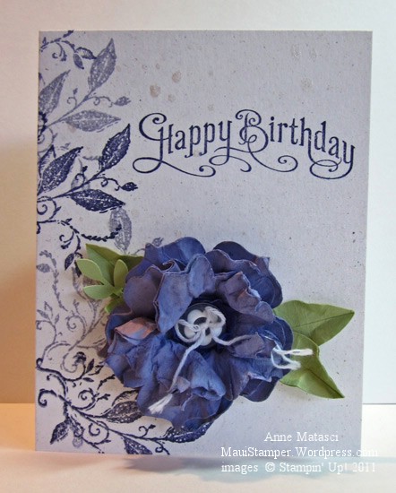
For our second Wow card, I cased one of my own recent favorite projects:

Wisteria Best Friends

  • Best Friends and Perfectly Penned stamp sets
  • Naturals White, Wisteria Wonder, Concord Crush and Pear Pizazz card stock
  • Wisteria Wonder and  Concord Crush Classic ink pads
  • Vanilla Smooch Spritz
  • Big Shot and Fun Flowers Bigz L die
  • XL Two Step Bird, Boho  and Flower Builder punches
  • Neutrals buttons and White Bakers Twine

I loved that big distressed flower and brought it back in a new color scheme.  To get that look, you REALLY have to smush the individual die cuts a lot, then stack them and secure them with a button or brad, and then mist them.  The misting process softens the paper even more, and so when you do your final crush and fluff your petals crumple naturally.  The paper also holds its shape best if it has been misted and allowed to dry in place.

We had a pretty good time smushing those flowers.   It’s an excellent way to take out a little aggression, because the paper really benefits from some serious twisting and crumpling.  Once you’ve really worked it over and you start to assemble the flower, all of that crankiness seems to melt away as your blossom takes shape.  Who could be angry with a flower?

I think I’ll cut some Fun Flower shapes to have on hand for emergencies.


Wow Cards: Uno

I liked the little card so well, I turned it into a full sized card for my WOW class:

Marina flower full card

It’s almost exactly the same – except there isn’t a pocket on the front.  This card still opens from the top, and the inside has a lovely panel but I forgot to take a photo of that.  Honestly, I must be sniffin’ the Tombo these days because I seem to forget more than I remember!!

I tried something a little different last week – a WOW card class.  In the past when I’ve done card classes I’ve tried to have something for everyone, but I’ve learned it’s pretty difficult to please all of the people, all of the time.  The people who like simple cards don’t want to fuss with detailed cards, and vice versa. This time we focused on details – lots and lots of details!  Cheryl said she had to stand up to get it right.

Cheryl the Stand Up Stamper

Her hands were flyin’!  I took 3 different photos and her hands are a blur in every one!  I have to confess that when I really get into a project I stand up too.  I just can’t seem to concentrate if I’m sitting down, or maybe it’s just that I have to get my whole body into the process.

Hmmm.  I wonder if Weight Watchers will assign a Points Plus activity value for aerobic card making and paper crafting?

A special order

Last week I was asked to design pocket cards to coordinate with an internal promotion a local business was doing for its sales staff.  The manager at the store wanted something that would set this promotion apart, and she gave me a sample of the card that her employees would receive.

I had a fabulous time playing with this project!  The sample that I received was trendy but very classy – much like the merchandise in this store.  The employees are all female, so I was free to encourage my feminine muse.  Here’s the result:

Marina Mist flower card holder

Because this project is sized to hold the equivalent of a business card, I was able to make it stand up.   It’s like a greeting card that opens from the top instead of the side, but there’s a pocket on the front to hold the card.  It looked GREAT with the enclosure inside – but I can’t share that with you.  This was such a fun More Is More project!

I used the Creative Elements stamp set with Shimmer White, Early Espresso, Crumb Cake and Marina Mist as the color palette, and I’m sure you can figure out the rest.

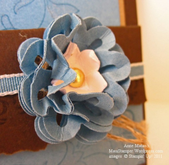
Here’s the flower embellishment up close:

Marina Mist Flower Embellishment

I heard they were a big hit with the staff – that feedback was music to my ears.  It’s one thing to love what you do, but when you create something for someone else and they love it too, that’s incredibly satisfying.

Come back tomorrow for another adaptation of this project!